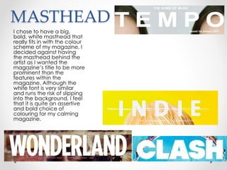
This document discusses how the student's media product uses and challenges conventions of real magazines.
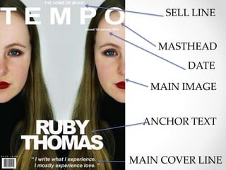
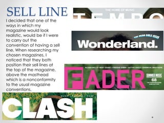
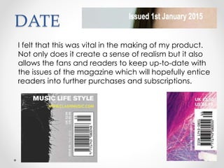
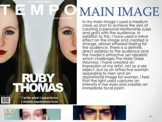
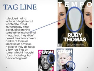
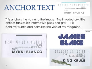
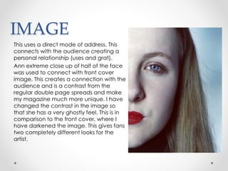
The front cover includes elements like a sell line, masthead, main image, anchor text, main cover line, and date that follow magazine conventions. However, the masthead placement is nonconforming.
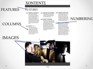
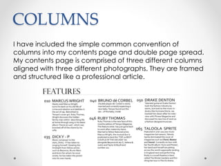
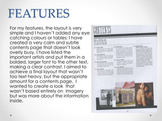
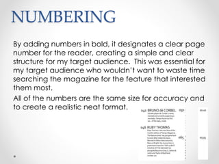
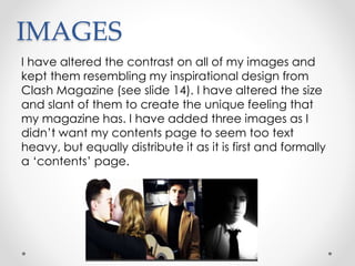
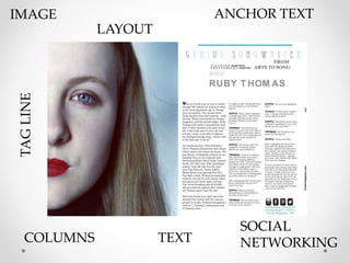
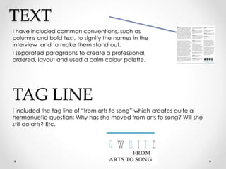
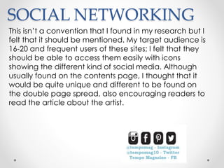
The contents page includes columns, numbered features, and images to look professional while keeping a calm style. The double-page spread features an unusual split image, bold text for names, columns, and a tagline that poses a question. Social media icons are also included in an unconventional place. Overall, the layout balances conventions with unique design choices.