EVALUATION
ONE
In what ways does your media product use, develop or
challenge forms and conventions of real media
products?
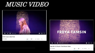
MUSIC VIDEO
MUSIC VIDEO:
LOCATION
Our music video location after our change of plan was
influenced vastly from music videos such as Imagine
Dragons- Believer and Ed Sheeran-ThinkingOut Loud
using the stage idea with coloured lights which is shown
in the establishing shot of the video.This stood out to
myself and Steph as it works well with the solely
performance aspect of our music video and as we
decided to no longer use the original location idea of the
church (influenced by the song name) because we
wanted an open space that would work with our dancers
and singer.Also taking inspiration from music videos by
The 1975 such asThe Sound and UGH! gave us the
inspiration of using coloured lights (shown at 0.03) as we
felt this connoted an indie approach in our music video
and we could achieve this effect using the stage.We
chose to use purple lights as we felt this worked well
with the stained glass window as well as working well
with the dramatic element myself and Steph wanted to
convey in our music video.
ImagineDragons-
Believer
Ed Sheeran- Thinking Out
Loud
The
197
5
The
Sound
UG
H!
MUSIC VIDEO-
DANCERS
We chose to use dancers as we gained inspiration from
Sia-The Greatest and P!nk-Try deciding to use this
creative approach as it made the videos stand out. Also by
combining this with our singer, we felt this would achieve
a professional approach as our dancers dance regularly
with a club and our singer has joined the drama group
‘Future Faces’ in the past and has singing experience from
that.
SI
A
The
Greates
t
P!NK-
MUSIC VIDEO- DANCE SHOW
INSPIRATION AND
CONVENTIONS
Another place we gained inspiration from was a dance show
which we attended seeing a contemporary dance to the song
by Hozier ‘Take Me to Church”. Myself and Steph loved the
dramatic aspect of this and the idea of using dancers stood out
to us as the performance was very different to the original
Hozier music video and upheld our interest throughout the
entire song. However, we chose to select a slower version of the
song challenging the conventions of the original Hozier song in
which we discovered Sofia Karlburg meaning we chose a female
singer. However, Sofia’s take on this song is not quite as
dramatic as Hozier’s suggesting a slight challenge to this media
product as we are presenting the song in a different way using
dancers. Another challenge in the video could be through the
use of the transitions using a cross dissolve which is shown at
0.08 rather than simply a cut as we felt during the post
production stage that this worked better than simply a cut from
each clip as the dancing faded into each other and worked well
with the shorter clips.
Sofia
Karlburg
MUSIC
VIDEO-
OUTFIT
INSPIRATION
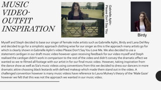
Myself and Steph decided to base our singer of female indie artists such as Gabrielle Aplin, Birdy and Lana Del Rey
and decided to go for a simplistic approach clothing wise for our singer as this is the approach many artists go for
which is clearly shown in Gabrielle Aplin’s video Please Don’t SayYou Love Me.We also decided to use a
statement cardigan in our draft music video however upon receiving feedback for our video myself and Steph
realised the cardigan didn’t work in comparison to the rest of the video and didn’t convey the dramatic effect we
wanted so we re-filmed all footage with our artist in for our final music video. However, taking inspiration from
the dance show as well as Sia’s music videos using conventions from this we decided to dress our dancers in more
dramatic attire choosing black leotards with defined makeup which made them stand out in the video. A
challenged convention however is many music videos have reference to Laura Mulvey’s theory of the ‘Male Gaze’
however we felt that this was not the approach we wanted in our music video.
GabrielleAplin-
PleaseDon’tSayYou
LoveMe
Birdy
MUSIC VIDEO- SHOT
INSPIRATION
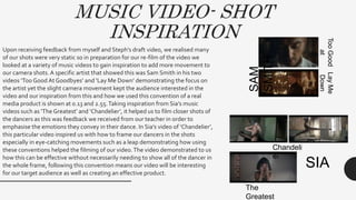
Upon receiving feedback from myself and Steph’s draft video, we realised many
of our shots were very static so in preparation for our re-film of the video we
looked at a variety of music videos to gain inspiration to add more movement to
our camera shots.A specific artist that showed this was Sam Smith in his two
videos ‘Too Good At Goodbyes’ and ‘Lay Me Down’ demonstrating the focus on
the artist yet the slight camera movement kept the audience interested in the
video and our inspiration from this and how we used this convention of a real
media product is shown at 0.13 and 2.55.Taking inspiration from Sia’s music
videos such as ‘The Greatest’ and ‘Chandelier’, it helped us to film closer shots of
the dancers as this was feedback we received from our teacher in order to
emphasise the emotions they convey in their dance. In Sia’s video of ‘Chandelier’,
this particular video inspired us with how to frame our dancers in the shots
especially in eye-catching movements such as a leap demonstrating how using
these conventions helped the filming of our video.The video demonstrated to us
how this can be effective without necessarily needing to show all of the dancer in
the whole frame, following this convention means our video will be interesting
for our target audience as well as creating an effective product.
SAM
SMITH
TooGood
at
Goodbyes
LayMe
Down
SIA
Chandeli
er
The
Greatest
MUSIC VIDEO- ANDREW GOODWIN
Our music video also demonstrates some of Andrew Goodwin’s features of a music video suggesting our product is using features
shown in real media products.This is shown how I feel our video clearly shows characteristics of an indie genre such as the female
solo artist whose style we based off other indie solo artists such Birdy and Gabriele Aplin.There is also a relationship between the
lyrics and the visuals such as we have a stained glass window in the background of the entire video giving the impression of a
Church motif.This suggests an illustrative approach for various parts of the song such as the lyrics “worshipped her sooner”,
“heaven I’ll be sent to”, “take me to church”, “tell you my sins” and “amen” which all closely relate to a Church.Although there
limited illustrative moments in the music video other than when dancer’s demonstrate a praying notion during the lyrics “amen”, it
can be suggested the dance in the song amplifies the lyrics due to the dramatic notion of the performance heightening the
emotions and connection the audience feels with the music video which will ultimately make the video more memorable. Using
these features shown by Andrew Goodwin suggest that our media product is using features that real products also use suggesting
a professional element of our video and the indication it would work with our target audience.
MUSIC VIDEO- THEORISTS
Also showing how our media product uses and develops conventions of real media products is shown
through how we show the features commented on by the narrative theorists Sven E Carlsson and Steve
Archer. Calsson believes videos can be split into two different types of video, performance and
conceptual and our video fits the conventions of a performance video. It can be suggested that there is an
element of “commercial exhibitionist” which Carlsson defines as creating a performer/artist that our
audience can aspire to be. Due to the fact our video belongs to the indie genre, our artist is presented as
relatable to the audience meaning our target audience may aspire to be like her to an extent due to the
normality displayed in her presentation. Another convention of performance videos Carlsson
demonstrates includes how we included both singers and dancers. Upon receiving feedback from our
draft video that a lot of our shots were fairly static, taking inspiration from videos such as Sam Smith ‘Too
Good At Goodbyes’ when we re filmed the majority of our video we took care to include movement into
our shots demonstrating how our video shows the features commented on by Steve Archer having to
include movement within the video. Looking at the quality difference between our draft and final video,
it shows following the conventions of real media products and fitting the features commented on by
Steve Archer made our video more engaging and interesting for the audience and added a more of a
professional element to our video.
DIGIPAK(S)
DIGIPAK-
FOLLOWING
CONVENTIONS
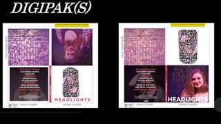
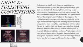
Following the rule of thirds shown on my digipak is a
convention shown by most real media products which splits
each panel into thirds displaying the main image and/or
information in the centre panel as this is predominately the
area where the audiences’ eye is drawn to.This is shown how I
framed the song names on the back of the digipak in the
middle long with the image behind and on the inside on the
right with the artist image or the stained glass window effect
image. In the front over of the second digipak with my artist
framed to the left, she is still clearly in a third of the digipak
and with the bold font across the bottom of the digipak it
means it still stands out to the audience.Another convention I
used which is shown on my digipak is the use of a bold font
throughout my digipak which is shown in many digipaks due
to the fact the font is eye-catching and easily readable.
Exampleartistwho
followsthis
convention-
ImagineDragons
Own
digipak(s)
DIGIPAK-
INSPIRATIONS
AND
CONVENTIONS
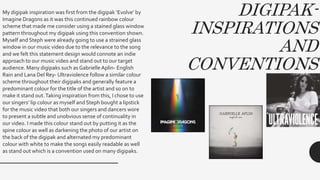
My digipak inspiration was first from the digipak ‘Evolve’ by
Imagine Dragons as it was this continued rainbow colour
scheme that made me consider using a stained glass window
pattern throughout my digipak using this convention shown.
Myself and Steph were already going to use a strained glass
window in our music video due to the relevance to the song
and we felt this statement design would connote an indie
approach to our music video and stand out to our target
audience. Many digipaks such as Gabrielle Aplin- English
Rain and Lana Del Rey- Ultraviolence follow a similar colour
scheme throughout their digipaks and generally feature a
predominant colour for the title of the artist and so on to
make it stand out.Taking inspiration from this, I chose to use
our singers’ lip colour as myself and Steph bought a lipstick
for the music video that both our singers and dancers wore
to present a subtle and unobvious sense of continuality in
our video. I made this colour stand out by putting it as the
spine colour as well as darkening the photo of our artist on
the back of the digipak and alternated my predominant
colour with white to make the songs easily readable as well
as stand out which is a convention used on many digipaks.
MAGAZINE ADVERT
MAGAZINE
ADVERT-
INSPIRATION AND
CONVENTIONS
For my magazine advert, I followed the convention of the
close relation of my advert to my digipak and music video.
For this, I had the stained glass window effect in the
background of the advert, as well as having the artist and
colouring the text in the same predominant colour used
throughout my digipak (white and the colour of the lipstick). I
also used my artist shown on the cover of the digipak which
is a convention that will help the success of the digipak due
to the fact the target audience are likely to see the magazine
advert and recognise the artist which will mean when they
see the digipak they are likely to make the reference and be
more likely to purchase the digipak.With the positioning of
my artist, I decided to have my artist looking down and to the
side to present a sense of ambiguity which I gained
inspiration from an Artic Monkeys magazine artist with the
woman in the image presented with a mask which will
intrigue the audience and make them more likely to find out
more about the digipak which is being released.
MAGAZINE ADVERT- INSPIRATION
AND CONVENTIONS
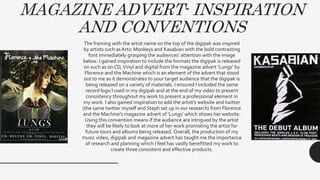
The framing with the artist name on the top of the digipak was inspired
by artists such as Artic Monkeys and Kasabian with the bold contrasting
font immediately grasping the audiences’ attention with the image
below. I gained inspiration to include the formats the digipak is released
on such as on CD,Vinyl and digital from the magazine advert ‘Lungs’ by
Florence and the Machine which is an element of the advert that stood
out to me as it demonstrates to your target audience that the digipak is
being released on a variety of materials. I ensured I included the same
record logo I used in my digipak and at the end of my video to present
consistency throughout my work to present a professional element in
my work. I also gained inspiration to add the artist’s website and twitter
(the same twitter myself and Steph set up in our research) from Florence
and the Machine’s magazine advert of ‘Lungs’ which shows her website.
Using this convention means if the audience are intrigued by the artist
they will be likely to look at more of her work promoting the artist for
future tours and albums being released. Overall, the production of my
music video, digipak and magazine advert has taught me the importance
of research and planning which I feel has vastly benefitted my work to
create three consistent and effective products.

Evaluation One

  • 1.
    EVALUATION ONE In what waysdoes your media product use, develop or challenge forms and conventions of real media products?
  • 2.
  • 3.
    MUSIC VIDEO: LOCATION Our musicvideo location after our change of plan was influenced vastly from music videos such as Imagine Dragons- Believer and Ed Sheeran-ThinkingOut Loud using the stage idea with coloured lights which is shown in the establishing shot of the video.This stood out to myself and Steph as it works well with the solely performance aspect of our music video and as we decided to no longer use the original location idea of the church (influenced by the song name) because we wanted an open space that would work with our dancers and singer.Also taking inspiration from music videos by The 1975 such asThe Sound and UGH! gave us the inspiration of using coloured lights (shown at 0.03) as we felt this connoted an indie approach in our music video and we could achieve this effect using the stage.We chose to use purple lights as we felt this worked well with the stained glass window as well as working well with the dramatic element myself and Steph wanted to convey in our music video. ImagineDragons- Believer Ed Sheeran- Thinking Out Loud The 197 5 The Sound UG H!
  • 4.
    MUSIC VIDEO- DANCERS We choseto use dancers as we gained inspiration from Sia-The Greatest and P!nk-Try deciding to use this creative approach as it made the videos stand out. Also by combining this with our singer, we felt this would achieve a professional approach as our dancers dance regularly with a club and our singer has joined the drama group ‘Future Faces’ in the past and has singing experience from that. SI A The Greates t P!NK-
  • 5.
    MUSIC VIDEO- DANCESHOW INSPIRATION AND CONVENTIONS Another place we gained inspiration from was a dance show which we attended seeing a contemporary dance to the song by Hozier ‘Take Me to Church”. Myself and Steph loved the dramatic aspect of this and the idea of using dancers stood out to us as the performance was very different to the original Hozier music video and upheld our interest throughout the entire song. However, we chose to select a slower version of the song challenging the conventions of the original Hozier song in which we discovered Sofia Karlburg meaning we chose a female singer. However, Sofia’s take on this song is not quite as dramatic as Hozier’s suggesting a slight challenge to this media product as we are presenting the song in a different way using dancers. Another challenge in the video could be through the use of the transitions using a cross dissolve which is shown at 0.08 rather than simply a cut as we felt during the post production stage that this worked better than simply a cut from each clip as the dancing faded into each other and worked well with the shorter clips. Sofia Karlburg
  • 6.
    MUSIC VIDEO- OUTFIT INSPIRATION Myself and Stephdecided to base our singer of female indie artists such as Gabrielle Aplin, Birdy and Lana Del Rey and decided to go for a simplistic approach clothing wise for our singer as this is the approach many artists go for which is clearly shown in Gabrielle Aplin’s video Please Don’t SayYou Love Me.We also decided to use a statement cardigan in our draft music video however upon receiving feedback for our video myself and Steph realised the cardigan didn’t work in comparison to the rest of the video and didn’t convey the dramatic effect we wanted so we re-filmed all footage with our artist in for our final music video. However, taking inspiration from the dance show as well as Sia’s music videos using conventions from this we decided to dress our dancers in more dramatic attire choosing black leotards with defined makeup which made them stand out in the video. A challenged convention however is many music videos have reference to Laura Mulvey’s theory of the ‘Male Gaze’ however we felt that this was not the approach we wanted in our music video. GabrielleAplin- PleaseDon’tSayYou LoveMe Birdy
  • 7.
    MUSIC VIDEO- SHOT INSPIRATION Uponreceiving feedback from myself and Steph’s draft video, we realised many of our shots were very static so in preparation for our re-film of the video we looked at a variety of music videos to gain inspiration to add more movement to our camera shots.A specific artist that showed this was Sam Smith in his two videos ‘Too Good At Goodbyes’ and ‘Lay Me Down’ demonstrating the focus on the artist yet the slight camera movement kept the audience interested in the video and our inspiration from this and how we used this convention of a real media product is shown at 0.13 and 2.55.Taking inspiration from Sia’s music videos such as ‘The Greatest’ and ‘Chandelier’, it helped us to film closer shots of the dancers as this was feedback we received from our teacher in order to emphasise the emotions they convey in their dance. In Sia’s video of ‘Chandelier’, this particular video inspired us with how to frame our dancers in the shots especially in eye-catching movements such as a leap demonstrating how using these conventions helped the filming of our video.The video demonstrated to us how this can be effective without necessarily needing to show all of the dancer in the whole frame, following this convention means our video will be interesting for our target audience as well as creating an effective product. SAM SMITH TooGood at Goodbyes LayMe Down SIA Chandeli er The Greatest
  • 8.
    MUSIC VIDEO- ANDREWGOODWIN Our music video also demonstrates some of Andrew Goodwin’s features of a music video suggesting our product is using features shown in real media products.This is shown how I feel our video clearly shows characteristics of an indie genre such as the female solo artist whose style we based off other indie solo artists such Birdy and Gabriele Aplin.There is also a relationship between the lyrics and the visuals such as we have a stained glass window in the background of the entire video giving the impression of a Church motif.This suggests an illustrative approach for various parts of the song such as the lyrics “worshipped her sooner”, “heaven I’ll be sent to”, “take me to church”, “tell you my sins” and “amen” which all closely relate to a Church.Although there limited illustrative moments in the music video other than when dancer’s demonstrate a praying notion during the lyrics “amen”, it can be suggested the dance in the song amplifies the lyrics due to the dramatic notion of the performance heightening the emotions and connection the audience feels with the music video which will ultimately make the video more memorable. Using these features shown by Andrew Goodwin suggest that our media product is using features that real products also use suggesting a professional element of our video and the indication it would work with our target audience.
  • 9.
    MUSIC VIDEO- THEORISTS Alsoshowing how our media product uses and develops conventions of real media products is shown through how we show the features commented on by the narrative theorists Sven E Carlsson and Steve Archer. Calsson believes videos can be split into two different types of video, performance and conceptual and our video fits the conventions of a performance video. It can be suggested that there is an element of “commercial exhibitionist” which Carlsson defines as creating a performer/artist that our audience can aspire to be. Due to the fact our video belongs to the indie genre, our artist is presented as relatable to the audience meaning our target audience may aspire to be like her to an extent due to the normality displayed in her presentation. Another convention of performance videos Carlsson demonstrates includes how we included both singers and dancers. Upon receiving feedback from our draft video that a lot of our shots were fairly static, taking inspiration from videos such as Sam Smith ‘Too Good At Goodbyes’ when we re filmed the majority of our video we took care to include movement into our shots demonstrating how our video shows the features commented on by Steve Archer having to include movement within the video. Looking at the quality difference between our draft and final video, it shows following the conventions of real media products and fitting the features commented on by Steve Archer made our video more engaging and interesting for the audience and added a more of a professional element to our video.
  • 10.
  • 11.
    DIGIPAK- FOLLOWING CONVENTIONS Following the ruleof thirds shown on my digipak is a convention shown by most real media products which splits each panel into thirds displaying the main image and/or information in the centre panel as this is predominately the area where the audiences’ eye is drawn to.This is shown how I framed the song names on the back of the digipak in the middle long with the image behind and on the inside on the right with the artist image or the stained glass window effect image. In the front over of the second digipak with my artist framed to the left, she is still clearly in a third of the digipak and with the bold font across the bottom of the digipak it means it still stands out to the audience.Another convention I used which is shown on my digipak is the use of a bold font throughout my digipak which is shown in many digipaks due to the fact the font is eye-catching and easily readable. Exampleartistwho followsthis convention- ImagineDragons Own digipak(s)
  • 12.
    DIGIPAK- INSPIRATIONS AND CONVENTIONS My digipak inspirationwas first from the digipak ‘Evolve’ by Imagine Dragons as it was this continued rainbow colour scheme that made me consider using a stained glass window pattern throughout my digipak using this convention shown. Myself and Steph were already going to use a strained glass window in our music video due to the relevance to the song and we felt this statement design would connote an indie approach to our music video and stand out to our target audience. Many digipaks such as Gabrielle Aplin- English Rain and Lana Del Rey- Ultraviolence follow a similar colour scheme throughout their digipaks and generally feature a predominant colour for the title of the artist and so on to make it stand out.Taking inspiration from this, I chose to use our singers’ lip colour as myself and Steph bought a lipstick for the music video that both our singers and dancers wore to present a subtle and unobvious sense of continuality in our video. I made this colour stand out by putting it as the spine colour as well as darkening the photo of our artist on the back of the digipak and alternated my predominant colour with white to make the songs easily readable as well as stand out which is a convention used on many digipaks.
  • 13.
  • 14.
    MAGAZINE ADVERT- INSPIRATION AND CONVENTIONS For mymagazine advert, I followed the convention of the close relation of my advert to my digipak and music video. For this, I had the stained glass window effect in the background of the advert, as well as having the artist and colouring the text in the same predominant colour used throughout my digipak (white and the colour of the lipstick). I also used my artist shown on the cover of the digipak which is a convention that will help the success of the digipak due to the fact the target audience are likely to see the magazine advert and recognise the artist which will mean when they see the digipak they are likely to make the reference and be more likely to purchase the digipak.With the positioning of my artist, I decided to have my artist looking down and to the side to present a sense of ambiguity which I gained inspiration from an Artic Monkeys magazine artist with the woman in the image presented with a mask which will intrigue the audience and make them more likely to find out more about the digipak which is being released.
  • 15.
    MAGAZINE ADVERT- INSPIRATION ANDCONVENTIONS The framing with the artist name on the top of the digipak was inspired by artists such as Artic Monkeys and Kasabian with the bold contrasting font immediately grasping the audiences’ attention with the image below. I gained inspiration to include the formats the digipak is released on such as on CD,Vinyl and digital from the magazine advert ‘Lungs’ by Florence and the Machine which is an element of the advert that stood out to me as it demonstrates to your target audience that the digipak is being released on a variety of materials. I ensured I included the same record logo I used in my digipak and at the end of my video to present consistency throughout my work to present a professional element in my work. I also gained inspiration to add the artist’s website and twitter (the same twitter myself and Steph set up in our research) from Florence and the Machine’s magazine advert of ‘Lungs’ which shows her website. Using this convention means if the audience are intrigued by the artist they will be likely to look at more of her work promoting the artist for future tours and albums being released. Overall, the production of my music video, digipak and magazine advert has taught me the importance of research and planning which I feel has vastly benefitted my work to create three consistent and effective products.