
Recommended
Recommended
More Related Content
What's hot
What's hot (19)
Similar to Drafts
Similar to Drafts (20)
More from RyanLock10
More from RyanLock10 (20)
Recently uploaded
Recently uploaded (20)
Drafts
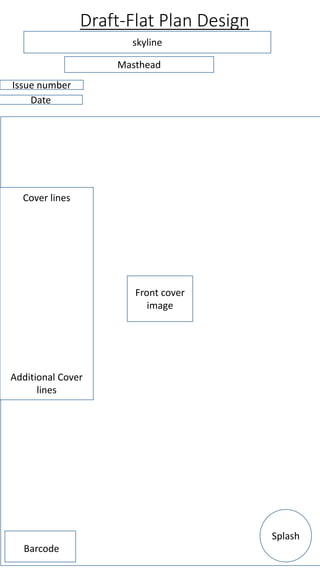
- 1. Draft-Flat Plan Design Front cover image Masthead Issue number Date Cover lines Additional Cover lines Splash skyline Barcode
- 2. I would consider using this design for my front cover because everything is organized however the front cover does looks bland and has a lack of information which might not attract my target audience because the front cover of my magazine wont look professional.
- 3. Draft-Flat Plan Design Article Title Main article Drop cap Mag name and page number Image Stan lee death Image Image
- 4. I would consider using this layout for my double page spread because everything looks well designed and well thought out which makes the double page spread look professional. This will attract my target audience because the pages will look professional and will interest them because the design of this layout allows for their to be information anywhere on the page.
- 5. Draft-Flat Plan Design Dominant image Masthead Issue number Date Cover lines Additional Cover lines skyline Barcode Sell Line Price
- 6. The reason I like this draft layout of a front cover for my magazine is because everything is spaced out and nothing is too close to each other. This would make my front cover look professional and would attract my target audience because the front cover is not over flooded with images and text.
- 7. Article Title Main article Drop cap page number Article Title Image Image Image Image Image Dominant image I would consider using this design for my double page spread because the design is well thought out and looks professional. It will also attract my target audience because there is not too much text or images.
- 8. Firstly, I used the shape creation tool to create boxes to put my text in because it will make the text stand out. Secondly, I used the text tool to create my article title and I also used a website called da.font to find the right font for the article title. The font I used is the one I believe looks more professional and appropriate for my target audience. I colored the text write because red and white are the iconic colours of Spider-man and that is who the article is based upon as well as the front cover. The colour scheme is the same through out the magazine to attract my target audience because they will see Spider-mans iconic colours. I also used the text tool to add my page numbers in the bottom left and right of my double page spread. Thirdly, I added a black box at the top right of my page using the shape tool and then added text saying “exclusive” using the text tool. I done this to attract my audience because when they flick through the magazine they will see the exclusive box at the top of the page which will interest them in buying the magazine because its something only this magazine will contain. Then I added my sub-images onto my page and began to layout the design for the article. The images I used are primary images and are placed around the article to attract the audience and make they want to read the article based upon the images.
- 9. Furthermore, I then added the text for the article and then decided if I liked the look of the layout. Which I didn't’t so I changed the layout because my original layout I had didn't’t look nice or professional for me and that is shows below. The article contains a drop cap to attract my target audience because it stands out and will interest them and encourage them to read the article because they will want to know what its about. I then start adding more black boxes using the shape tool to make the text and image stand out and catch the readers eye, making them interested in what's on the page. The text within the black boxes contains a word that fans of Stan lee would understand which would make them emotional which will make them want to see what else the page has to offer and it also creates a special relationship between the reader and the magazine. Also I began to add screenshots of famous actors paying tribute to Stan Lee which will attract my audience because the actors I used were all characters that played Stan lees heroes he created. Using these specific actors will mean more to the fans of the characters and of Stan lee which will create a relationship between the magazine and the audience, it will also make the reader interested in the rest of the magazine because they will wonder what the rest of the magazine contains and if they will have similar interests to what they magazine is showing. Finally, I added an overlay to use as my background and I kept the one I first chose because I believe the background could represent Stan lees death and the light is the beginning of his new life and some of my target audience might realize that and appreciate it which might make them want to buy the magazine more often. Also the background brings the double page spread to life and adds colour which will catch the eye of my audience if they flick through the magazine because the colours used within the page make it stand out. . I used an overlay because it gave my double page spread background a more vibrant look rather than using a gradient tool or the paint bucket to create a background.
- 10. Firstly, I used the text box to type my masthead onto my front cover and I used a website called da.font to find a font I believe looks right for my magazines name. Then I used the ruler to create bleed lines for my front cover because I want my magazine to be printed which means up to a certain point my front cover will be cut so I created guidelines so none of my work will be cut off when the magazine is printed. Secondly, I added my dominant image and positioned my masthead to where I want it to be. Then I used the eraser to remove parts of the masthead that was placed over my dominant image to create an affect where the dominant image is in front of the masthead which means the dominant image is more significant than the magazine itself. Thirdly, I added the price, issue number, date and a skyline which will attract my audience because a skyline will give the audience a sneak peak at what's inside the magazine. I also used da.font again to find a more suitable font for my text that was going to be used through out the magazine. Furthermore, I used the text tool again and included more information however, I created a colour scheme which will attract my target audience because they will see the iconic colours of my dominant image. The sub-head is colour differently to make the front cover look unique and attract my target audience.
- 11. Comparison • My magazine shares the same genre and target audience as EMPIRE magazine and the reason my magazine is different is because I don’t have sub- images on my front cover, as I believe it interests the audience more because if you just tell them the information within the magazine they will be more interested and persuaded to buy the magazine rather than showing them a sneak peak via an image because I believe that spoils the mystery. Although both magazines do share some of the same codes and conventions such as having the dominant image appear over the mast-head and having main sell lines take over a lot of the page to stand out and interest the audience. However I found adding a skyline challenging because after the audience look at the masthead and the dominant image normally they will see the skyline, so I felt that the skyline had to pull my audience in and persuade them to buy the magazine which was difficult for me.
- 12. Final Finally, I added cover lines to attract my audience and I added secrets on set which will attract my audience because they will want to know what the secrets are and this will also give them something to talk about and allows the audience to talk to others who like the magazine creating relationships.
- 13. Peer Feedback • Dillon- I like the red, white and black theme because it links with your image on your front cover which is spider-man. However, I don’t like the the background on the double page spread. • Emma-The front cover looks like a film review magazine, I like the lighting effect behind Spiderman and the tone you have set with your choice of background colours also. Consider moving your ‘free exclusive’ sell line away from the dominant image. You might have used the word ‘exclusive’ a little too much. Consider including sub images on your front cover also, maybe examples of the posters. DPS – good overall layout have you considered including some text with your screen shots of tweets? Have you finished the article or would it continue to another page, if it does not finish consider including arrows to show that the reader needs to turn the page to read more about this article.
- 14. Experimentation Firstly, I used the text box to type my masthead onto my front cover and I used a website called da.font to find a font I believe looks right for my magazines name. Then I used the ruler to create bleed lines for my front cover because I want my magazine to be printed which means up to a certain point my front cover will be cut so I created guidelines so none of my work will be cut off when the magazine is printed. Secondly, I added my dominant image and positioned my masthead to where I want it to be. Then added sub-images to interest and engage the reader more by teasing them with images that are inside the magazine. Thirdly, I added the price, issue number, date and a skyline which will attract my audience because a skyline will give the audience a sneak peak at what's inside the magazine. I also used da.font again to find a more suitable font for my text that was going to be used through out the magazine. Furthermore, I used the text tool again and included more information however, I created a colour scheme which will attract my target audience because they will see the iconic colours of my dominant image. The sub-head is colour differently to make the front cover look unique and attract my target audience. Finally, I added cover lines to attract my audience and I added secrets on set which will attract my audience because they will want to know what the secrets are and this will also give them something to talk about and allows the audience to talk to others who like the magazine creating relationships.