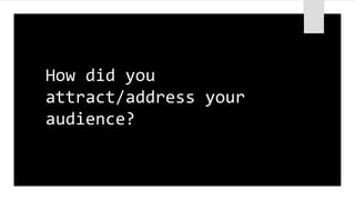
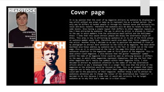
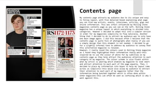
How did you
attract/address your
audience?
It is my opinion that the cover of my magazine attracts my audience by displaying a
new artist without any props or make up to represent him as a normal person- the
only way he differs to normal people is through his fashion sense and obviously his
vocal and music talents- therefore the audience will be able to relate to him on
some levels. Also having a simple layout that differs to other magazines layouts is
how I have attracted my audience. The way in which my artist is dressed is similar
to the way In which members from the alternative band Catfish and the Bottlemen
dress- I knew that this would attract people who enjoy the alternative style of
dress. This area is key to attracting my audience as it is one of the first places
an audience member would look, therefore would also make their first judgments of
the artist. Another thing I decided to do was to position the masthead in front of
my photograph to attract more attention to the title of my magazine. The bold white
masthead also helps address my audience due to the fact it stands out on the cover
page. Plus as it is positioned at the top of the page this helps attract my
audiences attention to the magazines name at first glance of the magazine- this is
done within Clash magazine. I also believe that the guitar ‘headstock’ symbol
within the name of my magazine title could be seen as enticing because it differs
to the ways in which other magazines represent themselves. Due top the fact that
other magazines don’t really use symbols within their magazine title. I also
decided to attract my audiences attention to the names of the new alternative
artists which is why I displayed them in a larger text size than the price of the
magazine-so the attention would be focused on them. This is an element that Clash
magazine use to help their artists within their magazine make an appearance-which
could add to the popularity of their magazine. Another thing I did to attract my
audiences attention was to change the colour of the alternative duo ‘Camellia’. I
decided to do this because I knew that it would add curiosity for my target
audience as to why this duo’s name was in a blue colour.
Cover page
Contents page
My contents page attracts my audience due to its unique and easy
to follow layout, with five detailed boxed explaining what page
you can find new artists, events, interviews, articles, gigs and
online information. This was infact influenced by Rolling stone
magazines contents page as you can see on the left. Rolling Stone
magazine has a unique layout in which everything is divided into
categories. However I decided to adapt this into a simpler version
in order for my magazines simplicity to flow naturally. Another
thing that I decided to do to attract my audience was to only have
one main image again. I did this because often I believe that the
contents page is quite full of photographs when really if you use
a simple design then this element is not needed. I decided to go
for a slightly informal tone to address my audience to convey that
this alternative magazine is relaxed.
However, I really loved the colours used in Rolling Stone magazine
as I found they highlighted their information really well-this
inspired me to use the colour of white for my subtitles on my
contents page as they help attract the audiences attention to each
category of my magazine. The colour scheme is also fluent within
what my artist is wearing which enables my magazine to look smart
and attract attention to each part of the page equally. Then, I
decided to place my information into boxes to help my layout come
across as simplistic-this would also allow my audience to attract
their attention to each part of my magazine rather than the
information being bunched together which is often done within
other magazines-this can often be seen as confusing which is why I
went against this.
Double page spread
My double page spread attracts my audience as I made sure that my
layout followed the conventions of Clash Magazine, ensuring that it
was simple so that my audience could follow it easily. The next thing
I did that was influenced by Clash Magazine was to have the second
page of my magazine as large photograph. I decided to do this because
it allows the audiences to attract their direct attention on to the
new artists and view how they have been portrayed through their
clothes. Yet again, here I decided to attract my audiences attention
to what these artists are wearing, by ensuring it fits into the
‘indie’/alternative trend-so that my audience could relate to this.
Then, I added a picture to fit around my text on the opposite page as
I believed it looks simple yet effective and compliments the title at
the top of this page. I also added small symbols of a flower to
symbolize Camellia being a Chinese flower. I knew that this would
interest my audience as it is an unusual feature to have within a
magazine-therefore, later on within the magazine it is mentioned that
Camellia is a flower. Here, I made it obvious that the reason that
Camellia was written in a blue font here as that is their signature
colour. I did this by making many other of the features on this page a
blue colour such as the subtitle and a quote said by ‘Hallie Stoker’
(one of the new alternative artists). I addressed my audience within
this article as slightly informal as I believe my audience would be
able to interact with this magazine better and find it more thrilling
to read. I also discovered that this is usually done within other
alternative magazines which is what helped me make my decision about
making my magazines tone slightly informal.

Attract audience

  • 1.
  • 2.
    It is myopinion that the cover of my magazine attracts my audience by displaying a new artist without any props or make up to represent him as a normal person- the only way he differs to normal people is through his fashion sense and obviously his vocal and music talents- therefore the audience will be able to relate to him on some levels. Also having a simple layout that differs to other magazines layouts is how I have attracted my audience. The way in which my artist is dressed is similar to the way In which members from the alternative band Catfish and the Bottlemen dress- I knew that this would attract people who enjoy the alternative style of dress. This area is key to attracting my audience as it is one of the first places an audience member would look, therefore would also make their first judgments of the artist. Another thing I decided to do was to position the masthead in front of my photograph to attract more attention to the title of my magazine. The bold white masthead also helps address my audience due to the fact it stands out on the cover page. Plus as it is positioned at the top of the page this helps attract my audiences attention to the magazines name at first glance of the magazine- this is done within Clash magazine. I also believe that the guitar ‘headstock’ symbol within the name of my magazine title could be seen as enticing because it differs to the ways in which other magazines represent themselves. Due top the fact that other magazines don’t really use symbols within their magazine title. I also decided to attract my audiences attention to the names of the new alternative artists which is why I displayed them in a larger text size than the price of the magazine-so the attention would be focused on them. This is an element that Clash magazine use to help their artists within their magazine make an appearance-which could add to the popularity of their magazine. Another thing I did to attract my audiences attention was to change the colour of the alternative duo ‘Camellia’. I decided to do this because I knew that it would add curiosity for my target audience as to why this duo’s name was in a blue colour. Cover page
  • 3.
    Contents page My contentspage attracts my audience due to its unique and easy to follow layout, with five detailed boxed explaining what page you can find new artists, events, interviews, articles, gigs and online information. This was infact influenced by Rolling stone magazines contents page as you can see on the left. Rolling Stone magazine has a unique layout in which everything is divided into categories. However I decided to adapt this into a simpler version in order for my magazines simplicity to flow naturally. Another thing that I decided to do to attract my audience was to only have one main image again. I did this because often I believe that the contents page is quite full of photographs when really if you use a simple design then this element is not needed. I decided to go for a slightly informal tone to address my audience to convey that this alternative magazine is relaxed. However, I really loved the colours used in Rolling Stone magazine as I found they highlighted their information really well-this inspired me to use the colour of white for my subtitles on my contents page as they help attract the audiences attention to each category of my magazine. The colour scheme is also fluent within what my artist is wearing which enables my magazine to look smart and attract attention to each part of the page equally. Then, I decided to place my information into boxes to help my layout come across as simplistic-this would also allow my audience to attract their attention to each part of my magazine rather than the information being bunched together which is often done within other magazines-this can often be seen as confusing which is why I went against this.
  • 4.
    Double page spread Mydouble page spread attracts my audience as I made sure that my layout followed the conventions of Clash Magazine, ensuring that it was simple so that my audience could follow it easily. The next thing I did that was influenced by Clash Magazine was to have the second page of my magazine as large photograph. I decided to do this because it allows the audiences to attract their direct attention on to the new artists and view how they have been portrayed through their clothes. Yet again, here I decided to attract my audiences attention to what these artists are wearing, by ensuring it fits into the ‘indie’/alternative trend-so that my audience could relate to this. Then, I added a picture to fit around my text on the opposite page as I believed it looks simple yet effective and compliments the title at the top of this page. I also added small symbols of a flower to symbolize Camellia being a Chinese flower. I knew that this would interest my audience as it is an unusual feature to have within a magazine-therefore, later on within the magazine it is mentioned that Camellia is a flower. Here, I made it obvious that the reason that Camellia was written in a blue font here as that is their signature colour. I did this by making many other of the features on this page a blue colour such as the subtitle and a quote said by ‘Hallie Stoker’ (one of the new alternative artists). I addressed my audience within this article as slightly informal as I believe my audience would be able to interact with this magazine better and find it more thrilling to read. I also discovered that this is usually done within other alternative magazines which is what helped me make my decision about making my magazines tone slightly informal.