
More Related Content
What's hot
What's hot (20)
Viewers also liked
Similar to Analysis of colours
Similar to Analysis of colours (20)
Recently uploaded
Recently uploaded (20)
Analysis of colours
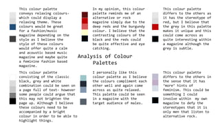
- 1. Analysis of Colour Palettes This colour palette conveys relaxing colours- which could display a relaxing theme. These colours would be great for a fashion/music magazine depending on the style as I believe the style of these colours would offer quite a calm and acoustic based music magazine and maybe quite a feminine fashion based magazine. In my opinion, this colour palette reminds me of an alternative or rock magazine simply due to the deep reds and the burgundy colour. I believe that the contrasting colours of the black and the reds could be quite effective and eye catching. This colour palette differs to the others as it has the stereotype of red, but I believe that the grey in this palette makes it unique and this could come across as quite interesting within a magazine although the grey is subtle. This colour palette consisting of the classic black, grey and white combination could be seen on a page full of text- however some people could argue that this may not brighten the page up. Although I believe these colours need to be accompanied by a bright colour in order to be able to highlight things. I personally like this colour palette as I believe the colours compliment each other well and again come across as quite relaxed. This palette could be seen in a magazine with the target audience of males. This colour palette differs to the others in the sense that it has ‘more’ hints of feminism. This could be something I could involve within my own magazine to defy the stereotypes that it is only men that listen to alternative rock.
- 2. I believe that this is one of my favorite colour palettes out of the ten shown here. This is because there are both light and dark colours and they contrast strongly but I find them very appealing and believe that they could go together to create an interesting magazine theme. I love how the grey/blue in the middle isn’t aimed at just the male audience it can be aimed at both audiences. I find this colour palette to be gentle looking as it contains no harsh colours. I believe that it would set a nice layout for a contents page as the colours do still manage to stand out but aren’t very bold. I believe this is something I would like to include within my own magazine. This colour palette differs to the other colour palettes as I believe that these colours may work well with light/dark greys. I think that it would also appeal to both audiences as in my opinion green is neither related highly to the female or male audiences specifically. As you can see from my previous colour palettes blue is a regular theme, this is because I believe the colour blue is calm and relaxing and isn’t very hard hitting (therefore isn’t hard to look at). I think that this colour palette would be very close to being one of my favorites due to its relaxing vibe.
- 3. Why have I chosen to use this colour palette? The reason I have chosen to use this colour palette for my magazine is because I think that the colours compliment each other very well and I also believe that they really fit with my music theme being alternative. The black is a colour that will enable me to allow things to stand out if they need too and the blues and greys are subtle-yet again effective. I love how the grey/blue in the middle isn’t aimed at just the male audience it can be aimed at both audiences as this is what my magazine is about. Below are some examples of what the title of my magazine may look like with the chosen font/colours. Headstock Headstock Headstock Headstock