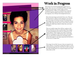
1. These boxes are used for backgrounds against text or
images. Here, you can see the build up of the cover page
showing the main image, smaller images and the
background boxes. There is no masthead yet or any text
across the magazine page because this is a first draft of
the magazine cover with just the background features.
This is the main image used on the front cover. This was
the first feature to appear on the magazine cover and the
rest of the items were placed on top of the main image.
This image allows me to place features around the central
model. This image also has create a route of the eye by her
holding the white heart which is where the cover story
will appear.
These are smaller images that will have captions with
them so that they are clear to understand. These images
are representing pop artists that are well known to my
target audience. These images were taken so that they
appeal to young girls as their friends and as role models.
They are represented as glamorous and happy which
makes them appeal to my target age group and therefore I
do not need to change them.
This image I do not like, because it does not appeal to my
target audience. I am going to change this image to a more
conventional image because of the lack of colour and use of
the white background is too overpowering because of the
white shirt as well.
2. Here, you can see the magazine starting to appear with
the masthead now present and the cover story has been
created and there is a route of the eye appearing across
the magazine which follows across the top, diagonally
down to the bottom left and across the bottom.
These are the cover lines that go with the images. I have
added these and I still need to add the captions that will
explain the image further. These cover lines are eye catching
to my target audience and they are conventional to a pop
magazine because of the band name ‘The Kitty Kat Dolls’ and
the feminine cover line ‘Get Lucy’s Winter look’.
This is the cover story that I have created which is to appeal to
my target audience because this is supposed to be about a famous
pop star and therefore younger girls will want to know about her
‘secret heartache’ and how she ‘rose to fame’. This cover story I
won’t change because I think it is conventional for the magazine
and it creates a route of the eye which is very important for
selling purposes.
This image I have changed to a more conventional and
effective image. It is of the same person but a slightly
different image. This image is more conventional because she
is smiling which connotes a happy and friendly vibe which is
important on the front cover because it draws the audience in
and makes them feel welcome. She is also wearing an animal
hat which makes her appear fun and silly which mirrors the
actions of the target audience.
3. This image shows how I have added further features
such as the stars along the background of the
masthead. The stars connote stardom and fame and
are therefore representational of a pop magazine.
Here, this background box has been filled with fashion
items labelled ‘Your Winter Wardrobe’. This strongly
appeals to my target gender- females because this is the
type of things they want to be reading about. It is
representational for a pop magazine because the clothes
will be influenced by what the current pop stars are
wearing. Each item of clothing has been labelled by where
it’s from and this makes it more appealing towards the
target audience.
Here, the captions to the images have been created and
they are explanatory to the images. They bring attention to
the left third because of the use of making the names of the
pop stars bigger so that the audience notice them and
want to see what the article on this particular pop star is
about.
This poster strip along the bottom is eye catching once the
cover line is on there. It uses hyperbolic adjectives such as
‘glamorous’ to make the posters seem really amazing and it
is worth buying the magazine in order to have the posters.
Below the posters is a column which has the names of the
pop stars that feature in this magazine which shows the
audience who is in this magazine.
4. This is a cover line and it is one of the first features that
the audience will see. It is a positive cover line, saying
that the magazine is very popular and has been voted by
the public as Britain's no.1 pop magazine which is a great
achievement and proves the magazine must be worth
reading.
This is just some information that I added to the
magazine cover such as the date of this issue and the
magazines website address which also indicates that
this magazine is available on the internet and is also
available to subscribe to and any further information is
on the website.
This cover line goes with the above ‘Plus Iconic Pops big
top..’ the 40 is in bold and has been made bigger to catch
the attention of the audience. The ‘Big’ shows that it is
very important and is a good read.
This cover line has no image with it but the number is in
bold and has been enlarged in font size to catch the
audiences attention. This cover line is talking about
music; and the play on verbs hate to love is catchy which
makes it more appealing.
Here, the final draft of the cover page contains further cover lines
which emphasises that this is a pop music magazine not a
women’s magazine. With cover lines such as ‘Biggest and Best
music videos’ this appeals to my target audience because of the
emphasis in how good this article is on music videos and that the
music videos are rated. This automatically makes them want to
know which music video was voted no.1.