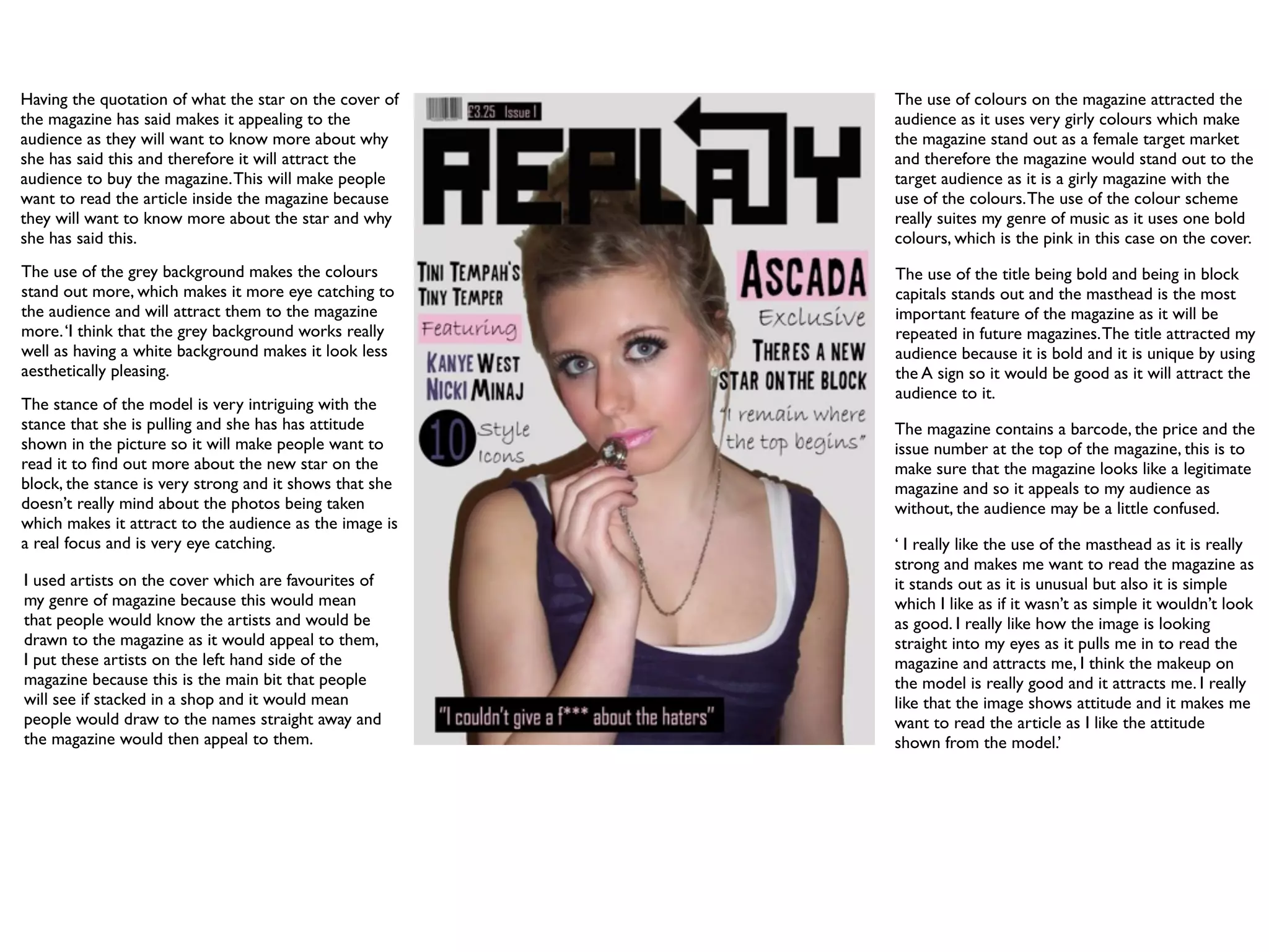
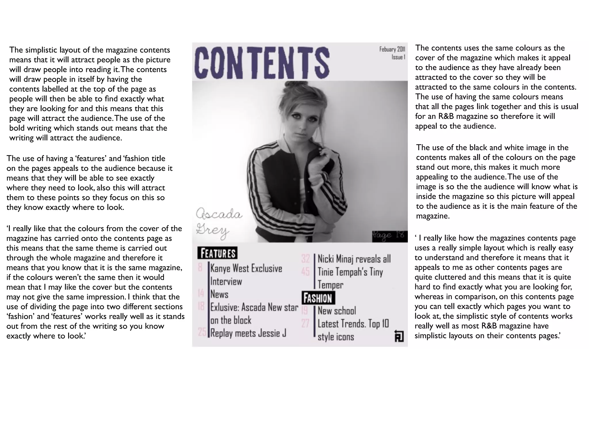
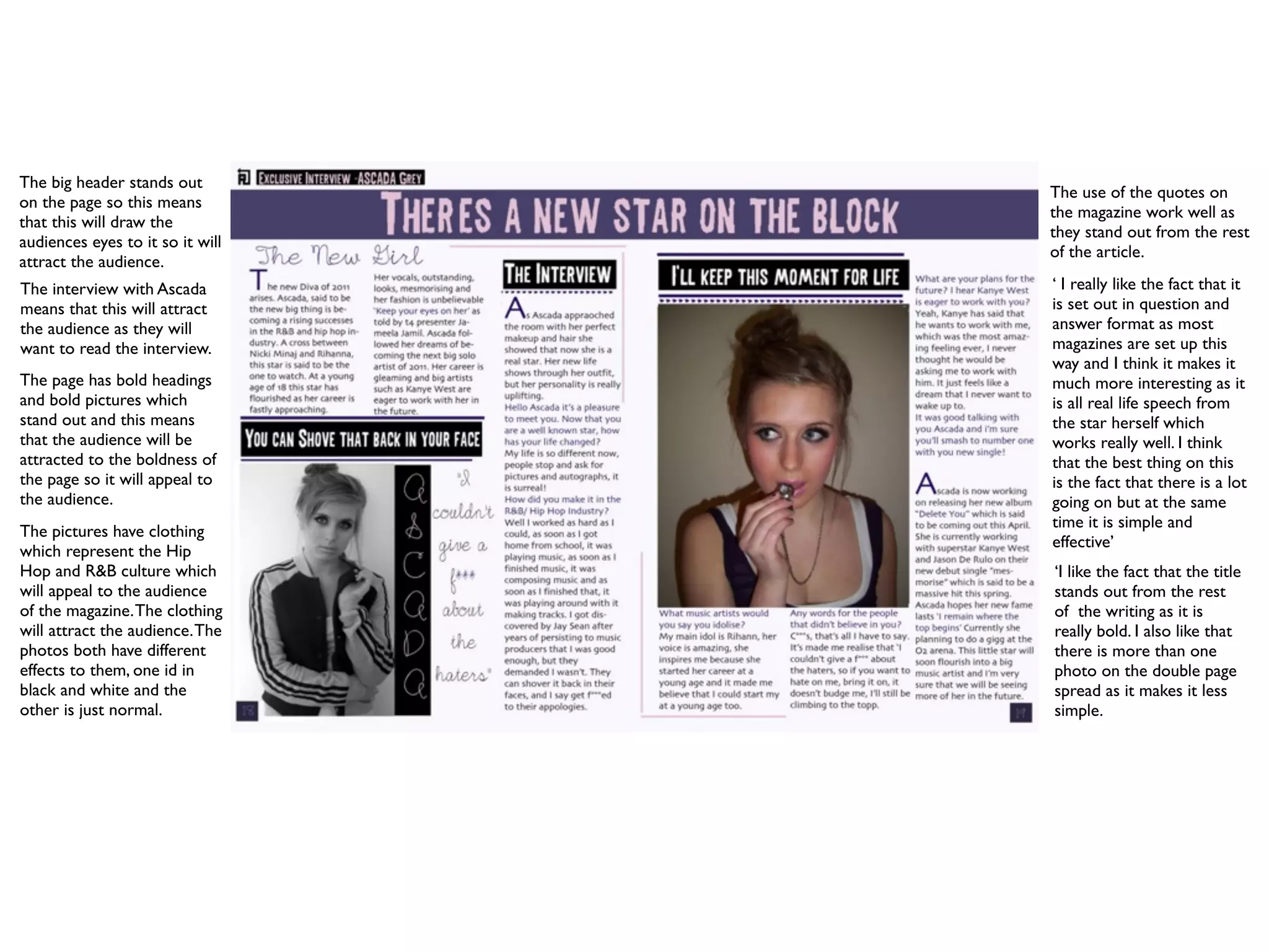
Visit to a blind student's school🧑🦯🧑🦯(community medicine)
Question 5
1. Having the quotation of what the star on the cover of The use of colours on the magazine attracted the
the magazine has said makes it appealing to the audience as it uses very girly colours which make
audience as they will want to know more about why the magazine stand out as a female target market
she has said this and therefore it will attract the and therefore the magazine would stand out to the
audience to buy the magazine. This will make people target audience as it is a girly magazine with the
want to read the article inside the magazine because use of the colours. The use of the colour scheme
they will want to know more about the star and why really suites my genre of music as it uses one bold
she has said this. colours, which is the pink in this case on the cover.
The use of the grey background makes the colours The use of the title being bold and being in block
stand out more, which makes it more eye catching to capitals stands out and the masthead is the most
the audience and will attract them to the magazine important feature of the magazine as it will be
more. ‘I think that the grey background works really repeated in future magazines. The title attracted my
well as having a white background makes it look less audience because it is bold and it is unique by using
aesthetically pleasing. the A sign so it would be good as it will attract the
audience to it.
The stance of the model is very intriguing with the
stance that she is pulling and she has has attitude The magazine contains a barcode, the price and the
shown in the picture so it will make people want to issue number at the top of the magazine, this is to
read it to find out more about the new star on the make sure that the magazine looks like a legitimate
block, the stance is very strong and it shows that she magazine and so it appeals to my audience as
doesn’t really mind about the photos being taken without, the audience may be a little confused.
which makes it attract to the audience as the image is
a real focus and is very eye catching. ‘ I really like the use of the masthead as it is really
strong and makes me want to read the magazine as
I used artists on the cover which are favourites of it stands out as it is unusual but also it is simple
my genre of magazine because this would mean which I like as if it wasn’t as simple it wouldn’t look
that people would know the artists and would be as good. I really like how the image is looking
drawn to the magazine as it would appeal to them, straight into my eyes as it pulls me in to read the
I put these artists on the left hand side of the magazine and attracts me, I think the makeup on
magazine because this is the main bit that people the model is really good and it attracts me. I really
will see if stacked in a shop and it would mean like that the image shows attitude and it makes me
people would draw to the names straight away and want to read the article as I like the attitude
the magazine would then appeal to them. shown from the model.’
2. The simplistic layout of the magazine contents The contents uses the same colours as the
means that it will attract people as the picture cover of the magazine which makes it appeal
will draw people into reading it. The contents to the audience as they have already been
will draw people in itself by having the attracted to the cover so they will be
contents labelled at the top of the page as attracted to the same colours in the contents.
people will then be able to find exactly what The use of having the same colours means
they are looking for and this means that this that all the pages link together and this is usual
page will attract the audience. The use of the for an R&B magazine so therefore it will
bold writing which stands out means that the appeal to the audience.
writing will attract the audience.
The use of the black and white image in the
The use of having a ‘features’ and ‘fashion title contents makes all of the colours on the page
on the pages appeals to the audience because it stand out more, this makes it much more
means that they will be able to see exactly appealing to the audience. The use of the
where they need to look, also this will attract image is so the the audience will know what is
them to these points so they focus on this so inside the magazine so this picture will appeal
they know exactly where to look. to the audience as it is the main feature of the
magazine.
‘I really like that the colours from the cover of the
magazine has carried onto the contents page as ‘ I really like how the magazines contents page
this means that the same theme is carried out uses a really simple layout which is really easy
through the whole magazine and therefore it to understand and therefore it means that it
means that you know that it is the same magazine, appeals to me as other contents pages are
if the colours weren’t the same then it would quite cluttered and this means that it is quite
mean that I may like the cover but the contents hard to find exactly what you are looking for,
may not give the same impression. I think that the whereas in comparison, on this contents page
use of dividing the page into two different sections you can tell exactly which pages you want to
‘fashion’ and ‘features’ works really well as it stands look at, the simplistic style of contents works
out from the rest of the writing so you know really well as most R&B magazine have
exactly where to look.’ simplistic layouts on their contents pages.’
3. The big header stands out
The use of the quotes on
on the page so this means
the magazine work well as
that this will draw the
they stand out from the rest
audiences eyes to it so it will
of the article.
attract the audience.
The interview with Ascada ‘ I really like the fact that it
means that this will attract is set out in question and
the audience as they will answer format as most
want to read the interview. magazines are set up this
way and I think it makes it
The page has bold headings much more interesting as it
and bold pictures which is all real life speech from
stand out and this means the star herself which
that the audience will be works really well. I think
attracted to the boldness of that the best thing on this
the page so it will appeal to is the fact that there is a lot
the audience. going on but at the same
time it is simple and
The pictures have clothing
effective’
which represent the Hip
Hop and R&B culture which ‘I like the fact that the title
will appeal to the audience stands out from the rest
of the magazine. The clothing of the writing as it is
will attract the audience. The really bold. I also like that
photos both have different there is more than one
effects to them, one id in photo on the double page
black and white and the spread as it makes it less
other is just normal. simple.