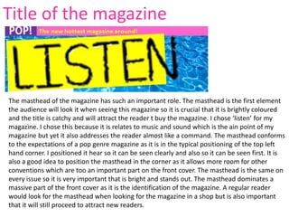
1. The masthead of the magazine has such an important role. The masthead is the first element
the audience will look it when seeing this magazine so it is crucial that it is brightly coloured
and the title is catchy and will attract the reader t buy the magazine. I chose ‘listen’ for my
magazine. I chose this because it is relates to music and sound which is the ain point of my
magazine but yet it also addresses the reader almost like a command. The masthead conforms
to the expectations of a pop genre magazine as it is in the typical positioning of the top left
hand corner. I positioned it hear so it can be seen clearly and also so it can be seen first. It is
also a good idea to position the masthead in the corner as it allows more room for other
conventions which are too an important part on the front cover. The masthead is the same on
every issue so it is very important that is bright and stands out. The masthead dominates a
massive part of the front cover as it is the identification of the magazine. A regular reader
would look for the masthead when looking for the magazine in a shop but is also important
that it will still proceed to attract new readers.
Title of the magazine
2. The title, font and style is also such an important part of the front cover. My magazine is brightly
coloured and quite quirky and bubbly, which will attract my target audience as they are younger
and will be intrigued by this. They conform to the conventions of a pop magazine as they are
bold, in capital letters and stand out. I have also used some different style font which are
appealing and eye catching. I think it is so important that the font is interesting as it will make
the cover more fun and informal and will also give them a perspective on what sort of magazine
it is and will attract the target audience again as it is extravagant and appealing. My title and
conventions are quite matching. I have stuck to a colour scheme which makes the front cover
look more appealing and is a typical element that magazines use. I used yellows, pinks and blue
as they are all bright colours and stand out well. The masthead is also brightly coloured but still
sticks the colour scheme which will make it memorable and important to its audience. The
yellow is so powerful on the blue background as the colour contrast each other but are also so
bright so it works well together and stands out, as does the pink. The pink on the blue
background really makes it stand out and catch the eye of the reader. The white font stand out
amongst the pink background also as does the black on the yellow as they as well are two
different contrasting colours but work well together to catch the ye of the reader and attract
them to read it.
Font and style.
3. Mise en scene of images
I am looking at my front cover to analyse the mise-
en-scene of the images. The main image on this page
is bright and sharp. I have used a pool effect
background and it indicates fun and is very bright.
However the main image I have used features
completely contrasting colours so it does not blend in
with the blue but yet is still bright and stands out
well. The brightness and contrasting of the picture
makes the model stand out more as generally models
look better in bright lighting. This also sticks to the
bright and colourful theme of the front cover. In a
stereotypical pop magazine the main image would
feature a celebrity who is seen to be admirable or
inspiring. My model is smiling and has been touched
up in terms of airbrushing and brightening the face to
stick to the stereotype. My model is pictured with her
hand in front of her mouth whilst she is bent over to
show she is laughing. This is to show the fun and
quirky side to the magazine and the femininity of the
model which makes the magazine in general more
appealing to my aimed target audience.
Mise-en-scene
4. I have decided to use my front page to analyse a range of
people used in my magazine as it features images with more
than one person on it so it is a good point to start with. I think
the people I have used on my front cover follow the
conventional types of a pop genre magazine. Each person in the
images are all the same age and are the same age as my target
audience which allows them to connect more closely. Another
important concept to notice when looking at this part of the
magazine is the dominance of females. This was completely
intended as it is not often you find a pop magazine packed with
images of boys. The only time I believe it is acceptable to
feature a male on the front cover is if it is a celebrity or boy
band that have sex appeal which attracts the audience as they
like the look of them. I have used a tiny thumbnail image of
Justin Bieber to attract the young ‘fans’ to read the magazine as
he is a massive idol and would attract more readers however I
have only used one tiny image of him and the rest of idolising
females. The female dominance relates closely to the target
audience and having more females would potentially attract
more female readers which I am aiming for. All the models I
have used are pretty girls who are relatively thin and have been
airbrushed this is a typical element of a pop magazine as the
girls will be desirable and classed as an idol.
People
5. Costume and props
I have chosen my contents page to be analysed. The costumes
and props used in the pictures on this page are the only ones i
have used during the making of this task. I chose to use my
contents page as you can see the costumes much clearer. the
costumes I used on my model are simple but yet fashionable, I
used 2 different costumes for different shoots. I used a brightly
coloured top with different colours and patterns on it for the
main images as it is very bright and stands out a lot, I matched
this up with a simple black pencil skirt as I was going for the fun
but smart look which is very fashionable right now and will
appeal to the audience, and for the other shoot I used a more
fashionable but yet more ‘rock chick’ look as it shows how
professional my model is and are serious shots to go with a
serious article and interview. For this look I used a plain nude
top with a black leather jacket over the top and a gold chain. I
also spent time doing my models hair and make up to match the
look I was going for. Many stereotypical pop artists like the rock
chick look as it is a new but young fashion that has come about
and looks good and professional.
6. the written content on my double page spread is essentially stereotypical to a standard pop
genre magazine article. It uses a basic writing techniques to create text that sounds
professional but at the same time would make the reader feel comfortable. The main
technique I have used is a large quote. This is a pull technique that catches the attentions of
the reader first and encourages them to read it. I decided to use the quote ‘I have never had a
boyfriend’ as this would draw readers in because an idolising beautiful celebrity is bound to
attract loads of boys, but in this case she hasn’t and she explains why. The written contents
also follows the conventions because it is split into columns. This is a standard layout
technique that allows the audience to differentiate each question and read the article easily. I
have also used a reasonable size font which is 12. I used this size because It is quite big and
easy to read but at the same time its not too big and takes up a lot of room. The language
used in my article appeals to the target audience as it is aimed at younger age meaning that
the language isn't overly intelligent and fit more to the age groups.
Written content
7. My music magazine is presented the way a general pop magazine
would be. This is quite easily done by the use of popular names and
pictures, for example I have used a thumbnail picture of Justin
Bieber who is huge in the pop industry so would draw in readers.
The subtle language also indicates the genre, an obvious one is the
company name I created who would produce the magazine Is called
POP!. This signifies the genre in a straight to the point way. I have
also used another quote which works as a pull/grab technique.
“everything I do, I do to be the best”, this is a quote from the main
celebrity of the front cover which would intrigue the readers to buy
the magazine and find out what she does to be the best and how
she did it. It creates questions that can only be answered by the
text inside. The pop genre is also suggested by the use of bright
colours, the colour are also quite girly which emphasises the pop
genre of the magazine and clearly shows to the audience the type
of music it supports.
8. To analyse the layout I have decided to use my contents page as it
follows the typical layout of a pop genre magazine.. I think the
layout of the contents page is important. For starters it is the
second page of the magazine so even a person who is debating
buying it they would pick it up and more than likely look at the
first page! The first impressions has to be good in order to
persuade the reader to buy the magazine. It also tells the reader
where everything is and where to find certain things which is
important so they don’t have to look through every page to find it
and the contents page can direct them to the right page for what
they are looking for. The contents page is also a big part in drawing
In the reader and to promote each article. I used a small image of
the front cover with arrows pointing from each article to page
number to show where each article from the front page is. This is a
main feature of the magazine as it is a visual view which the reader
would look at first as it is in the top left and would direct them to
the articles that the front page had already intrigued them to read.
I have also made the page numbers stand out by using larger,
different font and various font colours, as well as making it easy to
understand, it also makes the page look appealing. By using
headers for each section it breaks up the magazine into different
areas such as Gossip, we love boys and the regular weekly sections
etc... Which makes it easier for the reader to find what they are
looking for.