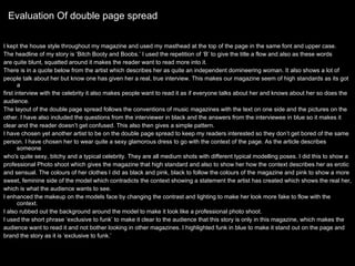
The document provides an evaluation of a magazine front cover and contents page design. Key details include:
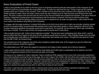
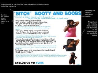
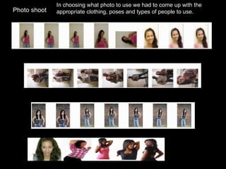
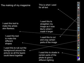
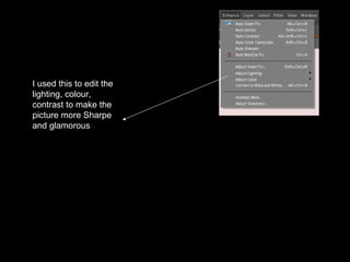
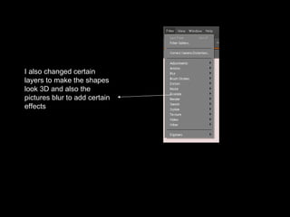
- The front cover features a young female artist to appeal to the target demographic, shown in a powerful pose. Her appearance was edited using Photoshop to look glamorous.
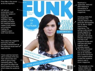
- The contents page follows a traditional magazine layout with headlines, page numbers, and pictures. It includes opportunities for reader interaction like competitions.
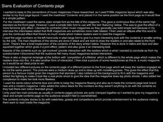
- A double page article spread interviews a celebrity known for being independent and outspoken. It follows conventions with text on one side and pictures of the celebrity on the other.