
Recommended
Recommended
More Related Content
What's hot
What's hot (20)
Viewers also liked
Similar to Hip Hop magazine analysis
Similar to Hip Hop magazine analysis (20)
Recently uploaded
Recently uploaded (20)
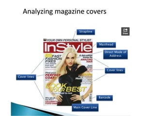
Hip Hop magazine analysis
- 3. Costume: Conventional ‘rapper’ clothes have been used amplifying his character. Colours: Red has ben used for the most important features of the cover, the name of the artist and the magazine name. The black and white photo makes the red stand out more and enhances the artists ‘angry’ pose. Content: A famous quote has been used, rhetorical questions used to make you want to look through the magazine to find the answer. No back ground to make the artist the center of attention Other featured artists seem to be drowned out because of the smaller font size Direct address, angry NVC makes an intense personal situation added by how the masthead is behind the artist
- 4. Direct address with minimal NVC is conventional to Rap artists, it connotes a ‘bad boy’ look. Having the artist in front of the masthead seems to be conventional to Hip-Hop magazines, this creates a sense of connection with the artist Chains seem to be conventional to the artists look The aesthetically pleasing colour theme seems to be conventional to rap and hip-hop magazines. This could be what colours the audience finds most pleasing. Different fonts and font sizes have been used to promote the more information more clearly. What looks like hand writing makes the artist come back to life because the magazine is a tribute. Famous words by the artist seem to b conventional to rap magazines
- 5. Mise En Scene: On this XXL magazine cover they have a long shot picture of a well-known hip hop artist called T.I. As rapper T.I. is featured on the front cover its telling that he is the main story in this magazine. This long shot was used to show the audience what he is wearing and his urban clothing style. Also this shot draws attention to the readers because rapper T.I. is looking down at the camera, which gives the readers and the magazine contact. Also because the picture was taken from the bottom it makes T.I. look more superior on this picture. Rapper T.I ‘s posing makes him look confident and superior with the photo shot. He is wearing a dark blue shirt with baggy denim jeans which most urban artist wear to represent the hip-hop clothing style it also stands out from the background image. On top of T.I’s picture it says in white writing ‘T.I. On Top Of The World’ this makes him look very powerful along with his facial expression where he has risen both of his eyebrows in an aggressive way which makes him look harsh but represents the hip hop/r&b genre. Also it shows that T.I. is the main story in the magazine. At the bottom left of the front cover it has the barcode and the price of the magazine in small format because the magazine is expensive. However this way music magazine are able to increase their sales. LOGO: the masthead on this magazine is very large and bold which gets the readers attention. The colour they have used for the masthead is very bold and catchy because they used red and white. The colour red they used is strong and powerful masculine it usually means energizing a situation also it is promoting ambition and determination. Also using white colour for ‘XXL’ makes the masthead stand out even further because white is a calm colour and that being on top of red shows that the magazine is very powerful for the hip hop culture.
- 6. Other backgrounds: Behind rapper T.I. there is a mansion and car, were you can’t see the car but only the front part and only a bit of the mansion. The suggests that hip hop artists like having mansions and the car looks like a racing car, most hip hop/r&b artist do enjoy having a lot of racing cars. It is also influencing the readers of this magazine like young urban followers to have a nice car and a house if they work hard like this rapper because most hip hop followers know about this specific rapper T.I. and how he got this successful in life. This magazine looks expensive because all the expensive car and mansion it shows at the background. Also this magazine is not just targeted at male followers because ‘XXL’ do have female rappers like Nicki Minaj, Ciara, and Keri Hilson etc. at the front of the covers, however male gender are the main target audience for this magazine because even though there are female rappers XXL tent to use male quite often on their magazine. Tone: The overall tone of this page is mature and calm. They have used variety of colours that represent the hip-hop culture. This magazine front cover will help me when I get to do my music magazine because I follow the hip-hop culture and it gave me ideas on how I want my pictures shot taken and types of colours and font I want mine to be. ‘XXL’ is the main magazine that I will be focusing on for my research. Overall I think that this front cover is attractive and can be easily identifies which genre it is by the reader. When researching the 'XXL' magazine I have noticed that within their front covers, the artists that are featured on the magazine use similar poses. Most of them have a harsh look on their face, to portray fierceness. These other XXL magazine front covers are different compared to the one I chose, as the other ones have a close up and mid shot. Also the other front covers for XXL magazine are covered with either a close up or mid-shot of the hip hop artists.
- 8. The right side is divided into six parts: News, Reviews, Radar, Live, Features and Plus. Page numbers are next to the article as this helps the reader find what they are looking for the features on the contents page would show what’s on the front cover and where to find it. This is a basic convention to content pages. The right hand side of the page is filled with a list of sub-headings which helps the reader navigate around the magazine and find the information they’re most interested in faster. Inside the sub-headings. This is conventional to most magazines. One of the things that gives a magazine its brand identity is the colours theme. Here is the colour theme for this and most music magazines because of the aesthetic qualities; Red, white, black. Another thing that gives the magazine a brand identity is the typography used. The text through out is the same, using the same font throughout, but only changing the colours and font sizes. A convention this content page follows is that the biggest image relates to the one on the content page, and the cover story has its own section, which links to the image. The image is a long-shop of the band A subscription option is always performing. advertised on the content page, in yellow that stands out clearly in the page because they want viewers to subscribe.
- 9. Conventional colours theme seem from rap magazine covers, with the red, black and white. This content page is hard to navigate. The page numbers aren’t in order and it has minimal subheading. The transparent red isn’t only visually pleasing but also helps the text stand out more. Direct address and an angry NVC again make this content page conventional Magazine name visible Low key lighting adds to the artists perception of being a ‘thug’ Close up of the artist makes his NVC more The source has a unique look and feel through colours and font also with their minimal layout style. Plain background important to the viewer makes the artist the center of attention
- 10. VIBE magazine log, also includes the issue of the magazine below it. The title ‘Content’ has been placed in unique way, this is shown through out VIBE making it like a signiture for the company. The use of white text makes the title contrast with the dark red background The title features is a curved fancy test. Connoting money and wealth. This is conventional to Hip Hop magazines The background is a dark red to red gradient. This makes the Hip Hop artist stand out even more. It also makes the spotlight on him, showing that he is the main focus on the content page. The ‘V’ for VIBE is in a darker red in the background constantly promoting the magazine. Making VIBE symbolic Subheadings located in capitals to make it easier for the reader to find what they are looking for Top less rapper to show body tattoos. This suggests that tattoos are a strong part of the Hip Hop stereotype. Amplified by the jewelry which Is also conventional to this genre
- 12. The double page spread denotes a central figure (male rapper Nas) looking directly into the camera. It is a medium close-up shot revealing his arms, shoulders, body and head with his waist downwards not visible in the shot. The background (which occupies one page and half a page) appears to be denoting gym and boxing equipment such as: punch bags, gym mats and weight machines. The magazine has been divides using the rule of three. This is used to direct the audience to key features. For example the left side directs you to the artists face, and the right directs you to the writing. The artists name is in a different font to stand out and also helps to amplify the genres style. An extract from the artists interview is shown in a different font to stand out and makes it more realistic that he said that because they have used the same font as they have for his name in the top right.
- 13. The colours used for this DPS are unconventional for a Hip Hop magazine. A conventional magazine colours would be black, red, and white. A bold has been used to promote the more important information. Also black boxes have been used. A minimalist style has been used that appeals to the audience making the information easier to read. Plain white background making the artist the center of attention Direct mode of address is conventional to the genre. This creates a personal connection with the artist, it also adds to the stereotype of rap artists being dominant. Artists name promoted in white, same as the background. It adds an artistic feel and look amplified by the minimalistic feel. The connotes the Jay-Z’s music as artistic.
- 14. A silhouette picture in the back ground of the page is of the artist performing. The blue doesn't compliment the colour scheme used through out making the image stand out even though its small. The main article is put into conventional columns simply because its easier for the audience to read, and its more aesthetically pleasing. A gold and white has been used for the interview, this helps the reader to understand quickly what the artist has said. It also follows the theme throughout. Pull quote: the large distractive font has been used because it help the audience see key features. Also the colours of the main parts that promote the artists positively have been changed to white, for the same reason as the main article. The background is a basic, solid black- this has been done so the colour of the text will be more visible and easier to read for the audience. It gives the page a professional look and helps promote important information and make the photos seem more welcome. The main image is a centralized mid shot of the artist on the left page , making him the main focus as you take a first glance. The colour scheme of the double page spread is basic and complimented by the artists clothing being white, gold and black.