
Recommended
More Related Content
What's hot
What's hot (17)
Similar to Hugv
Similar to Hugv (20)
More from emilyallenxx
More from emilyallenxx (20)
Recently uploaded
Recently uploaded (20)
Hugv
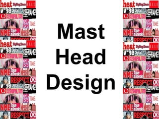
- 2. MFYFont size : 166 Font Name : Tempus Sans ITC This mast head is not that effective although it is bold, and big, the font type just wouldn’t fit in with my modern magazine style, Also I don’t like the gaps between the letters as I don’t think it looks professional, Moreover I don’t think this mast head would stand out next to other music magazine so I am not keen on this design idea.
- 3. This mast head is effective as it is bold, big and simplistic, this would make it easily recognisable on a shelf and a well known brand logo. This mast head would also fit in with the theme of my front page and keep continuity and professionalism throughout my magazine as this is similar to the text I use throughout my design. I also love the colour scheme as it is the same as the one used through out my magazine. Font size : 199 Font Name : Haettenschweiler MFY
- 4. MFYFont size : 199 Font Name : GulimChe This mast head is effective as it is bold, and simplistic, the lettering is large and easy to read which would make it noticeable on a shelf and a globally recognised logo like “NME” . I like the use of colour in this mast head design as it fits in with the colour scheme of my magazine, this mast head would be effective as it is modern and attractive.
- 5. MFYFont size : 199 Font Name : Consolas This mast head is attractive and looks professional, it incorporates the colour scheme so would make my magazine have continuity through out. However I do not like the spacing between the letters, but when creating the final design I could bring the letters closer together using in design. To finalise I like this mast head design and it could be my final choice.
- 6. MFYFont size : 199 Font Name : Franklin Gothic Medium Cond This mast head is extremely bold and would stand out on a shelf due to the bright red colour. Red has connotations of energy and passion which demonstrates the type of audience I will be appealing too. This would look great on my front cover and it also is written in a similar font to the ones I have used through out my magazine, by having the mast head as a similar font it will make my magazine look professional. Which will appeal to my audience within the social class ABC1.
- 7. MFYFont size : 166 Font Name : Rockwell This mast head is one of my favourite choices, it is modern and I can imagine this placed in the corner of my front page, The colours look simplistic and modern and the font is bold and readable. I also think this mast head design has an American feel to it which appeals to me, as in my magazine I will be including both British and American artists. This design is one of my final