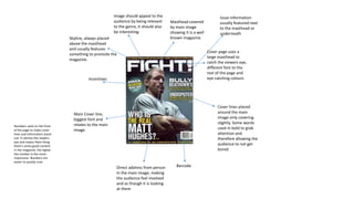
1. Masthead covered
by main image
showing it is a well
known magazine.
Direct address from person
In the main image, making
the audience feel involved
and as though it is looking
at them
Skyline, always placed
above the masthead
and usually features
something to promote the
magazine.
Main Cover line,
biggest font and
relates to the main
image.
Numbers used on the front
of the page to make cover
lines and information stand
out. It catches the readers
eye and makes them thing
there's some good content
in the magazine, the higher
the number is the more
impressive. Numbers are
easier to quickly scan.
Issue information
usually featured next
to the masthead or
underneath
Image should appeal to the
audience by being relevant
to the genre, it should also
be interesting.
Cover page uses a
large masthead to
catch the viewers eye,
different font to the
rest of the page and
eye-catching colours
Barcode
Cover lines placed
around the main
image only covering
slightly. Some words
used in bold to grab
attention and
therefore allowing the
audience to not get
bored
Incentives
2. The Masthead is in
large font, the main
image covers it
because it is a well
known magazine.
Main image stands out and
appeals to the audience, on this
particular cover page it uses
vibrant colours to make it stand
out and catch the audiences eye.
Its relevant to the genre of the
magazine
Main cover line is relevant to
the main image and is larger
than the other coverlines
Other cover lines
giving a brief over
view of the contents
of the magazine.
This stops the reader
from having to flick
through and read
more than they
want to
Barcode
Cover lines positioned
around the main
image
Image giving direct address to
entice the audience
Skyline- placed
above the
masthead
3. Big bold masthead to
stand out and catch the
readers eye. Always
bigger than any other
text and always has its
own colour
Main image fills up
the majority of the
space, they’ve used
direct address to
make the viewer feel
targeted making
them want to buy it
and the image is
relevant.
Main cover line
linking to the main
image, the biggest
cover line to show
the main feature in
the magazine.
Smaller cover lines
showing what else is
in the magazine.
Gives the viewer a
brief overview so
they can skim over
the cover page and
see what’s inside
Barcode
Numbers used in bold or large
font to stand out and make
the viewer think they are
getting something from the
magazine
Issue number/date
4. Date
Introduces the page
with the title
‘Contents’, mostly in
capitals.
Page uses columns, its splits up
the different elements shown
on the page: feature content,
regular, reviews, images etc.
Images used to
show reader
what’s featured
on certain pages
Page numbers on the left
hand side of page and of
the contents
Relevant mise en
scene, for example
colour scheme links
with the genre
Different information split
up using headings,
usually in bold, different
coloured font, different
style font or underlined
Images that are
featured in the
magazine shown
on the contents
page
Captions on images.
Picture of cover
page featured
5. Contents page includes
the magazine title at the
top of the page
Page numbers on the left
hand side of page and of the
contents
Introduces the page with the
title ‘Contents’, mostly in
capitals
Main image relevant one of the pages
contents
Date
Featured content, the content
that is rare and not shown
regularly
Different information split up
using headings, usually in bold,
different coloured font, different
style font or underlined
6. Relevant mise en scene, for
example colour scheme,
costume etc links with the
genre
Captions on images.
Introduces the page with the
title ‘Contents’, mostly in
capitals
Regular content, content that’s
featured weekly or monthly
Featured content, content
that’s a one off
Main image relevant one
of the pages contents
Page numbers on images
Images as well as
information to show what’s
on the pages
Date and page number
Different
information split up
using headings,
usually in bold,
different coloured
font, different style
font or underlined