
Recommended
More Related Content
What's hot
What's hot (20)
Similar to Codes and conventions of Regional Magazine Front Covers
Similar to Codes and conventions of Regional Magazine Front Covers (20)
More from Owen Barnett
More from Owen Barnett (15)
Recently uploaded
Recently uploaded (20)
Codes and conventions of Regional Magazine Front Covers
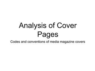
- 1. Analysis of Cover Pages Codes and conventions of media magazine covers
- 2. Kent Life Cover The masthead is at the top of the page in large text. It is whiter and stands out against the blue of the background to make it easily readable. The photograph is of a main feature in a long shot towards the bottom. It is clearly related to a region the magazine is based around. A separate image is laid over the top to create interest in a feature article inside. Some places that can be visited in the area are listed in a bar across the top of the cover and suggest to the reader some of the places that could be featured inside the magazine. Tag lines which describe some of the main articles are placed surrounding the main feature image to give the audience an Idea of the themes that are covered inside. The barcode and price are placed in the corner to not obscure the image and are quite small as they are least important part of the front.
- 3. Landscape Cover The masthead is again placed across the top in white text. The first four letter (‘Land’) are in a plain sans serif font whereas ‘Scape’ is still sans serif but has more flourish. The photograph is of a main feature in a long shot towards the bottom. It is clearly related to a region the magazine is based around. The barcode is very small and insignificant in the corner. The background of the masthead is different to the main image; it is a very close-up shot of flower petals. This is a very bright photograph but allows the white font of the mastheads to stand out. A competition sticker is added to the main image to appeal to the audience that they could gain from buying the magazine. A main tagline is placed at the bottom of the page in a large serif font but gives little details to what article it may be referencing. This is ambiguous and may cause the reader intrigue. The main image is a close-up of some flowers which are rightly coloured and compliment the pink colours at the top. There images are placed in a column down the left side to indicate the ideas and themes explored inside the articles.
- 4. Cornwall Today Cover The title is again in what font but it is a serif font and contains the place that the magazine focusses on. It is clearly readable against the gradient blue from the photograph behind. A transparent sticker made up of text is used to promote a competition inside that may cause the reader to think that they are gaining something else when buying the magazine. The image is in focus in the foreground of the sea but the background is slightly out of focus. The colours are vivid and compliment each other and it is the most striking feature on the cover. A bar at the top of the page announces that the magazine won ‘Regional magazine of the year 2014’ which could be a big advertising and selling point for the brand. A few tag lines are placed down the right side of the page in a block san serif font. These do not obscure the photograph in any way and are clearly readable. Lots of the smaller articles in the magazine are listed in a transparent bar across the bottom of the page. A reader who is looking closely at the front cover might look at the this and it may make their decision to buy it final as all the content is readily labelled on the front cover.
- 5. General Codes and Conventions • The masthead is usually in white font and found in large text at the top of the page. • The image can be from a closeup to a long shot but it is always the main striking feature of the cover. • Overlays such as images or competitions can be placed over the main image in a non- obscuring fashion so as to interest the audience in articles other than the main featured one and is more interesting than simple tag lines. • Tag lines are used to frame the main photograph and act as an insight into the magazine’s themes. • A bar can sometimes be found at the bottom or the top of the cover which can identify key places or awards to further interest the reader. • The barcode is placed inconspicuously in one of the bottom corners along with the price.