SlideShare a Scribd company logo
1 of 3
images
On this contents page there are 8 images. On the first page there is one main image of Noel Gallagher
who is not using direct address, thus may be a symbolic sign representing his coolness and how little he
is bothered or phased by this experience. This may potentially suggest he's done this before. There is
also another thumbnail image in the top left corner including Queen, this shows that they are not as
significant as Noel Gallagher in this article and that he is the headline as he has more of the page to
himself. The other images on the right hand side are boxed and separated amongst themselves. The
middle box contains images in side an image maybe showing their pages are not what would’ve been
advertised for the magazine as they may just be sub stories. There is no text used in the images however
all singers shown have an explanation underneath there name going down in the contents list. This
provides all the information needed about them still providing space for the image. On the other hand I
would like text to be on the image as its more convenient for me because the images which strike me
should have information that goes with them as I do not want to look around for the text as I want to
automatically know about that image. Noel Gallagher's page dedicated to him is also thumb nailed in the
corner exemplifying the link between the huge picture in the middle and his page. This is good as it gives
me an insight on what the headline story looks like drawing me in. The magazine has the cover story of
queen shown as a thumbnail in the top left. Thus is simply used to add more to the magazine. Q also has
a magazine website at the bottom which is useful as it is likely to offer competitions and much more
information on Q which readers may find useful and purchase things from.
Layout
The information is laid out in 2 columns either side of the
magazine where the information goes down vertically. I
like this as the location of the information is contrasted
and is symmetric and isn’t cluttered and laid out badly.
The attention by readers is mainly focused on the main
image of noel Gallagher which may not be a good thing
as a contents page should be mainly based on
information which should be bold and understandable. I
feel there is a hierarchy of information because the page
numbers do not go downwards chronologically therefore
Q may be putting pages which are more anticipated
higher up and going down in importance.
Sections
There is a q review at the bottom of the page giving the brand an image as they are showing that they themselves are
conducting this review. There is also a feature of queen in the article which links to a headline of the context list. The features
are bordered off in a section to the side of the page. On the first page there is 7 articles in the section. Noel Gallagher is the
headline in this section due to the large picture dominating the page. On the second page there is 10 articles in the section.
There is a significant amount more due to more space being provided as there isn’t one dominating image unlike the first page.
Articles
The article has one main heading which is simply ‘’contents’’. This is good because it outlines the whole page and causes no
confusion. There is also a subheading which says ‘’features’’. Thus is used to elaborate what all the names going down mean.
Without this subheading this information would be useless. The article uses the same font for every single name or band
listed. This is useful as it signifies them as one section bordering them off from anything else. The article has a main basis
colour of red. The red is used as a heading back ground and it also underlines all types on information. I feel this colour gives
q an identity and a brand image because you can remember it as being red. A section of the article describes some names as
‘’regulars’’ making these people a asset of the magazine as they may be regularly regarded with q.
Image
The image is a mid shot of Kanye west, there is what seems to be a woman from behind grabbing his
heart. She is deliberately behind him to not take any attention away from him. The idea she is
grabbing his heart may be symbolic that he is a ladies man potentially enticing women in.
Furthermore the heart being the only colourful thing in the shot shows its significance and may mean
she is trying to win over his heart. Kanye also looks very moody and angry which suggests the anger
and rebellion often associated with rappers. The idea that Kanye is dressed smart and not in his usual
tatted clothes suggests the elegance and classiness of the magazine. This may also contrast with the
simplicity of the colour as they are keeping it professional and not changing the colours around. Kanye
also dominates this page proving he is the main topic. There is no text supporting this image, This may
be because Kanye's body language and facial expressions speaks many words. They therefore may
want to leave the reader wondering about him. This photo is a studio shot as there is no back drop of
any nature or people of kind. Kanye being pushed in front of the V symbol is also very important as it
suggests that he is this weeks hot topic and owns the cover.
Layout
All text is not bordered off at all or separated from the backdrop. This may be because there is no major
colours which drown the text out. All attention is drawn to the image of Kanye because he takes up most
of the page however information is near by which readers can fall back onto easily. There is a hierarchy
as the features of the magazine is placed above fashion. Kanye is commonly related to his Yeezy brand
and the fashion section highlights this. V may feel there magazine is more important then this as they
have pushed the subject down towards the bottom of the page. The headline is laid out in quite an
obscure form as it is separated into letters of the word contents. This may be done as it allows the word
to be bigger as the break up of words provide more space.
Sections
There is a features section which includes all what is contained in the magazine. However I feel this is not
laid out well because a contents page should focus on information and not an image however v have
focused on Kanye west owning the page. There is only 2 articles and that is fashion and features. I feel
they should have a bigger space on the page and be exemplified as more important and have bigger
writing. As a reader I would come to the contents page for information however I struggle to gather any
on this page.
Articles
The article has the main heading of contents. This is big and bold and easy to read
therefore causing no confusion of the meaning of the page. There is subheadings
of each article which are ‘’features’’ and ‘’fashion’’ which outline the purpose of
the text. The page number is put under the heading which is quite strange as
magazine usually put them at the bottom of the page. This could be very useful
however as you are not searching for specific pages for long. The font uses serifs
which is not good as it can be confusing to use and serifs are not often used in the
magazine industry. The colours use the only sdhcme of grey which is very basic
and can be interpreted as boring. Despite this is could be portrayed as elegant and
classy as they are sticking to simplicity
Other considerations
There are no cover stories. The only link to a subscription is the website. However this is
put in the bottom amongst lots of other text. This text contains serifs which can be
confusing. There are no band indexes because the page has not included detailed
information of any other singers. I felt the use of no barcode is very confusing as it
doesn’t give the magazine an identity.
Image
The image contains the band the couteneers all facing in direct address. The idea that Liam
is standing in front of all the others may suggest he has more hierarchy and is maybe the
lead singer or icon for the band. This may be done as the magazine wants him to be seen so
people are drawn to it. Liam is also the only one with sunglasses on ,this could be a
symbolic sign as him being cool and different. This therefore links to the hierarchy as Liam
is the only one with sunglasses on therefore standing out. The shot is a location shot as the
background obtains an aspect of nature and isn't at a studio. This image is full bleed and
does take up most of the page. There is only one small thumbnail at the bottom of the page
however it doesn’t take any attention away from the main cover story. The image is a
midshot of the band, this was most likely to have been done to include all of the band
members and make them easily visible. Its mise en scene is a back shot of a dark and
gloomy sky. This may be suggesting the band is quite dark and rock like. There body
language is also very chilled and relaxed maybe suggesting them as rebellious as they don’t
care. The image is boxed as it is pushed away from the text. Furthermore there is text on
the images supporting it.
Layout
The text is bordered off into sections. In the features section all the features are listed
down in a chronological number order. There is therefore no order of hierarchy there.
The attention is automatically dragged towards the picture as it takes up most the page.
However due to the colourful subheadings of ‘’features’’ people are drawn in to read.
This is very clever as a contents page is all about the text and information an q makes the
information stand out a lot. The information is very uniformed as it sticks to the same
font with no serifs, also the size is all the same and there is no variation. Consistency in a
magazine is good as it shows professionalism and class.
Sections
There are 3 sections on this contents page. There are features, an every month section
showing where the additional to the magazine are and the review. The magazine also
include an Oasis special. These extra cover stories give readers more of a reason to
read as it appeals to more people as not everyone may like the couteneers yet want to
read about Oasis. The layout for each section is very professional as they are bordered
off from the text and have a set position. This gives the page order and stability.
Articles
The page number is at the top right of the page. This is quite obscure as the page numbers tend to be
in the bottom right. By doing this however Q get to broadcast what edition number this is and makes
it easily seen. The heading is ‘’contents’’, the colour of this doesn’t follow the scheme of colours.
Despite this variation it makes the headline stand out more and broadcasts what the page is about
which is needed a lot. The magazine persistently follows the same colour scheme of red highlighting
its headings. This gives Q its own image and is a good bright colour to highlight important text.
Other considerations
There is a website link at the top of the page which has a link to subscriptions. This
is important for the website as its how they make their money so it being placed at
the top shows it well. Q also contains a section on the best house music which is a
very different type of music then what is the main story. They may do this to appeal
to all kinds of people and to add variety to Q making it diverse.

More Related Content

What's hot

Contents page analysis
Contents page analysisContents page analysis
Contents page analysisDavid Stout
 
Analysis of other double page spreads
Analysis of other double page spreadsAnalysis of other double page spreads
Analysis of other double page spreadslucyl0u
 
Front cover, contents page & double page spread
Front cover, contents page & double page spreadFront cover, contents page & double page spread
Front cover, contents page & double page spreadChloeDrury
 
Rationles billboard
Rationles billboardRationles billboard
Rationles billboardemmaslater9
 
Print rotation powerpoint
Print rotation powerpointPrint rotation powerpoint
Print rotation powerpointLuke Ross
 
Print rotation powerpoint
Print rotation powerpointPrint rotation powerpoint
Print rotation powerpointLuke Ross
 
Music magazine Analysis
Music magazine Analysis Music magazine Analysis
Music magazine Analysis izzyrowland
 
front cover magazine analysis
front cover magazine analysisfront cover magazine analysis
front cover magazine analysisjoannajcjmedia
 
Content page analysis
Content page analysisContent page analysis
Content page analysisgarrett001
 
Content page analysis
Content page analysisContent page analysis
Content page analysisGeorgia Grant
 
Flatplan and rationale presentation
Flatplan and rationale presentationFlatplan and rationale presentation
Flatplan and rationale presentationLaurenDickson99
 
Contents analysis
Contents analysisContents analysis
Contents analysisjackahern11
 
Contents page music magazine deconstruction
Contents page music magazine deconstructionContents page music magazine deconstruction
Contents page music magazine deconstructionRebecca Black
 

What's hot (20)

Contents page analysis
Contents page analysisContents page analysis
Contents page analysis
 
Rationals a2
Rationals a2Rationals a2
Rationals a2
 
Analysis of other double page spreads
Analysis of other double page spreadsAnalysis of other double page spreads
Analysis of other double page spreads
 
Front cover, contents page & double page spread
Front cover, contents page & double page spreadFront cover, contents page & double page spread
Front cover, contents page & double page spread
 
Rationles billboard
Rationles billboardRationles billboard
Rationles billboard
 
Print rotation powerpoint
Print rotation powerpointPrint rotation powerpoint
Print rotation powerpoint
 
Print rotation powerpoint
Print rotation powerpointPrint rotation powerpoint
Print rotation powerpoint
 
Double page
Double pageDouble page
Double page
 
Music magazine Analysis
Music magazine Analysis Music magazine Analysis
Music magazine Analysis
 
Evaluation
EvaluationEvaluation
Evaluation
 
Contents pages
Contents pagesContents pages
Contents pages
 
front cover magazine analysis
front cover magazine analysisfront cover magazine analysis
front cover magazine analysis
 
Content page analysis
Content page analysisContent page analysis
Content page analysis
 
Double Page
Double PageDouble Page
Double Page
 
Evaluation Q1
Evaluation Q1Evaluation Q1
Evaluation Q1
 
Content page analysis
Content page analysisContent page analysis
Content page analysis
 
Flatplan and rationale presentation
Flatplan and rationale presentationFlatplan and rationale presentation
Flatplan and rationale presentation
 
Contents analysis
Contents analysisContents analysis
Contents analysis
 
Contents page music magazine deconstruction
Contents page music magazine deconstructionContents page music magazine deconstruction
Contents page music magazine deconstruction
 
Dps
DpsDps
Dps
 

Similar to Contents+analysis

Fashion Magazine CP Analysis
Fashion Magazine CP AnalysisFashion Magazine CP Analysis
Fashion Magazine CP AnalysisJoynesEllie
 
Double page spread deconstructions!
Double page spread deconstructions! Double page spread deconstructions!
Double page spread deconstructions! HollyAnderson5
 
Feature Article Analysis
Feature Article AnalysisFeature Article Analysis
Feature Article Analysisellagreyx
 
Contents page analysis
Contents page analysisContents page analysis
Contents page analysisshaniajay
 
Presentation of music magazines contents page
Presentation of music magazines contents pagePresentation of music magazines contents page
Presentation of music magazines contents pagemaddybrown
 
Front cover analysis
Front cover analysisFront cover analysis
Front cover analysisalexberry27
 
Unit 30- LO2
Unit 30- LO2Unit 30- LO2
Unit 30- LO2lewis269
 
Article analyse
Article analyseArticle analyse
Article analysejackherbz
 
Double spread analysis
Double spread analysisDouble spread analysis
Double spread analysisMariaZaka
 
Music magazines research: Contents Page Analysis
Music magazines research: Contents Page AnalysisMusic magazines research: Contents Page Analysis
Music magazines research: Contents Page AnalysisKiraan123
 
Double page spread/article research
Double page spread/article researchDouble page spread/article research
Double page spread/article researchleahdouglas98
 
Double page spread/article research
Double page spread/article researchDouble page spread/article research
Double page spread/article researchleahdouglas98
 
Double page spread/article research
Double page spread/article researchDouble page spread/article research
Double page spread/article researchleahdouglas98
 
Own magazine analysis
Own magazine analysisOwn magazine analysis
Own magazine analysisasmediae15
 
2nd Magazine Analysis
2nd Magazine Analysis2nd Magazine Analysis
2nd Magazine Analysisguestbce3da
 
Analysing magazine contents pages
Analysing magazine contents pagesAnalysing magazine contents pages
Analysing magazine contents pagessarah123ashcroft
 

Similar to Contents+analysis (20)

Contents page evaluations
Contents page evaluationsContents page evaluations
Contents page evaluations
 
Fashion Magazine CP Analysis
Fashion Magazine CP AnalysisFashion Magazine CP Analysis
Fashion Magazine CP Analysis
 
Double page spread deconstructions!
Double page spread deconstructions! Double page spread deconstructions!
Double page spread deconstructions!
 
Feature Article Analysis
Feature Article AnalysisFeature Article Analysis
Feature Article Analysis
 
Contents page analysis
Contents page analysisContents page analysis
Contents page analysis
 
Mag anlysis
Mag anlysisMag anlysis
Mag anlysis
 
Presentation of music magazines contents page
Presentation of music magazines contents pagePresentation of music magazines contents page
Presentation of music magazines contents page
 
Front cover analysis
Front cover analysisFront cover analysis
Front cover analysis
 
Unit 30- LO2
Unit 30- LO2Unit 30- LO2
Unit 30- LO2
 
Research contents 2
Research contents 2Research contents 2
Research contents 2
 
Article analyse
Article analyseArticle analyse
Article analyse
 
Double spread analysis
Double spread analysisDouble spread analysis
Double spread analysis
 
Music magazines research: Contents Page Analysis
Music magazines research: Contents Page AnalysisMusic magazines research: Contents Page Analysis
Music magazines research: Contents Page Analysis
 
Double page spread/article research
Double page spread/article researchDouble page spread/article research
Double page spread/article research
 
Double page spread/article research
Double page spread/article researchDouble page spread/article research
Double page spread/article research
 
Double page spread/article research
Double page spread/article researchDouble page spread/article research
Double page spread/article research
 
Own magazine analysis
Own magazine analysisOwn magazine analysis
Own magazine analysis
 
2nd Magazine Analysis
2nd Magazine Analysis2nd Magazine Analysis
2nd Magazine Analysis
 
Analysing magazine contents pages
Analysing magazine contents pagesAnalysing magazine contents pages
Analysing magazine contents pages
 
Mag anlysis
Mag anlysisMag anlysis
Mag anlysis
 

Recently uploaded

Russian Escort Service in Delhi 11k Hotel Foreigner Russian Call Girls in Delhi
Russian Escort Service in Delhi 11k Hotel Foreigner Russian Call Girls in DelhiRussian Escort Service in Delhi 11k Hotel Foreigner Russian Call Girls in Delhi
Russian Escort Service in Delhi 11k Hotel Foreigner Russian Call Girls in Delhikauryashika82
 
Presentation by Andreas Schleicher Tackling the School Absenteeism Crisis 30 ...
Presentation by Andreas Schleicher Tackling the School Absenteeism Crisis 30 ...Presentation by Andreas Schleicher Tackling the School Absenteeism Crisis 30 ...
Presentation by Andreas Schleicher Tackling the School Absenteeism Crisis 30 ...EduSkills OECD
 
The Most Excellent Way | 1 Corinthians 13
The Most Excellent Way | 1 Corinthians 13The Most Excellent Way | 1 Corinthians 13
The Most Excellent Way | 1 Corinthians 13Steve Thomason
 
Beyond the EU: DORA and NIS 2 Directive's Global Impact
Beyond the EU: DORA and NIS 2 Directive's Global ImpactBeyond the EU: DORA and NIS 2 Directive's Global Impact
Beyond the EU: DORA and NIS 2 Directive's Global ImpactPECB
 
Class 11th Physics NEET formula sheet pdf
Class 11th Physics NEET formula sheet pdfClass 11th Physics NEET formula sheet pdf
Class 11th Physics NEET formula sheet pdfAyushMahapatra5
 
Sports & Fitness Value Added Course FY..
Sports & Fitness Value Added Course FY..Sports & Fitness Value Added Course FY..
Sports & Fitness Value Added Course FY..Disha Kariya
 
Holdier Curriculum Vitae (April 2024).pdf
Holdier Curriculum Vitae (April 2024).pdfHoldier Curriculum Vitae (April 2024).pdf
Holdier Curriculum Vitae (April 2024).pdfagholdier
 
APM Welcome, APM North West Network Conference, Synergies Across Sectors
APM Welcome, APM North West Network Conference, Synergies Across SectorsAPM Welcome, APM North West Network Conference, Synergies Across Sectors
APM Welcome, APM North West Network Conference, Synergies Across SectorsAssociation for Project Management
 
Nutritional Needs Presentation - HLTH 104
Nutritional Needs Presentation - HLTH 104Nutritional Needs Presentation - HLTH 104
Nutritional Needs Presentation - HLTH 104misteraugie
 
Interactive Powerpoint_How to Master effective communication
Interactive Powerpoint_How to Master effective communicationInteractive Powerpoint_How to Master effective communication
Interactive Powerpoint_How to Master effective communicationnomboosow
 
Sanyam Choudhary Chemistry practical.pdf
Sanyam Choudhary Chemistry practical.pdfSanyam Choudhary Chemistry practical.pdf
Sanyam Choudhary Chemistry practical.pdfsanyamsingh5019
 
microwave assisted reaction. General introduction
microwave assisted reaction. General introductionmicrowave assisted reaction. General introduction
microwave assisted reaction. General introductionMaksud Ahmed
 
Unit-IV- Pharma. Marketing Channels.pptx
Unit-IV- Pharma. Marketing Channels.pptxUnit-IV- Pharma. Marketing Channels.pptx
Unit-IV- Pharma. Marketing Channels.pptxVishalSingh1417
 
The basics of sentences session 2pptx copy.pptx
The basics of sentences session 2pptx copy.pptxThe basics of sentences session 2pptx copy.pptx
The basics of sentences session 2pptx copy.pptxheathfieldcps1
 
BAG TECHNIQUE Bag technique-a tool making use of public health bag through wh...
BAG TECHNIQUE Bag technique-a tool making use of public health bag through wh...BAG TECHNIQUE Bag technique-a tool making use of public health bag through wh...
BAG TECHNIQUE Bag technique-a tool making use of public health bag through wh...Sapna Thakur
 
Explore beautiful and ugly buildings. Mathematics helps us create beautiful d...
Explore beautiful and ugly buildings. Mathematics helps us create beautiful d...Explore beautiful and ugly buildings. Mathematics helps us create beautiful d...
Explore beautiful and ugly buildings. Mathematics helps us create beautiful d...christianmathematics
 
fourth grading exam for kindergarten in writing
fourth grading exam for kindergarten in writingfourth grading exam for kindergarten in writing
fourth grading exam for kindergarten in writingTeacherCyreneCayanan
 
General AI for Medical Educators April 2024
General AI for Medical Educators April 2024General AI for Medical Educators April 2024
General AI for Medical Educators April 2024Janet Corral
 

Recently uploaded (20)
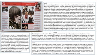
Russian Escort Service in Delhi 11k Hotel Foreigner Russian Call Girls in Delhi
Russian Escort Service in Delhi 11k Hotel Foreigner Russian Call Girls in DelhiRussian Escort Service in Delhi 11k Hotel Foreigner Russian Call Girls in Delhi
Russian Escort Service in Delhi 11k Hotel Foreigner Russian Call Girls in Delhi
 
Presentation by Andreas Schleicher Tackling the School Absenteeism Crisis 30 ...
Presentation by Andreas Schleicher Tackling the School Absenteeism Crisis 30 ...Presentation by Andreas Schleicher Tackling the School Absenteeism Crisis 30 ...
Presentation by Andreas Schleicher Tackling the School Absenteeism Crisis 30 ...
 
The Most Excellent Way | 1 Corinthians 13
The Most Excellent Way | 1 Corinthians 13The Most Excellent Way | 1 Corinthians 13
The Most Excellent Way | 1 Corinthians 13
 
Beyond the EU: DORA and NIS 2 Directive's Global Impact
Beyond the EU: DORA and NIS 2 Directive's Global ImpactBeyond the EU: DORA and NIS 2 Directive's Global Impact
Beyond the EU: DORA and NIS 2 Directive's Global Impact
 
Class 11th Physics NEET formula sheet pdf
Class 11th Physics NEET formula sheet pdfClass 11th Physics NEET formula sheet pdf
Class 11th Physics NEET formula sheet pdf
 
Sports & Fitness Value Added Course FY..
Sports & Fitness Value Added Course FY..Sports & Fitness Value Added Course FY..
Sports & Fitness Value Added Course FY..
 
Holdier Curriculum Vitae (April 2024).pdf
Holdier Curriculum Vitae (April 2024).pdfHoldier Curriculum Vitae (April 2024).pdf
Holdier Curriculum Vitae (April 2024).pdf
 
APM Welcome, APM North West Network Conference, Synergies Across Sectors
APM Welcome, APM North West Network Conference, Synergies Across SectorsAPM Welcome, APM North West Network Conference, Synergies Across Sectors
APM Welcome, APM North West Network Conference, Synergies Across Sectors
 
Nutritional Needs Presentation - HLTH 104
Nutritional Needs Presentation - HLTH 104Nutritional Needs Presentation - HLTH 104
Nutritional Needs Presentation - HLTH 104
 
Interactive Powerpoint_How to Master effective communication
Interactive Powerpoint_How to Master effective communicationInteractive Powerpoint_How to Master effective communication
Interactive Powerpoint_How to Master effective communication
 
Sanyam Choudhary Chemistry practical.pdf
Sanyam Choudhary Chemistry practical.pdfSanyam Choudhary Chemistry practical.pdf
Sanyam Choudhary Chemistry practical.pdf
 
microwave assisted reaction. General introduction
microwave assisted reaction. General introductionmicrowave assisted reaction. General introduction
microwave assisted reaction. General introduction
 
Unit-IV- Pharma. Marketing Channels.pptx
Unit-IV- Pharma. Marketing Channels.pptxUnit-IV- Pharma. Marketing Channels.pptx
Unit-IV- Pharma. Marketing Channels.pptx
 
Advance Mobile Application Development class 07
Advance Mobile Application Development class 07Advance Mobile Application Development class 07
Advance Mobile Application Development class 07
 
The basics of sentences session 2pptx copy.pptx
The basics of sentences session 2pptx copy.pptxThe basics of sentences session 2pptx copy.pptx
The basics of sentences session 2pptx copy.pptx
 
BAG TECHNIQUE Bag technique-a tool making use of public health bag through wh...
BAG TECHNIQUE Bag technique-a tool making use of public health bag through wh...BAG TECHNIQUE Bag technique-a tool making use of public health bag through wh...
BAG TECHNIQUE Bag technique-a tool making use of public health bag through wh...
 
Explore beautiful and ugly buildings. Mathematics helps us create beautiful d...
Explore beautiful and ugly buildings. Mathematics helps us create beautiful d...Explore beautiful and ugly buildings. Mathematics helps us create beautiful d...
Explore beautiful and ugly buildings. Mathematics helps us create beautiful d...
 
fourth grading exam for kindergarten in writing
fourth grading exam for kindergarten in writingfourth grading exam for kindergarten in writing
fourth grading exam for kindergarten in writing
 
Mattingly "AI & Prompt Design: The Basics of Prompt Design"
Mattingly "AI & Prompt Design: The Basics of Prompt Design"Mattingly "AI & Prompt Design: The Basics of Prompt Design"
Mattingly "AI & Prompt Design: The Basics of Prompt Design"
 
General AI for Medical Educators April 2024
General AI for Medical Educators April 2024General AI for Medical Educators April 2024
General AI for Medical Educators April 2024
 

Contents+analysis

  • 1. images On this contents page there are 8 images. On the first page there is one main image of Noel Gallagher who is not using direct address, thus may be a symbolic sign representing his coolness and how little he is bothered or phased by this experience. This may potentially suggest he's done this before. There is also another thumbnail image in the top left corner including Queen, this shows that they are not as significant as Noel Gallagher in this article and that he is the headline as he has more of the page to himself. The other images on the right hand side are boxed and separated amongst themselves. The middle box contains images in side an image maybe showing their pages are not what would’ve been advertised for the magazine as they may just be sub stories. There is no text used in the images however all singers shown have an explanation underneath there name going down in the contents list. This provides all the information needed about them still providing space for the image. On the other hand I would like text to be on the image as its more convenient for me because the images which strike me should have information that goes with them as I do not want to look around for the text as I want to automatically know about that image. Noel Gallagher's page dedicated to him is also thumb nailed in the corner exemplifying the link between the huge picture in the middle and his page. This is good as it gives me an insight on what the headline story looks like drawing me in. The magazine has the cover story of queen shown as a thumbnail in the top left. Thus is simply used to add more to the magazine. Q also has a magazine website at the bottom which is useful as it is likely to offer competitions and much more information on Q which readers may find useful and purchase things from. Layout The information is laid out in 2 columns either side of the magazine where the information goes down vertically. I like this as the location of the information is contrasted and is symmetric and isn’t cluttered and laid out badly. The attention by readers is mainly focused on the main image of noel Gallagher which may not be a good thing as a contents page should be mainly based on information which should be bold and understandable. I feel there is a hierarchy of information because the page numbers do not go downwards chronologically therefore Q may be putting pages which are more anticipated higher up and going down in importance. Sections There is a q review at the bottom of the page giving the brand an image as they are showing that they themselves are conducting this review. There is also a feature of queen in the article which links to a headline of the context list. The features are bordered off in a section to the side of the page. On the first page there is 7 articles in the section. Noel Gallagher is the headline in this section due to the large picture dominating the page. On the second page there is 10 articles in the section. There is a significant amount more due to more space being provided as there isn’t one dominating image unlike the first page. Articles The article has one main heading which is simply ‘’contents’’. This is good because it outlines the whole page and causes no confusion. There is also a subheading which says ‘’features’’. Thus is used to elaborate what all the names going down mean. Without this subheading this information would be useless. The article uses the same font for every single name or band listed. This is useful as it signifies them as one section bordering them off from anything else. The article has a main basis colour of red. The red is used as a heading back ground and it also underlines all types on information. I feel this colour gives q an identity and a brand image because you can remember it as being red. A section of the article describes some names as ‘’regulars’’ making these people a asset of the magazine as they may be regularly regarded with q.
  • 2. Image The image is a mid shot of Kanye west, there is what seems to be a woman from behind grabbing his heart. She is deliberately behind him to not take any attention away from him. The idea she is grabbing his heart may be symbolic that he is a ladies man potentially enticing women in. Furthermore the heart being the only colourful thing in the shot shows its significance and may mean she is trying to win over his heart. Kanye also looks very moody and angry which suggests the anger and rebellion often associated with rappers. The idea that Kanye is dressed smart and not in his usual tatted clothes suggests the elegance and classiness of the magazine. This may also contrast with the simplicity of the colour as they are keeping it professional and not changing the colours around. Kanye also dominates this page proving he is the main topic. There is no text supporting this image, This may be because Kanye's body language and facial expressions speaks many words. They therefore may want to leave the reader wondering about him. This photo is a studio shot as there is no back drop of any nature or people of kind. Kanye being pushed in front of the V symbol is also very important as it suggests that he is this weeks hot topic and owns the cover. Layout All text is not bordered off at all or separated from the backdrop. This may be because there is no major colours which drown the text out. All attention is drawn to the image of Kanye because he takes up most of the page however information is near by which readers can fall back onto easily. There is a hierarchy as the features of the magazine is placed above fashion. Kanye is commonly related to his Yeezy brand and the fashion section highlights this. V may feel there magazine is more important then this as they have pushed the subject down towards the bottom of the page. The headline is laid out in quite an obscure form as it is separated into letters of the word contents. This may be done as it allows the word to be bigger as the break up of words provide more space. Sections There is a features section which includes all what is contained in the magazine. However I feel this is not laid out well because a contents page should focus on information and not an image however v have focused on Kanye west owning the page. There is only 2 articles and that is fashion and features. I feel they should have a bigger space on the page and be exemplified as more important and have bigger writing. As a reader I would come to the contents page for information however I struggle to gather any on this page. Articles The article has the main heading of contents. This is big and bold and easy to read therefore causing no confusion of the meaning of the page. There is subheadings of each article which are ‘’features’’ and ‘’fashion’’ which outline the purpose of the text. The page number is put under the heading which is quite strange as magazine usually put them at the bottom of the page. This could be very useful however as you are not searching for specific pages for long. The font uses serifs which is not good as it can be confusing to use and serifs are not often used in the magazine industry. The colours use the only sdhcme of grey which is very basic and can be interpreted as boring. Despite this is could be portrayed as elegant and classy as they are sticking to simplicity Other considerations There are no cover stories. The only link to a subscription is the website. However this is put in the bottom amongst lots of other text. This text contains serifs which can be confusing. There are no band indexes because the page has not included detailed information of any other singers. I felt the use of no barcode is very confusing as it doesn’t give the magazine an identity.
  • 3. Image The image contains the band the couteneers all facing in direct address. The idea that Liam is standing in front of all the others may suggest he has more hierarchy and is maybe the lead singer or icon for the band. This may be done as the magazine wants him to be seen so people are drawn to it. Liam is also the only one with sunglasses on ,this could be a symbolic sign as him being cool and different. This therefore links to the hierarchy as Liam is the only one with sunglasses on therefore standing out. The shot is a location shot as the background obtains an aspect of nature and isn't at a studio. This image is full bleed and does take up most of the page. There is only one small thumbnail at the bottom of the page however it doesn’t take any attention away from the main cover story. The image is a midshot of the band, this was most likely to have been done to include all of the band members and make them easily visible. Its mise en scene is a back shot of a dark and gloomy sky. This may be suggesting the band is quite dark and rock like. There body language is also very chilled and relaxed maybe suggesting them as rebellious as they don’t care. The image is boxed as it is pushed away from the text. Furthermore there is text on the images supporting it. Layout The text is bordered off into sections. In the features section all the features are listed down in a chronological number order. There is therefore no order of hierarchy there. The attention is automatically dragged towards the picture as it takes up most the page. However due to the colourful subheadings of ‘’features’’ people are drawn in to read. This is very clever as a contents page is all about the text and information an q makes the information stand out a lot. The information is very uniformed as it sticks to the same font with no serifs, also the size is all the same and there is no variation. Consistency in a magazine is good as it shows professionalism and class. Sections There are 3 sections on this contents page. There are features, an every month section showing where the additional to the magazine are and the review. The magazine also include an Oasis special. These extra cover stories give readers more of a reason to read as it appeals to more people as not everyone may like the couteneers yet want to read about Oasis. The layout for each section is very professional as they are bordered off from the text and have a set position. This gives the page order and stability. Articles The page number is at the top right of the page. This is quite obscure as the page numbers tend to be in the bottom right. By doing this however Q get to broadcast what edition number this is and makes it easily seen. The heading is ‘’contents’’, the colour of this doesn’t follow the scheme of colours. Despite this variation it makes the headline stand out more and broadcasts what the page is about which is needed a lot. The magazine persistently follows the same colour scheme of red highlighting its headings. This gives Q its own image and is a good bright colour to highlight important text. Other considerations There is a website link at the top of the page which has a link to subscriptions. This is important for the website as its how they make their money so it being placed at the top shows it well. Q also contains a section on the best house music which is a very different type of music then what is the main story. They may do this to appeal to all kinds of people and to add variety to Q making it diverse.