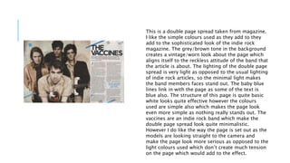
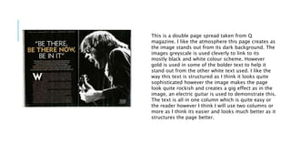
This document discusses several double page spreads from music magazines as examples and inspiration for the student's own article layout. It analyzes the layout, colors, images and text used in spreads from magazines like NME, Q and others. Key aspects noted are the large center images that spill over pages, bold headline text, use of columns, colors that add sophistication or align with the featured band's style, and inclusion of additional photos along the bottom. The student expresses a preference for styles that make the most of the page and have easy to read text surrounding engaging images.