How to Be Famous in your Field just visit our Site
EXTRA CD COVER ANALYSIS
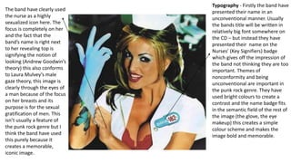
1. Typography - Firstly the band have
presented their name in an
unconventional manner. Usually
the bands title will be written in
relatively big font somewhere on
the CD – but instead they have
presented their name on the
Nurses’ (Key Signifiers) badge
which gives off the impression of
the band not thinking they are too
important. Themes of
nonconformity and being
unconventional are important in
the punk rock genre. They have
used bright colours to create a
contrast and the name badge fits
in the semantic field of the rest of
the image (the glove, the eye
makeup) this creates a simple
colour scheme and makes the
image bold and memorable.
The band have clearly used
the nurse as a highly
sexualized icon here. The
focus is completely on her
and the fact that the
band’s name is right next
to her revealing top is
signifying the notion of
looking (Andrew Goodwin’s
theory) this also conforms
to Laura Mulvey’s male
gaze theory, this image is
clearly through the eyes of
a man because of the focus
on her breasts and its
purpose is for the sexual
gratification of men. This
isn’t usually a feature of
the punk rock genre but I
think the band have used
this purely because it
creates a memorable,
iconic image.
2. • The album is called ‘Enema of the state’ but it does not include the name of the album on the front
cover, but elsewhere on the album it does like on the back and sides of the case.
• The model on the front of the CD cover is linked to the band as she features in a music video for one
of the songs ‘What’s My Age Again?’ Which is a track on the album. The song was released as a
single before the album ‘Enema of A State’ was released and so was the music video for ‘What’s My
Age Again’. So people who like the band blink-182 can probably recognize the model from the music
video, and ‘What’s My Age Again’ is the most known song from blink-182 so they have created a
marketing campaign that they hope will be memorable and iconic – this has become so.
The picture is a shot of 8 men all wearing swimwear/underwear standing
in front of some lockers ( emphasising the high school theme) The 4th,
6th and 8th men in the queue are the 3 members of blink-182 (Mark, Tom
and Travis). It all links together - It does this because on the front we can
see the nurse up close with nothing else there, whereas on the back you
can see Mark, Tom and Travis sat on a table with the nurse sat in front of
them and they’re wearing swimwear like in this photo. So by looking at the
other images we can tell this photo could be a queue to see the sexual
icon that is the model nurse. The band is know for their sense of humour
so that is why the first member is wearing very tight swimwear- to make
people laugh. Again the band have de-idolised themselves by being
places among other guys, which hints them having a laid back and
humorous personality. – goes with some of their humorous songs. They
are pointing fun perhaps at how the young men would be fantasizing over
this nurse, perhaps it is meant to be set in a high school setting which
appeals to their target audience of high school students. The setting of a
high school emphasises the bands humorous and immature nature which
links to the song ‘What's my age again?’ they're all past high school age
but here they are presented as teenagers showing nostalgia and
3. With this back image the
band are again appealing
to the humour aspect of
their campaign. This
image is humorous
because the first member
is making a funny hand
gesture and face toward
the nurse which is meant
to make people laugh and
identify with him. This
setting again relates to a
high school setting with
them seeing the school
nurse, the fact she is
exaggerated and over
sexualized it what brings
out the humour aspect
and makes the album
cover so iconic and
memorable – readers can
identify
Again the key signifier (the Nurse)
appears as she is a main aspect of this
campaign - The cover also contains
the 3 members of blink-182 – by
showing themselves as a band only
on the back cover again links to them
not taking themselves too seriously.
They have deliberately made this
photo humorous as the nurse is
sitting in front of them all holding a
giant syringe and the one to the far
left looks happy and the other two
members Tom and Travis look scared
– this is meant to go with the bands
personality which the DOMINANT
reading ( the fans ) will already know
and this will appeal to them. The
negotiated reading may find it funny
but perhaps wont understand it. The
oppositional reading would probably
say it’s a bit immature and
objectifying
4. The band have tried to go for the colour scheme of red, white and blue
perhaps because those are the colours of the American flag and the
album does contain the word ‘State’ and the band comes from America
– so its enforcing a kind of patriotical code whilst also being humorous,
this will appeal to their American fans. There is also Roland Barthes's
enigma code here and some readers may not be completely sure what
the images mean therefore they will perhaps want to listen to the
product to see what it’s all about. I think over all the band have created
a successful campaign here because they’ve appealing to sexual codes,
cultural codes (American connotations) as well as humour and all of
these things go along with the punk rock genre which they are
representatives of.