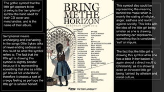
The poster is for the British metalcore band Bring Me the Horizon's 2013 album "Sempiternal". It features a minimalist design of a young girl drawing a symbol while holding a bible, contrasting innocence with the album's themes of atheism, anti-authority, and personal struggles. The unconventional poster aims to intrigue viewers and amplify the meaning and aggression of the lyrics through symbolic visuals and intertextual references.
Book Formatting: Quality Control Checks for DesignersConfidence Ago
This presentation was made to help designers who work in publishing houses or format books for printing ensure quality.
Quality control is vital to every industry. This is why every department in a company need create a method they use in ensuring quality. This, perhaps, will not only improve the quality of products and bring errors to the barest minimum, but take it to a near perfect finish.
It is beyond a moot point that a good book will somewhat be judged by its cover, but the content of the book remains king. No matter how beautiful the cover, if the quality of writing or presentation is off, that will be a reason for readers not to come back to the book or recommend it.
So, this presentation points designers to some important things that may be missed by an editor that they could eventually discover and call the attention of the editor.
Dive into the innovative world of smart garages with our insightful presentation, "Exploring the Future of Smart Garages." This comprehensive guide covers the latest advancements in garage technology, including automated systems, smart security features, energy efficiency solutions, and seamless integration with smart home ecosystems. Learn how these technologies are transforming traditional garages into high-tech, efficient spaces that enhance convenience, safety, and sustainability.
Ideal for homeowners, tech enthusiasts, and industry professionals, this presentation provides valuable insights into the trends, benefits, and future developments in smart garage technology. Stay ahead of the curve with our expert analysis and practical tips on implementing smart garage solutions.
Expert Accessory Dwelling Unit (ADU) Drafting ServicesResDraft
Whether you’re looking to create a guest house, a rental unit, or a private retreat, our experienced team will design a space that complements your existing home and maximizes your investment. We provide personalized, comprehensive expert accessory dwelling unit (ADU)drafting solutions tailored to your needs, ensuring a seamless process from concept to completion.
Between Filth and Fortune- Urban Cattle Foraging Realities by Devi S Nair, An...Mansi Shah
This study examines cattle rearing in urban and rural settings, focusing on milk production and consumption. By exploring a case in Ahmedabad, it highlights the challenges and processes in dairy farming across different environments, emphasising the need for sustainable practices and the essential role of milk in daily consumption.
1. BMTH Poster Analysis
Sempiternal is the fourth studio album by British metal
core band Bring Me the Horizon. It was released on 1 April
2013 worldwide through RCA, a subsidiary label of Sony
Music Entertainment. The album, as lead singer Ollie
Sykes tells an interviewer, is all about personal struggles
and each song addresses a different topic. The main
theme running throughout the songs is that of not only
atheism but anti-theism and aggression towards authority.
2. The font is in in a font
similar to ‘adobe
Garamond pro’ which
looks slightly old and
serious. The font is in
black which is keeping
with the metal core
convention of everything
being black or dark
colours. This title creates
a big impact and the
impression that the band
are serious and so are
the lyrics of the songs.
The poster is very minimal, on
a neutral – beige coloured
background. This creates the
impression of simplicity and
purity – which is contrasting
with the music itself.
The poster appears to be quite
simplistic and wholesome
looking. You would not assume
from looking at this poster that
this is a metal core band. It suits
more with the conventions of
the folk genre. The colours, font
and image all create a sort of
innocent fairy – tale feel to the
poster. This feeling of
innocence and purity completely
contrasts with the music genre
itself, which is very graphic,
violent and aggressive.
The image being a little girl
wearing pigtails with a bow, a
skirt and petticoat all relate to
this fairy tale/children’s story
theme. This creates a sort of
twisted image of innocence.
3. The gothic symbol that the
little girl appears to be
drawing is the ‘sempiternal’
symbol the band used for
their CD cover and
merchandise, and is the
name of their album.
Sempiternal means
unchanging and everlasting.
In the songs Ollie Sykes talks
of never-ending sadness so
this could be what the symbol
refers to. The fact that the
little girl is drawing this
symbol is slightly sinister
because it is representing
something that she as a little
girl should not understand,
therefore it creates a sort of
creepy feeling as perhaps the
little girl is sinister herself.
This symbol also could be
representing the meaning
behind the music which is
mainly the slating of religion,
anger, sadness and revolt
against society. This links with
the idea of the little girl being
sinister as she is drawing
something can represents
something that is considered
‘evil’ or impure.
The fact that the little girl is
drawing this symbol while she
has a bible in her basket is
again almost a direct insult to
Christianity, as it is showing
even an innocent little girl
being ‘tainted’ by atheism and
metal culture.
4. Andrew Goodwin’s idea of visuals
amplifying & illustrating lyrics can
be identified here. It is obvious
that the band mainly represent
anti-theism and as I have
previously mentioned this
blasphemy can be seen in the
graphic drawing of the little girl
with the bible in her basket
drawing the sempiternal symbol.
This visual is amplifying the lyrics
that can be found in the album
such as ‘F*ck your faith’ ‘when you
die the only kingdom you’ll see is
two foot wide and six foot deep’
‘go to hell for heavens sake’ ‘the
snakes start to sing’. This
technique can help the audience
identify meanings in the music
and be able to relate, perhaps
making this poster more
interesting when they know the
underlying meaning.
Andrew Goodwin’s idea of
intertextuality can also be
identified in this poster. The little
girl can also be identified as a
character from a fairy tale story,
such as red riding hood or gretal
from Hansel and gretal. This is
making a reference to other
media texts therefore attracting
attention from a wider audience.
The use of the bold, sharp font
that almost looks like it could be
from the bible highlights the over
all feel of the poster, as being a
mockery of Christianity.
This poster is very simplistic in
comparison with others because
it doesn’t include a parental
advisory stamp, barcode, social
network icons etc.
5. I don’t think that this poster is
conventional as it defies the
usual codes that are found in
metal core posters. Usually
metal posters contain a large
about of the colour black,
graphic images of the band
wearing their usual gothic
looking clothes and an edgy
font. This poster includes
none of those things and is
very simple which makes it
more appealing to the eye
and interesting.
Also, usually posters include
barcodes, parental advisory
and social network icons but
this one doesn’t as it is
keeping with a simplistic and
strange look.
Barthes's enigma code can be
identified in the illustration of
the girl. The audience have to
work out for themselves what
the girl is doing and what it
means. Mystery is created
around this girl and that raises
audiences attention and
makes them wonder what the
message could be. This may
increase attraction to the
band as people may think it’s
an interesting poster and
would like to see how it
relates to the music.
It appears that the girl has blood
on her arm, which again creates
mystery as the audience have no
idea how or why its there. The
juxtaposition of gore and the
innocence of the little girl create a
‘creepy’ effect.
6. Here are some examples of other promotional posters from the
metal core genre in contrast to this one to support the point that
this poster is not conventional of the genre. There are many
aspects which contrast, for example the other examples all contain
photographic images of the band themselves along with the title in
some kind of gothic font, where as this poster in hand does not
contain any of these conventions therefore making it stand out from
others: