International Islamic UniversityH-10, Islamabad, Pakistan
Mobile Applications Development
Week 03
Advanced UI Components
& Notifications
Engr. Rashid Farid Chishti
http://youtube.com/rfchishti
http://sites.google.com/site/chisht
i
2.
CheckBox
RadioButton& RadioGroup
Toast, Custom Toast
Snackbar
AlertDialog, Choice List Dialog,
Custom Dialogs for User Interaction
Spinner
Best Practices
Agenda
3.
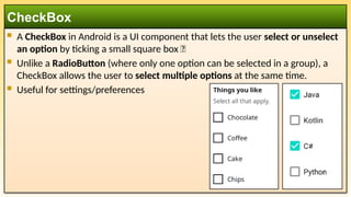
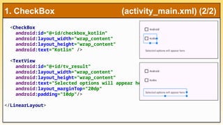
A CheckBoxin Android is a UI component that lets the user select or unselect
an option by ticking a small square box ✅
Unlike a RadioButton (where only one option can be selected in a group), a
CheckBox allows the user to select multiple options at the same time.
Useful for settings/preferences
CheckBox
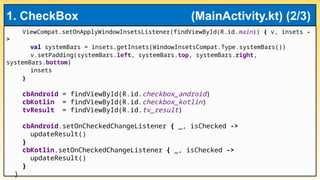
private fun updateResult(){
var str_message = "Selected:"
if (cbAndroid.isChecked)
str_message += " ${cbAndroid.text}"
if (cbKotlin.isChecked)
str_message += " ${cbKotlin.text}"
tvResult.text = str_message
}
}
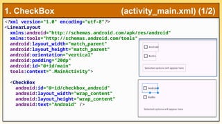
1. CheckBox (MainActivity.kt) (3/3)
Explanation
CheckBox is a toggle control (checked / unchecked ⬜ ).
⬜
You can select multiple checkboxes at once.
setOnCheckedChangeListener is used to detect when the user
checks/unchecks it.
isChecked tells whether it’s ticked or not.
9.
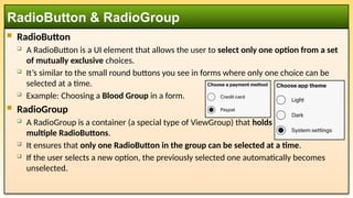
RadioButton
ARadioButton is a UI element that allows the user to select only one option from a set
of mutually exclusive choices.
It’s similar to the small round buttons you see in forms where only one choice can be
selected at a time.
Example: Choosing a Blood Group in a form.
RadioGroup
A RadioGroup is a container (a special type of ViewGroup) that holds
multiple RadioButtons.
It ensures that only one RadioButton in the group can be selected at a time.
If the user selects a new option, the previously selected one automatically becomes
unselected.
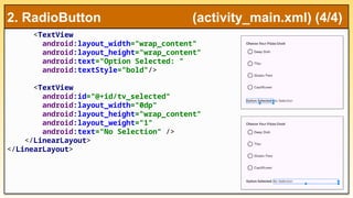
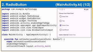
RadioButton & RadioGroup
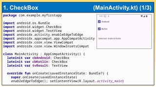
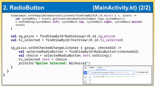
ViewCompat.setOnApplyWindowInsetsListener(findViewById(R.id.main)) { v,insets ->
val systemBars = insets.getInsets(WindowInsetsCompat.Type.systemBars())
v.setPadding(systemBars.left, systemBars.top, systemBars.right, systemBars.bottom)
insets
}
val rg_pizza = findViewById<RadioGroup>(R.id.rg_pizza)
val tv_selected = findViewById<TextView>(R.id.tv_selected)
rg_pizza.setOnCheckedChangeListener { group, checkedId ->
val selectedRadioButton = findViewById<RadioButton>(checkedId)
val choice = selectedRadioButton.text.toString()
tv_selected.text = choice
println("Option Selected: ${choice}")
}
}
}
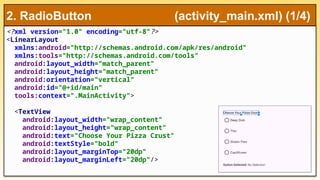
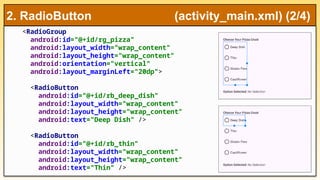
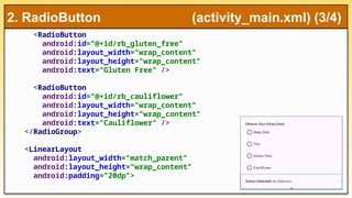
2. RadioButton (MainActivity.kt) (2/2)
16.
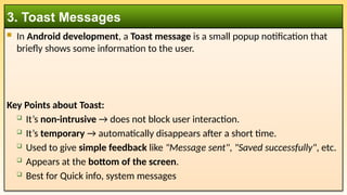
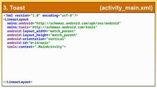
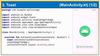
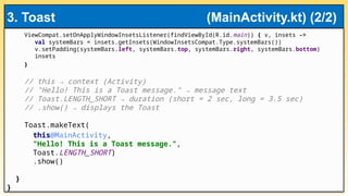
In Androiddevelopment, a Toast message is a small popup notification that
briefly shows some information to the user.
Key Points about Toast:
It’s non-intrusive → does not block user interaction.
It’s temporary → automatically disappears after a short time.
Used to give simple feedback like "Message sent", "Saved successfully", etc.
Appears at the bottom of the screen.
Best for Quick info, system messages
3. Toast Messages
ViewCompat.setOnApplyWindowInsetsListener(findViewById(R.id.main)) { v,insets -
>
val systemBars = insets.getInsets(WindowInsetsCompat.Type.systemBars())
v.setPadding(systemBars.left, systemBars.top, systemBars.right,
systemBars.bottom)
insets
}
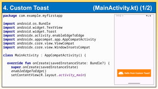
val layout = layoutInflater.inflate(R.layout.toast_layout, null)
val text: TextView = layout.findViewById(R.id.toast_text)
text.text = "Hello from Custom Toast!"
val toast = Toast(applicationContext)
toast.duration = Toast.LENGTH_LONG
toast.view = layout
toast.show()
}
}
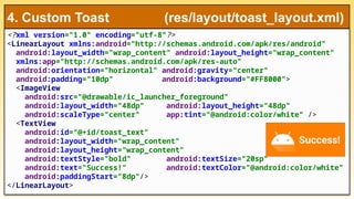
4. Custom Toast (MainActivity.kt) (2/2)
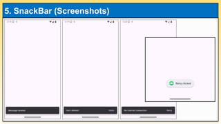
23.
A Snackbaris a UI component in Android (part of Material Design) used to
show brief messages at the bottom of the screen, usually with an optional
action button (like “UNDO” or “RETRY”).
It’s considered a modern alternative to Toasts.
Key Features of Snackbar
Shows a short message to the user.
Appears at the bottom of the screen (can be swiped away).
Can have an action button (e.g., Undo, Retry).
Automatically disappears after a few seconds.
Follows Material Design guidelines (preferred over custom Toasts).
Best for User feedback with possible action
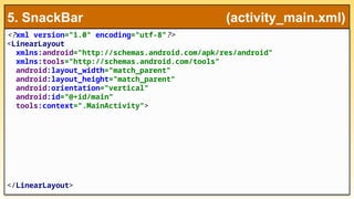
5. SnackBar
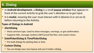
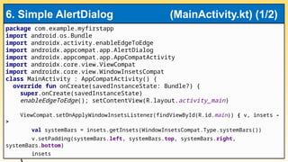
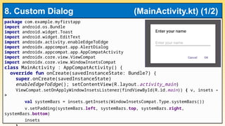
In Androiddevelopment, a Dialog is a small popup window that appears in
front of the current Activity to grab the user’s attention or to get input.
It is modal, meaning the user must interact with it (dismiss it or act on it)
before returning to the Activity.
Types of Dialogs in Android
AlertDialog
Most common type. Used to show messages, warnings, or get confirmation.
Supports title, message, buttons (OK/Cancel/Yes/No), and custom views.
DatePickerDialog & TimePickerDialog
Pre-built dialogs for picking date or time.
Custom Dialog
You can design your own layout and use it inside a dialog.
6. Dialog
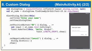
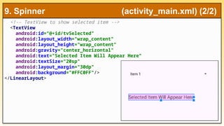
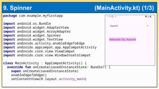
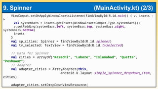
A Spinnerin Android is a UI element that lets the user select an item from a
drop-down list.
It works like a combo box in desktop applications.
By default, it shows the currently selected item, and when tapped, it displays a
list of available options.
Allows user to select from a list of options
Common for settings or categories
👉 Most of the time in real apps, developers create their own custom XML
layout (e.g., with text + image) and use it with the adapter.
9. Spinner (Drop-down Menu)
CheckBox
Usewhen: You want the user to select multiple options independently.
Example: "Select your hobbies" → Music, 🎨 Painting, ⚽ Sports (user can
⚽
pick many).
✔️Good for multi-select.
RadioButton & RadioGroup
Use when: The user must select only one option from a set.
Example: "Select gender" → Male / Female / Other (only one allowed).
✔️Good for single-choice options.
10. Best Practices (1/4)
43.
Toast
Usefor simple, short, non-blocking messages.
Example: "Message sent", "File saved".
Custom Toast (not recommended in new APIs, but still possible):
Use if you want a more styled toast (with image, color).
Example: A green tick with "Success!"
✔️
⚠️Note: Since Android 11, custom toasts are discouraged → Prefer Snackbar instead.
Snackbar
Use when: You want to give feedback + possible user action.
Example: "Item deleted. [UNDO]" "No internet. [RETRY]“
✔️Snackbar is interactive and Material Design compliant (preferred over custom Toasts).
10. Best Practices (2/4)
44.
AlertDialog
Usewhen: You need to ask for a confirmation or decision.
Example: "Are you sure you want to exit?" → [Yes] [No]
✔️Good for yes/no/ok/cancel situations.
Single-choice dialog:
Use when the user must pick one option from a list, shown in a popup.
Example: Select ringtone → (Classic, Beep, Tone).
Multi-choice dialog:
Use when the user can select multiple items in a dialog.
Example: "Select subjects to subscribe to" → (Math, Science, English).
✔️Good when options don’t need to stay visible on screen permanently.
10. Best Practices (3/4)
45.
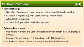
Custom Dialogs
Use when: You need a popup form or custom input UI inside a dialog.
Example: A login dialog with username + password fields.
A feedback form popup.
✔️Great for input collection inside a popup.
Spinner (Drop-down)
Use when: You want the user to choose one option from a list, but space is
limited.
Example:"Select country" → Dropdown with 100 countries.
✔️Preferred when choices are many (instead of RadioButtons).
10. Best Practices (4/4)


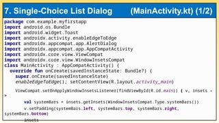
![val items = arrayOf("Red", "Green", "Blue")
AlertDialog.Builder(this)
.setTitle("Choose Color")
.setSingleChoiceItems(items, -1) { dialog, which ->
Toast.makeText(
this,
"Selected: ${items[which]}",
Toast.LENGTH_SHORT).show()
dialog.dismiss()
}
.show()
}
}
7. Single-Choice List Dialog (MainActivity.kt) (2/2)](https://image.slidesharecdn.com/week03-advanceduicomponentsnotifications-250926074456-e42112cc/85/Week-03-Advanced-UI-Components-Notifications-pptx-32-320.jpg)
![// Spinner item selection
sp_cities.onItemSelectedListener = object:
AdapterView.OnItemSelectedListener {
override fun onItemSelected( parent: AdapterView<*>,
view: android.view.View?, position: Int, id:
Long) {
tv_selected.text = "Selected City: ${cities[position]}"
}
override fun onNothingSelected(parent: AdapterView<*>) {
tv_selected.text = "No city selected"
}
}
}
}
9. Spinner (MainActivity.kt) (3/3)](https://image.slidesharecdn.com/week03-advanceduicomponentsnotifications-250926074456-e42112cc/85/Week-03-Advanced-UI-Components-Notifications-pptx-41-320.jpg)
![ Toast
Use for simple, short, non-blocking messages.
Example: "Message sent", "File saved".
Custom Toast (not recommended in new APIs, but still possible):
Use if you want a more styled toast (with image, color).
Example: A green tick with "Success!"
✔️
⚠️Note: Since Android 11, custom toasts are discouraged → Prefer Snackbar instead.
Snackbar
Use when: You want to give feedback + possible user action.
Example: "Item deleted. [UNDO]" "No internet. [RETRY]“
✔️Snackbar is interactive and Material Design compliant (preferred over custom Toasts).
10. Best Practices (2/4)](https://image.slidesharecdn.com/week03-advanceduicomponentsnotifications-250926074456-e42112cc/85/Week-03-Advanced-UI-Components-Notifications-pptx-43-320.jpg)
![ AlertDialog
Use when: You need to ask for a confirmation or decision.
Example: "Are you sure you want to exit?" → [Yes] [No]
✔️Good for yes/no/ok/cancel situations.
Single-choice dialog:
Use when the user must pick one option from a list, shown in a popup.
Example: Select ringtone → (Classic, Beep, Tone).
Multi-choice dialog:
Use when the user can select multiple items in a dialog.
Example: "Select subjects to subscribe to" → (Math, Science, English).
✔️Good when options don’t need to stay visible on screen permanently.
10. Best Practices (3/4)](https://image.slidesharecdn.com/week03-advanceduicomponentsnotifications-250926074456-e42112cc/85/Week-03-Advanced-UI-Components-Notifications-pptx-44-320.jpg)


![Day 5: Android User Interface [View Widgets]](https://cdn.slidesharecdn.com/ss_thumbnails/android1-7-130407053041-phpapp02-thumbnail.jpg?width=640&height=640&fit=bounds)