
Recommended
More Related Content
What's hot
What's hot (20)
Similar to Website first draft
Similar to Website first draft (20)
More from hollyjac
Recently uploaded
Recently uploaded (19)
Website first draft
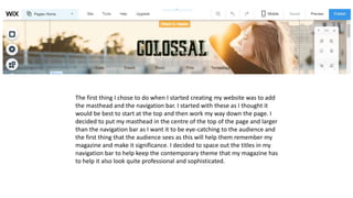
- 1. The first thing I chose to do when I started creating my website was to add the masthead and the navigation bar. I started with these as I thought it would be best to start at the top and then work my way down the page. I decided to put my masthead in the centre of the top of the page and larger than the navigation bar as I want it to be eye-catching to the audience and the first thing that the audience sees as this will help them remember my magazine and make it significance. I decided to space out the titles in my navigation bar to help keep the contemporary theme that my magazine has to help it also look quite professional and sophisticated.
- 2. I then added my strapline underneath the header where my masthead and navigation bar is and centred it in the middle of the page in bold, large text. Again, I wanted my strapline to be eye- catching and easy to remember for the audience when thy visited the website, so I thought this would be the best decision for that purpose. Also, with the strapline being the only visible text on this part of the page, it allows the audience to see the dominant image clearly without anything blocking the view. The image shown is not my image as I am adding them after I complete all the texts and content.
- 3. I then added a category section to my home page in order to allow my audience to become familiar with the sub-genres of the magazine and for them to be able to access the hyperlinked pages in different ways. I believe this layout helps the website to become modern and cultural as the categories are spaced out evenly and are eye- catching. The aim for the images is to be similar tones within the colours in order to keep the aesthetic appeal.
- 4. Near the bottom of the homepage, I added some small blogpost that will make the audience become intrigued in the sub-genres and allows them to gain a perspective on the magazine without having to go into depth and search the whole site. I believe this will help me gain a wider audience as the layout of the website is quite simplistic however still extremely informative and I believe this will help when it comes to engaging the target audience. The colours used are very simplistic as they are mostly whites, blacks and greys however, the colour in the images allows the post to become eye catching.
- 5. Next to the blog posts, I have a very short message post that introduces the social media links and encourages the audiences to go follow them in order to stay up to date. After this, I have also scattered the same social media links around the website in order to remind the audience that they exist, for example on the right of the message the social media is seen which follows the page whenever they scroll up or down. Below that there is an archive search, this allows the audience to search for different posts and articles depending on the month they were published. I believe that this is a good addition to the website as it will be an easier way for the audience to find an article that they came onto the website for.
- 6. At the bottom of the homepage, I added a ‘contact us’ section where the audience can send queries or messages to the company. This will allow the audience to feel more connected with the magazine and will ultimately make them feel content when visiting the site.
- 7. At the very bottom of the page, I have added a section called ‘Join the Colossal family’ this is where the audience can register their email addresses in order to gain weekly updates on the articles that will be published in the magazines, allowing to stay up to date without having the hassle of trying to find the news elsewhere. Below this there is also the social media links for the magazine to remind the audience to go and follow them. The theme throughout this website will be whites, black and greys with the occasional pop of colour from images and the sub-genre colours. This is featured at the bottom of every page.
- 8. In order to achieve my sub-genre colours, I had to add buttons on top of the menu in order to achieve the individual hover colours due to the menu being a single thing so if you tried to change the colours, all the titles would change. I did this for each title.
- 9. I then had to create a button that overlapped the menu title on each hyperlinked page in order to achieve the colour change that matched the sub-genre. I done this by disabling the ‘show on all pages’ button so that colour would only appear on the selected page. I continued to do this for the other hyperlinked page as well.
- 10. For my first hyperlink page (events) I have followed my flatplan and created a contents box on the top left hand side of the page with three articles surrounding it. I thought this was a good idea because the audience will be able to see what articles the website has and also allows them to see previews of the articles so they can gain an idea on how they are written. The previews also have a small summary which will draw the attention of the reader and make them want to read the rest of the article to see what happens. The colour for this sub-genre is a pastel purple/pink. I decided to use pastel colours as part of my colour scheme because I thought it would help with the contemporary and cultural theme of the magazine.
- 11. The colour for this sub-genre is pastel blue as I believe that is the most fitting colour for a music genre. The second hyperlinked page I chose to create was a music section, this is because I believe that this is the second most popular sub-genre within the magazine due to the target audience enjoying different types of music e.g. indie and rap. I stuck to my flatplan when creating this page as I believe it is extremely eye-catching and sophisticated. I chose to display four articles, with a title and a short summary of what it is about along with a read more button for when the audience wants to continue reading. The images that I will capture for this page will be quiet artsy and quirky in order to show the personality of my models, allowing the audience to relate.