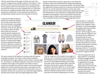
1. The colour scheme of this website is very basic with the majority
using Black and white. This shows a mature theme therefore
conveying that their target audience is more mature, of woman aged
18 – 30. However I would personally like to see a bit more colour on
a websites home page as this would be more likely to attract
someone to the page and would also make it more entertaining. By
adding more colour it would also give further connotations of the
businesses target audience, with what their personality is like and
what their interests are e.g. with the use of pink the target audience
would be woman with a girly and happy (bright) personality.
I like how there is a subscribe
button as this directly links the
website to the magazine. These
also shows a use of technological
convergence with the promotion
of ‘FREE ACCESS to digital
editions!’ (of the magazine). This
will also make the magazine more
convenient for the audience as
they will be able to read it
anywhere they please on their
smart phone or laptop instead of
having to physically carry around
the paper based product. And then
there is also marketing use by
creating an offer for ‘12 issues for
£12’ using persuasive language to
promote the magazine further.
Having a Follow button would be a good idea as this allows the
customers to get more involved with the magazine by following
their pages and accounts on social network sites. This will also allow
the organization to keep up with their customers and what they like
with the use of a like and favorite button on these sites as the
audience can like the their posts and therefore showing which news
and articles they are most interested in reading about and which
would be the most popular. There is also the fact that with the
companies posts on these social network so they are therefore
more noticeable and their customers wont forget about them.
I like the image use on this website home page as it
allow the user to instantly see the genre (fashion). It
immediately promotes fashionable clothing with
the use of a strip slideshow allowing more images
to be seen using a more compact space. There has
also been close up shots used on the celebrities
included in the articles. With this use of shot type it
allows the audience to feel up close and personal
with the celebrities making a better connection
with them and therefore appealing more to them.
I like this appropriate use of
video add ad it is promoting
the beauty blogger Zoella’s
YouTube channel. This would
be appealing to the target
audience as relation to my
target audience interview they
said they would like to read
and know about fashion tips,
therefore this would
compliment their interests.
I like the overall layout of the page as it flows easy and is also
simple to navigate round making it usable for any audience. I also
like how its very interactive as this will make it ore entertaining
for the audience with more information to see and things to do. I
also quite like how there are two navigation bars as it would look
two much on a single bar however when split in two and in two
locations the information is more spread out and looks less
overwhelming, making it easier to use and easier on the eye.
I really like the ‘News & Opinion’
board as this allows the audience
not not only see the latest news
but to also be able to see peoples
opinions on them by reading the
comments. They can also add their
own opinions which will allow
them to feel not only more
involved with the magazine but
also noticed by he company and
feeling wanted and their opinions
valued. I also like the layout of this
board as it contains both images
and text making the information
look more spread out instead of a
clustered bulk of text which would
not be appealing to their target
audience.
2. I like how the ‘News & Opinion’
board has been continuously
used throughout the site as this
gives the website consistency. I
also believe this is a good use of
convention to have on all the
pages since it does make the
audience feel more involved in
the business and feel as if their
opinion is valued.
The magazines masthead is also used on
the website on all pages to create a link of
synergy between the them. This can also
be used to as a good link for all of the
webpages and then for all of the social
network sites and anything else they
produce to ensure brad recognized and
for anything they produced to be instantly
recognized as their work.
The colour scheme is also continuous throughout the website to create a
house style. The dominant colour on this site is predominantly white, this
connotes that the target audience will be more mature and also convey
that so with the articles, themes and stories used within the website and
magazine. As stated in the Glamour home page deconstruction I would
like my own website to feature more colour as I believe this would appeal
more to my target audience and make the Tribe website more
entertaining.
The layout of this page is very
simple which I believe would also
suit my target audience and would
be a good idea for one of my web
page layouts as it is easy to use
and navigate around to find the
information. I like how they have
used large banner sized boxes for
a link to each article containing
various images and the
appropriate text to back up these
images. It is also a good feature
that the News & Opinion board
does not move as the viewer
scrolls down the web pages
articles as this gives the web page
a feel of consistency and also uses
a professional effect which will be
appealing to their target audience.
It is a good idea that there has been a lot of images included ion the page
as there are what will initially attract the audience to the articles and will
also intrigue them with the use of celebrities. I like the image use with
the camera shots being close ups as since this page is dedicated to make
up it allows the audience to see how the make up has been applied and
the total effects it have left. I also like how the models in the images all
look confident and strong woman which will leave a positive effect on
the target audience as they themselves are woman and will see these
specific individuals as inspirations and someone to look up to.
There have been a vary of font
sizes used on the page however
there doesn’t seem to be much
variation between font styles.
In my opinion they have done a
good job in constructing the
page well based on font sizes as
they have allowed their more
important pieces of texts to
stand out amongst the
subordinate text. For instance
the headings of the articles
have been set in a larger font
than its description therefore
the audience will be drawn to
this first. If I was to change
anything I would alter the size
of the web pages title as it is
only shown very small in the
top left hand corner of the
page and is quite difficult to see
amongst the mass of other
information and conventions
on the page.
These are the bottom of webpage links and navigation bar. It is fairly small
compared to that on other fashion websites. It is fairly simple yet still provides a
link for the audience to contact the company therefore getting them more
involved and also a link to their private policy and cookie statement which would
be important for the audience to reed especially if they intend to add any private
details onto the site e.g. by subscribing to their magazine online.