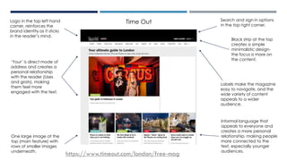
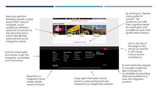
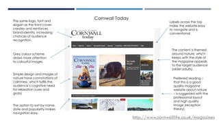
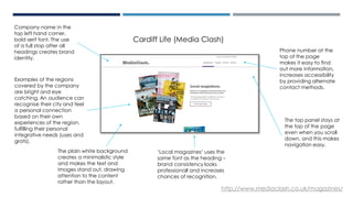
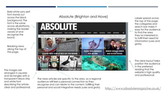
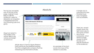
CODES AND
CONVENTIONS OF
REGIONAL MAGAZINES-
WEBSITES
Time Out
‘Your’ is direct mode of
address and creates a
personal relationship
with the reader (Uses
and grats), making
them feel more
engaged with the text.
Labels make the magazine
easy to navigate, and the
wide variety of content
appeals to a wider
audience.
Logo in the top left hand
corner, reinforces the
brand identity as it sticks
in the reader’s mind.
Black strip at the top
creates a simple
minimalistic design-
the focus is more on
the content.
One large image at the
top (main feature) with
rows of smaller images
underneath.
Search and sign in options
in the top right corner.
https://www.timeout.com/london/free-mag
Informal language that
appeals to everyone and
creates a more personal
relationship, making people
more connected to the
text, especially younger
audiences.
Social media links appeal
to younger audiences,
also increases the
accessibility by providing
alternative platforms to
view the magazine
content.
Bold sans serif font
heading creates a clear
layout that’s easy to
navigate. Local
audiences will feel a
personal connection to
the area they live in,
which will fulfil their
personal and social
integrative needs.
Repetition of
magazine name
makes reader
aware of brand.
Copy right information at the
bottom. Looks professional and
trustworthy as a legitimate website.
Link to the top of
the page in red-
stands out and fits
in with house
colours (brand
consistency)
Contact information
and where to get the
magazine- accessible
and informative.
By clicking on ‘Explore
more guides to
London’ the
audience can fulfil
their cognitive needs
for information and
surveillance (uses and
gratifications theory).
CORNWALL TODAY
Labels across the top
make the website easy
to navigate and is
conventional.
Grey colour scheme
draws more attention
to colourful images
The same logo, font and
slogan as the front cover-
creates and reinforces
brand identity, increasing
chances of audience
recognition.
The option to sort by name,
date and popularity makes
navigation easy.
The content is themed
around nature, which
keeps with the style of
the magazine appeals
to the target audience
(older adults).
http://www.cornwalllife.co.uk/magazines
Cornwall Today
Simple design and images of
nature have connotations of
calmness, which fulfils the
audience’s cognitive need
for relaxation (uses and
grats)
Preferred reading –
that this is a good
quality magazine
website about nature
– is suggested with the
professional layout
and high quality
image (reception
theory).
Examples of the regions
covered by the company
are bright and eye
catching. An audience can
recognise their city and feel
a personal connection
based on their own
experiences of the region,
fulfilling their personal
integrative needs (uses and
grats).
The plain white background
creates a minimalistic style
and makes the text and
images stand out, drawing
attention to the content
rather than the layout.
Phone number at the
top of the page
makes it easy to find
out more information,
increases accessibility
by providing alternate
contact methods.
Company name in the
top left hand corner,
bold serif font. The use
of a full stop after all
headings creates brand
identity.
‘Local magazines’ uses the
same font as the heading –
brand consistency looks
professionall and increases
chances of recognition.
The top panel stays at
the top of the page
even when you scroll
down, and this makes
navigation easy.
http://www.mediaclash.co.uk/magazines/
Cardiff Life (Media Clash)
ABSOLUTE
http://www.absolutemagazine.co.uk/
Bold white sans serif
font stands out
across the black
background. The
font is the same
across all platforms,
making the reader
aware of and
recognise the
brand.
Labels spread across
the top of the page,
the categories and
search bar make it
easy for the audience
to find the area
they’re interested in,
to fulfil their need for
information (uses and
grats).
The images are
arranged in squares
and rectangles with a
transparent black strip
and white font
describing the article-
clear and professional.
Breaking news
along the top of
the page.
The news articles are specific to the area, so a regional
audience will feel a personal connection as they
recognise and can relate to the content, fulfilling their
personal and social integrative needs (uses and grats)
Absolute (Brighton and Hove)
The clear layout helps
position the audience
in the preferred
reading that the
website is high quality
and professional.
A simple way to
subscribe and view
the latest issue-
easy navigation
and accessibility.
The top bar and labels
stay at the top of the
page, making it more
likely to fulfil the
audience’s need for
relaxation as navigation
is straightforward and
non frustrating (uses and
grats).
Dogs trust advert in
the middle of the
article- likely to be
notices and bright
so stands out.
There are several
adverts down the
right hand column,
and some of them
are of local
companies, which
will encourage
viewers to revisit
the site as it’s
directly beneficial
to the audience.
An example of the front
cover of an issue of the
viewers to subscribe.
Absolute
Article about a famous figure (Paloma
Faith) reinforces the preferred reading
that this is a legitimate company that has
interesting and informative articles.
Codes and Conventions
• The magazine name/ logo is along the top of the page or in the
right hand corner.
• Along the top of the page there are always labels that link to
different pages and a search bar.
• At the bottom of the page there are social media links, an about us
section, copyright information and sometimes a link back to the top
of the page.
• There’s often rows of images and article headings.
• The labels bar always stays at the top of the page when you scroll
down.
• The colour scheme is often black or grey.
• Information about subscribing to the magazine is somewhere on the
website.

Codes and Conventions - WEBSITES

  • 1.
  • 2.
    Time Out ‘Your’ isdirect mode of address and creates a personal relationship with the reader (Uses and grats), making them feel more engaged with the text. Labels make the magazine easy to navigate, and the wide variety of content appeals to a wider audience. Logo in the top left hand corner, reinforces the brand identity as it sticks in the reader’s mind. Black strip at the top creates a simple minimalistic design- the focus is more on the content. One large image at the top (main feature) with rows of smaller images underneath. Search and sign in options in the top right corner. https://www.timeout.com/london/free-mag Informal language that appeals to everyone and creates a more personal relationship, making people more connected to the text, especially younger audiences.
  • 3.
    Social media linksappeal to younger audiences, also increases the accessibility by providing alternative platforms to view the magazine content. Bold sans serif font heading creates a clear layout that’s easy to navigate. Local audiences will feel a personal connection to the area they live in, which will fulfil their personal and social integrative needs. Repetition of magazine name makes reader aware of brand. Copy right information at the bottom. Looks professional and trustworthy as a legitimate website. Link to the top of the page in red- stands out and fits in with house colours (brand consistency) Contact information and where to get the magazine- accessible and informative. By clicking on ‘Explore more guides to London’ the audience can fulfil their cognitive needs for information and surveillance (uses and gratifications theory).
  • 4.
    CORNWALL TODAY Labels acrossthe top make the website easy to navigate and is conventional. Grey colour scheme draws more attention to colourful images The same logo, font and slogan as the front cover- creates and reinforces brand identity, increasing chances of audience recognition. The option to sort by name, date and popularity makes navigation easy. The content is themed around nature, which keeps with the style of the magazine appeals to the target audience (older adults). http://www.cornwalllife.co.uk/magazines Cornwall Today Simple design and images of nature have connotations of calmness, which fulfils the audience’s cognitive need for relaxation (uses and grats) Preferred reading – that this is a good quality magazine website about nature – is suggested with the professional layout and high quality image (reception theory).
  • 5.
    Examples of theregions covered by the company are bright and eye catching. An audience can recognise their city and feel a personal connection based on their own experiences of the region, fulfilling their personal integrative needs (uses and grats). The plain white background creates a minimalistic style and makes the text and images stand out, drawing attention to the content rather than the layout. Phone number at the top of the page makes it easy to find out more information, increases accessibility by providing alternate contact methods. Company name in the top left hand corner, bold serif font. The use of a full stop after all headings creates brand identity. ‘Local magazines’ uses the same font as the heading – brand consistency looks professionall and increases chances of recognition. The top panel stays at the top of the page even when you scroll down, and this makes navigation easy. http://www.mediaclash.co.uk/magazines/ Cardiff Life (Media Clash)
  • 6.
    ABSOLUTE http://www.absolutemagazine.co.uk/ Bold white sansserif font stands out across the black background. The font is the same across all platforms, making the reader aware of and recognise the brand. Labels spread across the top of the page, the categories and search bar make it easy for the audience to find the area they’re interested in, to fulfil their need for information (uses and grats). The images are arranged in squares and rectangles with a transparent black strip and white font describing the article- clear and professional. Breaking news along the top of the page. The news articles are specific to the area, so a regional audience will feel a personal connection as they recognise and can relate to the content, fulfilling their personal and social integrative needs (uses and grats) Absolute (Brighton and Hove) The clear layout helps position the audience in the preferred reading that the website is high quality and professional.
  • 7.
    A simple wayto subscribe and view the latest issue- easy navigation and accessibility. The top bar and labels stay at the top of the page, making it more likely to fulfil the audience’s need for relaxation as navigation is straightforward and non frustrating (uses and grats). Dogs trust advert in the middle of the article- likely to be notices and bright so stands out. There are several adverts down the right hand column, and some of them are of local companies, which will encourage viewers to revisit the site as it’s directly beneficial to the audience. An example of the front cover of an issue of the viewers to subscribe. Absolute Article about a famous figure (Paloma Faith) reinforces the preferred reading that this is a legitimate company that has interesting and informative articles.
  • 8.
    Codes and Conventions •The magazine name/ logo is along the top of the page or in the right hand corner. • Along the top of the page there are always labels that link to different pages and a search bar. • At the bottom of the page there are social media links, an about us section, copyright information and sometimes a link back to the top of the page. • There’s often rows of images and article headings. • The labels bar always stays at the top of the page when you scroll down. • The colour scheme is often black or grey. • Information about subscribing to the magazine is somewhere on the website.