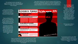
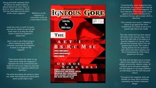
Music Magazine – Final Magazine
ANNOTATED
Hamza Khan
The masthead has been used again but
without the red filter, just so that the pages are
different. This helps create a white/red pattern
using rectangles.
Large and bold heading
draws attention. It is put into
quotation marks which
seems scandalous and urges
consumers to keep reading.
There are different fonts
used from the headings and
the main body text. This is so
that the significant text and
headlines stand out from the
main bulk of information.
Throughout this feature
page, exclusives are used
which would appeal to the
rock community as rock
idols are well renown and
any interview with them
would be highly sought
after.
There is a mid parting to this page, separating the main image
(mid shot) from the text and the content. This is done as it is a
convention of feature pages to split up the double page spread
in this manner. It also helps keep the page tidy, and so the page
isn’t cluttered,
“Best selling magazine 2014” helps the magazine sell as consumers
know that it is a reputable magazine if it has been nominated or won
an award. Below it, is the website which, again, is useful for those
using a subscription service or would like to contact the producers. The main image is a mid-
shot, photoshopped to
create an almost silhouette-
like pattern. This gives the
magazine a feeling of
uncertainty and danger. The
eyes are again emphasised
with a filter. The “mystique”
created by the filters and
silhouette style is quite
unique and goes against
convention, as usually a
double feature spread would
show a standard model.
The house style of filters is
applied throughout.
An autograph exclusive to this 1000th
release of magazine is placed in the
magazine from a famous rock celebrity as
to give the magazine a unique selling
point.
The masthead has been used in the
contents page, centred and placed at the
top of the magazine, which is
conventional. This convention is applied
to make the name of the magazine stand
out and loyal customers can repurchase
this same magazine.
The image is a close-up shot of the model in
glasses. The model is staring directly into the
camera, and is head on towards the camera
which uses direct address and makes the
reader feel drawn towards the image.
An editors note is used at the bottom
middle of the magazine, summarising the
contents, exclusives and recommending
articles to read, as well as promoting the
magazine. This is interesting as it would
help sell the magazine, as readers would
feel as though the magazine is personalised
towards them.
The significant pages with topics are
listed in the contents column. The words
are large so that it is clear to read, and
the page numbers are also declared next
to the topic.
Throughout the contents page, a fog or mist
effect is used which is also red. This gives the
magazine an effect of mystique and stealth.
This is a concurrent theme throughout the
other pages, as well as a theme throughout
other rock magazines.
Here I used a rule of three plug to
attract attention and make the
consumer remember the magazine.
It works as a slogan for the
magazine.
Inside the circle is a puff. It is quick
and easy for readers to see this and
draws them in as they are made
aware of what the magazine is
related with.
Strong and bold masthead which
will attract my target audience,
placed behind red ,neon, filters to
give it a “gory” appearance, which
suits the masthead and the genre
of this music magazine.
These points allow the reader to see
what will be inside the magazine. It
highlights the most controversial and
significant rock music topics to cause the
reader to buy the magazine, before even
opening it.
The white font allows the words to stand
out, rather than keeping the writing black
which would make it dull.
Conventionally, music magazines have
the barcode, price tag and date listed all
at the bottom right of the magazine. To
show elements of the rock genre, I went
against conventions and placed the
barcode at the top right instead, which is
abnormal.
This connotes rock music’s “rebellious”
nature to go against the norm.
Furthermore, It is easier to see as it is
placed right above the model.
The main model here has been placed
off centre to the normal image, and is
set on the right side of the page as to
give the magazine a C-layout, which
was the most popular layout from the
questionnaire results. The model is
staring directly into the audiences
eyes, which uses direct address, and
this is emphasised by a filter being
placed over this eyes.
The filter and red lights acts as a house
style for the magazine. Red connotes
danger, promiscuity, violence, anger; all
of which suit a rock genre magazine.
This also appeals to my target audience
as red/orange were the most favoured
colours.
Throughout the magazine, there are
blacked out areas which symbolise
uncertainty and further emphasise
danger.
Website is on the
magazine, as
consumers could use
a subscription service.

Final Magazine Annotated

  • 1.
    Music Magazine –Final Magazine ANNOTATED Hamza Khan
  • 2.
    The masthead hasbeen used again but without the red filter, just so that the pages are different. This helps create a white/red pattern using rectangles. Large and bold heading draws attention. It is put into quotation marks which seems scandalous and urges consumers to keep reading. There are different fonts used from the headings and the main body text. This is so that the significant text and headlines stand out from the main bulk of information. Throughout this feature page, exclusives are used which would appeal to the rock community as rock idols are well renown and any interview with them would be highly sought after. There is a mid parting to this page, separating the main image (mid shot) from the text and the content. This is done as it is a convention of feature pages to split up the double page spread in this manner. It also helps keep the page tidy, and so the page isn’t cluttered, “Best selling magazine 2014” helps the magazine sell as consumers know that it is a reputable magazine if it has been nominated or won an award. Below it, is the website which, again, is useful for those using a subscription service or would like to contact the producers. The main image is a mid- shot, photoshopped to create an almost silhouette- like pattern. This gives the magazine a feeling of uncertainty and danger. The eyes are again emphasised with a filter. The “mystique” created by the filters and silhouette style is quite unique and goes against convention, as usually a double feature spread would show a standard model. The house style of filters is applied throughout. An autograph exclusive to this 1000th release of magazine is placed in the magazine from a famous rock celebrity as to give the magazine a unique selling point.
  • 3.
    The masthead hasbeen used in the contents page, centred and placed at the top of the magazine, which is conventional. This convention is applied to make the name of the magazine stand out and loyal customers can repurchase this same magazine. The image is a close-up shot of the model in glasses. The model is staring directly into the camera, and is head on towards the camera which uses direct address and makes the reader feel drawn towards the image. An editors note is used at the bottom middle of the magazine, summarising the contents, exclusives and recommending articles to read, as well as promoting the magazine. This is interesting as it would help sell the magazine, as readers would feel as though the magazine is personalised towards them. The significant pages with topics are listed in the contents column. The words are large so that it is clear to read, and the page numbers are also declared next to the topic. Throughout the contents page, a fog or mist effect is used which is also red. This gives the magazine an effect of mystique and stealth. This is a concurrent theme throughout the other pages, as well as a theme throughout other rock magazines.
  • 4.
    Here I useda rule of three plug to attract attention and make the consumer remember the magazine. It works as a slogan for the magazine. Inside the circle is a puff. It is quick and easy for readers to see this and draws them in as they are made aware of what the magazine is related with. Strong and bold masthead which will attract my target audience, placed behind red ,neon, filters to give it a “gory” appearance, which suits the masthead and the genre of this music magazine. These points allow the reader to see what will be inside the magazine. It highlights the most controversial and significant rock music topics to cause the reader to buy the magazine, before even opening it. The white font allows the words to stand out, rather than keeping the writing black which would make it dull. Conventionally, music magazines have the barcode, price tag and date listed all at the bottom right of the magazine. To show elements of the rock genre, I went against conventions and placed the barcode at the top right instead, which is abnormal. This connotes rock music’s “rebellious” nature to go against the norm. Furthermore, It is easier to see as it is placed right above the model. The main model here has been placed off centre to the normal image, and is set on the right side of the page as to give the magazine a C-layout, which was the most popular layout from the questionnaire results. The model is staring directly into the audiences eyes, which uses direct address, and this is emphasised by a filter being placed over this eyes. The filter and red lights acts as a house style for the magazine. Red connotes danger, promiscuity, violence, anger; all of which suit a rock genre magazine. This also appeals to my target audience as red/orange were the most favoured colours. Throughout the magazine, there are blacked out areas which symbolise uncertainty and further emphasise danger. Website is on the magazine, as consumers could use a subscription service.