ARCTIC MONKEYS
LAYOUT USABILITY GRID SYSTEM
Arctic Monkeys
have always
owned a simple
but an aesthetic
style.
The layout of their website is similar to
their latest albums design, therefore
the album cover and design of the
website compliment each other.
The grid system they
have gives the main
factors that represent
who they are (what
people in general know
about them and have
the access to mainly)
such as their YouTube
and Spotify channels
including a link to buy
their latest album and
their shop, promoting
them on the side –
almost like a reminder
How does the website represent the artist?
The group is represented as organised and
aesthetically creative because they used the
album’s design to develop their website’s layout
and everything that is available on the website is
easy to have access to.
The website makes it easy to use
because of the grid system and
the buttons it contains.
CONTINUED…
BUTTONS BACKGROUND AND FONT COLOUR INFORMATION
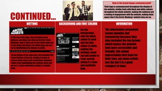
How is the brand image communicated?
Their logo is communicated throughout the display of
the website, similar fonts with black and white colours
throughout the whole website, making the audience get
a feeling of engagement with the website, making them
aware that it the Arctic Monkeys’ website they are on.
For the
background,
only the black
colour is used
and the font
colour is white,
making the
writings stand
out and easier to
read; overall,
giving it a clear
and aesthetic
look.
At the top of the page, they included some
buttons, and when you click on the big ‘Arctic
Monkeys’ logo it takes you to the home page too.
It also helps you figure out which page you are
on by highlighting the buttons in white.
At the bottom of the page they also included the
same buttons at the top, making it easier to
access them even if you scroll down. However,
rather than highlightingthe buttons when you
go on it, it gets underlined, giving it a simple
look.
The information presented
seems genuine and
trustworthy because they
also included the fan forums
which makes the website
look more accessible and
friendly, this shows
appreciation they have for
their fans, not many artists
use the but it is a good
category to have.
CONTINUED…
IMAGES CONTENT LEGAL INFORMATION
They also used the grid system in
this category (showing the events
they have completed), making the
photos available for the viewers,
and made the understanding of
the categories easier by putting
up the title of ‘Now Viewing’ at the
top of the photos.
What is the target audience and how do you know?
The target audience is adolescents mainly because
according to the fans forum I have read that they put a
link of on their website, they seem to be old enough to
write forums about the group and make comments
based on their appearance, shows or discuss what they
could have done better etc.
This means the website was
created by this company, and
they made sure there was no
copyright issues by putting
the logo at the right bottom of
the page.
The content consists of all
the news, attended events
and concerts including
some pictures, videos and
other social media
accounts’ links which are
the main information
needed on an artist’s
website.
JAKE BUGG
LAYOUT USABILITY GRID SYSTEM
How does the website represent the artist?
Lively because of the colourful opening and the
colourful album artwork, and productive as there are
many news of him. He may also be seen ‘new’ in the
industry because he has included only three albums on
the website.
The openingpage is
very colourful and
almost giving the
viewers positive
energy.It includes
his latest album’s
artwork for the
background, his
album’scover and
some links below it
that gives you
differentplatforms
that you can have
the albumform, his
social media links
at the top of the
page.
When you click ‘Enter
Site’ on the opening
page, this opensup
another windowand on
that website Jake Bugg’s
home page appears
where there are his
news and tour dates
includingsome photos
etc.
This is a good way of presenting and promoting his
latest project, as it grabs the attentionand causes
the viewers to explore more.
The usability of this website is
decent however, it sometimes takes
a bit of time to download the pages
or some of the contents because of
the large images it includes. But in
general, all the information on the
webpage is clearly represented and
it is easy to have access to different
links such as ‘Home’ or ‘Store’ on the
website.
This website does not use a grid
system.
CONTINUED…
BUTTONS BACKGROUND AND FONT COLOUR INFORMATION
How is the brand image communicated?
Buttons on this website are
underlined if you click or go on them
which makes it easier to understand
which page you are on.
The logo on the left hand side at the
top of the page takes you to the
opening page which is a great way
of navigating the viewer.
Font used on this website is
clear to see as they are wide
and big. Background for the
opening page is the album
cover’s artwork which
highlights the album
and on the home page the
background is white which
makes the rest of the content
stand out.
We can understand that the
information on this website is
regularly updated because for
example, on the ‘Gigs’ page
where his tour dates take place,
there are no new ones expect the
archived ones which means that
the tour has ended. Also on the
‘Home’ page the news of him
come up, to inform the viewers
about the activities he has done.
The brand image is communicated a lot in the home
and opening pages if we consider the advert, the logo
and the same background (that is for the album
artwork) in all the other pages, promoting the
production.
CONTINUED…
IMAGES CONTENT LEGAL INFORMATION
What is the target audience and how do you know?
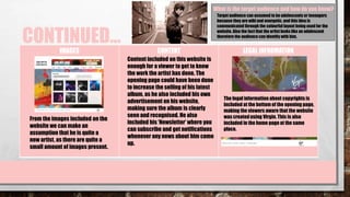
The legal information about copyrights is
included at the bottom of the opening page,
making the viewers aware that the website
was createdusing Virgin. This is also
included in the home page at the same
place.
From the images included on the
website we can make an
assumption that he is quite a
new artist, as there are quite a
small amount of images present.
Content included on this website is
enough for a viewer to get to know
the work the artist has done. The
opening page could have been done
to increase the selling of his latest
album, as he also included his own
advertisement on his website,
making sure the album is clearly
seen and recognised. He also
included his ‘Newsletter’ where you
can subscribe and get notifications
whenever any news about him come
up.
Target audience can assumed to be adolescents or teenagers
because they are wild and energetic, and this idea is
communicated through the colourful layout being used for the
website. Also the fact that the artist looks like an adolescent
therefore the audience can identify with him.
SIA
LAYOUT USABILITY GRID SYSTEM
How does the website represent the artist?
Her website has a unique style, the
background gif is from her latest music video,
the grid system is on the left hand side if you
click on the three lines one under the other,
and she included her social media links on
the right hand side with a bar for
subscriptions. This makes the viewers be
aware of her latest production and to find out
what it is, causes them to explore the page.
The first option on the
list of the grid system,
which says ‘Sia’, is the
home button. In each
link, the website
keeps its gif style
maintained.
For example, when you click on the ‘Music’
button, all of her published albums come up
with the gif on the background.
However, when you
click on the ‘Store’
button it takes you to
another website that is
also Sia’s but has her
merchandise.
Even though sometimes it takes a bit of time
to download the pages when you’re using
the website, it is useful because her social
media including the grid system are
maintained in their places, making it easier
to not get lost on the website.
The use of the colours (mainly black) and font styles (narrow
and sharp) which are aesthetic but gives us the idea that she
may be depressed (as dark colours are associated with
sadness and the font looks a worrisome problem) as the
websites are a representation of the artists.
CONTINUED…
BUTTONS BACKGROUND AND FONT COLOUR INFORMATION
How is the brand image communicated?
Buttons at the left hand
side of the page are for
navigation within the
website.
Buttons at the bottom
right hand side include
the media platforms Sia
is available on.
Information is updated on the
website regularly and we can
understand this from, for
example, if we go on the ‘Tour’
page, it says that ‘There are no
upcoming tour dates’ which
shows that people can trust this
website.
In both of the conditions, buttons
light up when you go on them,
making it easier for the viewers to
see.
Main colours of her page are usually
dark with light coloured fonts so that
they stand out, and the font is also the
same as the font used for her latest
album, again promoting the latest
production, which gives the website
an identity.
The font used consists of narrow and sharp letters which
suggests the tender feeling in a sensitive and sad way almost
giving us the idea that the artist is slightly disturbed. Also the
layout is simple, which furtheremphasises the sadness. This
may communicate that the artist may have personal
problems and she expressing these problems through her
music.
CONTINUED…
IMAGES CONTENT LEGAL INFORMATION
What is the target audience and how do you know?
There is no ‘Photos’ page on this
website which is acceptable for this
particular artist because she stated
that she covers her face for not be well
known or that she has an insecurity
(http://www.dailymail.co.uk/tvshowbiz
/article-2946583/Who-real-Sia-story-
wig-wearing-singer-REFUSES-face-
contemplated-suicide-battling-
alcohol-drug-addiction.html) However,
to keep the aesthetic look of the
website sustained, there are some
images on the ‘News’ the ‘Music’ page.
There is no legal
information included on
this website.
The website’s content includes
what we generally need to know
about the artist, and has
information that we can trust. Other
information that are not given on
the webpage can be found on the
internet such as her latest music
video’s name. However, for people
who don’t know where the gifs at
the background belong to, by
putting her YouTube page at the
bottom can help them find out.
If we only consider the website and its context, we could
say the LGBTQ youth because one of the gifs at the
background had the main characters crying with rainbows
drawn on her check. This could be the representation of
them. But in general the target audience is adolescents.

Website Research

  • 2.
    ARCTIC MONKEYS LAYOUT USABILITYGRID SYSTEM Arctic Monkeys have always owned a simple but an aesthetic style. The layout of their website is similar to their latest albums design, therefore the album cover and design of the website compliment each other. The grid system they have gives the main factors that represent who they are (what people in general know about them and have the access to mainly) such as their YouTube and Spotify channels including a link to buy their latest album and their shop, promoting them on the side – almost like a reminder How does the website represent the artist? The group is represented as organised and aesthetically creative because they used the album’s design to develop their website’s layout and everything that is available on the website is easy to have access to. The website makes it easy to use because of the grid system and the buttons it contains.
  • 3.
    CONTINUED… BUTTONS BACKGROUND ANDFONT COLOUR INFORMATION How is the brand image communicated? Their logo is communicated throughout the display of the website, similar fonts with black and white colours throughout the whole website, making the audience get a feeling of engagement with the website, making them aware that it the Arctic Monkeys’ website they are on. For the background, only the black colour is used and the font colour is white, making the writings stand out and easier to read; overall, giving it a clear and aesthetic look. At the top of the page, they included some buttons, and when you click on the big ‘Arctic Monkeys’ logo it takes you to the home page too. It also helps you figure out which page you are on by highlighting the buttons in white. At the bottom of the page they also included the same buttons at the top, making it easier to access them even if you scroll down. However, rather than highlightingthe buttons when you go on it, it gets underlined, giving it a simple look. The information presented seems genuine and trustworthy because they also included the fan forums which makes the website look more accessible and friendly, this shows appreciation they have for their fans, not many artists use the but it is a good category to have.
  • 4.
    CONTINUED… IMAGES CONTENT LEGALINFORMATION They also used the grid system in this category (showing the events they have completed), making the photos available for the viewers, and made the understanding of the categories easier by putting up the title of ‘Now Viewing’ at the top of the photos. What is the target audience and how do you know? The target audience is adolescents mainly because according to the fans forum I have read that they put a link of on their website, they seem to be old enough to write forums about the group and make comments based on their appearance, shows or discuss what they could have done better etc. This means the website was created by this company, and they made sure there was no copyright issues by putting the logo at the right bottom of the page. The content consists of all the news, attended events and concerts including some pictures, videos and other social media accounts’ links which are the main information needed on an artist’s website.
  • 5.
    JAKE BUGG LAYOUT USABILITYGRID SYSTEM How does the website represent the artist? Lively because of the colourful opening and the colourful album artwork, and productive as there are many news of him. He may also be seen ‘new’ in the industry because he has included only three albums on the website. The openingpage is very colourful and almost giving the viewers positive energy.It includes his latest album’s artwork for the background, his album’scover and some links below it that gives you differentplatforms that you can have the albumform, his social media links at the top of the page. When you click ‘Enter Site’ on the opening page, this opensup another windowand on that website Jake Bugg’s home page appears where there are his news and tour dates includingsome photos etc. This is a good way of presenting and promoting his latest project, as it grabs the attentionand causes the viewers to explore more. The usability of this website is decent however, it sometimes takes a bit of time to download the pages or some of the contents because of the large images it includes. But in general, all the information on the webpage is clearly represented and it is easy to have access to different links such as ‘Home’ or ‘Store’ on the website. This website does not use a grid system.
  • 6.
    CONTINUED… BUTTONS BACKGROUND ANDFONT COLOUR INFORMATION How is the brand image communicated? Buttons on this website are underlined if you click or go on them which makes it easier to understand which page you are on. The logo on the left hand side at the top of the page takes you to the opening page which is a great way of navigating the viewer. Font used on this website is clear to see as they are wide and big. Background for the opening page is the album cover’s artwork which highlights the album and on the home page the background is white which makes the rest of the content stand out. We can understand that the information on this website is regularly updated because for example, on the ‘Gigs’ page where his tour dates take place, there are no new ones expect the archived ones which means that the tour has ended. Also on the ‘Home’ page the news of him come up, to inform the viewers about the activities he has done. The brand image is communicated a lot in the home and opening pages if we consider the advert, the logo and the same background (that is for the album artwork) in all the other pages, promoting the production.
  • 7.
    CONTINUED… IMAGES CONTENT LEGALINFORMATION What is the target audience and how do you know? The legal information about copyrights is included at the bottom of the opening page, making the viewers aware that the website was createdusing Virgin. This is also included in the home page at the same place. From the images included on the website we can make an assumption that he is quite a new artist, as there are quite a small amount of images present. Content included on this website is enough for a viewer to get to know the work the artist has done. The opening page could have been done to increase the selling of his latest album, as he also included his own advertisement on his website, making sure the album is clearly seen and recognised. He also included his ‘Newsletter’ where you can subscribe and get notifications whenever any news about him come up. Target audience can assumed to be adolescents or teenagers because they are wild and energetic, and this idea is communicated through the colourful layout being used for the website. Also the fact that the artist looks like an adolescent therefore the audience can identify with him.
  • 8.
    SIA LAYOUT USABILITY GRIDSYSTEM How does the website represent the artist? Her website has a unique style, the background gif is from her latest music video, the grid system is on the left hand side if you click on the three lines one under the other, and she included her social media links on the right hand side with a bar for subscriptions. This makes the viewers be aware of her latest production and to find out what it is, causes them to explore the page. The first option on the list of the grid system, which says ‘Sia’, is the home button. In each link, the website keeps its gif style maintained. For example, when you click on the ‘Music’ button, all of her published albums come up with the gif on the background. However, when you click on the ‘Store’ button it takes you to another website that is also Sia’s but has her merchandise. Even though sometimes it takes a bit of time to download the pages when you’re using the website, it is useful because her social media including the grid system are maintained in their places, making it easier to not get lost on the website. The use of the colours (mainly black) and font styles (narrow and sharp) which are aesthetic but gives us the idea that she may be depressed (as dark colours are associated with sadness and the font looks a worrisome problem) as the websites are a representation of the artists.
  • 9.
    CONTINUED… BUTTONS BACKGROUND ANDFONT COLOUR INFORMATION How is the brand image communicated? Buttons at the left hand side of the page are for navigation within the website. Buttons at the bottom right hand side include the media platforms Sia is available on. Information is updated on the website regularly and we can understand this from, for example, if we go on the ‘Tour’ page, it says that ‘There are no upcoming tour dates’ which shows that people can trust this website. In both of the conditions, buttons light up when you go on them, making it easier for the viewers to see. Main colours of her page are usually dark with light coloured fonts so that they stand out, and the font is also the same as the font used for her latest album, again promoting the latest production, which gives the website an identity. The font used consists of narrow and sharp letters which suggests the tender feeling in a sensitive and sad way almost giving us the idea that the artist is slightly disturbed. Also the layout is simple, which furtheremphasises the sadness. This may communicate that the artist may have personal problems and she expressing these problems through her music.
  • 10.
    CONTINUED… IMAGES CONTENT LEGALINFORMATION What is the target audience and how do you know? There is no ‘Photos’ page on this website which is acceptable for this particular artist because she stated that she covers her face for not be well known or that she has an insecurity (http://www.dailymail.co.uk/tvshowbiz /article-2946583/Who-real-Sia-story- wig-wearing-singer-REFUSES-face- contemplated-suicide-battling- alcohol-drug-addiction.html) However, to keep the aesthetic look of the website sustained, there are some images on the ‘News’ the ‘Music’ page. There is no legal information included on this website. The website’s content includes what we generally need to know about the artist, and has information that we can trust. Other information that are not given on the webpage can be found on the internet such as her latest music video’s name. However, for people who don’t know where the gifs at the background belong to, by putting her YouTube page at the bottom can help them find out. If we only consider the website and its context, we could say the LGBTQ youth because one of the gifs at the background had the main characters crying with rainbows drawn on her check. This could be the representation of them. But in general the target audience is adolescents.