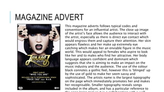
PRODUCT
RESEARCH
DIGIP
AK
The artist uses a strong use of mise-en-scene to emphasise the emotion and
feeling behind the image. The use of beautiful red roses connotes passion and
love, and the way she is lying on them creates a sense of weakness to these
emotions. It is immediately eye catching because of the bright red used, and
makes the audience think about all the different messages she could be
attempting to convey, for example red is known to be a seductive colour and
this could therefore be used to attract a male audience, this is emphasised
through the revealing outfit that the protagonist is wearing, and highlights her
use of sex appeal to capture an audience.It is evident that the colour
red is the reoccurring theme
in this digipak. It suggests
that the album is going to be
emotional and influential.
Rihanna’s bold red lips and
bright red hair support the
name of the album ‘Loud’ and
suggests that she wants to
stand out and create an
impact on the audience. The
typography is very minimal,
with only the album name and
the artist’s name being
featured. The white writing
contrasts against the
Rihanna’s facial expression
looks extremely passionate
and therefore highlights the
work she has put into her
album. Having no eye contact
with the audience makes her
seem mysterious and creates
an enigma about her, which
draws the audience in. Her
simple make up connotes
purity however the bright red
continues to emphasise
passion and seduction.
The image on the actual CD is that of a pale pink rose. Roses
are commonly used as a symbol of romance and love, which
conveys the theme of her album. The pale pink and vibrant
red used on the digipak are used to appeal to a female
audience that could relate to the album and its songs.
WEBS
ITE
The name of the artist is the most prominent thing on the page and
demonstrates that the website is there to promote the artist as much
as possible. The paw print is a well known symbol that Ed Sheeran
uses and this therefore relates to his fans and develops a personal
relationship with them.
The variety of
languages that the
website can be shown
in highlights the
international star
status that the artist
has acquired, and is
therefore catering to
the needs of fans
from all over the
world.
The artist’s latest
album is being
promoted on the front
page in order to gain it
as much publicity and
attention as possible.
The link to download it
on iTunes includes the
development of
technology and also
The reference to social media emphasises the ways in which the
artist is trying to connect with his fans and create personal
relationships. It allows them to feel closer to him and follow what
he is doing. As social media is a defining part of modern society
it is essential that he uses this to please his fans.
The artist’s latest video
for his most recent
song is displayed on the
front page to gain
attention from it and
help to increase sales of
the song. The artist is
featured in this frozen
image which showcases
him and enables the
audience to connect
with him and his music.
The artist’s tour is also
being promoted as it
gives viewers of the
website the
opportunity to buy
tickets.
MAGAZINE ADVERT
This magazine adverts follows typical codes and
conventions for an influential artist. The close up image
of the artist’s face allows the audience to interact with
the artist, especially as there is direct eye contact which
would engross them and capture their attention. Her skin
appears flawless and her make up extremely eye
catching which makes her an enviable figure in the music
world. This would appeal to females who aspire to look
like her and to males who find her attractive. Her body
language appears confident and dominant which
suggests that she is aiming to make an impact on the
music industry and the audience. The use of the colour
black connotes a gothic feel, however this is ‘blinged’ up
by the use of gold to make her seem sassy and
sophisticated. The artists name is the largest typography
on the page which immediately promotes her and makes
her recognisable. Smaller typography reveals songs
included in the album, and has a particular reference to

Product research

  • 1.
  • 2.
    DIGIP AK The artist usesa strong use of mise-en-scene to emphasise the emotion and feeling behind the image. The use of beautiful red roses connotes passion and love, and the way she is lying on them creates a sense of weakness to these emotions. It is immediately eye catching because of the bright red used, and makes the audience think about all the different messages she could be attempting to convey, for example red is known to be a seductive colour and this could therefore be used to attract a male audience, this is emphasised through the revealing outfit that the protagonist is wearing, and highlights her use of sex appeal to capture an audience.It is evident that the colour red is the reoccurring theme in this digipak. It suggests that the album is going to be emotional and influential. Rihanna’s bold red lips and bright red hair support the name of the album ‘Loud’ and suggests that she wants to stand out and create an impact on the audience. The typography is very minimal, with only the album name and the artist’s name being featured. The white writing contrasts against the Rihanna’s facial expression looks extremely passionate and therefore highlights the work she has put into her album. Having no eye contact with the audience makes her seem mysterious and creates an enigma about her, which draws the audience in. Her simple make up connotes purity however the bright red continues to emphasise passion and seduction. The image on the actual CD is that of a pale pink rose. Roses are commonly used as a symbol of romance and love, which conveys the theme of her album. The pale pink and vibrant red used on the digipak are used to appeal to a female audience that could relate to the album and its songs.
  • 3.
    WEBS ITE The name ofthe artist is the most prominent thing on the page and demonstrates that the website is there to promote the artist as much as possible. The paw print is a well known symbol that Ed Sheeran uses and this therefore relates to his fans and develops a personal relationship with them. The variety of languages that the website can be shown in highlights the international star status that the artist has acquired, and is therefore catering to the needs of fans from all over the world. The artist’s latest album is being promoted on the front page in order to gain it as much publicity and attention as possible. The link to download it on iTunes includes the development of technology and also The reference to social media emphasises the ways in which the artist is trying to connect with his fans and create personal relationships. It allows them to feel closer to him and follow what he is doing. As social media is a defining part of modern society it is essential that he uses this to please his fans. The artist’s latest video for his most recent song is displayed on the front page to gain attention from it and help to increase sales of the song. The artist is featured in this frozen image which showcases him and enables the audience to connect with him and his music. The artist’s tour is also being promoted as it gives viewers of the website the opportunity to buy tickets.
  • 4.
    MAGAZINE ADVERT This magazineadverts follows typical codes and conventions for an influential artist. The close up image of the artist’s face allows the audience to interact with the artist, especially as there is direct eye contact which would engross them and capture their attention. Her skin appears flawless and her make up extremely eye catching which makes her an enviable figure in the music world. This would appeal to females who aspire to look like her and to males who find her attractive. Her body language appears confident and dominant which suggests that she is aiming to make an impact on the music industry and the audience. The use of the colour black connotes a gothic feel, however this is ‘blinged’ up by the use of gold to make her seem sassy and sophisticated. The artists name is the largest typography on the page which immediately promotes her and makes her recognisable. Smaller typography reveals songs included in the album, and has a particular reference to