SIMILAR PRODUCT 
RESEARCH 
Amy Myers
Website 
Front Page 
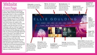
Merchandise store – this 
allows the fans to buy 
things associated with the 
artist. Also allows the 
audience to show their 
passion for the artist. 
Social Network 
(twitter) – this 
means that the fans 
can instantly tweet 
her. 
Social Network 
(instagram)– here the fans 
can look through her 
instagram pictures. 
Tabs– the different 
tabs allow the website 
to be organised as well 
as making it easier for 
the users to find the 
page they want to go 
to. 
Social 
Network 
(twitter) – 
this allows the 
fans to view 
her tweets and 
stay update to 
date with the 
artist. 
Image of the 
artist – makes 
it clear who's 
website you 
are looking at. 
Sign up – here the fans can 
sign up for her newsletter 
which means they will be kept 
up to date with all the latest 
information about the artist. 
Sound cloud and 
Spotify– this means that 
the fans can download 
and listen to her songs. 
Artists name – the large blue 
font with the artists name stands 
out to the audience allowing 
them to see who the artist is. 
Vote now – here the artist is 
encouraging the fans to vote for 
here which they can do by clicking 
on vote now. 
Colour scheme – the colour of the 
website is very girly and links to the pop 
genre of music. It would also appeal to 
the target audience. It also blends very 
well with the font colours and allows 
the fonts to stand out so that the users 
read it. 
Information – here 
shows the artists new 
song that is out given 
the fans information on 
when the single was 
released. 
Here I have analysed Ellie Gouldings 
website. When looking at the webpage 
personally I think it is very successful as 
the colour scheme clearly meets the 
genre of music straight away it is clear 
who's webpage you are on through the 
images and text. There is not too much 
text which draws the reader to the 
images. This also makes it clearer to the 
audience and the text that is on the 
webpage is split up making it organised 
and professional looking. In addition I 
like the layout of the webpage as all the 
tabs are at the top of the page below the 
name of the artist. Then below this are 
the images of the artist which are 
positioned in an organised way. I like the 
use of having a store tab on the 
webpage as this means that if fans are 
looking to find a merchandise of hers 
they would be able to find it on the blog. 
Finally the use of social networking such 
as twitter, instagram, sound cloud 
Spotify mean that the audience can 
keep up to date with the artist.
Website 
Front Page 
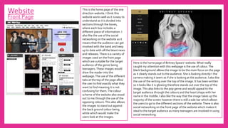
Here is the home page of Britney Spears’ website. What really 
caught my attention with this webpage is the use of colour. The 
black background allows the image to be the main focus on the page 
as it clearly stands out to the audience. She is looking directly t the 
camera making it seem as if she is looking at the audience. I also like 
the use of the writing over the top of the image. It has been written 
so it looks like it is glowing therefore stands out over the top of the 
image. This also links to the pop genre and would appeal to the 
target audience through the colours and the heart shape with her 
name in the middle. I also like the way that the image takes up the 
majority of the screen however there is still a side bar which allows 
the users to go to the different sections of the website. There is also 
social networking on the front page of the website which makes it 
ideal to the target audience as many teenagers are involved in using 
social networking. 
This is the home page of the one 
direction website. I think this 
website works well as it is easy to 
understand as it is divided into 
sections through the boxes, 
where each box includes a 
different piece of information. I 
also like the use of the social 
networking on the website as it 
means that the audience can get 
involved with the band and keep 
up to date with all the latest news 
and releases. There is a variety of 
images used on the front page 
which are suitable for the target 
audience of the genre being 
teenagers. These images would 
draw the reader into the 
webpage. The use of the different 
tabs at the top of the page allow 
the user to find exactly what they 
want to find meaning it is not 
confusing for them. The colour 
scheme of the website also stood 
out to me through the use of the 
opposing colours. This also allows 
the images to stand out against 
the back ground colour being 
white which would make the 
users look at the images.

Similar product research

  • 1.
  • 2.
    Website Front Page Merchandise store – this allows the fans to buy things associated with the artist. Also allows the audience to show their passion for the artist. Social Network (twitter) – this means that the fans can instantly tweet her. Social Network (instagram)– here the fans can look through her instagram pictures. Tabs– the different tabs allow the website to be organised as well as making it easier for the users to find the page they want to go to. Social Network (twitter) – this allows the fans to view her tweets and stay update to date with the artist. Image of the artist – makes it clear who's website you are looking at. Sign up – here the fans can sign up for her newsletter which means they will be kept up to date with all the latest information about the artist. Sound cloud and Spotify– this means that the fans can download and listen to her songs. Artists name – the large blue font with the artists name stands out to the audience allowing them to see who the artist is. Vote now – here the artist is encouraging the fans to vote for here which they can do by clicking on vote now. Colour scheme – the colour of the website is very girly and links to the pop genre of music. It would also appeal to the target audience. It also blends very well with the font colours and allows the fonts to stand out so that the users read it. Information – here shows the artists new song that is out given the fans information on when the single was released. Here I have analysed Ellie Gouldings website. When looking at the webpage personally I think it is very successful as the colour scheme clearly meets the genre of music straight away it is clear who's webpage you are on through the images and text. There is not too much text which draws the reader to the images. This also makes it clearer to the audience and the text that is on the webpage is split up making it organised and professional looking. In addition I like the layout of the webpage as all the tabs are at the top of the page below the name of the artist. Then below this are the images of the artist which are positioned in an organised way. I like the use of having a store tab on the webpage as this means that if fans are looking to find a merchandise of hers they would be able to find it on the blog. Finally the use of social networking such as twitter, instagram, sound cloud Spotify mean that the audience can keep up to date with the artist.
  • 3.
    Website Front Page Here is the home page of Britney Spears’ website. What really caught my attention with this webpage is the use of colour. The black background allows the image to be the main focus on the page as it clearly stands out to the audience. She is looking directly t the camera making it seem as if she is looking at the audience. I also like the use of the writing over the top of the image. It has been written so it looks like it is glowing therefore stands out over the top of the image. This also links to the pop genre and would appeal to the target audience through the colours and the heart shape with her name in the middle. I also like the way that the image takes up the majority of the screen however there is still a side bar which allows the users to go to the different sections of the website. There is also social networking on the front page of the website which makes it ideal to the target audience as many teenagers are involved in using social networking. This is the home page of the one direction website. I think this website works well as it is easy to understand as it is divided into sections through the boxes, where each box includes a different piece of information. I also like the use of the social networking on the website as it means that the audience can get involved with the band and keep up to date with all the latest news and releases. There is a variety of images used on the front page which are suitable for the target audience of the genre being teenagers. These images would draw the reader into the webpage. The use of the different tabs at the top of the page allow the user to find exactly what they want to find meaning it is not confusing for them. The colour scheme of the website also stood out to me through the use of the opposing colours. This also allows the images to stand out against the back ground colour being white which would make the users look at the images.