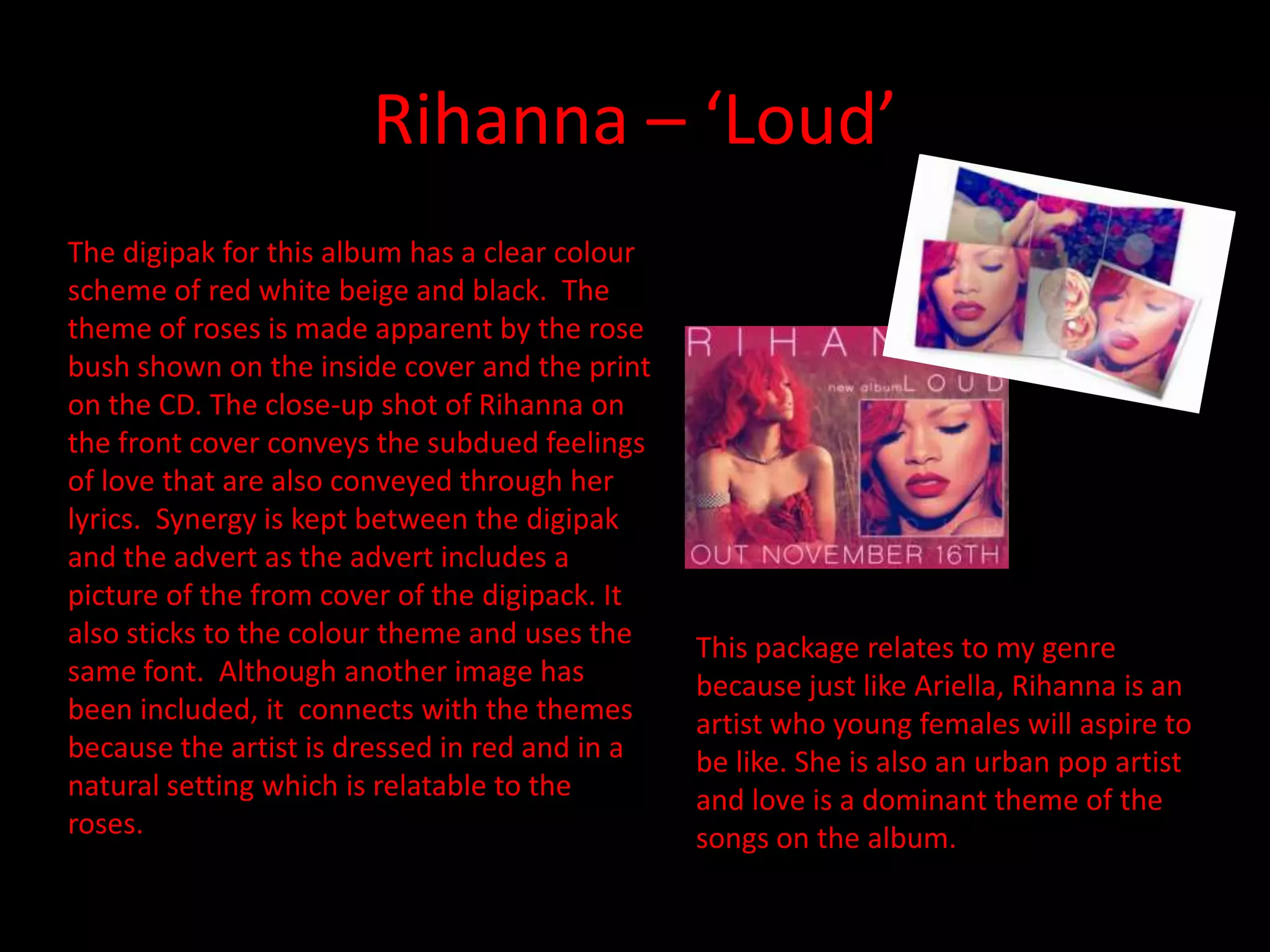
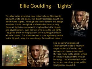
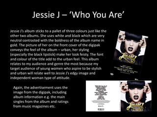
Rihanna – ‘Loud’
The digipak for this album has a clear colour
scheme of red white beige and black. The
theme of roses is made apparent by the rose
bush shown on the inside cover and the print
on the CD. The close-up shot of Rihanna on
the front cover conveys the subdued feelings
of love that are also conveyed through her
lyrics. Synergy is kept between the digipak
and the advert as the advert includes a
picture of the from cover of the digipack. It
also sticks to the colour theme and uses the
same font. Although another image has
been included, it connects with the themes
because the artist is dressed in red and in a
natural setting which is relatable to the
roses.

This package relates to my genre
because just like Ariella, Rihanna is an
artist who young females will aspire to
be like. She is also an urban pop artist
and love is a dominant theme of the
songs on the album.e
Ellie Goulding – ‘Lights’
This album also presents a clear colour scheme (dominantly
gold with white and black). This directly corresponds with the
album name ‘Lights’. Although the colour scheme and design
are quite simple, the digipak is effective because a strong
theme of lights is represented throughout both the digipak
and advertisement. Even the font style looks like LED lights.
The glitter effect on the picture of Ellie Goulding also ties in
with the theme. The advertisement is once again very similar
to the digipack, using the same image, font and font colours.
Eliie Goulding’s digipak and
advertisement relate to my main
target audience of mid to late
teenage girls because once again
they can relate to the artist’s styling
in these products and the lyrics of
her songs. This album relates more
to the pop side of my genre as Ellie
Goulding is a pop artist.
Jessie J – ‘Who You Are’
Jessie J’s album sticks to a pallet of three colours just like the
other two albums. She uses white and black which are very
neutral contrasted with the boldness of the album name in
gold. The picture of her on the front cover of the digipak
conveys the feel of the album – urban, her styling
(especially the black lipstick) make her look feisty. The font
and colour of the title add to the urban feel. This album
relates to my audience and genre the most because my
target audience of young women who aspire to be stylish
and urban will relate well to Jessie J’s edgy image and
independent woman type of attitude.

Again, the advertisement uses the
image from the digipak, including
album information e.g. the main
singles from the album and ratings
from music magazines etc.
My Findings
• Artists stick to a colour pallet of maximum 3
colours
• Digipaks and album adverts usually include a
theme that runs through all music videos but
is especially relatable to the main single e.g
Ellie Goulding ‘Lights’
• The artist connects to their audience and
music genre through the aesthetics of their
digipak and album advert

Leila analysing digipaks

  • 1.
    Rihanna – ‘Loud’ Thedigipak for this album has a clear colour scheme of red white beige and black. The theme of roses is made apparent by the rose bush shown on the inside cover and the print on the CD. The close-up shot of Rihanna on the front cover conveys the subdued feelings of love that are also conveyed through her lyrics. Synergy is kept between the digipak and the advert as the advert includes a picture of the from cover of the digipack. It also sticks to the colour theme and uses the same font. Although another image has been included, it connects with the themes because the artist is dressed in red and in a natural setting which is relatable to the roses. This package relates to my genre because just like Ariella, Rihanna is an artist who young females will aspire to be like. She is also an urban pop artist and love is a dominant theme of the songs on the album.e
  • 2.
    Ellie Goulding –‘Lights’ This album also presents a clear colour scheme (dominantly gold with white and black). This directly corresponds with the album name ‘Lights’. Although the colour scheme and design are quite simple, the digipak is effective because a strong theme of lights is represented throughout both the digipak and advertisement. Even the font style looks like LED lights. The glitter effect on the picture of Ellie Goulding also ties in with the theme. The advertisement is once again very similar to the digipack, using the same image, font and font colours. Eliie Goulding’s digipak and advertisement relate to my main target audience of mid to late teenage girls because once again they can relate to the artist’s styling in these products and the lyrics of her songs. This album relates more to the pop side of my genre as Ellie Goulding is a pop artist.
  • 3.
    Jessie J –‘Who You Are’ Jessie J’s album sticks to a pallet of three colours just like the other two albums. She uses white and black which are very neutral contrasted with the boldness of the album name in gold. The picture of her on the front cover of the digipak conveys the feel of the album – urban, her styling (especially the black lipstick) make her look feisty. The font and colour of the title add to the urban feel. This album relates to my audience and genre the most because my target audience of young women who aspire to be stylish and urban will relate well to Jessie J’s edgy image and independent woman type of attitude. Again, the advertisement uses the image from the digipak, including album information e.g. the main singles from the album and ratings from music magazines etc.
  • 4.
    My Findings • Artistsstick to a colour pallet of maximum 3 colours • Digipaks and album adverts usually include a theme that runs through all music videos but is especially relatable to the main single e.g Ellie Goulding ‘Lights’ • The artist connects to their audience and music genre through the aesthetics of their digipak and album advert