Download to read offline

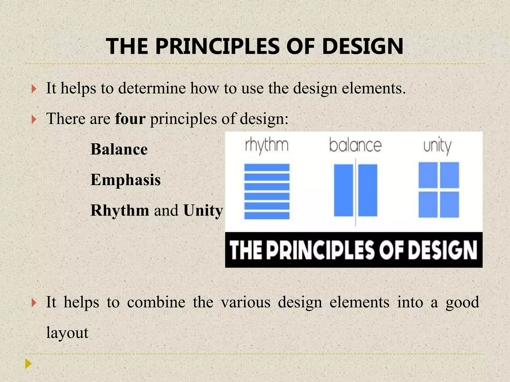


The document discusses the four principles of design: balance, emphasis, rhythm, and unity. It defines each principle and provides examples. Balance involves symmetrical or asymmetrical placement of visual elements. Emphasis draws the eye to the focal point. Rhythm is created through repetition of elements with variation. Unity makes all elements seem cohesive through consistent use of color, style, and layout. Together these principles help create effective visual designs.


