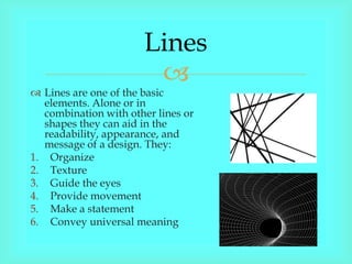
The document discusses key design elements including lines, shape, form, color, texture, depth, light, direction, mass, tone, value, space, balance, emphasis, proportion, repetition, unity, contrast, harmony, proximity, and variety. It describes how each element can be used alone or combined with other elements to achieve different effects in visual design works.
The presentation will give you a good understanding about the significance, meaning and the types of designing elements and principles. For more visit our website https://www.admecindia.co.in/.
Walls, Pillars and Beams: A 3D Decomposition of Quality Anomalies (vissoft2016)Yuriy Tymchuk
Quality rules are used to capture important implementation and design decisions embedded in a software system’s architecture. They can automatically analyze software and assign quality grades to its components. To provide a meaningful evaluation of quality, rules have to stay up-to-date with the continuously evolving system that they describe. However one would encounter unexpected anomalies during a historical overview because the notion of quality is always changing, while the qualitative evolution analysis requires it to remain constant.
To understand the anomalies in a quality history of a real-world software system we use an immersive visualization that lays out the quality fluctuations in three dimensions based on two co-evolving properties: quality rules and source code. This helps us to identify and separate the impact caused by the changes of each property, and allows us to detect significant mistakes that happened during the development process.
A basic guide to design composition,
why and how.
_
presented in one of my design introduction class circa 2009.
Please take note:
*These slides are not a comprehensive / in depth but more towards a basic 101 guide of whats behind the importance of basic design composition and how to create it.
*All images are copyrighted and owned to their respective owner (as mentioned in the URL links).
*Slides and images are used for non profit education purposed only.
Basic design & visual arts (Elements of design)Ar.Shakti Nanda
Lecture and presentation on Elements of Design for students of architecture, fine art and photography. semester - I (2015), Sri Sri University, Odisha. 7+1 Elements of design explained (Point, Line, Shapes, Space, Form, Texture, Value, Colour) in details with examples for better understanding. Content compiled from books and internet.
This slideshow provides an introduction to graphic design. It illustrates the growth of it, especially during the Web 2.0 age. This was presented by Viraj and Veena, our designers at MindTree Limited.
The slideshow uses images and examples from external sources. The respective owners hold the copyright.
Graphic Design Elements and Principles - Tips and inspirationShahria Hossain
Graphic Design Elements and Principles - Tips and inspiration.In this Slide i tried to share some tips and inspiraion and some major discuss about Graphic Design principles and elements.I hope you enjoy it all.
Between Filth and Fortune- Urban Cattle Foraging Realities by Devi S Nair, An...Mansi Shah
This study examines cattle rearing in urban and rural settings, focusing on milk production and consumption. By exploring a case in Ahmedabad, it highlights the challenges and processes in dairy farming across different environments, emphasising the need for sustainable practices and the essential role of milk in daily consumption.
Hello everyone! I am thrilled to present my latest portfolio on LinkedIn, marking the culmination of my architectural journey thus far. Over the span of five years, I've been fortunate to acquire a wealth of knowledge under the guidance of esteemed professors and industry mentors. From rigorous academic pursuits to practical engagements, each experience has contributed to my growth and refinement as an architecture student. This portfolio not only showcases my projects but also underscores my attention to detail and to innovative architecture as a profession.
Unleash Your Inner Demon with the "Let's Summon Demons" T-Shirt. Calling all fans of dark humor and edgy fashion! The "Let's Summon Demons" t-shirt is a unique way to express yourself and turn heads.
https://dribbble.com/shots/24253051-Let-s-Summon-Demons-Shirt
You could be a professional graphic designer and still make mistakes. There is always the possibility of human error. On the other hand if you’re not a designer, the chances of making some common graphic design mistakes are even higher. Because you don’t know what you don’t know. That’s where this blog comes in. To make your job easier and help you create better designs, we have put together a list of common graphic design mistakes that you need to avoid.
Book Formatting: Quality Control Checks for DesignersConfidence Ago
This presentation was made to help designers who work in publishing houses or format books for printing ensure quality.
Quality control is vital to every industry. This is why every department in a company need create a method they use in ensuring quality. This, perhaps, will not only improve the quality of products and bring errors to the barest minimum, but take it to a near perfect finish.
It is beyond a moot point that a good book will somewhat be judged by its cover, but the content of the book remains king. No matter how beautiful the cover, if the quality of writing or presentation is off, that will be a reason for readers not to come back to the book or recommend it.
So, this presentation points designers to some important things that may be missed by an editor that they could eventually discover and call the attention of the editor.
Can AI do good? at 'offtheCanvas' India HCI preludeAlan Dix
Invited talk at 'offtheCanvas' IndiaHCI prelude, 29th June 2024.
https://www.alandix.com/academic/talks/offtheCanvas-IndiaHCI2024/
The world is being changed fundamentally by AI and we are constantly faced with newspaper headlines about its harmful effects. However, there is also the potential to both ameliorate theses harms and use the new abilities of AI to transform society for the good. Can you make the difference?
1. Lines
Lines are one of the basic
elements. Alone or in
combination with other lines or
shapes they can aid in the
readability, appearance, and
message of a design. They:
1. Organize
2. Texture
3. Guide the eyes
4. Provide movement
5. Make a statement
6. Convey universal meaning
2. Shape (2D)
Shape is one of the basic
elements of design.
Alone or in combination
with other shapes or lines
they can convey
universal meanings as
well as guide the eye or
organize information.
The three basic types of
shapes are geometric,
natural, and abstract.
3. Form (3D)
Form is the three-
dimensionality of an
object. Shape is only
two-dimensional; form is
three dimensional. You
can hold a form; walk
around a form and in
some case walk inside a
form.
4. Color
Color affects us emotionally,
with different colors evoking
different emotions
1. Hue: refers to the names of
primary colors, red green,
blue.
2. Value: lightness and darkness
of the color
3. Intensity :the purity or
saturation of the color
4. Monochromatic color: uses of
one color where only value of
the color changes.
5. Texture
Texture is always a part of
our designs whether
intentional or not. It is the
visual or tactile surface
characteristics of a piece.
Visual textures through the
arrangements of lines and
shapes or the use of
photographic images of
specific surfaces.
6. Depth (Perspective)
The allusion of depth:
1. Size and vertical location- closer objects being larger and
smaller objects being smaller, also we perceive objects
that are higher on the page and smaller as being further
away.
2. Overlapping- when objects are partially obscured by
other objects in front of them.
3. Detail(aerial or atmospheric perspective)- uses color
value contrasts to show depth.
4. Linear perspective (converging lines)- all lines will
converge on a common point on the horizon called the
vanishing point.
7. Light
When light from a single
direction hits an object is in
shadow. Light and dark
areas within an image
provide contrast that can
suggest volume. Factors
that can affect our feelings
towards an image include
the direction of the light
source, from above or
below, and the gentleness
or abruptness of the half
tones.
8. Direction (motion)
To show direction we
use:
1. Anticipated
movement
2. Fuzzy outlines
3. Multiple images
4. Optical movement
5. Optical illusions
6. Rhythm and
movement
9. Mass (Visual Weight)
Everything has physical mass.
The physical mass or size is
the actual dimensions of the
piece:
1. Height
2. Width
3. thickness/weight
4. Depth( of 3D objects)
10. Tone (Black and White)
Tone can be regarded as
value both terms refer to
the various degrees of
lightness or darkness.
1. Shade: a color (hue) with
black added.
2. Tint: a color (hue) with
white added
3. Tone : a color (hue) with
grey added
4. Value: the degree of
lightness or darkness in
colors.
11. Value
refers to
Vales
the relative
lightness or
darkness of a
certain area.
Value can be
used for
emphasis.
Variations in
values are
used to create
a focal point
for the design
of a picture.
12. Space (Positive and
Negative)
Space is the area provided for
a particular purpose. It may
have two dimensions or three
dimensions. There are two
type of space: positive and
negative space. Positive space
refers to the space of a shape
representing the subject
matter. Negative space refers
to space around and between
the subject matter.
13. Balance
Symmetrical: balance is
easiest to see in perfectly
centered compositions or
those with mirror images.
Asymmetrical: design is
typically off-center or
created with an odd or
mismatched number of
different elements.
Redial: designs the elements
radiate from or swirl around
in a circular or spiral path.
14. Emphasis
Emphasis in design provides the focal point for the piece.
It is a way of making the element the most important
stand out in the design.
15. Proportion (Scale)
Proportion refers to the
relative size and scale of
the various elements in a
design. The issue is the
relationship between
objects, or parts, of a
whole. This means that it
is necessary to discuss
proportion in terms of the
context or standard used
to determine proportions.
16. Repetition
(Rhythm/Pattern)
Newsletters, magazines,
brochures, annual
reports, and book often
have many visual
elements: columns of
text, headlines, photos,
illustrations, pull-quotes,
etc. Grids allow the
designer to build page-
to-page consistency into
these documents.
17. Unity
Unity is a way to
make objects in a
piece seem as if
they are related to
each other. There
are many ways that
this can be
achieved.
1. Proximity
2. Repetition
3. Continuation
18. Contrast
Contrast occurs when two
elements are different. The
grater the different the grater
the contrast. The key to
working with contrast is to
make sure the different are
obvious. Four common
methods of creating contrast
are by using differences in
size, value, color, and type.
19. Harmony
Harmony is painting is
visually satisfying effect of
combining similar, related
elements, e.g. adjacent
colors on the color wheel,
similar shapes etc.
The principle of design
concerned with combining
similar art element to create
a pleasing image.
20. Proximity
One of the easiest ways to
create a visual structure and
give your piece an organized
feel is to space items according
to their relation to one another.
This is called the rule of
proximity, and it simply
means that related items
should appear closer together
then items that are not related.
21. Variety
Variety means “ to change the
character” of an element, to make it
different. Varying the elements
creates variety. Ways to vary
element include:
1. Lines-thinness, value, color,
angle, length.
2. Shape-size, color, orientation and
texture type.
3. Color- hue, value, saturation.
4. Value-darkness, lightness, high-
key, low-key, value contrast.
5. Texture-rough, smooth.