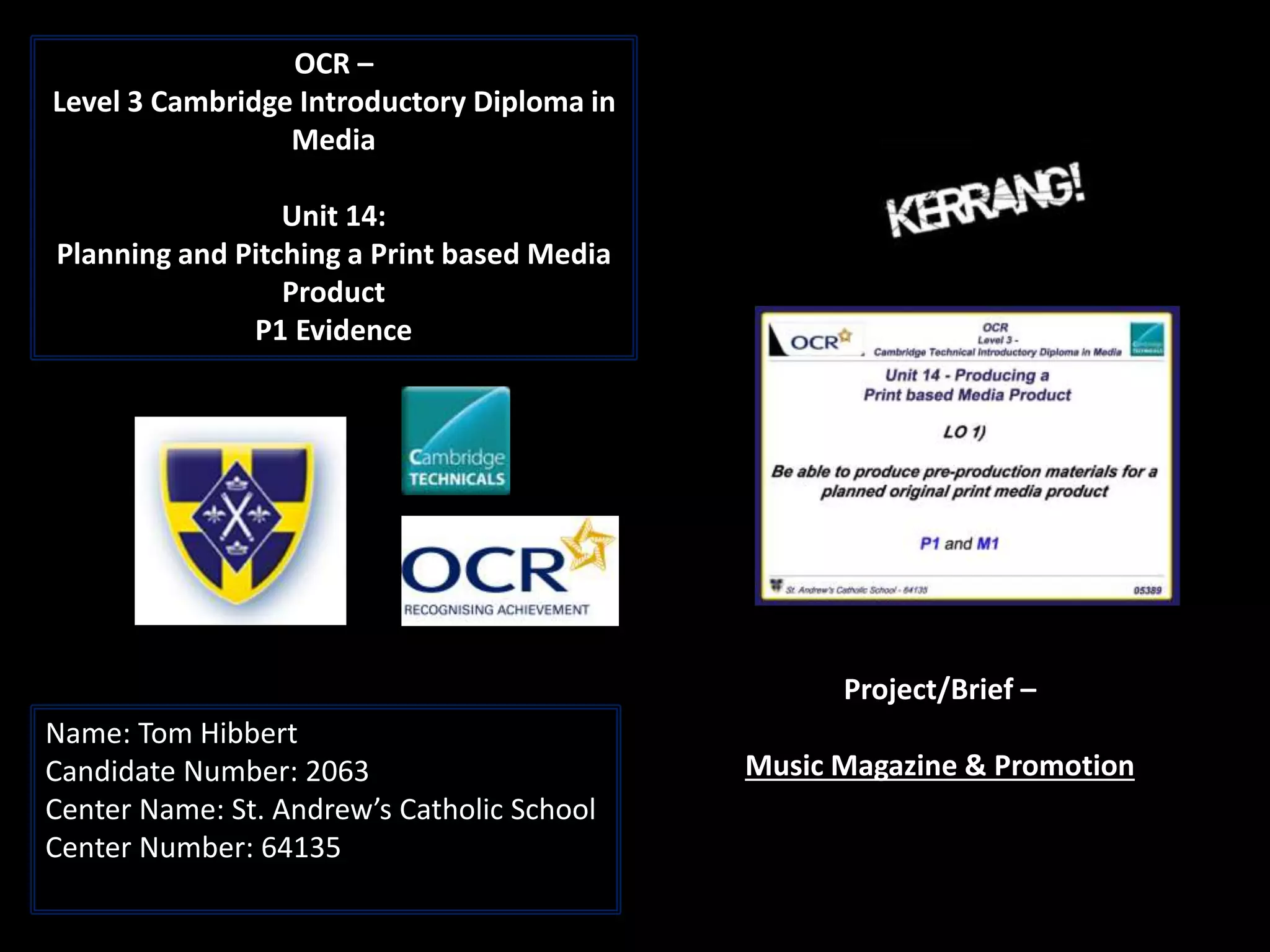
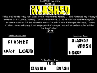
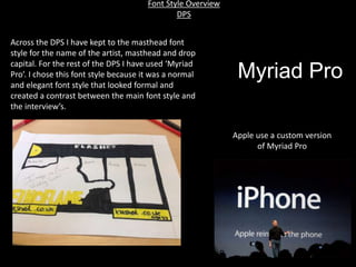
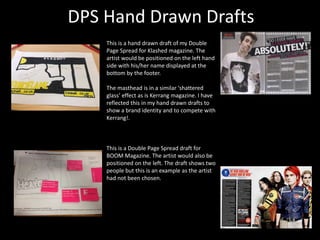
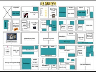
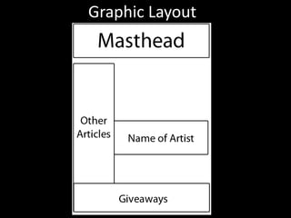
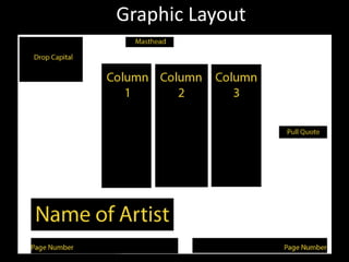
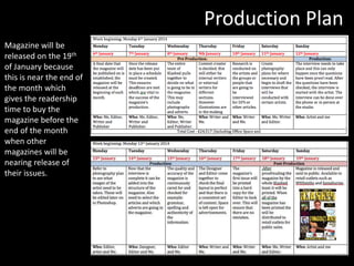
1. OCR –
Level 3 Cambridge Introductory Diploma in
Media
Unit 14:
Planning and Pitching a Print based Media
Product
P1 Evidence
Name: Tom Hibbert
Candidate Number: 2063
Center Name: St. Andrew’s Catholic School
Center Number: 64135
Project/Brief –
Music Magazine & Promotion
3. Font Style Overview
Masthead
Insomnia FontBroken Stick Font
Font
These are all quite ‘edgy’ font styles which are similar to Kerrang!. I have narrowed my font style
down to similar ones to Kerrang! because they will battle the competition with Kerrang well.
The connotations of Klashed resemble musical sounds as does Kerrang!’s masthead, I chose
Klashed because this way it will keep up with Kerrang!’s competitive audience that will be
battling Klashed.
Broken Glass Font
4. Font Style Overview
DPS
Across the DPS I have kept to the masthead font
style for the name of the artist, masthead and drop
capital. For the rest of the DPS I have used ‘Myriad
Pro’. I chose this font style because it was a normal
and elegant font style that looked formal and
created a contrast between the main font style and
the interview’s.
Myriad Pro
Apple use a custom version
of Myriad Pro
5. Hand Drawn Drafts
This is a hand drawn draft of my front cover
for Klashed magazine. The headlines for the
articles inside are displayed on the left
hand side of the page. This is also used in
Kerrang magazine on their front covers.
The masthead is in a similar ‘shattered
glass’ effect as is Kerrang magazine. I have
reflected this in my hand drawn drafts to
show that I intend to use the same effect
on my masthead for Klashed.
This is a hand drawn draft of my front cover
for BOOM magazine. In the drawn draft you
can see that there is a fire effect across the
masthead. Fire is usually associated with
rock music, this means that the effect is
relevant and useful in demonstrating the
genre.
6. DPS Hand Drawn Drafts
This is a hand drawn draft of my Double
Page Spread for Klashed magazine. The
artist would be positioned on the left hand
side with his/her name displayed at the
bottom by the footer.
The masthead is in a similar ‘shattered
glass’ effect as is Kerrang magazine. I have
reflected this in my hand drawn drafts to
show a brand identity and to compete with
Kerrang!.
This is a Double Page Spread draft for
BOOM Magazine. The artist would also be
positioned on the left. The draft shows two
people but this is an example as the artist
had not been chosen.
7. Colour Scheme/House Style
Colour Scheme
I have chosen to use this colour scheme
because it reflects different types of rock
music.
The dark purple is associated with Rock Pop.
The purple symbolises brightness and pop and
the dark element in the purple always refers to
rock which is known for being dark.
I have chosen black because it represents pure
rock and the yellow colour to show
modernised rock.
9. Mood Board Conclusion
Artists
To conclude, my mood board has influenced me to select what bands I would like
to include in my magazine. I have three bands on my Mood Board. Green Day,
Tonight Alive and My Chemical Romance. These are not only personal favoured
artists but artists that represent rock music and have been in the rock music
business for a long time. To feature them in the magazine would show the
dedication to rock music that my target audience is looking for.
Font
To conclude my mood board and the ideas that it has influenced me on about
font the three fonts that I have narrowed my choice to are called ‘Broken Stick’,
Broken Glass’ and ‘Insomnia’. Just the name of the fonts have rock element and
these choices are based on font used by two of the artists themselves. Green Day
uses ‘Insomnia’ font for their poster sand general name as it appears cracked and
broken but is still able to read. My Chemical Romance uses similar text to ‘Broken
Stick’ but is not fully readable. ‘Broken Glass’ was chosen as one of my choices
for font as well not because of other artists but because I like the way that the
Broken Stick font looked and Broken Glass provided a similar look but with a
more easy to read element.
Theme
This mood board of ideas has influenced my choice of theme not to be a contrast
in dark rock but to make my magazine a unique rock magazine in a modern
timeline with different appearances in the rock music genre.
10. Draft Article
Popular artist ‘Fingoflame’ also known as David Armitage has recently released his album ‘Don’t let the flame go out’.
‘Don’t let the flame go out’ burnt 10 million copies into its fans’ hearts. The 17 year old rock artist has made a name for
himself ever since he started recording music and releasing it to his neighbourhood. It wasn’t long until he was discovered
through popular media site ‘Youtube’ which he still claims today was his “Guardian angel”. Fingoflame can be found in the
Klashed charts with his second album ever made. As a new magazine, Fingoflame has given us the luxury of hosting his
first ever interview to be featured in a magazine. The young artist has brought something new to the rock genre and has
the full support of some of the biggest rock artists to exist. He is an inspirational character and is here exclusively for you.
The editor of Klashed magazine Tom Hibbert had the pleasure of meeting the modern rock artist.
TH: Thank you for taking the time to be interviewed today, I can honestly say that we are as nervous as you are so
hopefully this first interview for both of us will be one to remember.
FF: No problem, I always make time for fans and giving back to the audience as they’re the ones who made me who I am
today.
TH: So you really appreciate your fans then?
FF: Oh yeah, of course! Not enough people in this industry give credit to those who got them to where they are today and
I for one am not one of those people.
TH: “Not one of those people”. One of the people who discredit their fans, or not someone who got you to where you are
now?
FF: Both to be honest, my past was always daunting and still hangs over me to this day like one of those cartoon clouds.
[Both chuckle]
TH: Well I can see that you are just as nice as the rumour has it. Anyway, back to the album. The single you released and is
featured on the album called ‘love like a matchstick’. Is it just me or is the album very fire based [chuckles]
FF: [Smirks] It is because that’s how I depict love like fire, deadly, heated and has to end.
TH: Is this based on past experience?
FF: [Doesn’t answer but looks at the floor]
TH: Never the less it is a great song and you really must have spent a long and difficult time on the song.
FF: [Lifting his head] The difficult part is putting yourself in the song and picturing the lyrics as your life and then singing
them as you would feel in that position.
TH: That’s a really emotional and powerful method. Well that’s all we time for but thanks for being here with us
[Handshake]
16. Prop Sourcing
Before I took the pictures for the front cover and double
page spread I needed to ensure that I would be able to
use the equipment I needed. I already had the coat and
black paint as I owned them. I needed to gain access to a
camera for these pictures. In this case I needed to source
the camera from somewhere. I looked online into buying
a camera and found various prices and found that the
best price was on www.amazon.co.uk.
Screenshot
of the
camera for
sale on
www.amazo
n.co.uk
17. Permission Needed
I did not have a camera so I needed to
borrow one from school. I obviously
could not just take one so I needed to
contact my media teacher who
possessed the camera, as you can see in
the screenshots above I asked if I was
able to borrow one and the reply was
when I needed it.
I referred to my locations recce and
because I planned when I would need
the images taken I was able to give him
a time for when I could use them, this
was not a problem and I was able to use
the cameras with the granted
permission from my teacher.
18. Prop List
Prop List
Costume
Coat
Black Jeans
Black shoes
Eye shadow (Black)
Technical Equipment
Canon SLR Camera ( I can use this
camera from school)
Lens Cap (from school)
Battery(from school)
Charger for camera battery(from
school)
Tripod(from school)
SD Card(from school)
Other props
Guitar (£97.00)
Before I took the images for my front cover and
double page spread I had to make an extensive list of
the ‘props’ and equipment needed to do so. On the
prop list there are three sections for Costume,
Technical equipment and other props.
The advantage to making this is list is that it will make
me prepared for the shoot and this way I can tell the
artist what he needs to wear and what he will be
wearing.
I included smaller less important details such as the
lens cap and SD card because if the lens cap is missing
then the camera could be damaged and without an SD
card I would not be able to take these pictures.
This is the camera I
used for the images.
19. Images of influence
I will use the front covers below as influence
because of their layouts. On my magazine I
will recreate the side bar on the left hand side
of the Kerrang magazine, I will do this because
I think that the side bar with the articles are
professional and display the content clearly.
Another thing I will do from influence of these
magazines are the shot type for the artist used
in them. The shot types are full body, I will use
a full body shot out of influence and because
this way the audience can see the whole
artist, this suggests that the audience will
know everything about the artists after
reading it and that they are going to ‘see’
everything to him.
20. Production Plan
Magazine will be
released on the 19th
of January because
this is near the end of
the month which
gives the readership
time to buy the
magazine before the
end of the month
when other
magazines will be
nearing release of
their issues.
21. Front Cover
My front cover is similar and
can be related to Kerrang’s
as there are elements that
can be found on both
magazine pages.
Barcode
The barcodes for both magazines
are in the same place. They both
contain the price, web address and
two bars.
Headline
The main headline and Kerrang’s main
headline are positioned in the middle and
both got mild shadow effects.
Other articles
The other articles that are
going to be featured in both
magazines are written in a
list. I chose to do this on my
magazine because I liked
how straight forward it was
to inform the audience of
the content before they have
started to read the
magazine.
Steve Neale
I am going to repeat these
conventions from the Kerrang
magazine to keep up with the
competition of Kerrang as well
as to try and make Klashed
appeal to their readership.
22. DPS
Artist Photo
Both photos show the emotion on their faces
which draws the reader in to try and find out
why they are posing in a traumatic sense.
Drop Capital
Both drop capitals are in the main focused
colour in the magazine’s colour scheme, this
shows consistency which gives the magazine
an overall professional appearance for a rock
magazine.
Pull Quote
The pull quote for the Klashed DPS is meant to
attract the readers attention and encourage
them to feel empathy for the artist.
Steve Neale
I will be repeating the pull quote and
other features because this will convey
similarity between the magazines so
hopefully the people that read Kerrang
will read Klashed.
23. Conclusion
In this LO I covered the pre-production material
that I created and prepared for each magazine
idea. This included the photography plan, the
hand drawn drafts, flat plans, mood boards and
graphic layouts.
For LO1 I also had to discuss my images of
influence and what lead me to create the final
magazine pages. LO1 is about the build up to
making the final pages including the plan for the
actual production for the first issue of Klashed.