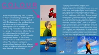
Question 2
How effective is the combination of your main product
and ancillary texts?
MY DIGIPACK ADVERT
My aim for my product was to
create something that linked the
music video and the CD cover
together, because I believe that
it is important to replicate the
artists style, even in the
advertising. Using the correct
‘Pop’ genre themes onto my
Digipack and poster was also
my main goal, as my target
audience are particularly
interested in ‘pop’. I also
achieved a consistency
throughout the advert and Digi
Pack, in order to create a sense
of brand. I achieved this
continuity through the colour,
font and imagery.
The Positioning of the Artist
In many Pop front album covers, the artists are positioned at the centre of the frame. This is because multiple ‘Pop’ artists
try to present a strong and extravagant image. The fact that most artists are positioned at the centre of the cover, also
presents them to be the main focus of the album. In my album cover, I also used the model to be positioned at the centre of
the frame, because my aim was to have the artist to draw focus to the audience, as well as to create a powerful appeal and
image, which in turn the audience may recognise and remember. For example, Lena del Rey’s album has become
recognisable by the use of the head to shoulder shot. This concept has thus been replicated in promoting many of her
singles and albums.
In Lana del Rey and Ross’s album, the use of the low angle shot and their eye line focus looking directly at the frame not
only draws focus onto the artists, but it also allows the audience to connect to them, due to the direct address. In my Digi
pack, I used this similar concept by positioning an extreme close up of the artist’s face as she looks directly at the camera. I
hope this was effective as it forces the audience to be drawn to her and it also emphases the powerful appeal.
However, for the front cover I specifically chose to use the artist to look away from the frame and instead present an
exaggerative pose. This is similarly done in albums such as Paloma Faith and Lord’s album. In Faith’s album, the long shot
allows us to notice the model’s extravagant costume and pose - reinforcing the artist’s sophisticated and unique image.
Similarly Lorde, is presents in the midst of dancing. These poses present the artist powerful and their own, individual
appeal.
4
C O L O U R B L A C K and W H I T E+
5
C O L O U R
When designing my Digi Pack, I wanted
to ensure I was keeping with the genre and
style of advertising that is is associated
with. The key aspect that stood out during
my research was the use of colour.
Although each cover is unique to the
artists, in my research I narrowed it down
to a group of pop/pop soul albums that use
two main colour themes that is used
throughout the album. The background is
always either a block of one or two
colours or mixed with similar shades of
colour. The albums I particularly
researched used a simple colour scheme,
in order to make the album stand out and
draw attention to the audience.
These particular examples of using one or two
main blocks of colour is replicated in my
DigiPack - whereby I used a light blue colour to be my main
colour theme, along side with hints of yellow. Similarly in
John Legends album (1), he used pink and red colours,
Charlie Puth’s (2) used only yellow and green and Kimbra
(3) used a rich blue and golden yellow .These use of simple
colours creates a sophisticated and classy look, which was
my aim for the album cover as it is similar to the music
video. My decision in using the golden colour of the coat
and the text is similar to Kimbra’s album (3), in which the
colour gives connotations of an extravagant and classy tone
to the album. I also decided to use a lighter blue, in order to
highlight how Dalida’s songs in particular are more relaxed.
This is similar in John Legends album (1) , as the light pink
colour, reflects his pop soul and smooth romantics style. All
in all, the colours not only conforms to the pop/soul genres,
but it also shows how each individual artists uses colour to
reflect the artists individual and unique own style.
1
2
3
B L A C K and W H I T E
6
I have also considered to split my album
from colour to black and white. I have chosen
this as it links to my music video as it plays
around with colour and black and white
throughout the song. However, I have also used
black and white because in my research I have
found out that multiple Pop/pop soul artists use
this concept in their albums. Many classic and old
fashioned albums began with black and white, for
example Laura Nyro’s (1969) album and even Elvis
Presley’s albums. These black and white classics is
still constantly used in the 21 century pop albums.
These particular pop artists, have a retro style
which includes many pop classics in their song
therefore black and white may fit the artists
style. Therefore, I decides to use black and
white in mine, because the songs are classics
from the 60’s. This means the black and white
inside the album cover will clearly indicate to
the audience that this is a very retro piece of
music. Black and white also gives connotations
of sad and slow songs. This is reflected in my
artist’s song choices in the album.
Within my genre research, I discovered the use of bold (Time
New Roman) style font was common for album covers, posters
and logos. Similarly, the lettering has sharp edges either by use
of capital letters or choosing a font that makes individual edges
of the letters more pronounced. I believe this creative choice
may give good reference to soft, orchestral, retro and
progression of chords.
T E X T
7
I then looked at Dalida’s official logo and found out that the letter
albums have a very similar style, they all consist in capital letters
and are bold with sharp edges on the lettering. This similar style is
consistently used through her later albums, therefore I knew I had
to replicate it as it is something that the audience will recognise.
MY FINAL FONT
8
In my main title, I used capital letters and sharp
edges. This creates a more classy and
sophisticated look, which was my aim for the
album to look like. This type of font is not only
similarly used in Dalida’s original albums but the
bold, capital letters is also presented in many
pop soul artists albums. I decided to use the
same font for the back album cover, in order for
it to have relations with the front. I also decided
to use the lyrics to be slanted. Although, it has
the same font style, the slanted style reinforces
the sophisticated look.
I have also used a cursive writing to emphasise
the retro and old fashioned look. I noticed how
not many pop artists nor any singers in the 60s
use cursive for their album cover. I therefore
challenged this, as I wanted to create unique and
different persona of the artist. Due to the fact
that the music video is very cliche, the cursive
writing also reflects the artists’s french, classy,
60’s image.
Costume and Make up
9
For the front cover, I chose the artist to wear a rich yellow
coat with the scarf wrapped around her head. My intention
being because it introduces the 60’s fashion and to imply her
music has a 60’s/70’s vibe. I also chose to take the picture
whilst she is in the costume from ‘Parole Parole’, because I
felt the look was iconic and further promoted the new hit
single.
I also decided to have the artist wear a head scarf and glasses,
because it creates a sense of strength and control of the artist.
It also reflects Dalida’s passion and tone of her voice when
she sings the chorus ‘Parole Parole’, meaning ‘words, words,
words’ - as she takes control of her relationship. I had
inspiration from ‘Thelma and Louise’ and Audrey Hepburn as
they are the iconic figures of who are inspirational and
powerful to many females audiences.
Similar artist include, Paloma Faith who has also chosen to
wear an old century and glamours costume, because it reflects
her music and most importantly because she is is known for
her retro and eccentric style. Similarly in Lena Del Rey’s
album cover she has soft, neat curls and make up to reflect
her vintage and simple look.
Print advert
• When researching advertising and posters for my pop genre, I found that a
common convention was to include the main artist at the centre of the page.
This may be because Pop artists also try to promote their image as well as their
music. The positioning and the size of their name title would be the largest size
either across the artist or at the top. The name would be the first thing the
audience would notice. However, due to the fact that I have used the same
picture in the front of my cd cover, I wanted to emphases the time the album
was released, ’out now’, by positioning the text at the very top of the page.
Unlike Marina and the Diamonds, who has positioned it at the bottom in
smaller text size, my aim was to promote the time and the album more than
focusing on the artist. This is because the picture is already been repeated in
both the CD cover and the music video - audience who are the fans of the artist
would already notice her image.
• I chose to use star ratings of two famous companies, positioned between the
centre of the model. This not only promotes and emphasises the success of the
album, but artists such as Paloma Faith have critics quotes written on the
poster in order to reinforce the likability of the album and thus focusing on
audience’s who may not know her. I only decided to use the star ratings, as it is
a quick and easy way to reinforce the success of the album, and also due to the
positioning of the model - including quotes would make the poster look more
crammed in and therefore not as visually appealing.
• Although the aim was to create the old fashioned 60’s look, I added social
media at the bottom in order for the artist to have good contact with the
audiences and thus promoting the album more effectively. I chose the social
media icons to be the same colour as the jacket and the text, in order to keep
it visually appealing.
10
How authentic are my ancillary texts?
11
One aspect of real products that I achieved is by having the artists to be the
main focus in the album cover. The variety of close ups and long shots is
commonly used in many ‘Pop’ genres, in order to promote the artists star
image. The close ups allows the audience to feel connected to the audiences,
as it directly makes the audience focus on the singer.
Next aspect that I have achieved is the simplicity of the advert - with simple
colours without any overlays – it makes the audience solely focus on the
artists and create a sophisticated image. The use of colour not only relates to
music video, but it also represents the artists music style – sad, relaxing and
slow music.
On the CD template cover (top left), I decided to only use the side of the
artists face and the hair covering most of it. Majority of the pop genre album's
either include only a black background or a different perspective, angle of the
artist. The fact that I have included allows the audience to see a different
presentation of the artist.
The visuals and the images links to the original Dalida artist. The use of
barcode, social media, website and even the production company ‘music
entertainments’ creates more authentic text and a professional look.
F E E D B A C K
12
What my audience liked about it.
13
The main good feedback was the use of
the simplicity of colours within the album
and advert. As well as the framing of the
girl - making her powerful.
All of these were the main aims and
intentions that I wanted to be the focus
and the success on the advert
Improvement
14
The fact that not many people were able to respond or think of any, shows how the advert and cd cover was
very effective and professional.
However the comment in particular about the image on the top left ‘could’ve chosen better’, is what I
agree with also. Once looking back, I believe the photo could have been stronger and match the lighting
intensity of the other two images.

Question 2

  • 1.
    Question 2 How effectiveis the combination of your main product and ancillary texts?
  • 2.
    MY DIGIPACK ADVERT Myaim for my product was to create something that linked the music video and the CD cover together, because I believe that it is important to replicate the artists style, even in the advertising. Using the correct ‘Pop’ genre themes onto my Digipack and poster was also my main goal, as my target audience are particularly interested in ‘pop’. I also achieved a consistency throughout the advert and Digi Pack, in order to create a sense of brand. I achieved this continuity through the colour, font and imagery.
  • 3.
    The Positioning ofthe Artist In many Pop front album covers, the artists are positioned at the centre of the frame. This is because multiple ‘Pop’ artists try to present a strong and extravagant image. The fact that most artists are positioned at the centre of the cover, also presents them to be the main focus of the album. In my album cover, I also used the model to be positioned at the centre of the frame, because my aim was to have the artist to draw focus to the audience, as well as to create a powerful appeal and image, which in turn the audience may recognise and remember. For example, Lena del Rey’s album has become recognisable by the use of the head to shoulder shot. This concept has thus been replicated in promoting many of her singles and albums. In Lana del Rey and Ross’s album, the use of the low angle shot and their eye line focus looking directly at the frame not only draws focus onto the artists, but it also allows the audience to connect to them, due to the direct address. In my Digi pack, I used this similar concept by positioning an extreme close up of the artist’s face as she looks directly at the camera. I hope this was effective as it forces the audience to be drawn to her and it also emphases the powerful appeal. However, for the front cover I specifically chose to use the artist to look away from the frame and instead present an exaggerative pose. This is similarly done in albums such as Paloma Faith and Lord’s album. In Faith’s album, the long shot allows us to notice the model’s extravagant costume and pose - reinforcing the artist’s sophisticated and unique image. Similarly Lorde, is presents in the midst of dancing. These poses present the artist powerful and their own, individual appeal.
  • 4.
    4 C O LO U R B L A C K and W H I T E+
  • 5.
    5 C O LO U R When designing my Digi Pack, I wanted to ensure I was keeping with the genre and style of advertising that is is associated with. The key aspect that stood out during my research was the use of colour. Although each cover is unique to the artists, in my research I narrowed it down to a group of pop/pop soul albums that use two main colour themes that is used throughout the album. The background is always either a block of one or two colours or mixed with similar shades of colour. The albums I particularly researched used a simple colour scheme, in order to make the album stand out and draw attention to the audience. These particular examples of using one or two main blocks of colour is replicated in my DigiPack - whereby I used a light blue colour to be my main colour theme, along side with hints of yellow. Similarly in John Legends album (1), he used pink and red colours, Charlie Puth’s (2) used only yellow and green and Kimbra (3) used a rich blue and golden yellow .These use of simple colours creates a sophisticated and classy look, which was my aim for the album cover as it is similar to the music video. My decision in using the golden colour of the coat and the text is similar to Kimbra’s album (3), in which the colour gives connotations of an extravagant and classy tone to the album. I also decided to use a lighter blue, in order to highlight how Dalida’s songs in particular are more relaxed. This is similar in John Legends album (1) , as the light pink colour, reflects his pop soul and smooth romantics style. All in all, the colours not only conforms to the pop/soul genres, but it also shows how each individual artists uses colour to reflect the artists individual and unique own style. 1 2 3
  • 6.
    B L AC K and W H I T E 6 I have also considered to split my album from colour to black and white. I have chosen this as it links to my music video as it plays around with colour and black and white throughout the song. However, I have also used black and white because in my research I have found out that multiple Pop/pop soul artists use this concept in their albums. Many classic and old fashioned albums began with black and white, for example Laura Nyro’s (1969) album and even Elvis Presley’s albums. These black and white classics is still constantly used in the 21 century pop albums. These particular pop artists, have a retro style which includes many pop classics in their song therefore black and white may fit the artists style. Therefore, I decides to use black and white in mine, because the songs are classics from the 60’s. This means the black and white inside the album cover will clearly indicate to the audience that this is a very retro piece of music. Black and white also gives connotations of sad and slow songs. This is reflected in my artist’s song choices in the album.
  • 7.
    Within my genreresearch, I discovered the use of bold (Time New Roman) style font was common for album covers, posters and logos. Similarly, the lettering has sharp edges either by use of capital letters or choosing a font that makes individual edges of the letters more pronounced. I believe this creative choice may give good reference to soft, orchestral, retro and progression of chords. T E X T 7 I then looked at Dalida’s official logo and found out that the letter albums have a very similar style, they all consist in capital letters and are bold with sharp edges on the lettering. This similar style is consistently used through her later albums, therefore I knew I had to replicate it as it is something that the audience will recognise.
  • 8.
    MY FINAL FONT 8 Inmy main title, I used capital letters and sharp edges. This creates a more classy and sophisticated look, which was my aim for the album to look like. This type of font is not only similarly used in Dalida’s original albums but the bold, capital letters is also presented in many pop soul artists albums. I decided to use the same font for the back album cover, in order for it to have relations with the front. I also decided to use the lyrics to be slanted. Although, it has the same font style, the slanted style reinforces the sophisticated look. I have also used a cursive writing to emphasise the retro and old fashioned look. I noticed how not many pop artists nor any singers in the 60s use cursive for their album cover. I therefore challenged this, as I wanted to create unique and different persona of the artist. Due to the fact that the music video is very cliche, the cursive writing also reflects the artists’s french, classy, 60’s image.
  • 9.
    Costume and Makeup 9 For the front cover, I chose the artist to wear a rich yellow coat with the scarf wrapped around her head. My intention being because it introduces the 60’s fashion and to imply her music has a 60’s/70’s vibe. I also chose to take the picture whilst she is in the costume from ‘Parole Parole’, because I felt the look was iconic and further promoted the new hit single. I also decided to have the artist wear a head scarf and glasses, because it creates a sense of strength and control of the artist. It also reflects Dalida’s passion and tone of her voice when she sings the chorus ‘Parole Parole’, meaning ‘words, words, words’ - as she takes control of her relationship. I had inspiration from ‘Thelma and Louise’ and Audrey Hepburn as they are the iconic figures of who are inspirational and powerful to many females audiences. Similar artist include, Paloma Faith who has also chosen to wear an old century and glamours costume, because it reflects her music and most importantly because she is is known for her retro and eccentric style. Similarly in Lena Del Rey’s album cover she has soft, neat curls and make up to reflect her vintage and simple look.
  • 10.
    Print advert • Whenresearching advertising and posters for my pop genre, I found that a common convention was to include the main artist at the centre of the page. This may be because Pop artists also try to promote their image as well as their music. The positioning and the size of their name title would be the largest size either across the artist or at the top. The name would be the first thing the audience would notice. However, due to the fact that I have used the same picture in the front of my cd cover, I wanted to emphases the time the album was released, ’out now’, by positioning the text at the very top of the page. Unlike Marina and the Diamonds, who has positioned it at the bottom in smaller text size, my aim was to promote the time and the album more than focusing on the artist. This is because the picture is already been repeated in both the CD cover and the music video - audience who are the fans of the artist would already notice her image. • I chose to use star ratings of two famous companies, positioned between the centre of the model. This not only promotes and emphasises the success of the album, but artists such as Paloma Faith have critics quotes written on the poster in order to reinforce the likability of the album and thus focusing on audience’s who may not know her. I only decided to use the star ratings, as it is a quick and easy way to reinforce the success of the album, and also due to the positioning of the model - including quotes would make the poster look more crammed in and therefore not as visually appealing. • Although the aim was to create the old fashioned 60’s look, I added social media at the bottom in order for the artist to have good contact with the audiences and thus promoting the album more effectively. I chose the social media icons to be the same colour as the jacket and the text, in order to keep it visually appealing. 10
  • 11.
    How authentic aremy ancillary texts? 11 One aspect of real products that I achieved is by having the artists to be the main focus in the album cover. The variety of close ups and long shots is commonly used in many ‘Pop’ genres, in order to promote the artists star image. The close ups allows the audience to feel connected to the audiences, as it directly makes the audience focus on the singer. Next aspect that I have achieved is the simplicity of the advert - with simple colours without any overlays – it makes the audience solely focus on the artists and create a sophisticated image. The use of colour not only relates to music video, but it also represents the artists music style – sad, relaxing and slow music. On the CD template cover (top left), I decided to only use the side of the artists face and the hair covering most of it. Majority of the pop genre album's either include only a black background or a different perspective, angle of the artist. The fact that I have included allows the audience to see a different presentation of the artist. The visuals and the images links to the original Dalida artist. The use of barcode, social media, website and even the production company ‘music entertainments’ creates more authentic text and a professional look.
  • 12.
    F E ED B A C K 12
  • 13.
    What my audienceliked about it. 13 The main good feedback was the use of the simplicity of colours within the album and advert. As well as the framing of the girl - making her powerful. All of these were the main aims and intentions that I wanted to be the focus and the success on the advert
  • 14.
    Improvement 14 The fact thatnot many people were able to respond or think of any, shows how the advert and cd cover was very effective and professional. However the comment in particular about the image on the top left ‘could’ve chosen better’, is what I agree with also. Once looking back, I believe the photo could have been stronger and match the lighting intensity of the other two images.