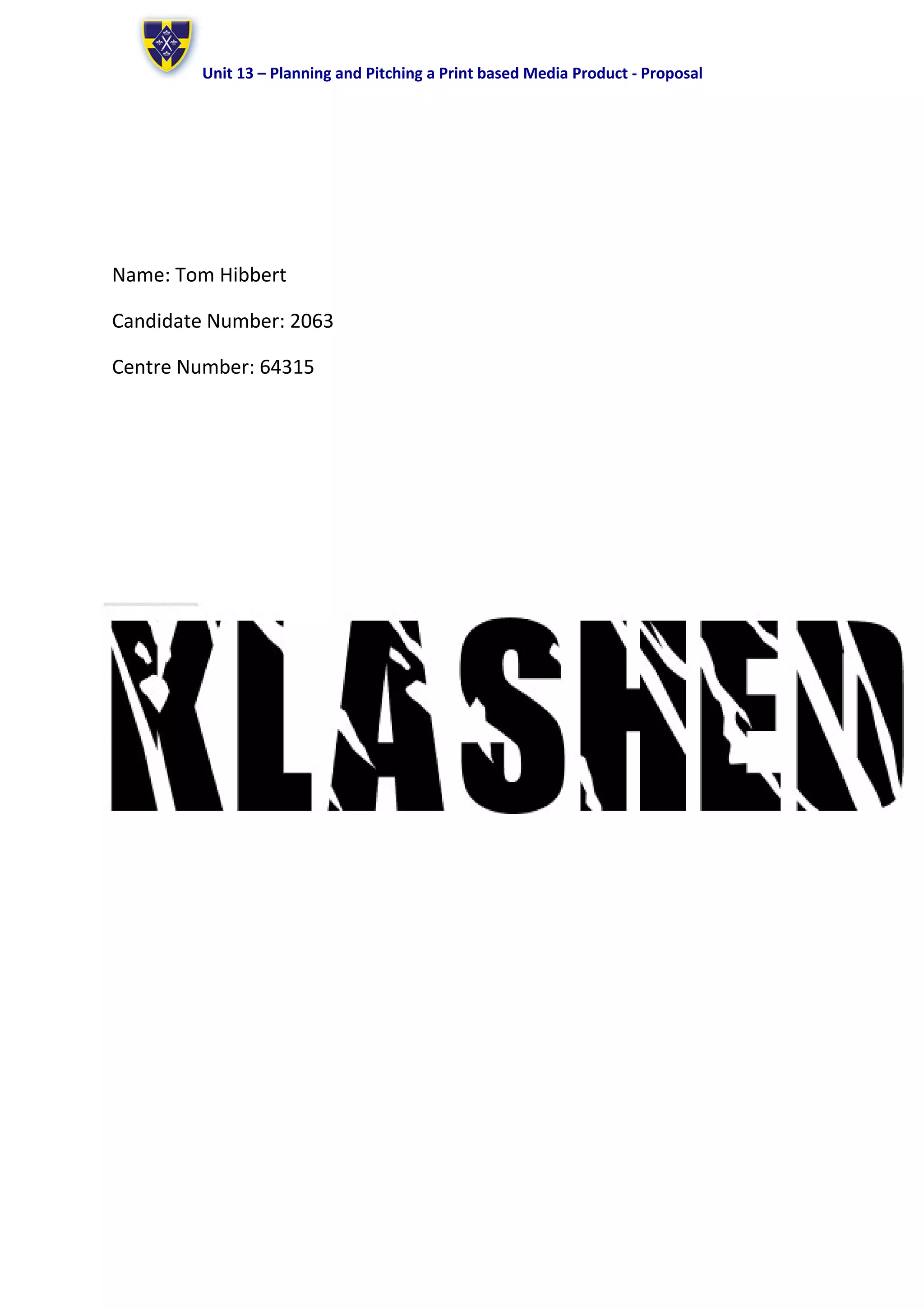
Unit 13 – Planning and Pitching a Print based Media Product - Proposal
Name: Tom Hibbert
Candidate Number: 2063
Centre Number: 64315
Unit 13 – Planning and Pitching a Print based Media Product - Proposal
Format: Magazine
I am going to produce a brand new modern rock music magazine in the form of a
Front Cover and DPS (Double Page Spread). These will illustrate and show the theme
and content that ‘Klashed’ magazine has to offer to the modern rock genre of music
magazines. This will be a part of a larger promotional project for ‘Klashed’ magazine
Working Title: My working title is ‘Klashed’ although this might change I have planned
to have the title in black with brief highlights of purple and yellow, this will keep to
the consistent colour scheme of the magazine that I planned to use. This is part of the
name of a band that could appear in the fanzine although it will not be all about
them. The font style will be a font called ‘Insomnia’. I have chosen this particular font
style out of three choices because it is a similar font to the title of an artist featured in
‘Kerrang’ magazine, it is clearly visible but still has a broken effect on the letters which
also reflect back to ‘Kerrang’ magazine.
The format of the magazine will be 210 x 297mm in size.
Genre:
The sub-genre of the magazine will be modern rock which will be in competition with
‘Kerrang’ and ‘Rock Sound’ as they are also from the rock genre. In order to compete
with these magazines I will have to provide a good and well detailed DPS in order to
give the readers as much information as possible and therefore entertaining them as
‘Kerrang’ and Rock sound’ would.
Content:
The name of sub-genre entitled ‘Klashed’ magazine will be full of pictures, articles,
tour dates, tour locations and band profiles. The magazine will also feature bands that
are quite well known and fairly mainstream. Most will be signed to large record labels
and would have been in the music industry for a while.
The artists I include in the magazine will (according to dyer’s ‘stars’ theory) be
favoured by people who are involved or interested in style as the artists have changed
their music style in the past to current date.
Style or Approach:
The magazine will be presented in the chosen colour scheme which is purple, yellow
and black. The font style will be ‘insomnia’. Insomnia is a broken, dark and scratchy
font and is similar to the font used by Kerrang. I have chosen this font because that is
the type of magazine it will be, similar to Kerrang, scratchy, broken and dark.
The denotation of the colour scheme for the magazine front cover will be a mixed
colour shade from bright yellow to dark black with medium brightness in the middle,
purple. This will connote the theme of my magazine which will contain the different
types of rock music. Pure rock (My chemical romance), Pop rock (Tonight Alive) and
Modern Rock (Green Day).
The colour yellow was chosen to symbolise pop rock because I plan on including pop
rock artists in my magazine and the yellow colour connotes this.
The colour purple connotes modern rock which is why I included it in my colour
scheme because another artist I plan to use has transcended from pure rock to rock
with a modern twist to keep up the appeal with its target audience’s progression
followed by their music.
I am going to use Photoshop CS5.1 to construct the magazine pages (Front Cover and
DPS) because it will allow me to edit pictures I have taken and tweak them as well as
text to fit my planned magazine format and theme along with colour scheme.
Some of the tools in Photoshop that will be particularly beneficial in constructing the
double page spread because Photoshop will allow me to set out the orientation of the
page (landscape for a DPS) and set columns and edit pictures to coincide with the
layout.
Audience:
The audience is mostly male although there are still female fans. They are 16-25 in

Proposal 1 - Klashed

  • 1.
    Unit 13 –Planning and Pitching a Print based Media Product - Proposal Name: Tom Hibbert Candidate Number: 2063 Centre Number: 64315
  • 2.
    Unit 13 –Planning and Pitching a Print based Media Product - Proposal Format: Magazine I am going to produce a brand new modern rock music magazine in the form of a Front Cover and DPS (Double Page Spread). These will illustrate and show the theme and content that ‘Klashed’ magazine has to offer to the modern rock genre of music magazines. This will be a part of a larger promotional project for ‘Klashed’ magazine Working Title: My working title is ‘Klashed’ although this might change I have planned to have the title in black with brief highlights of purple and yellow, this will keep to the consistent colour scheme of the magazine that I planned to use. This is part of the name of a band that could appear in the fanzine although it will not be all about them. The font style will be a font called ‘Insomnia’. I have chosen this particular font style out of three choices because it is a similar font to the title of an artist featured in ‘Kerrang’ magazine, it is clearly visible but still has a broken effect on the letters which also reflect back to ‘Kerrang’ magazine. The format of the magazine will be 210 x 297mm in size. Genre: The sub-genre of the magazine will be modern rock which will be in competition with ‘Kerrang’ and ‘Rock Sound’ as they are also from the rock genre. In order to compete with these magazines I will have to provide a good and well detailed DPS in order to give the readers as much information as possible and therefore entertaining them as ‘Kerrang’ and Rock sound’ would. Content: The name of sub-genre entitled ‘Klashed’ magazine will be full of pictures, articles, tour dates, tour locations and band profiles. The magazine will also feature bands that are quite well known and fairly mainstream. Most will be signed to large record labels and would have been in the music industry for a while. The artists I include in the magazine will (according to dyer’s ‘stars’ theory) be favoured by people who are involved or interested in style as the artists have changed their music style in the past to current date. Style or Approach: The magazine will be presented in the chosen colour scheme which is purple, yellow and black. The font style will be ‘insomnia’. Insomnia is a broken, dark and scratchy font and is similar to the font used by Kerrang. I have chosen this font because that is the type of magazine it will be, similar to Kerrang, scratchy, broken and dark. The denotation of the colour scheme for the magazine front cover will be a mixed colour shade from bright yellow to dark black with medium brightness in the middle, purple. This will connote the theme of my magazine which will contain the different types of rock music. Pure rock (My chemical romance), Pop rock (Tonight Alive) and Modern Rock (Green Day). The colour yellow was chosen to symbolise pop rock because I plan on including pop rock artists in my magazine and the yellow colour connotes this. The colour purple connotes modern rock which is why I included it in my colour scheme because another artist I plan to use has transcended from pure rock to rock with a modern twist to keep up the appeal with its target audience’s progression followed by their music. I am going to use Photoshop CS5.1 to construct the magazine pages (Front Cover and DPS) because it will allow me to edit pictures I have taken and tweak them as well as text to fit my planned magazine format and theme along with colour scheme. Some of the tools in Photoshop that will be particularly beneficial in constructing the double page spread because Photoshop will allow me to set out the orientation of the page (landscape for a DPS) and set columns and edit pictures to coincide with the layout. Audience: The audience is mostly male although there are still female fans. They are 16-25 in