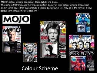
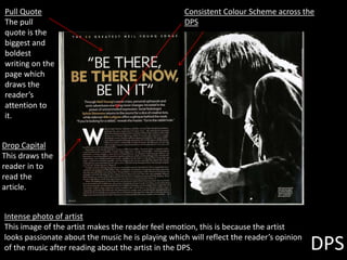
OCR –
Level 3 Cambridge Introductory Diploma in
Media
Unit 13:
Planning and Pitching a Print based Media
Product
P1 Evidence
Name: Tom Hibbert
Candidate Number: 2063
Center Name: St. Andrew’s Catholic School
Center Number: 64135
Set Brief - Print
Project/Brief –
Music Magazine & Promotion
Contents
1. Purpose of the magazine – Slide 3
2. Publisher – Slide 4
3. Form and Style – Slide 5
4. Genre – Slide 6
5. Target Audience – Slide 7
6. Frequency – Slide 8
7. Production process of the magazine – Slide 9
8. Production process and relationship between
reader and distributor – Slide 10
9. Colour Scheme – Slide 11
10. Front Cover Deconstruction – Slide 12
11. Website Analysis – Slide 13
12. Contents page analysis – Slide 14
13. DPS Analysis – Slide 15
14. Form and Style – Slide 16
Purpose of the Magazine
Strapline
MOJO’s strapline is as simple as they can be, “The music magazine”. The
strapline is located across the masthead itself and straight away introduces
the magazine as “the music magazine”. This connotes the simplicity of the
magazine and how it is an old music magazine but still committed to being
all about the music. The artists on the front cover usually just cut a bit out of
the strapline, this suggests that even though there are other features and
things in the magazine, the magazine is still focused on the artists they are
covering.
Publisher Slogan
Bauer’s slogan is “WE THINK POPULAR”
This ‘signifies’ (De Saussure) that Bauer’s interests are to be popular
and that they control their strategies around popularity and not
other factors. This connotes the publisher’s commitments to the
magazine audiences and that they are always trying to be the best
and the most popular.
Publisher
Bauer Media Group
CEO: Andreas Schoo
Headquarters: Hamburg
1.Europe’s largest privately owned publishing Group
2.The seeds of the company’s radio business were
planted in 1990
3.In 1994, the company bought a small magazine called
For Him Magazine which is now the core of the best-
selling international multi-platform brand FHM.
4.Bauer media group holds a 56 per cent retail market
share of the popular magazine segment, and is also the
leading private radio provider.
MOJO’s publisher used to be ‘Emap’ but in
2008 they switched to Bauer, Bauer also
publishes KERRANG! magazine.
Bauer media also publish
the following magazines
Form and Style
MOJOs form and style
Colour Scheme
MOJOs colour scheme appears to be black, white and silver. This is a continuous theme throughout all their
issues that helps to establish the brand identity of the publication.
Language
The language used in MOJO magazine is quite colloquial. It is not perfect English but it is not slang or
incorrect language.
Genre
MOJO magazine’s genre is classic and modern
rock. It differs from KERRANG! because
KERRANG! magazine is “screamer” rock and
punk rock. MOJO features classics like Paul
Weller and The Rolling Stones. This gives
MOJO an edge on Kerrang because more of
their audience will remember these classic
rock artists as their target age group would
have listened to those artists when they were
brand new.
Target Audience
Source:
http://www.bauermedia.co.uk/uploads/Mojo
-MediaPack-2011.pdf
MOJO’s target audience
are passionate about
music and are into old
pure and original rock
music. This fits in with
their genre of classic
rock.
Katz
In terms of Katz’ theory
MOJOs
Frequency
MOJO is released monthly. Its
competitors like Kerrang are also
monthly released. This means that
MOJO will need to have aspects
and features to fight the
competition and to be able to
survive as a competing rock music
magazine.
Production process of the Magazine
Pre Production
Production
Editorial and budgetary decision
-The editorial team put together and decide what topics will be covered in the next issue of
the magazine.
Content acquisition
-Gathering content for the magazine.
Sub editing
-Checking that standards are met
-Laws have been obeyed
-IPSO
Page layout
-Putting the magazine together with the pages and a specific layout
Post production
File emailed to printer
Distribution
Production process and relationship
between reader and distributor
Shops MOJO is available in
• Most newsagents
• Sainsbury's
• Tescos
• Magazine racks
MOJO magazine can be bought online as well, this
is evidence of technological convergence as most
people are familiar with the internet purchases etc.
and by selling their magazine online MOJO are
meeting the needs of customers online and making
it easier to be a part of MOJO magazine.
Colour Scheme
MOJO’s colour scheme consists of Black, White and Silver.
Throughout MOJO’s issues there is a consistent display of their colour scheme throughout
and in some issues they even include a special background, this may be in the form of a new
colour to the magazine or a scenery.
Front Cover deconstruction
Colour Scheme
Consistent use of
the light blue for
the artist’s name,
other featured
articles and other
artists in the
magazine as well as
the main focused
artist for this issue.
Puff Promotion
Being advertised is a
CD which is free for
the customer when
they purchase this
issue of MOJO. This
entices the reader
especially if they are a
Madonna fan.
Masthead
The masthead is
covered by the artist so
that only the first and
last letter can be seen.
This suggests that
MOJO care more about
the artists then
publicity of the
magazines name.
Website Analysis
Masthead
Main article
By displaying the main
article
Advertisement of new
music album
Advertising current
issue of MOJO.
This keeps customers
and visitors of the
website up to date with
current issues of the
magazine that are out.
Navigation Bar
Contents Page
Masthead
The masthead on the
contents page
establishes a brand
identity and
consistency across the
magazine.
Pull Quote
By including the
pull quote it draws
the reader into the
DPS and makes
them read the
contents page to
find out what page
this interview is on.
Issue
Number
Date
Bold text
DPS
Pull Quote
The pull
quote is the
biggest and
boldest
writing on the
page which
draws the
reader’s
attention to
it.
Drop Capital
This draws the
reader in to
read the
article.
Consistent Colour Scheme across the
DPS
Intense photo of artist
This image of the artist makes the reader feel emotion, this is because the artist
looks passionate about the music he is playing which will reflect the reader’s opinion
of the music after reading about the artist in the DPS.
Form and Style
The form and style of
MOJO is more formal
and presentable than
Kerrang!. This is
because MOJO has a
more professional
colour scheme
consisting of high
standard colours such as
white, black and silver
as a pose to Kerrang!’s
yellow, black and white.
Conclusion
MOJO is also published by Bauer
media and has been growing in
popularity for a long time to modern
day. MOJO is a classic rock music
magazine that focuses more on old
rock artists and what they are doing
in modern day, this may influence
older readers to read MOJO instead
of Kerrang.

LO1 Second Magazine

  • 1.
    OCR – Level 3Cambridge Introductory Diploma in Media Unit 13: Planning and Pitching a Print based Media Product P1 Evidence Name: Tom Hibbert Candidate Number: 2063 Center Name: St. Andrew’s Catholic School Center Number: 64135 Set Brief - Print Project/Brief – Music Magazine & Promotion
  • 2.
    Contents 1. Purpose ofthe magazine – Slide 3 2. Publisher – Slide 4 3. Form and Style – Slide 5 4. Genre – Slide 6 5. Target Audience – Slide 7 6. Frequency – Slide 8 7. Production process of the magazine – Slide 9 8. Production process and relationship between reader and distributor – Slide 10 9. Colour Scheme – Slide 11 10. Front Cover Deconstruction – Slide 12 11. Website Analysis – Slide 13 12. Contents page analysis – Slide 14 13. DPS Analysis – Slide 15 14. Form and Style – Slide 16
  • 3.
    Purpose of theMagazine Strapline MOJO’s strapline is as simple as they can be, “The music magazine”. The strapline is located across the masthead itself and straight away introduces the magazine as “the music magazine”. This connotes the simplicity of the magazine and how it is an old music magazine but still committed to being all about the music. The artists on the front cover usually just cut a bit out of the strapline, this suggests that even though there are other features and things in the magazine, the magazine is still focused on the artists they are covering. Publisher Slogan Bauer’s slogan is “WE THINK POPULAR” This ‘signifies’ (De Saussure) that Bauer’s interests are to be popular and that they control their strategies around popularity and not other factors. This connotes the publisher’s commitments to the magazine audiences and that they are always trying to be the best and the most popular.
  • 4.
    Publisher Bauer Media Group CEO:Andreas Schoo Headquarters: Hamburg 1.Europe’s largest privately owned publishing Group 2.The seeds of the company’s radio business were planted in 1990 3.In 1994, the company bought a small magazine called For Him Magazine which is now the core of the best- selling international multi-platform brand FHM. 4.Bauer media group holds a 56 per cent retail market share of the popular magazine segment, and is also the leading private radio provider. MOJO’s publisher used to be ‘Emap’ but in 2008 they switched to Bauer, Bauer also publishes KERRANG! magazine. Bauer media also publish the following magazines
  • 5.
    Form and Style MOJOsform and style Colour Scheme MOJOs colour scheme appears to be black, white and silver. This is a continuous theme throughout all their issues that helps to establish the brand identity of the publication. Language The language used in MOJO magazine is quite colloquial. It is not perfect English but it is not slang or incorrect language.
  • 6.
    Genre MOJO magazine’s genreis classic and modern rock. It differs from KERRANG! because KERRANG! magazine is “screamer” rock and punk rock. MOJO features classics like Paul Weller and The Rolling Stones. This gives MOJO an edge on Kerrang because more of their audience will remember these classic rock artists as their target age group would have listened to those artists when they were brand new.
  • 7.
    Target Audience Source: http://www.bauermedia.co.uk/uploads/Mojo -MediaPack-2011.pdf MOJO’s targetaudience are passionate about music and are into old pure and original rock music. This fits in with their genre of classic rock. Katz In terms of Katz’ theory MOJOs
  • 8.
    Frequency MOJO is releasedmonthly. Its competitors like Kerrang are also monthly released. This means that MOJO will need to have aspects and features to fight the competition and to be able to survive as a competing rock music magazine.
  • 9.
    Production process ofthe Magazine Pre Production Production Editorial and budgetary decision -The editorial team put together and decide what topics will be covered in the next issue of the magazine. Content acquisition -Gathering content for the magazine. Sub editing -Checking that standards are met -Laws have been obeyed -IPSO Page layout -Putting the magazine together with the pages and a specific layout Post production File emailed to printer Distribution
  • 10.
    Production process andrelationship between reader and distributor Shops MOJO is available in • Most newsagents • Sainsbury's • Tescos • Magazine racks MOJO magazine can be bought online as well, this is evidence of technological convergence as most people are familiar with the internet purchases etc. and by selling their magazine online MOJO are meeting the needs of customers online and making it easier to be a part of MOJO magazine.
  • 11.
    Colour Scheme MOJO’s colourscheme consists of Black, White and Silver. Throughout MOJO’s issues there is a consistent display of their colour scheme throughout and in some issues they even include a special background, this may be in the form of a new colour to the magazine or a scenery.
  • 12.
    Front Cover deconstruction ColourScheme Consistent use of the light blue for the artist’s name, other featured articles and other artists in the magazine as well as the main focused artist for this issue. Puff Promotion Being advertised is a CD which is free for the customer when they purchase this issue of MOJO. This entices the reader especially if they are a Madonna fan. Masthead The masthead is covered by the artist so that only the first and last letter can be seen. This suggests that MOJO care more about the artists then publicity of the magazines name.
  • 13.
    Website Analysis Masthead Main article Bydisplaying the main article Advertisement of new music album Advertising current issue of MOJO. This keeps customers and visitors of the website up to date with current issues of the magazine that are out. Navigation Bar
  • 14.
    Contents Page Masthead The mastheadon the contents page establishes a brand identity and consistency across the magazine. Pull Quote By including the pull quote it draws the reader into the DPS and makes them read the contents page to find out what page this interview is on. Issue Number Date Bold text
  • 15.
    DPS Pull Quote The pull quoteis the biggest and boldest writing on the page which draws the reader’s attention to it. Drop Capital This draws the reader in to read the article. Consistent Colour Scheme across the DPS Intense photo of artist This image of the artist makes the reader feel emotion, this is because the artist looks passionate about the music he is playing which will reflect the reader’s opinion of the music after reading about the artist in the DPS.
  • 16.
    Form and Style Theform and style of MOJO is more formal and presentable than Kerrang!. This is because MOJO has a more professional colour scheme consisting of high standard colours such as white, black and silver as a pose to Kerrang!’s yellow, black and white.
  • 17.
    Conclusion MOJO is alsopublished by Bauer media and has been growing in popularity for a long time to modern day. MOJO is a classic rock music magazine that focuses more on old rock artists and what they are doing in modern day, this may influence older readers to read MOJO instead of Kerrang.