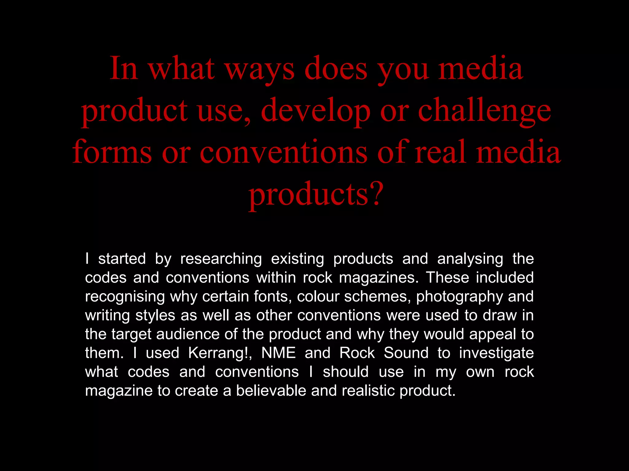
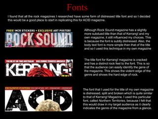
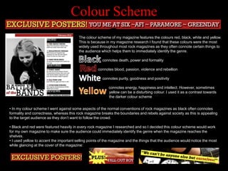
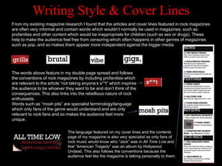
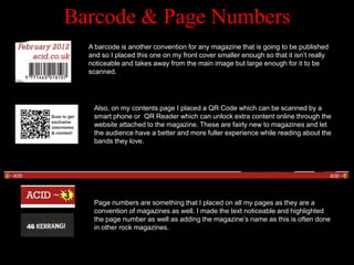
In what ways does you media
 product use, develop or challenge
forms or conventions of real media
             products?
I started by researching existing products and analysing the
codes and conventions within rock magazines. These included
recognising why certain fonts, colour schemes, photography and
               Codes & Conventions
writing styles as well as other conventions were used to draw in
the target audience of the product and why they would appeal to
them. I used Kerrang!, NME and Rock Sound to investigate
what codes and conventions I should use in my own rock
magazine to create a believable and realistic product.
Fonts
I found that all the rock magazines I researched have some form of distressed title font and so I decided
this would be a good place to start in replicating this for ACID magazine.


                                                        Although Rock Sound magazine has a slightly
                                                        more subdued title than that of Kerrang! and my
                                                        own magazine, it still influenced my choices. This
                                                        is because the font is subtly distressed. Also, the
                                                        body text font is more simple than that of the title
                                                        and so I used this technique in my own magazine


                                                        The title font for Kerrang! magazine is cracked
                                                        and has a distinct rock feel to the font. This is so
                                                        that the audience can easily identify the gene of
                                                        the magazine. This shows the violent edge of the
                                                        genre and shows the hard edge of rock.


                                                       The font that I used for the title of my own magazine
                                                       is distressed, split and broken which is quite similar
                                                       to that of Kerrang! Magazine. I used this particular
                                                       font, called Northern Territories, because I felt that
                                                       this would draw in my target audience as it clearly
                                                       indicates the genre of the magazine from a glance.
Colour Scheme
                                         The colour scheme of my magazine features the colours red, black, white and yellow.
                                         This is because in my magazine research I found that these colours were the most
                                         widely used throughout most rock magazines as they often connote certain things to
                                         the audience which helps them to immediately identify the genre.

                                                        connotes death, power and formality

                                                     connotes blood, passion, violence and rebellion

                                                        connotes purity, goodness and positivity

                                                           connotes energy, happiness and intellect. However, sometimes
                                                           yellow can be a disturbing colour. I used it as a contrast towards
                                                           the darker colour scheme


• In my colour scheme I went against some aspects of the normal conventions of rock magazines as black often connotes
formality and correctness, whereas this rock magazine breaks the boundaries and rebels against society as this is appealing
to the target audience as they don‟t want to follow the crowd.

• Black and red were featured heavily in every rock magazine I researched and so I decided this colour scheme would work
for my own magazine to make sure the audience could immediately identify the genre when the magazine reaches the
shelves.
• I used yellow to accent the important selling points of the magazine and the things that the audience would notice the most
while glancing at the cover of the magazine:
Front Cover
                     Photography
                               The front cover of my magazine is very similar in style to
                               Kerrang magazine. This is because I felt like Kerrang
                               represented rock magazines efficiently and so used some of
                               their conventions in my own magazine. I had one of my main
                               subjects look menacing towards the camera to better portray
                               the violent, passionate emotions of the band members which
                               would appeal to the audience. The image is quite high-key to
                               connote intensity and it is also high contrast which makes the
                               image stand out and give the clothing a dark appearance as
                               fans of the magazine would often wear black to form their own
                               identity. Having the camera at a slightly low angle makes the
                               band members appear powerful which would make the
                               audience idolize them and looking into the camera helps to
                               create a sense of unity between them and the audience so
                               they can feel like the audience are personally involved.

Double Page Spread
                          The photography in magazines such as Kerrang! and NME are often
                          very high contrast to make the blacks stand out dramatically against
                          white and lighter colours. I adjusted the contrast for my own photos
                          in Photoshop to better suit the look of the magazine as the models
                          were wearing very dark colours. I felt that, compared to Kerrang!
                          magazine, my own images didn‟t need a higher saturation and more
                          colours – I think the dark look of the clothing and mise-en-scene
                          worked with the overall colour scheme. The poses were fairly
                          relaxed and eye-level with the camera giving the impression that the
                          audience are their equals. This draws the audience in as they like to
                          think that they are connected on a personal level to the band.
                          However, the „photoshoot‟ look of the main image gives the
                          impression of being serious about their music to the audience so it
                          appears they have a passion.
Writing Style & Cover Lines
From my existing magazine research I found that the articles and cover lines featured in rock magazines
are often very informal and contain words which wouldn‟t normally be used in magazines, such as
profanities and other content which would be inappropriate for children (such as sex or drugs). These
help to make the audience feel free from censoring which often happens in other genres of magazines
such as pop, and so makes them appear more independent against the bigger media.


The words above feature in my double page spread and follows
the conventions of rock magazines by including profanities which
are relevant to the article “not taking anyone‟s s**t” which inspires
the audience to be whoever they want to be and don‟t think of the
consequences. This also links into the rebellious nature of rock
enthusiasts.
Words such as “mosh pits” are specialist terminology/language
which only fans of the genre would understand and are only
relevant to rock fans and so makes the audience feel more
unique.

                              The language featured on my cover lines and the contents
                              page of my magazine is also very specialist as only fans of
                              rock music would know who “Jack” was in All Time Low and
                              that “American Tragedy” was an album by Hollywood
                              Undead. This also follows the conventions because the
                              audience feel like the magazine is talking personally to them.
Barcode & Page Numbers
  A barcode is another convention for any magazine that is going to be published
  and so I placed this one on my front cover smaller enough so that it isn‟t really
  noticeable and takes away from the main image but large enough for it to be
  scanned.


   Also, on my contents page I placed a QR Code which can be scanned by a
   smart phone or QR Reader which can unlock extra content online through the
   website attached to the magazine. These are fairly new to magazines and let
   the audience have a better and more fuller experience while reading about the
   bands they love.


   Page numbers are something that I placed on all my pages as they are a
   convention of magazines as well. I made the text noticeable and highlighted
   the page number as well as adding the magazine‟s name as this is often done
   in other rock magazines.

Codes and conventions

  • 1.
    In what waysdoes you media product use, develop or challenge forms or conventions of real media products? I started by researching existing products and analysing the codes and conventions within rock magazines. These included recognising why certain fonts, colour schemes, photography and Codes & Conventions writing styles as well as other conventions were used to draw in the target audience of the product and why they would appeal to them. I used Kerrang!, NME and Rock Sound to investigate what codes and conventions I should use in my own rock magazine to create a believable and realistic product.
  • 2.
    Fonts I found thatall the rock magazines I researched have some form of distressed title font and so I decided this would be a good place to start in replicating this for ACID magazine. Although Rock Sound magazine has a slightly more subdued title than that of Kerrang! and my own magazine, it still influenced my choices. This is because the font is subtly distressed. Also, the body text font is more simple than that of the title and so I used this technique in my own magazine The title font for Kerrang! magazine is cracked and has a distinct rock feel to the font. This is so that the audience can easily identify the gene of the magazine. This shows the violent edge of the genre and shows the hard edge of rock. The font that I used for the title of my own magazine is distressed, split and broken which is quite similar to that of Kerrang! Magazine. I used this particular font, called Northern Territories, because I felt that this would draw in my target audience as it clearly indicates the genre of the magazine from a glance.
  • 3.
    Colour Scheme The colour scheme of my magazine features the colours red, black, white and yellow. This is because in my magazine research I found that these colours were the most widely used throughout most rock magazines as they often connote certain things to the audience which helps them to immediately identify the genre. connotes death, power and formality connotes blood, passion, violence and rebellion connotes purity, goodness and positivity connotes energy, happiness and intellect. However, sometimes yellow can be a disturbing colour. I used it as a contrast towards the darker colour scheme • In my colour scheme I went against some aspects of the normal conventions of rock magazines as black often connotes formality and correctness, whereas this rock magazine breaks the boundaries and rebels against society as this is appealing to the target audience as they don‟t want to follow the crowd. • Black and red were featured heavily in every rock magazine I researched and so I decided this colour scheme would work for my own magazine to make sure the audience could immediately identify the genre when the magazine reaches the shelves. • I used yellow to accent the important selling points of the magazine and the things that the audience would notice the most while glancing at the cover of the magazine:
  • 4.
    Front Cover Photography The front cover of my magazine is very similar in style to Kerrang magazine. This is because I felt like Kerrang represented rock magazines efficiently and so used some of their conventions in my own magazine. I had one of my main subjects look menacing towards the camera to better portray the violent, passionate emotions of the band members which would appeal to the audience. The image is quite high-key to connote intensity and it is also high contrast which makes the image stand out and give the clothing a dark appearance as fans of the magazine would often wear black to form their own identity. Having the camera at a slightly low angle makes the band members appear powerful which would make the audience idolize them and looking into the camera helps to create a sense of unity between them and the audience so they can feel like the audience are personally involved. Double Page Spread The photography in magazines such as Kerrang! and NME are often very high contrast to make the blacks stand out dramatically against white and lighter colours. I adjusted the contrast for my own photos in Photoshop to better suit the look of the magazine as the models were wearing very dark colours. I felt that, compared to Kerrang! magazine, my own images didn‟t need a higher saturation and more colours – I think the dark look of the clothing and mise-en-scene worked with the overall colour scheme. The poses were fairly relaxed and eye-level with the camera giving the impression that the audience are their equals. This draws the audience in as they like to think that they are connected on a personal level to the band. However, the „photoshoot‟ look of the main image gives the impression of being serious about their music to the audience so it appears they have a passion.
  • 5.
    Writing Style &Cover Lines From my existing magazine research I found that the articles and cover lines featured in rock magazines are often very informal and contain words which wouldn‟t normally be used in magazines, such as profanities and other content which would be inappropriate for children (such as sex or drugs). These help to make the audience feel free from censoring which often happens in other genres of magazines such as pop, and so makes them appear more independent against the bigger media. The words above feature in my double page spread and follows the conventions of rock magazines by including profanities which are relevant to the article “not taking anyone‟s s**t” which inspires the audience to be whoever they want to be and don‟t think of the consequences. This also links into the rebellious nature of rock enthusiasts. Words such as “mosh pits” are specialist terminology/language which only fans of the genre would understand and are only relevant to rock fans and so makes the audience feel more unique. The language featured on my cover lines and the contents page of my magazine is also very specialist as only fans of rock music would know who “Jack” was in All Time Low and that “American Tragedy” was an album by Hollywood Undead. This also follows the conventions because the audience feel like the magazine is talking personally to them.
  • 6.
    Barcode & PageNumbers A barcode is another convention for any magazine that is going to be published and so I placed this one on my front cover smaller enough so that it isn‟t really noticeable and takes away from the main image but large enough for it to be scanned. Also, on my contents page I placed a QR Code which can be scanned by a smart phone or QR Reader which can unlock extra content online through the website attached to the magazine. These are fairly new to magazines and let the audience have a better and more fuller experience while reading about the bands they love. Page numbers are something that I placed on all my pages as they are a convention of magazines as well. I made the text noticeable and highlighted the page number as well as adding the magazine‟s name as this is often done in other rock magazines.