In what ways does your media
product use, develop or challenge
forms and conventions of real media
products?
Front Cover
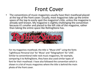
• The conventions of music magazines usually have their masthead placed
at the top of the front cover. Usually, most magazines take up the entire
space of the top to easily spot the magazine’s title, unless the magazine is
already well-known. My magazine is slightly challenging the convention
because it’s smaller and placed to the left side of the magazine, rather
than taking the entire space like RollingStone has.
For my magazines masthead, the title is “Muse LIVE” using the fonts
‘Lighthouse Personal Use’ for ‘Muse’ and ‘Telegraphem’ for ‘LIVE’.
Similar to conventional indie rock music magazines, for example,
comparing it to RollingStone, they have also used similar types of
font for their masthead. I have also followed the convention which is
shown in a lot of music magazines where the title is behind the main
photo of the front cover.
• I have used colours red, black and white for my
masthead because that is the main colour
scheme of my entire magazine. I chose these
colours because I felt that they were conventional
colours used for my magazine’s genre. I have
taken elements from RollingStone’s magazine,
such as their colour scheme and similar font style
for inspiration. Furthermore, into the research of
similar magazines of the same genre, I found that
most magazines used gender neutral colours for
their audiences.
Mise-en-scene
• The mise-en-scene of most of my photos contain the conventions of
what a usual music magazine would have. For my front cover, I used a
photo of a teenager looking down at her guitar, wearing rock/indie
styled clothing such as a beanie, a scarf and a leather jacket. I did not
want to make too much of an impact of the “rock” genre of the
magazine, given that it’s indie rock, so to include elements of an indie
rock genre I had her holding an acoustic guitar. In that sense, my
magazine does not follow the conventions of a rock magazine such as
Kerrang! In which their photos are full of expression while holding
typical instruments used I rock bands.
• Furthermore, the majority of my images also contain a similar style
such as wearing clothes which are typically associated to the indie
rock style bands.
• However, most of my images had no background. This challenges the
convention of rock/indie magazines, particularly rock magazines such
as Kerrang!; where the scenery of their photos are typically during a
performance, or outside in a rough-looking setting.
Costumes and Props
The costumes of most of my photos are
clothing that has an essence of the indie
rock genre. The clothes of Muse LIVE’s
main focus (Han-sun), wears shirts,
cardigan-sweaters and jewelry that
challenge the genre of a rock magazine,
but given that indie rock is a more subtle
subgenre of rock, it suits well to the indie
essence of my magazine.
People
• The people I have included in
my magazine challenges the
conventions of a typical
magazine, because they are
young teenagers whereas
magazines usually contain
people who are adults. This is
challenging as a magazine
because with adult artists in a
music magazine, this can
attract audiences from a young
to an older age, whereas
mostly teenagers are featured
it suggests that it is only for an
audience of teenagers or
younger.
Written Content
• The written content of my music magazine follows the conventions
of a real music magazine. For example, I have included an interview
from the main person on the front cover, which is a usual aspect that
music magazines go by. Specifically, in the interview it contained
questions that are typically used in interviews for music magazines
such as questions on the artist’s new album or upcoming tour.
• Layout and Style:
The layout of my magazine mainly follows the conventions of a real
music magazine. However, unlike a conventional magazine, I have used
the same font in the same position as the title of he magazine in all of
my pages. For example:
• My contents page and double page spread mainly follows the
layout of a conventional magazine. In my contents page, I have
distinguished the font type of the page numbers to the text. But I
have also made the layout in a conventional style by placing it on
one side of the page, rather than taking up the entirety of the
page. Furthermore, I have included photos of which my magazine
will be featuring such as who I’m interviewing, articles on bands,
etc…
Different font styles
Contents and photos on
different sides of the page
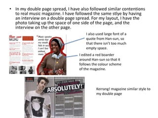
• In my double page spread, I have also followed similar contentions
to real music magazine. I have followed the same stlye by having
an interview on a double page spread. For my layout, I have the
photo taking up the space of one side of the page, and the
interview on the other page.
I also used large font of a
quote from Han-sun, so
that there isn’t too much
empty space.
I edited a red boarder
around Han-sun so that it
follows the colour scheme
of the magazine.
Kerrang! magazine similar style to
my double page
After Improvements
• After improving my magazine, I have
made clearer connections within my
magazine to the indie rock genre.
• In my contents page, I included
photos of artists linking to the
magazine’s genre. Linking back to
my audience research, the feedback
I received showed that most people
liked the first cover than the rest.
Although it is a front cover, I thought
that I could use similar artists to the
woman on The Fly’s front cover.
Therefore, I took photos of a few
people in class who were similarly
dressed, and had them pose in a
similar way. By using The Fly – a
magazine of the same genre – for
my photos, it has helped me create
a magazine in which it reflects its
genre.

Question 1

  • 1.
    In what waysdoes your media product use, develop or challenge forms and conventions of real media products?
  • 2.
    Front Cover • Theconventions of music magazines usually have their masthead placed at the top of the front cover. Usually, most magazines take up the entire space of the top to easily spot the magazine’s title, unless the magazine is already well-known. My magazine is slightly challenging the convention because it’s smaller and placed to the left side of the magazine, rather than taking the entire space like RollingStone has. For my magazines masthead, the title is “Muse LIVE” using the fonts ‘Lighthouse Personal Use’ for ‘Muse’ and ‘Telegraphem’ for ‘LIVE’. Similar to conventional indie rock music magazines, for example, comparing it to RollingStone, they have also used similar types of font for their masthead. I have also followed the convention which is shown in a lot of music magazines where the title is behind the main photo of the front cover.
  • 3.
    • I haveused colours red, black and white for my masthead because that is the main colour scheme of my entire magazine. I chose these colours because I felt that they were conventional colours used for my magazine’s genre. I have taken elements from RollingStone’s magazine, such as their colour scheme and similar font style for inspiration. Furthermore, into the research of similar magazines of the same genre, I found that most magazines used gender neutral colours for their audiences.
  • 4.
    Mise-en-scene • The mise-en-sceneof most of my photos contain the conventions of what a usual music magazine would have. For my front cover, I used a photo of a teenager looking down at her guitar, wearing rock/indie styled clothing such as a beanie, a scarf and a leather jacket. I did not want to make too much of an impact of the “rock” genre of the magazine, given that it’s indie rock, so to include elements of an indie rock genre I had her holding an acoustic guitar. In that sense, my magazine does not follow the conventions of a rock magazine such as Kerrang! In which their photos are full of expression while holding typical instruments used I rock bands. • Furthermore, the majority of my images also contain a similar style such as wearing clothes which are typically associated to the indie rock style bands. • However, most of my images had no background. This challenges the convention of rock/indie magazines, particularly rock magazines such as Kerrang!; where the scenery of their photos are typically during a performance, or outside in a rough-looking setting.
  • 5.
    Costumes and Props Thecostumes of most of my photos are clothing that has an essence of the indie rock genre. The clothes of Muse LIVE’s main focus (Han-sun), wears shirts, cardigan-sweaters and jewelry that challenge the genre of a rock magazine, but given that indie rock is a more subtle subgenre of rock, it suits well to the indie essence of my magazine.
  • 6.
    People • The peopleI have included in my magazine challenges the conventions of a typical magazine, because they are young teenagers whereas magazines usually contain people who are adults. This is challenging as a magazine because with adult artists in a music magazine, this can attract audiences from a young to an older age, whereas mostly teenagers are featured it suggests that it is only for an audience of teenagers or younger.
  • 7.
    Written Content • Thewritten content of my music magazine follows the conventions of a real music magazine. For example, I have included an interview from the main person on the front cover, which is a usual aspect that music magazines go by. Specifically, in the interview it contained questions that are typically used in interviews for music magazines such as questions on the artist’s new album or upcoming tour. • Layout and Style: The layout of my magazine mainly follows the conventions of a real music magazine. However, unlike a conventional magazine, I have used the same font in the same position as the title of he magazine in all of my pages. For example:
  • 8.
    • My contentspage and double page spread mainly follows the layout of a conventional magazine. In my contents page, I have distinguished the font type of the page numbers to the text. But I have also made the layout in a conventional style by placing it on one side of the page, rather than taking up the entirety of the page. Furthermore, I have included photos of which my magazine will be featuring such as who I’m interviewing, articles on bands, etc… Different font styles Contents and photos on different sides of the page
  • 9.
    • In mydouble page spread, I have also followed similar contentions to real music magazine. I have followed the same stlye by having an interview on a double page spread. For my layout, I have the photo taking up the space of one side of the page, and the interview on the other page. I also used large font of a quote from Han-sun, so that there isn’t too much empty space. I edited a red boarder around Han-sun so that it follows the colour scheme of the magazine. Kerrang! magazine similar style to my double page
  • 10.
    After Improvements • Afterimproving my magazine, I have made clearer connections within my magazine to the indie rock genre. • In my contents page, I included photos of artists linking to the magazine’s genre. Linking back to my audience research, the feedback I received showed that most people liked the first cover than the rest. Although it is a front cover, I thought that I could use similar artists to the woman on The Fly’s front cover. Therefore, I took photos of a few people in class who were similarly dressed, and had them pose in a similar way. By using The Fly – a magazine of the same genre – for my photos, it has helped me create a magazine in which it reflects its genre.