This document defines typography and discusses its key elements and classifications. It covers:
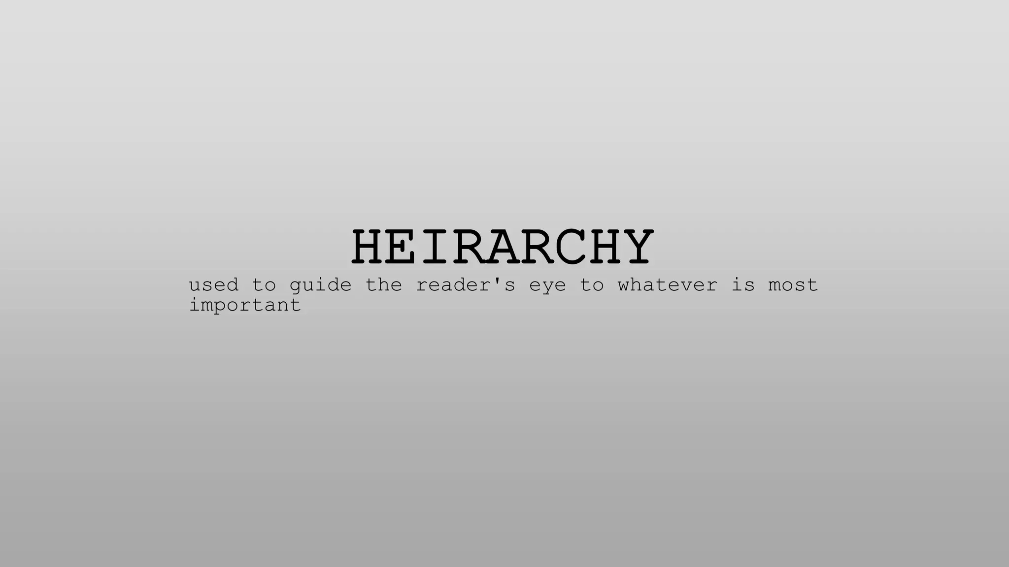
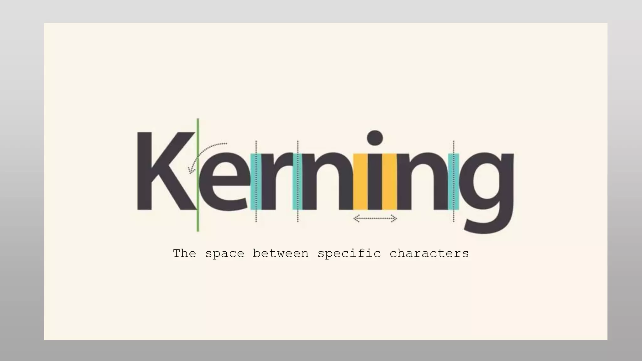
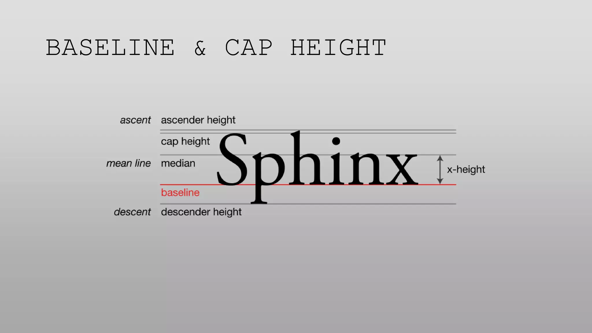
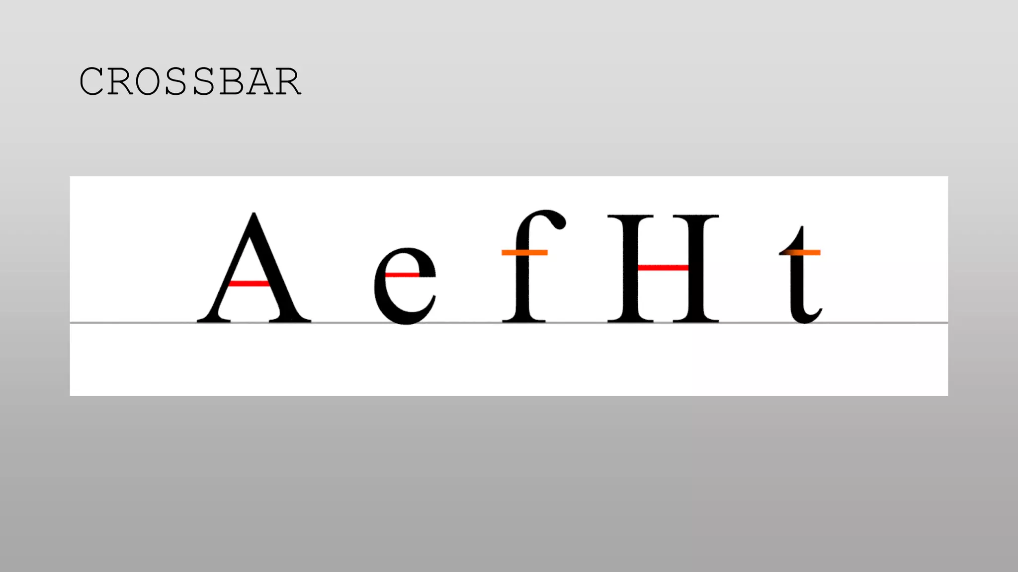
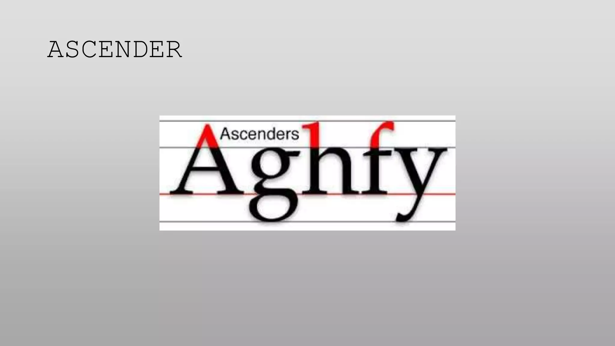
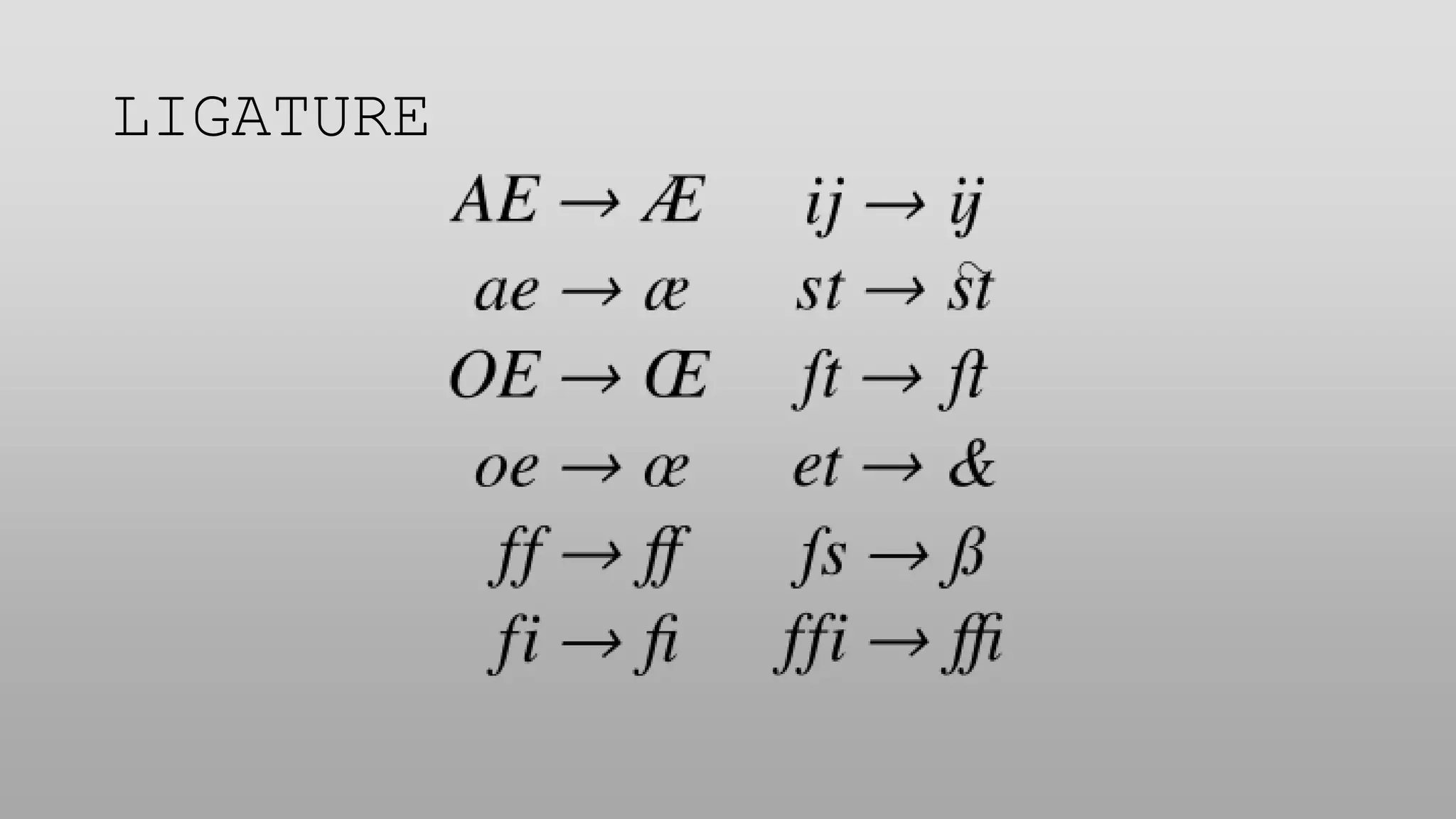
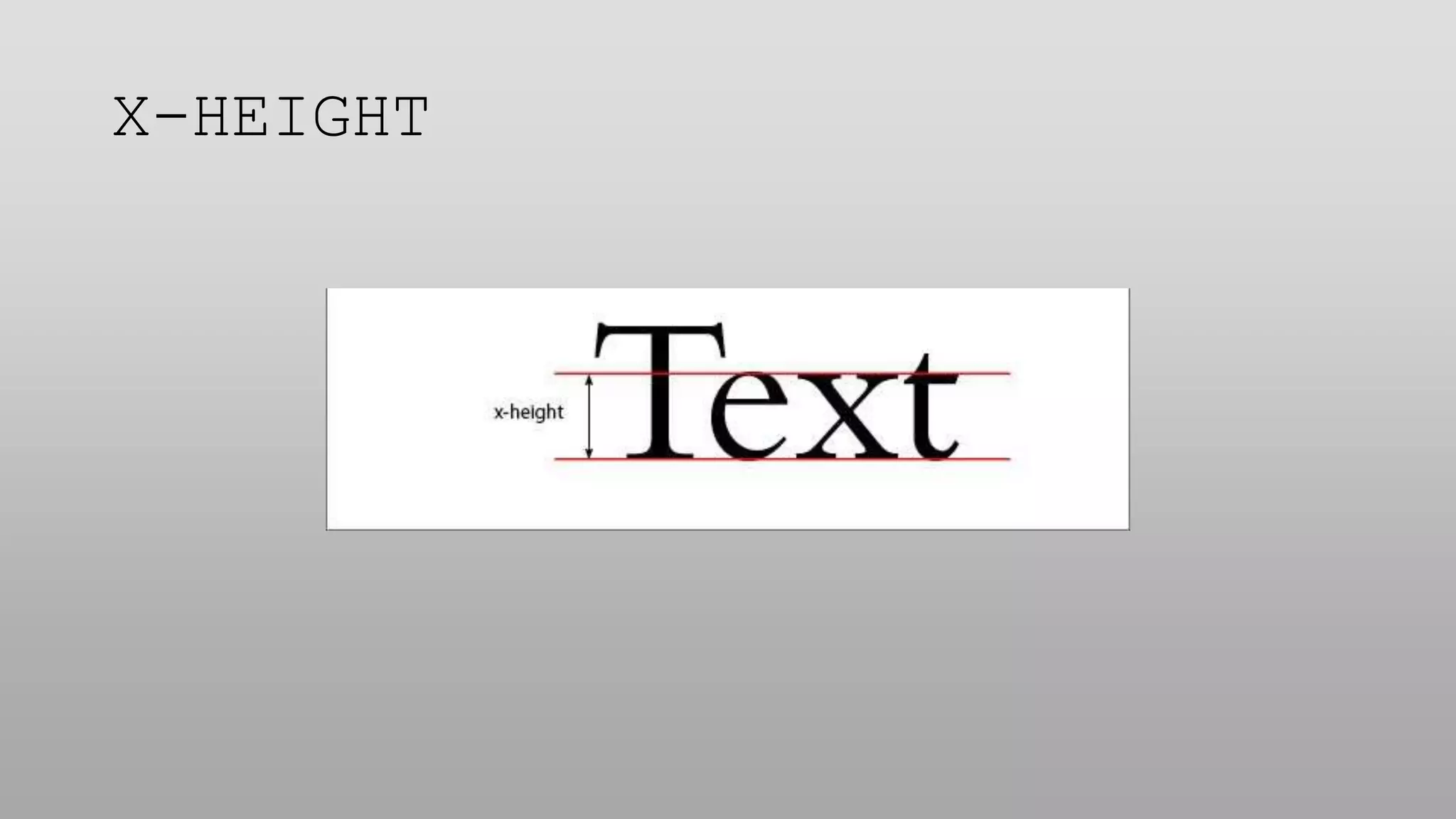
- Typography is the style and appearance of text, making it readable and pleasing to the eye through adjustments to typefaces, point size, leading, and kerning.
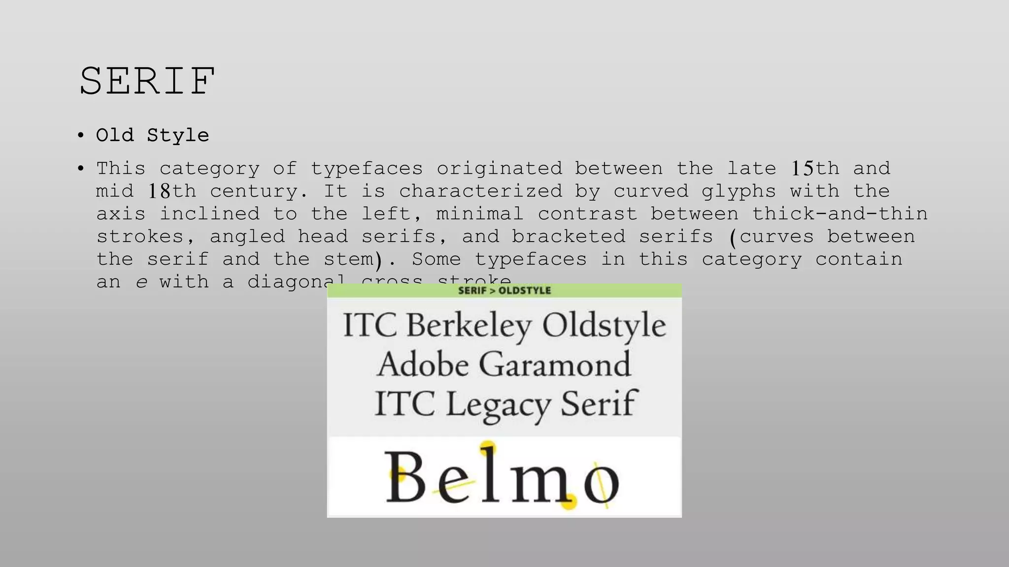
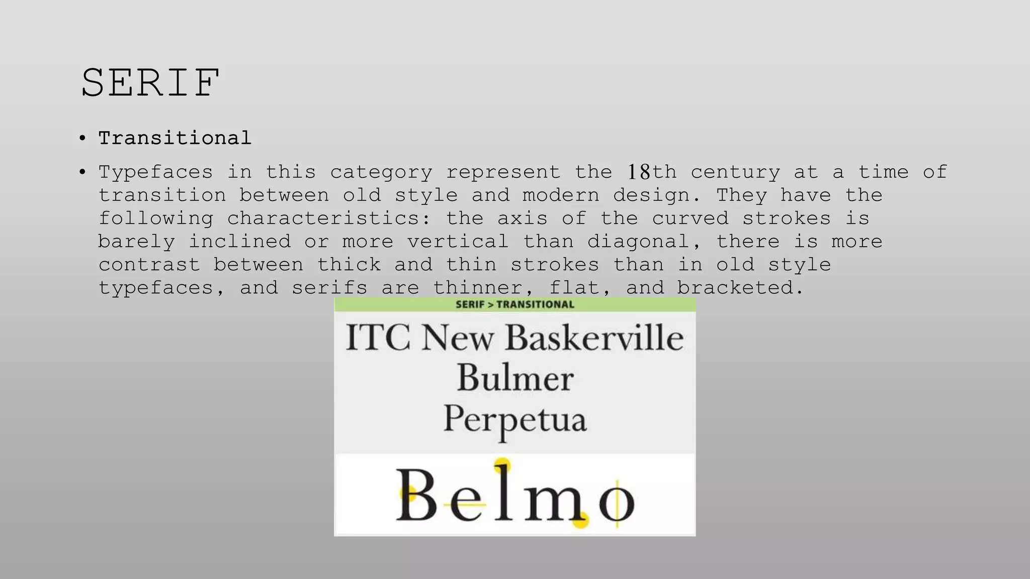
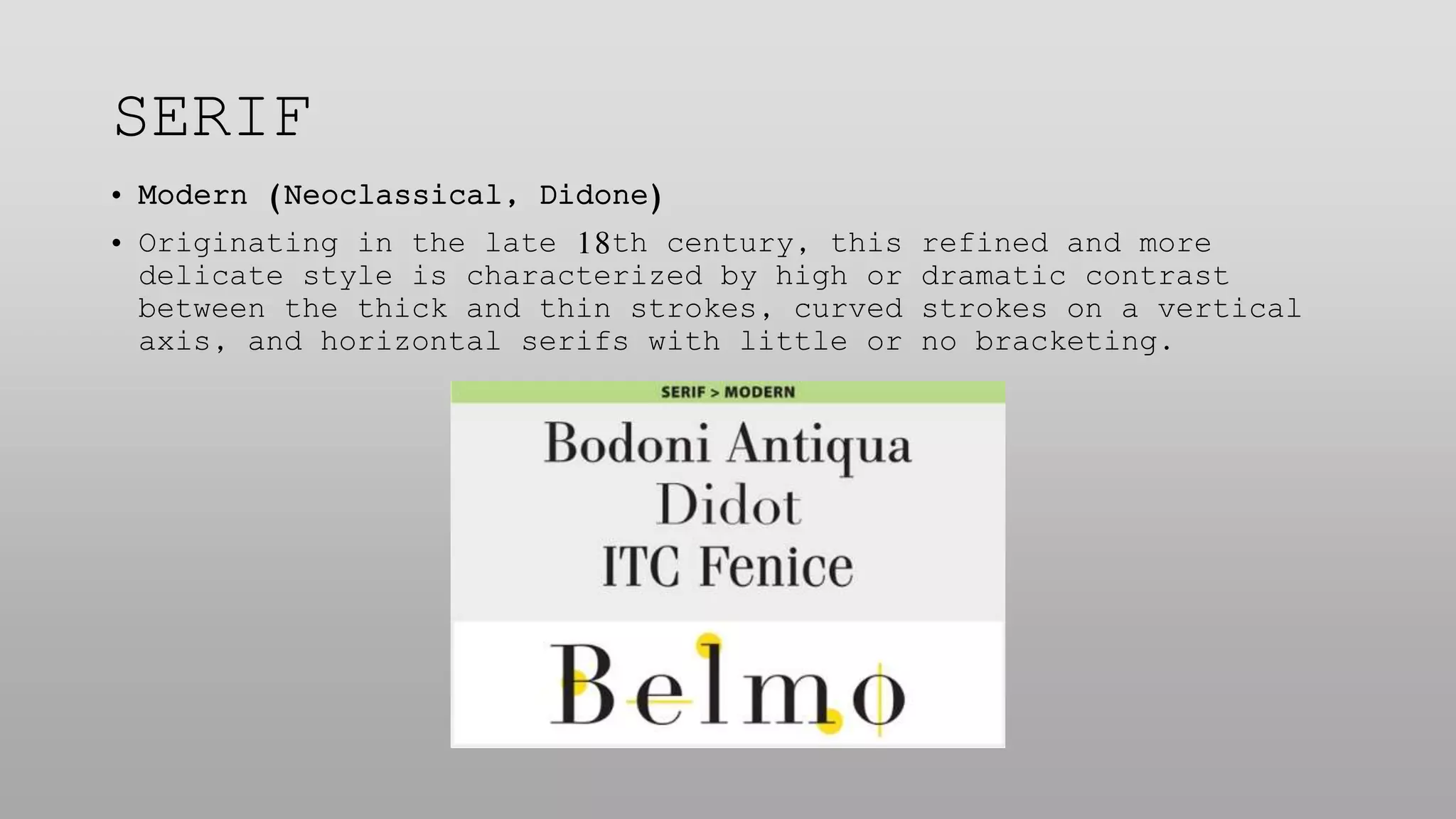
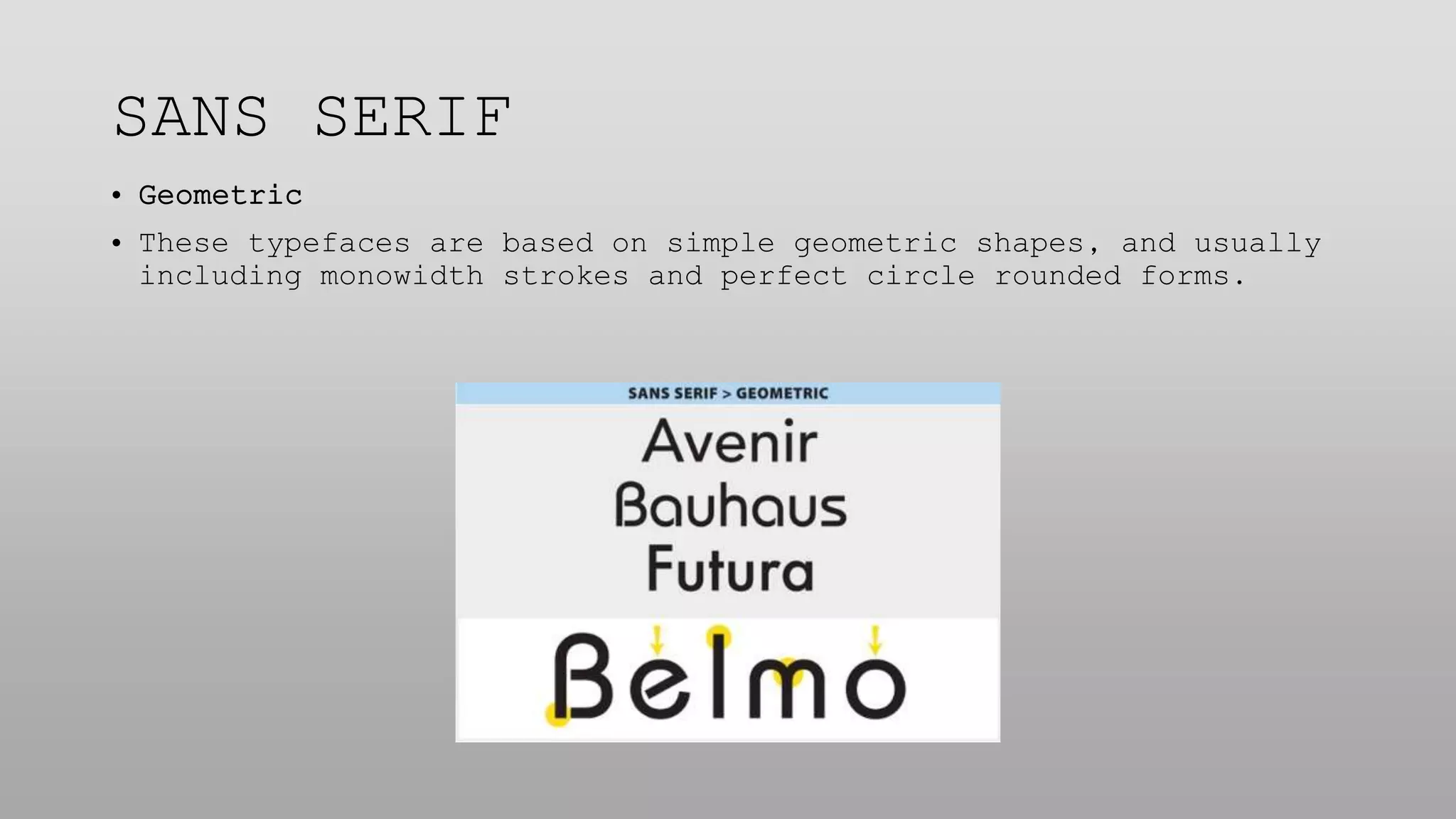
- Type classifications include serif, sans serif, scripts, decorative, and others defined by their visual characteristics and historical origins.
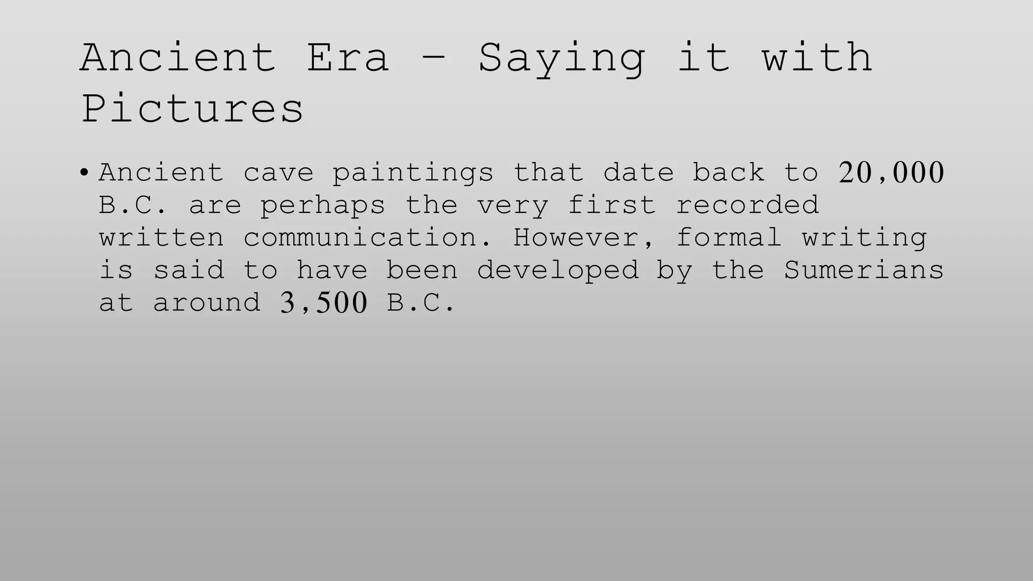
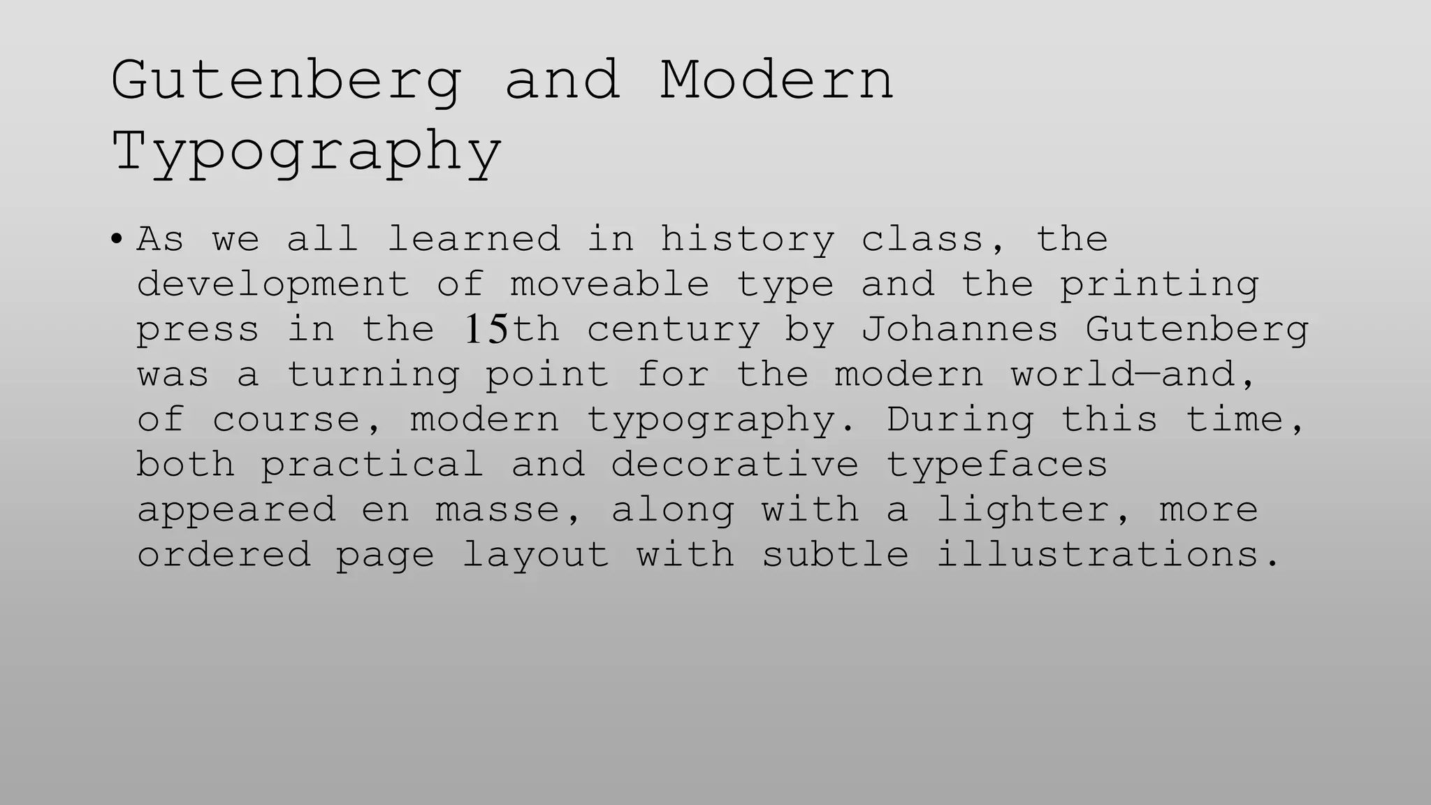
- The history of typography progressed from ancient cave paintings, to illuminated manuscripts in the Middle Ages, to the printing press and widespread typeface development sparked by Gutenberg.