


![classification
1. Serif—Humanist, Old Style,Transitional, and Modern
2. Slab Serif—Egyptian and Clarendon
3. Sans Serif—Grotesque, Geometric, Humanist, andTransitional
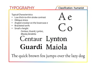
Serif: Humanist serifs are the original roman typefaces.They are
strikingly different from Blackletter [first typeface style]
TYPOGRAPHY
Blackletter Style
Humanist serifs have a low thick-to-thin stroke contrast and
bracketed serifs.The lowercase e features an angled, rather than
horizontal, crossbar. Round forms such as o have an oblique stress.](https://image.slidesharecdn.com/typography-200831054103/85/Typography-22-320.jpg)


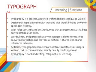
Typography is the craft of arranging type to convey language visually. It involves both macrotypography, which addresses layout and composition, and microtypography, which focuses on typesetting details like kerning and leading. Understanding typographic fundamentals includes learning terminology, anatomy, and classification of type. Serif typefaces are classified as Humanist, Old Style, Transitional, or Modern depending on attributes like stroke contrast, stress, serif style, and character forms. Typography aims to effectively communicate information through refined and balanced function and aesthetics of type.