How To
 Not just a mark
 Reflects a business’s brand using shapes,
fonts, color, and/or images.
 Used for inspiring trust, recognition and
admiration for a company or product
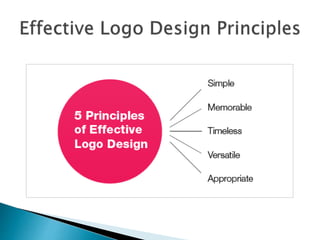
1. A logo must be simple
◦ A simple logo design allows for easy recognition
and allows the logo to be versatile and memorable.
◦ Good logos feature something unexpected or
unique without being irrelevant
2. A logo must be memorable
◦ An effective logo design should be memorable and
this is achieved by having a simple, yet appropriate
logo that does not blend in to the crowd
3. A logo must be timeless
◦ An effective logo should stand the test of time.
◦ A good way to determine is asking if your logo will
still be effective in 10, 20, 50 years?
4. A logo must be versatile
◦ An effective logo should be able to work across a
variety of mediums and applications
◦ It should be able to scale to a number of different
sizes
◦ It should be able to work in just one color or
grayscale as well
5. A logo must be appropriate
◦ An effective logo is appropriate for its intended
purpose.
 If you are designing for a children’s store – use a
childish font and color scheme
 These same fonts and color schemes would not be
appropriate for a law firm
1971- Represents
the wing in the
famous statue of
the Greek
Goddess of
victory
 Choosing common fonts
◦ Times New Roman, Arial, etc.
 Using “stock” images or copying competitors
 Preliminary work is a MUST
◦ Sketches (pencil and paper OR digital)
 at least 2-3 different designs
 then 3 variations of each of those
 Create Balance
◦ Balance is important because our minds naturally
perceive a balanced design as being pleasing and
appealing
◦ Keep your logo balanced by keeping the “weight” of
graphics, colors, and size equal on each side
 Clever use of color
◦ Basic rules to keep in mind
 Use colors near to each other in the color wheel (ex.
for a “warm” palettete, use red, orange and yellow
hues)
 Don’t use colors that are so bright they are hard on the
eyes
 IT MUST LOOK GOOD IN BLACK AND WHITE TOO
◦ Know how colors evoke certain feelings and moods
 Design style should suit the company
◦ Research the client and its audience
 Typography matters…A LOT!
◦ Avoid commonly used fonts
◦ Make sure the font is legible when scaled down,
especially with scripts
◦ One font is ideal – avoid more than TWO
 The goal is RECOGNITION
◦ Combine all graphic design elements and principles
 Design for the CLIENT NOT YOU
◦ You should never inject too much of your own
personality into the logo
◦ You are designing to appeal to the client and their
target audience, not yourself
 K.I.S.S.
◦ Keep It Simple, Stupid
◦ The more simple the logo, the more recognizable it
will be
◦ Work the design down to its essentials and leave
out all the unnecessary elements
 Use other design for INSPIRATION ONLY!
◦ Don’t copy other designers’ work! While there’s
nothing wrong with being inspired by other
designers, copying another person’s ideas or work
is morally and legally wrong
 Research
 Brainstorm and generate ideas
 Preliminary sketches
 Develop digital versions of design
 Send to client for comments and feedback
 Add or remove anything the client wants
 Finalize
 Design a logo for MooCow String Cheese
 Miss. Pruett is your client
 Target Audience – Moms with school-aged
children (think packing lunches or carpooling
with snacks for all the kids in the van)
 You may work in partners or on your own
 Today
◦ research and sketching
 Tomorrow
◦ sketches due
 3 different logos (or 3 different versions of one logo)
◦ begin digital version
 Friday
◦ first draft of logo due at end of class
Be prepared to provide rationale for certain
design choices and elements

Logo design

  • 1.
  • 2.
     Not justa mark  Reflects a business’s brand using shapes, fonts, color, and/or images.  Used for inspiring trust, recognition and admiration for a company or product
  • 4.
    1. A logomust be simple ◦ A simple logo design allows for easy recognition and allows the logo to be versatile and memorable. ◦ Good logos feature something unexpected or unique without being irrelevant
  • 5.
    2. A logomust be memorable ◦ An effective logo design should be memorable and this is achieved by having a simple, yet appropriate logo that does not blend in to the crowd
  • 6.
    3. A logomust be timeless ◦ An effective logo should stand the test of time. ◦ A good way to determine is asking if your logo will still be effective in 10, 20, 50 years?
  • 7.
    4. A logomust be versatile ◦ An effective logo should be able to work across a variety of mediums and applications ◦ It should be able to scale to a number of different sizes ◦ It should be able to work in just one color or grayscale as well
  • 8.
    5. A logomust be appropriate ◦ An effective logo is appropriate for its intended purpose.  If you are designing for a children’s store – use a childish font and color scheme  These same fonts and color schemes would not be appropriate for a law firm
  • 9.
    1971- Represents the wingin the famous statue of the Greek Goddess of victory
  • 11.
     Choosing commonfonts ◦ Times New Roman, Arial, etc.  Using “stock” images or copying competitors
  • 12.
     Preliminary workis a MUST ◦ Sketches (pencil and paper OR digital)  at least 2-3 different designs  then 3 variations of each of those
  • 13.
     Create Balance ◦Balance is important because our minds naturally perceive a balanced design as being pleasing and appealing ◦ Keep your logo balanced by keeping the “weight” of graphics, colors, and size equal on each side
  • 14.
     Clever useof color ◦ Basic rules to keep in mind  Use colors near to each other in the color wheel (ex. for a “warm” palettete, use red, orange and yellow hues)  Don’t use colors that are so bright they are hard on the eyes  IT MUST LOOK GOOD IN BLACK AND WHITE TOO ◦ Know how colors evoke certain feelings and moods
  • 15.
     Design styleshould suit the company ◦ Research the client and its audience
  • 16.
     Typography matters…ALOT! ◦ Avoid commonly used fonts ◦ Make sure the font is legible when scaled down, especially with scripts ◦ One font is ideal – avoid more than TWO
  • 17.
     The goalis RECOGNITION ◦ Combine all graphic design elements and principles
  • 18.
     Design forthe CLIENT NOT YOU ◦ You should never inject too much of your own personality into the logo ◦ You are designing to appeal to the client and their target audience, not yourself
  • 19.
     K.I.S.S. ◦ KeepIt Simple, Stupid ◦ The more simple the logo, the more recognizable it will be ◦ Work the design down to its essentials and leave out all the unnecessary elements
  • 20.
     Use otherdesign for INSPIRATION ONLY! ◦ Don’t copy other designers’ work! While there’s nothing wrong with being inspired by other designers, copying another person’s ideas or work is morally and legally wrong
  • 21.
     Research  Brainstormand generate ideas  Preliminary sketches  Develop digital versions of design  Send to client for comments and feedback  Add or remove anything the client wants  Finalize
  • 22.
     Design alogo for MooCow String Cheese  Miss. Pruett is your client  Target Audience – Moms with school-aged children (think packing lunches or carpooling with snacks for all the kids in the van)  You may work in partners or on your own
  • 23.
     Today ◦ researchand sketching  Tomorrow ◦ sketches due  3 different logos (or 3 different versions of one logo) ◦ begin digital version  Friday ◦ first draft of logo due at end of class Be prepared to provide rationale for certain design choices and elements