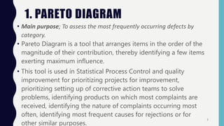
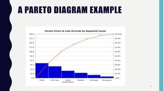
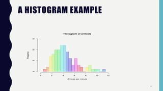
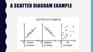
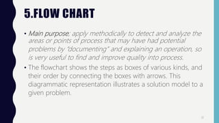
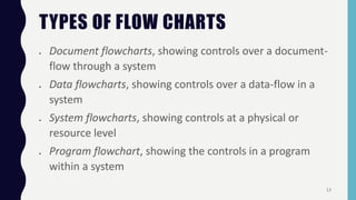
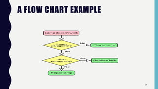
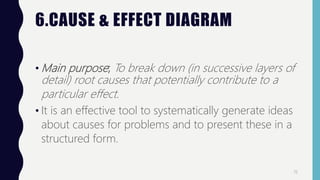
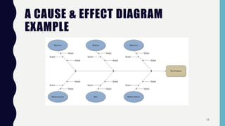
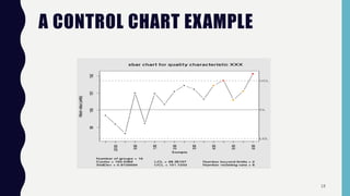
Quality control tools are used to collect and analyze data to identify root causes and measure quality improvements. The main tools discussed are Pareto charts, histograms, scatter diagrams, check sheets, flow charts, cause and effect diagrams, and control charts. Pareto charts arrange defects by category to identify the most common issues. Histograms depict the distribution of a variable through frequency bars. Scatter diagrams show the relationship between two variables with data points on an x-y graph. Check sheets systematically collect specified data. Flow charts document processes through a series of boxes and arrows. Cause and effect diagrams break down potential root causes in successive layers of detail. Control charts determine if a process should be examined by distinguishing between random and assignable variation. Examples
1. QUALITY
CONTROL TOOLS
P R E S E N T E D BY ; C H E M E N G I C H S A M M Y J A M A R
P R E S E N T E D TO ; P R O F. M O H A M M A D Y O U N E S
2. INTRODUCTION
Quality Control tools are the means for Collecting data,
analyzing data, identifying root causes and measuring the
results
These tools make quality improvements easier to see,
implement and track. They are mainly;
Pareto chart
Scatter diagram
Check sheets
Cause & effect diagram
Histogram
2
3. 1. PARETO DIAGRAM
• Main purpose; To assess the most frequently occurring defects by
category.
• Pareto Diagram is a tool that arranges items in the order of the
magnitude of their contribution, thereby identifying a few items
exerting maximum influence.
• This tool is used in Statistical Process Control and quality
improvement for prioritizing projects for improvement,
prioritizing setting up of corrective action teams to solve
problems, identifying products on which most complaints are
received, identifying the nature of complaints occurring most
often, identifying most frequent causes for rejections or for
other similar purposes.
3
5. 2.HISTOGRAM
• Main purpose; To roughly assess the probability distribution of a
given variable by depicting the frequencies of observations
occurring in certain ranges of values.
• Histograms or Frequency Distribution Diagrams are bar charts
showing the distribution pattern of observations grouped in
convenient class intervals and arranged in order of
magnitude.
• Histograms are useful in studying patterns of distribution and
in drawing conclusions about the process based on the
pattern.
5
7. 3. SCATTER DIAGRAM
• Main purpose; To identify the type of relationship (if any)
between two quantitative variables.
• A relationship may or may not exist between two variables. If
a relationship exists, it may be positive or negative, it may be
strong or weak and may be simple or complex.
• It consists of plotting a series of points representing several
observations on a graph in which one variable is on X-axis
the other variable in on Y-axis.
7
9. 4. CHECK SHEETS
• Main purpose; To provide a structured way to collect quality-
related data as a rough means for assessing a process or as
input to other analyses.
• Check sheets are tools for collecting data.
• They are designed specific to the type of data to be
• Check sheets aid in systematic collection of data.
9
10. USES OF CHECK SHEETS
• Kaoru Ishikawa identified five uses for check sheets in quality
control:
To check the shape of the probability distribution of a
process
To quantify defects by type
To quantify defects by location
To quantify defects by cause (machine, worker)
To keep track of the completion of steps in a multistep
procedure (in other words, as a checklist)
10
12. 5.FLOW CHART
• Main purpose; apply methodically to detect and analyze the
areas or points of process that may have had potential
problems by “documenting” and explaining an operation, so
is very useful to find and improve quality into process.
• The flowchart shows the steps as boxes of various kinds, and
their order by connecting the boxes with arrows. This
diagrammatic representation illustrates a solution model to a
given problem.
12
13. TYPES OF FLOW CHARTS
Document flowcharts, showing controls over a document-
flow through a system
Data flowcharts, showing controls over a data-flow in a
system
System flowcharts, showing controls at a physical or
resource level
Program flowchart, showing the controls in a program
within a system
13
15. 6.CAUSE & EFFECT DIAGRAM
• Main purpose; To break down (in successive layers of
detail) root causes that potentially contribute to a
particular effect.
• It is an effective tool to systematically generate ideas
about causes for problems and to present these in a
structured form.
15
17. 7.CONTROL CHARTS
• Main purpose; To determine whether a process
should undergo a formal examination for quality-
related problems.
• Variability is inherent in all manufacturing processes.
These variations may be due to two causes;
Random / Chance causes (un-preventable).
Assignable causes (preventable).
17