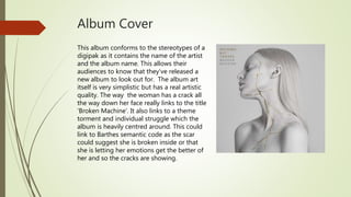
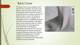
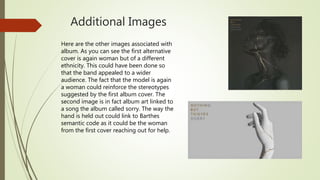
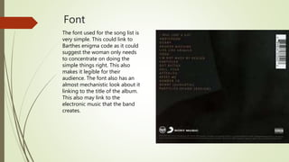
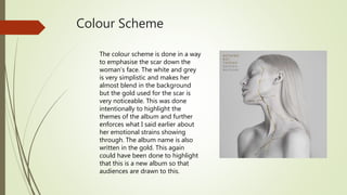
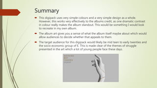
Textual Analysis Digipack
By Oliver Robinson
Broken Machine – Nothing But Thieves
 Broken Machine is the 2nd album released by NBT on September 8th 2017.
 After making a name for themselves with their debut album ‘Nothing but Thieves’
in 2015, pushing the boat out and defining themselves within the alternative rock
genre, with a variety of music, which is now more political.
 The album made it as high as N0.2 in the UK charts but only made it to 46 in the
US Top Rock albums (Billboard).
Album Cover
This album conforms to the stereotypes of a
digipak as it contains the name of the artist
and the album name. This allows their
audiences to know that they’ve released a
new album to look out for. The album art
itself is very simplistic but has a real artistic
quality. The way the woman has a crack all
the way down her face really links to the title
‘Broken Machine’. It also links to a theme
torment and individual struggle which the
album is heavily centred around. This could
link to Barthes semantic code as the scar
could suggest she is broken inside or that
she is letting her emotions get the better of
her and so the cracks are showing.
Back Cover
The back cover is very simplistic much
like the front. However, the back cover
shows a close up of the woman’s neck.
In the photo on the front the woman is
nude and as this is a close up section of
the front she is nude in this photo as
well. From this we can suggest she is
vulnerable as she is completely exposed.
This links to Laura Mulvey’s male gaze
theory as the extreme close up is there
for the purpose of male enjoyment
which also links to the fetishist
scopophilia. Not only this but it links to
the stereotypes of women as they are
usually portrayed as damsels in distress
and the same applies here. This also
conforms to the conventions of a
digipack as it references the record label
as well as having a barcode.
Additional Images
Here are the other images associated with
album. As you can see the first alternative
cover is again woman but of a different
ethnicity. This could have been done so
that the band appealed to a wider
audience. The fact that the model is again
a woman could reinforce the stereotypes
suggested by the first album cover. The
second image is in fact album art linked to
a song the album called sorry. The way the
hand is held out could link to Barthes
semantic code as it could be the woman
from the first cover reaching out for help.
Font
The font used for the song list is
very simple. This could link to
Barthes enigma code as it could
suggest the woman only needs
to concentrate on doing the
simple things right. This also
makes it legible for their
audience. The font also has an
almost mechanistic look about it
linking to the title of the album.
This also may link to the
electronic music that the band
creates.
Colour Scheme
The colour scheme is done in a way
to emphasise the scar down the
woman’s face. The white and grey
is very simplistic and makes her
almost blend in the background
but the gold used for the scar is
very noticeable. This was done
intentionally to highlight the
themes of the album and further
enforces what I said earlier about
her emotional strains showing
through. The album name is also
written in the gold. This again
could have been done to highlight
that this is a new album so that
audiences are drawn to this.
Summary
 This digipack uses very simple colours and a very simple design as a whole.
However, this works very effectively to the albums credit, as one dramatic contrast
in colour really makes the album standout. This would be something I would look
to recreate in my own album.
 The album art gives you a sense of what the album itself maybe about which would
allow audiences to decide whether that appeals to them.
 The target audience for this digipack would likely be mid teen to early twenties and
the socio economic group of E. This is made clear of the themes of struggle
presented in the art which a lot of young people face these days.

Textual analysis digipack

  • 1.
  • 2.
    Broken Machine –Nothing But Thieves  Broken Machine is the 2nd album released by NBT on September 8th 2017.  After making a name for themselves with their debut album ‘Nothing but Thieves’ in 2015, pushing the boat out and defining themselves within the alternative rock genre, with a variety of music, which is now more political.  The album made it as high as N0.2 in the UK charts but only made it to 46 in the US Top Rock albums (Billboard).
  • 3.
    Album Cover This albumconforms to the stereotypes of a digipak as it contains the name of the artist and the album name. This allows their audiences to know that they’ve released a new album to look out for. The album art itself is very simplistic but has a real artistic quality. The way the woman has a crack all the way down her face really links to the title ‘Broken Machine’. It also links to a theme torment and individual struggle which the album is heavily centred around. This could link to Barthes semantic code as the scar could suggest she is broken inside or that she is letting her emotions get the better of her and so the cracks are showing.
  • 4.
    Back Cover The backcover is very simplistic much like the front. However, the back cover shows a close up of the woman’s neck. In the photo on the front the woman is nude and as this is a close up section of the front she is nude in this photo as well. From this we can suggest she is vulnerable as she is completely exposed. This links to Laura Mulvey’s male gaze theory as the extreme close up is there for the purpose of male enjoyment which also links to the fetishist scopophilia. Not only this but it links to the stereotypes of women as they are usually portrayed as damsels in distress and the same applies here. This also conforms to the conventions of a digipack as it references the record label as well as having a barcode.
  • 5.
    Additional Images Here arethe other images associated with album. As you can see the first alternative cover is again woman but of a different ethnicity. This could have been done so that the band appealed to a wider audience. The fact that the model is again a woman could reinforce the stereotypes suggested by the first album cover. The second image is in fact album art linked to a song the album called sorry. The way the hand is held out could link to Barthes semantic code as it could be the woman from the first cover reaching out for help.
  • 6.
    Font The font usedfor the song list is very simple. This could link to Barthes enigma code as it could suggest the woman only needs to concentrate on doing the simple things right. This also makes it legible for their audience. The font also has an almost mechanistic look about it linking to the title of the album. This also may link to the electronic music that the band creates.
  • 7.
    Colour Scheme The colourscheme is done in a way to emphasise the scar down the woman’s face. The white and grey is very simplistic and makes her almost blend in the background but the gold used for the scar is very noticeable. This was done intentionally to highlight the themes of the album and further enforces what I said earlier about her emotional strains showing through. The album name is also written in the gold. This again could have been done to highlight that this is a new album so that audiences are drawn to this.
  • 8.
    Summary  This digipackuses very simple colours and a very simple design as a whole. However, this works very effectively to the albums credit, as one dramatic contrast in colour really makes the album standout. This would be something I would look to recreate in my own album.  The album art gives you a sense of what the album itself maybe about which would allow audiences to decide whether that appeals to them.  The target audience for this digipack would likely be mid teen to early twenties and the socio economic group of E. This is made clear of the themes of struggle presented in the art which a lot of young people face these days.