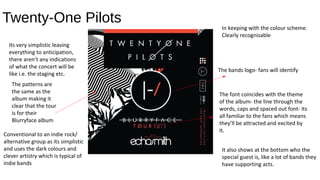
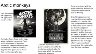
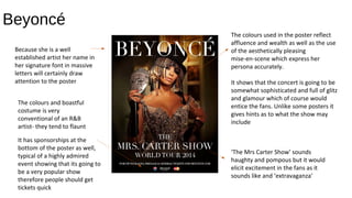
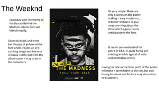
Ancillary Task Two-
Posters
By Sam Mir
Twenty-One Pilots
In keeping with the colour scheme.
Clearly recognisable
The bands logo- fans will identify
The font coincides with the theme
of the album- the line through the
words, caps and spaced out font- its
all familiar to the fans which means
they’ll be attracted and excited by
it.
Its very simplistic leaving
everything to anticipation,
there aren’t any indications
of what the concert will be
like i.e. the staging etc.
Conventional to an indie rock/
alternative group as its simplistic
and uses the dark colours and
clever artistry which is typical of
indie bands
It also shows at the bottom who the
special guest is, like a lot of bands they
have supporting acts.
The patterns are
the same as the
album making it
clear that the tour
is for their
Blurryface album
Arctic monkeys There is continuity with the
greyscale theme. Although the
two posters differ in what
they’re showing.
One of the posters is more
recent and the other is a few
years back. It could be that
they chose to have the image
of Alex Turner on the front of
the more recent poster
because they have grown in
popularity and the fans now
are aware of who Alex is, and
fans tend to idolise him rather
than the music which would
differ from a few years ago
when it was more about
experiencing the music rather
than the band members.
Having the ‘heart throb’ centre stage
would excites the consumers. This is
more conventional of a popular
alternative/ rock group although less
conventional of indie music which
they may have grown out of due to
their ever increasing fan-base.
Aesthetic illustrations on the
poster are conventional for the
mysterious and indie vibe the
band have, which the audience
would also relate too.
They also include
the supporting
act, typical of a
concert poster
Beyoncé
The colours used in the poster reflect
affluence and wealth as well as the use
of the aesthetically pleasing
mise-en-scene which express her
persona accurately.
It shows that the concert is going to be
somewhat sophisticated and full of glitz
and glamour which of course would
entice the fans. Unlike some posters it
gives hints as to what the show may
include
‘The Mrs Carter Show’ sounds
haughty and pompous but it would
elicit excitement in the fans as it
sounds like and ‘extravaganza’
Because she is a well
established artist her name in
her signature font in massive
letters will certainly draw
attention to the poster
The colours and boastful
costume is very
conventional of an R&B
artist- they tend to flaunt
It has sponsorships at the
bottom of the poster as well,
typical of a highly admired
event showing that its going to
be a very popular show
therefore people should get
tickets quick
The Weeknd
Coincides with the theme of
the Beauty Behind the
Madness album- fans will
identify easily.
Generally black and white
bar the pop of yellow on the
font which creates an eye-
catching image and because
it makes it different from the
album cover it may draw in
the consumers
Its very simple, there are
only 6 words on the poster
making It very mysterious,
it doesn’t indicate or give
away anything about the
show which again creates
anticipation in the fans.
It seems conventional of his
genre of R&B, its quite fazing yet
enticing which is typical of indie
and alternative artists.
Having his face as the focal point of the poster
will make it identifiable to the fans but also
having his name and his face may also entice
new listeners

Ancillary task two

  • 1.
  • 2.
    Twenty-One Pilots In keepingwith the colour scheme. Clearly recognisable The bands logo- fans will identify The font coincides with the theme of the album- the line through the words, caps and spaced out font- its all familiar to the fans which means they’ll be attracted and excited by it. Its very simplistic leaving everything to anticipation, there aren’t any indications of what the concert will be like i.e. the staging etc. Conventional to an indie rock/ alternative group as its simplistic and uses the dark colours and clever artistry which is typical of indie bands It also shows at the bottom who the special guest is, like a lot of bands they have supporting acts. The patterns are the same as the album making it clear that the tour is for their Blurryface album
  • 3.
    Arctic monkeys Thereis continuity with the greyscale theme. Although the two posters differ in what they’re showing. One of the posters is more recent and the other is a few years back. It could be that they chose to have the image of Alex Turner on the front of the more recent poster because they have grown in popularity and the fans now are aware of who Alex is, and fans tend to idolise him rather than the music which would differ from a few years ago when it was more about experiencing the music rather than the band members. Having the ‘heart throb’ centre stage would excites the consumers. This is more conventional of a popular alternative/ rock group although less conventional of indie music which they may have grown out of due to their ever increasing fan-base. Aesthetic illustrations on the poster are conventional for the mysterious and indie vibe the band have, which the audience would also relate too. They also include the supporting act, typical of a concert poster
  • 4.
    Beyoncé The colours usedin the poster reflect affluence and wealth as well as the use of the aesthetically pleasing mise-en-scene which express her persona accurately. It shows that the concert is going to be somewhat sophisticated and full of glitz and glamour which of course would entice the fans. Unlike some posters it gives hints as to what the show may include ‘The Mrs Carter Show’ sounds haughty and pompous but it would elicit excitement in the fans as it sounds like and ‘extravaganza’ Because she is a well established artist her name in her signature font in massive letters will certainly draw attention to the poster The colours and boastful costume is very conventional of an R&B artist- they tend to flaunt It has sponsorships at the bottom of the poster as well, typical of a highly admired event showing that its going to be a very popular show therefore people should get tickets quick
  • 5.
    The Weeknd Coincides withthe theme of the Beauty Behind the Madness album- fans will identify easily. Generally black and white bar the pop of yellow on the font which creates an eye- catching image and because it makes it different from the album cover it may draw in the consumers Its very simple, there are only 6 words on the poster making It very mysterious, it doesn’t indicate or give away anything about the show which again creates anticipation in the fans. It seems conventional of his genre of R&B, its quite fazing yet enticing which is typical of indie and alternative artists. Having his face as the focal point of the poster will make it identifiable to the fans but also having his name and his face may also entice new listeners
  • 6.
    The Weeknd Coincides withthe theme of the Beauty Behind the Madness album- fans will identify easily. Generally black and white bar the pop of yellow on the font which creates an eye- catching image and because it makes it different from the album cover it may draw in the consumers Its very simple, there are only 6 words on the poster making It very mysterious, it doesn’t indicate or give away anything about the show which again creates anticipation in the fans. It seems conventional of his genre of R&B, its quite fazing yet enticing which is typical of indie and alternative artists. Having his face as the focal point of the poster will make it identifiable to the fans but also having his name and his face may also entice new listeners