unwanted pregnancy Kit [+918133066128] Abortion Pills IN Dubai UAE Abudhabi
Bears den analysis pdf
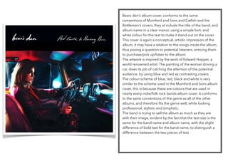
1. Bears den’s album cover, conforms to the same
conventions of Mumford and Sons and Catfish and the
Bottlemen’s covers, they al include the title of the band, and
album name in a clear manor, using a simple font, and
white colour for the text to make it stand out on the cover.
This cover is again a conceptual, artistic impression of the
album, it may have a relation to the songs inside the album,
thus posing a question to potential listeners, enticing them
to purchase/pick up/listen to the album.
The artwork is inspired by the work of Edward Hopper, a
world renowned artist. The painting of the woman driving a
car, does its job of catching the attention of the potential
audience, by using blue and red as contrasting covers.
The colour scheme of blue, red, black and white is very
similar to the scheme used in the Mumford and Sons album
cover, this is because these are colours that are used in
nearly every indie/folk rock bands album cover. It conforms
to the same conventions of the genre as all of the other
albums, and therefore fits the genre well, while looking
professional, stylistic and simplistic.
The band is trying to sell the album as much as they are
with their image, evident by the fact that the text size is the
same for the band name and album name, with the slight
difference of bold text for the band name, to distinguish a
difference between the two pieces of text.