Digipak Analysis
Olli Murphy
• What is a Digipak?
• A digipak is essentially an album case which is
often made of card. Digipaks are usually
presented in a book style, having more than just a
simple two sided case with one disc tray.
• The general content of a digipak would be the CD
case with the album name and the name of the
artist on the front, with the disc/s being inside
along with and information or lyric booklet. On
the back there is normally a track listing for the
album and any other content in the digipack.
Simple, pastel
coloured
background. This
makes the
strong, black
symbol stand out.
Artist/ Album
name clearly
presented at
bottom of cover.
No other
information is
presented on the
cover as the
audience for this
music doesn’t
want to be
bombarded with
information
straight away.
Simple, 2 tone
colour scheme
Use of strange
shaped object as
main focus of cover.
This is his logo. The
tears coming from
the eye show that the
music is not as
innocent as it may
first seem and has a
hidden, deep
meaning.
Image of an
eye, follows
convention of seeing/
voyeurism- popular
within genre
XXYYXX: XXYYXX
Album/Artist name
the same. Simple
and means the cover
can be very simple
and easy to take in.
James Blake: James Blake
Simple, 2
Coloured
palette for
artwork.
Image of actual
artist used on
front cover. This
has been edited in
post production to
give it a
trippy, weird feel.
Artist/ Album name
are the same.
Artist/ Album name
clearly presented at
bottom of cover.
4 eyes in image-
continuing
theme of
voyeurism.
The face on the cover at first glance
is looking directly at the
viewer, drawing them in. They are
then drawn in further when they
notice there are, infact, two photos
blended together.
Rihanna: Loud
Rihanna’s digipack for
‘Loud’ all follows the
same colour scheme
and theme. In the
video for the single
she is outside and
surrounded by red
roses. Her hair and
lips in the video are
also a strong red
colour. This implies a
richness as well as
implying love and
passion. The colours
of her lips and hair
also match the roses
which are natural
which could imply an
innocent or natural
aspect to her.
The name of the artist; ‘Rihanna’ isn’t very
large on the cover which is instead
dominated by an image of her face. This is
because she is already very famous and her
face very well known, meaning people will
recognise her simply by the picture.
Rihanna uses lots of
images of herself in
the digipak as she
knows that her looks
are part of the
reason for her fame.
Women can see her
as a role model
whilst men are
attracted to her and
might buy simply for
this reason. There is
a very obvious
theme of femininity
in the digipack but
also could show the
male gaze; attracting
male viewers to the
digipack.

Digipak Analysis

  • 1.
  • 2.
    • What isa Digipak? • A digipak is essentially an album case which is often made of card. Digipaks are usually presented in a book style, having more than just a simple two sided case with one disc tray. • The general content of a digipak would be the CD case with the album name and the name of the artist on the front, with the disc/s being inside along with and information or lyric booklet. On the back there is normally a track listing for the album and any other content in the digipack.
  • 3.
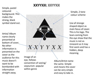
    Simple, pastel coloured background. This makesthe strong, black symbol stand out. Artist/ Album name clearly presented at bottom of cover. No other information is presented on the cover as the audience for this music doesn’t want to be bombarded with information straight away. Simple, 2 tone colour scheme Use of strange shaped object as main focus of cover. This is his logo. The tears coming from the eye show that the music is not as innocent as it may first seem and has a hidden, deep meaning. Image of an eye, follows convention of seeing/ voyeurism- popular within genre XXYYXX: XXYYXX Album/Artist name the same. Simple and means the cover can be very simple and easy to take in.
  • 4.
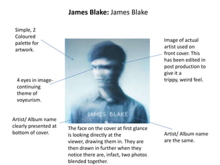
    James Blake: JamesBlake Simple, 2 Coloured palette for artwork. Image of actual artist used on front cover. This has been edited in post production to give it a trippy, weird feel. Artist/ Album name are the same. Artist/ Album name clearly presented at bottom of cover. 4 eyes in image- continuing theme of voyeurism. The face on the cover at first glance is looking directly at the viewer, drawing them in. They are then drawn in further when they notice there are, infact, two photos blended together.
  • 5.
    Rihanna: Loud Rihanna’s digipackfor ‘Loud’ all follows the same colour scheme and theme. In the video for the single she is outside and surrounded by red roses. Her hair and lips in the video are also a strong red colour. This implies a richness as well as implying love and passion. The colours of her lips and hair also match the roses which are natural which could imply an innocent or natural aspect to her. The name of the artist; ‘Rihanna’ isn’t very large on the cover which is instead dominated by an image of her face. This is because she is already very famous and her face very well known, meaning people will recognise her simply by the picture. Rihanna uses lots of images of herself in the digipak as she knows that her looks are part of the reason for her fame. Women can see her as a role model whilst men are attracted to her and might buy simply for this reason. There is a very obvious theme of femininity in the digipack but also could show the male gaze; attracting male viewers to the digipack.