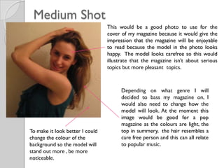
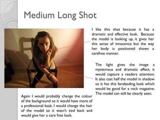
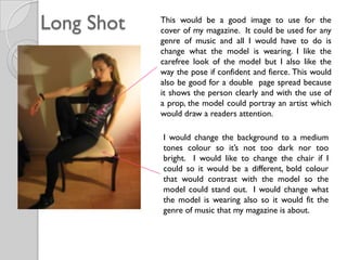
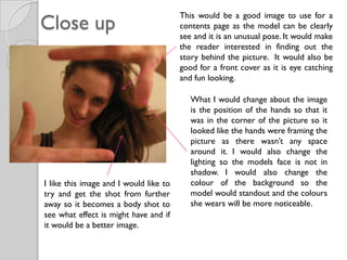
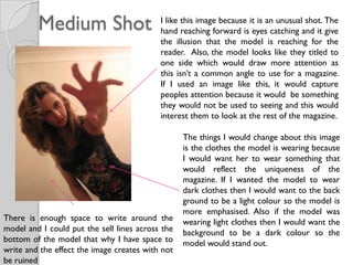
The document discusses potential cover shots for a magazine. It analyzes several photos of a model in different poses and compositions. For each photo, it discusses what genre of music it could represent and how the background, lighting, model's appearance could be modified to improve the image and make it suitable for different sections of the magazine like the cover or contents page.
2. Medium Shot
This would be a good photo to use for the
cover of my magazine because it would give the
impression that the magazine will be enjoyable
to read because the model in the photo looks
happy. The model looks carefree so this would
illustrate that the magazine isn’t about serious
topics but more pleasant topics.
Depending on what genre I will
decided to bass my magazine on, I
would also need to change how the
model will look. At the moment this
image would be good for a pop
magazine as the colours are light, the
To make it look better I could top in summery, the hair resembles a
change the colour of the care free person and this can all relate
background so the model will to popular music.
stand out more , be more
noticeable.
3. Medium Long Shot
I like this shot because it has a
dramatic and effective look. Because
the model is looking up, it gives her
this sense of innocence but the way
her body is positioned shows a
carefree manner.
The light gives the image a
mysterious and dramatic effect, it
would capture a readers attention.
It also cast half the model in shadow
so it has this foreboding look which
would be good for a rock magazine.
The model can still be clearly seen.
Again I would probably change the colour
of the background so it would have more of
a professional look. I would change the hair
of the model so it wasn’t tied back and
would give her a care free look.
4. Long Shot This would be a good image to use for the
cover of my magazine. It could be used for any
genre of music and all I would have to do is
change what the model is wearing. I like the
carefree look of the model but I also like the
way the pose if confident and fierce. This would
also be good for a double page spread because
it shows the person clearly and with the use of
a prop, the model could portray an artist which
would draw a readers attention.
I would change the background to a medium
tones colour so it’s not too dark nor too
bright. I would like to change the chair if I
could so it would be a different, bold colour
that would contrast with the model so the
model could stand out. I would change what
the model is wearing also so it would fit the
genre of music that my magazine is about.
5. Close up
This would be a good image to use for a
contents page as the model can be clearly
see and it is an unusual pose. It would make
the reader interested in finding out the
story behind the picture. It would also be
good for a front cover as it is eye catching
and fun looking.
What I would change about the image
is the position of the hands so that it
was in the corner of the picture so it
looked like the hands were framing the
picture as there wasn’t any space
around it. I would also change the
lighting so the models face is not in
shadow. I would also change the
I like this image and I would like to colour of the background so the
try and get the shot from further model would standout and the colours
away so it becomes a body shot to she wears will be more noticeable.
see what effect is might have and if
it would be a better image.
6. Medium Shot I like this image because it is an unusual shot. The
hand reaching forward is eyes catching and it give
the illusion that the model is reaching for the
reader. Also, the model looks like they titled to
one side which would draw more attention as
this isn’t a common angle to use for a magazine.
If I used an image like this, it would capture
peoples attention because it would be something
they would not be used to seeing and this would
interest them to look at the rest of the magazine.
The things I would change about this image
is the clothes the model is wearing because
I would want her to wear something that
would reflect the uniqueness of the
magazine. If I wanted the model to wear
dark clothes then I would want to the back
ground to be a light colour so the model is
more emphasised. Also if the model was
There is enough space to write around the wearing light clothes then I would want the
model and I could put the sell lines across the background to be a dark colour so the
bottom of the model that why I have space to model would stand out.
write and the effect the image creates with not
be ruined