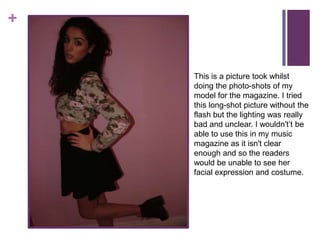
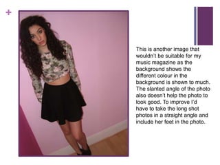
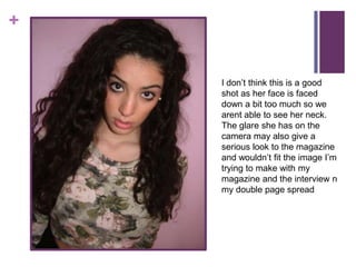
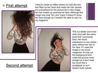
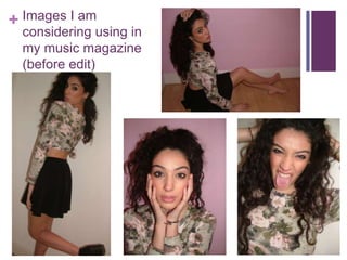
+


    Photoshoot 1
    Images I will be choosing to
    use in my magazine
+


    This is a picture took whilst
    doing the photo-shots of my
    model for the magazine. I tried
    this long-shot picture without the
    flash but the lighting was really
    bad and unclear. I wouldn't’t be
    able to use this in my music
    magazine as it isn't clear
    enough and so the readers
    would be unable to see her
    facial expression and costume.
+


    This is another image that
    wouldn’t be suitable for my
    music magazine as the
    background shows the
    different colour in the
    background is shown to much.
    The slanted angle of the photo
    also doesn’t help the photo to
    look good. To improve I’d
    have to take the long shot
    photos in a straight angle and
    include her feet in the photo.
+


    I don’t think this is a good
    shot as her face is faced
    down a bit too much so we
    arent able to see her neck.
    The glare she has on the
    camera may also give a
    serious look to the magazine
    and wouldn’t fit the image I’m
    trying to make with my
    magazine and the interview n
    my double page spread
I tried to create an effect where it’s look like she
+ First attempt    has lifted up her head and made her hair spread
                   out everywhere for the picture but in this image,
                   her hair ended up covering her face. Although this
                   image may look ‘fun’ and ‘crazy’ it doesn't’t show
                   her face enough so I wouldn’t be able to use it in
                   my magazine


                                                           This is a better and more
                                                           clear shot with the same
                                                           pose that I previously
                                                           tried. Her facial
                                                           expression is now clearly
                                                           seen without her hair in
                                                           her face. If I used this
                                                           image in my music
                                                           magazine, id crop out
                                                           the background and
                                                           make the picture more
                                                           straight so it don’t look
                                                           too much like a
  Second attempt                                           scrapbook or so it
                                                           doesn’t look rushed.
+ Images I am
  considering using in
  my music magazine
  (before edit)

Shahnaz media photo presentation

  • 1.
    + Photoshoot 1 Images I will be choosing to use in my magazine
  • 2.
    + This is a picture took whilst doing the photo-shots of my model for the magazine. I tried this long-shot picture without the flash but the lighting was really bad and unclear. I wouldn't’t be able to use this in my music magazine as it isn't clear enough and so the readers would be unable to see her facial expression and costume.
  • 3.
    + This is another image that wouldn’t be suitable for my music magazine as the background shows the different colour in the background is shown to much. The slanted angle of the photo also doesn’t help the photo to look good. To improve I’d have to take the long shot photos in a straight angle and include her feet in the photo.
  • 4.
    + I don’t think this is a good shot as her face is faced down a bit too much so we arent able to see her neck. The glare she has on the camera may also give a serious look to the magazine and wouldn’t fit the image I’m trying to make with my magazine and the interview n my double page spread
  • 5.
    I tried tocreate an effect where it’s look like she + First attempt has lifted up her head and made her hair spread out everywhere for the picture but in this image, her hair ended up covering her face. Although this image may look ‘fun’ and ‘crazy’ it doesn't’t show her face enough so I wouldn’t be able to use it in my magazine This is a better and more clear shot with the same pose that I previously tried. Her facial expression is now clearly seen without her hair in her face. If I used this image in my music magazine, id crop out the background and make the picture more straight so it don’t look too much like a Second attempt scrapbook or so it doesn’t look rushed.
  • 6.
    + Images Iam considering using in my music magazine (before edit)