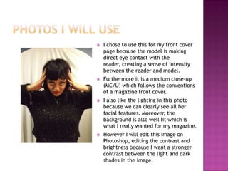
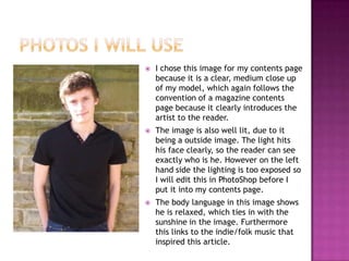
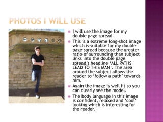
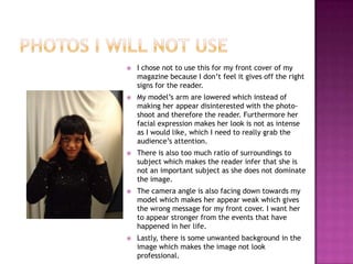
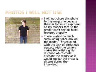
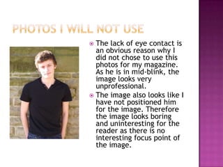
Rebecca Phillips
   I chose to use this for my front cover
    page because the model is making
    direct eye contact with the
    reader, creating a sense of intensity
    between the reader and model.
   Furthermore it is a medium close-up
    (MC/U) which follows the conventions
    of a magazine front cover.
   I also like the lighting in this photo
    because we can clearly see all her
    facial features. Moreover, the
    background is also well lit which is
    what I really wanted for my magazine.
   However I will edit this image on
    Photoshop, editing the contrast and
    brightness because I want a stronger
    contrast between the light and dark
    shades in the image.
   I chose this image for my contents page
    because it is a clear, medium close up
    of my model, which again follows the
    convention of a magazine contents
    page because it clearly introduces the
    artist to the reader.
   The image is also well lit, due to it
    being a outside image. The light hits
    his face clearly, so the reader can see
    exactly who is he. However on the left
    hand side the lighting is too exposed so
    I will edit this in PhotoShop before I
    put it into my contents page.
   The body language in this image shows
    he is relaxed, which ties in with the
    sunshine in the image. Furthermore
    this links to the indie/folk music that
    inspired this article.
   I will use the image for my
    double page spread.
   This is a extreme long-shot image
    which is suitable for my double
    page spread because the greater
    ratio of surrounding than subject
    links into the double page
    spread’s headline ‘ALL PATHS
    LEAD TO THIS MAN’. The area
    around the subject allows the
    reader to ‘follow a path’ towards
    him.
   Again the image is well lit so you
    can clearly see the model.
   The body language in this image
    is confident, relaxed and ‘cool’
    looking which is interesting for
    the reader.
   I chose not to use this for my front cover of my
    magazine because I don’t feel it gives off the right
    signs for the reader.
   My model’s arm are lowered which instead of
    making her appear disinterested with the photo-
    shoot and therefore the reader. Furthermore her
    facial expression makes her look is not as intense
    as I would like, which I need to really grab the
    audience’s attention.
   There is also too much ratio of surroundings to
    subject which makes the reader infer that she is
    not an important subject as she does not dominate
    the image.
   The camera angle is also facing down towards my
    model which makes her appear weak which gives
    the wrong message for my front cover. I want her
    to appear stronger from the events that have
    happened in her life.
   Lastly, there is some unwanted background in the
    image which makes the image not look
    professional.
   I will not chose this photo
    for my magazine because
    there is too much exposure
    on my model’s face so the
    reader can’t see his facial
    features properly.
   There is also too much
    surrounding space around
    the model. This coupled
    with the lack of direct eye
    contact with the camera
    makes the artist signify
    distance which could
    alienate the reader as it
    would appear the artist is
    distant during the
    interview.
 The lack of eye contact is
  an obvious reason why I
  did not chose to use this
  photos for my magazine.
  As he is in mid-blink, the
  image looks very
  unprofessional.
 The image also looks like I
  have not positioned him
  for the image. Therefore
  the image looks boring
  and uninteresting for the
  reader as there is no
  interesting focus point of
  the image.

Original Image Analysis

  • 1.
  • 2.
    I chose to use this for my front cover page because the model is making direct eye contact with the reader, creating a sense of intensity between the reader and model.  Furthermore it is a medium close-up (MC/U) which follows the conventions of a magazine front cover.  I also like the lighting in this photo because we can clearly see all her facial features. Moreover, the background is also well lit which is what I really wanted for my magazine.  However I will edit this image on Photoshop, editing the contrast and brightness because I want a stronger contrast between the light and dark shades in the image.
  • 3.
    I chose this image for my contents page because it is a clear, medium close up of my model, which again follows the convention of a magazine contents page because it clearly introduces the artist to the reader.  The image is also well lit, due to it being a outside image. The light hits his face clearly, so the reader can see exactly who is he. However on the left hand side the lighting is too exposed so I will edit this in PhotoShop before I put it into my contents page.  The body language in this image shows he is relaxed, which ties in with the sunshine in the image. Furthermore this links to the indie/folk music that inspired this article.
  • 4.
    I will use the image for my double page spread.  This is a extreme long-shot image which is suitable for my double page spread because the greater ratio of surrounding than subject links into the double page spread’s headline ‘ALL PATHS LEAD TO THIS MAN’. The area around the subject allows the reader to ‘follow a path’ towards him.  Again the image is well lit so you can clearly see the model.  The body language in this image is confident, relaxed and ‘cool’ looking which is interesting for the reader.
  • 5.
    I chose not to use this for my front cover of my magazine because I don’t feel it gives off the right signs for the reader.  My model’s arm are lowered which instead of making her appear disinterested with the photo- shoot and therefore the reader. Furthermore her facial expression makes her look is not as intense as I would like, which I need to really grab the audience’s attention.  There is also too much ratio of surroundings to subject which makes the reader infer that she is not an important subject as she does not dominate the image.  The camera angle is also facing down towards my model which makes her appear weak which gives the wrong message for my front cover. I want her to appear stronger from the events that have happened in her life.  Lastly, there is some unwanted background in the image which makes the image not look professional.
  • 6.
    I will not chose this photo for my magazine because there is too much exposure on my model’s face so the reader can’t see his facial features properly.  There is also too much surrounding space around the model. This coupled with the lack of direct eye contact with the camera makes the artist signify distance which could alienate the reader as it would appear the artist is distant during the interview.
  • 7.
     The lackof eye contact is an obvious reason why I did not chose to use this photos for my magazine. As he is in mid-blink, the image looks very unprofessional.  The image also looks like I have not positioned him for the image. Therefore the image looks boring and uninteresting for the reader as there is no interesting focus point of the image.