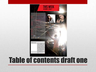
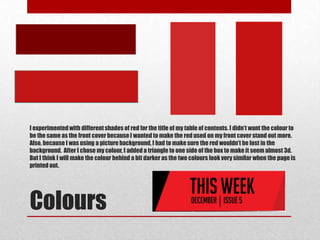
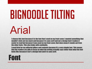
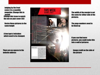
SlideShare a Scribd company logo
1 of 16
Table of contents
commentary
Table of contents draft one
PICTURES
Background picture
This picture wasn’t choose this picture because of the
                              amount of hands in the foreground. The main focus of
                              the picture is meant to be the artists performing and
                              the hands would have taken the focus away from the
                              artist.


The hand in the picture is covering the artist and so
are the heads in the front. I also feel I didn’t get
enough of the artist in as I wanted it to be a full body
shot. The picture is also a bit too dark to be used.


                              This picture isnt good enough to be used because the
                              artist is facing the ground and not all of the musician
                              can be seen because of the head in front. Also, the
                              ‘Ibiza Rocks’ poster is in the background which can’t be
                              included in the picture.
Other Pictures
I chose this picture because I feel it’s a very strong picture. The lighting from behind highlights
the artist and his positioning also draws the readers attention to him. There are many things
covering the artist so I am able to put as much as the artist in as possible. Through editing it I
can also make the outline of the artist darker to make him stand out even more by changes the
colour levels.


 Chosen Picture
PICTURES
Content pictures
I didn’t choose this photo because its too similar to the picture that I
                               used in my double page spread and I didn’t want the picture to be
                               completely centre. I wanted the picture to be a different height and
                               camera distance to the one I used in my double page spread. Also, the
                               costume seems a bit too similar.


This wasn’t chosen because the models face is a tiny bit
blurry. The blur is quite noticeable so it would be noticeable
on the table of contents . Although, the picture would have
been good because of the models facial expression and the
different costume to the one on my double page spread.


                                     This picture is a little bit too close up. I wanted a close-
                                     up picture to show a variety of images but I feel that this
                                     picture is too close up and because I an using other
                                     pictures on my table of contents, it may have taken too
                                     much attention from the other images.
I chose this photo because it says a lot about the characteristics of the artists. The
facial expression and hand movement add to the tough persona of the musician and
this gives an insight to the audience into what the musician is like. Also, the costume
is quite different to the one used in my double page spread. The picture is a close-up
but it not too close either, this shows a variety of images in my table of contents.


Chosen Photo
This picture was a bit too blurry to be used, this was because the
model was moving as the same time the picture was being
taken. I also think that the models trousers don’t really match
the artists or the look of the magazine. The picture also seems a
bit too long and so it wouldn’t match the other picture I plan to
use.


                        The facial expression of the model in this
                        picture doesn’t really work. The model
                        looks as though she is holding back a
                        laugh and that wouldn’t look good in the
                        magazine because it seems the model
                        doesn’t feel comfortable.


      The laugh from the model in this picture seems a bit forced. I
      asked the model to look like she was laughing but in this
      picture, it seems a bit fake. Also, I don’t really like the look of the
      model putting her hand behind her back as it looks a bit posed.
Although this picture is a bit blurry, I chose it for my table of contents. The smile on the models face
isn't too much and it doesn’t looks forced as I took a picture just before the model was actually about
to laugh. Also, the white wall is just white enough, so that when I edit the picture and change the
contrast, the background will go almost completely white. The picture is also the right length and
right distance, therefore it is a mid-length shot and it shows a variety of images on my table of
contents.


    Chosen Photo
DESIGN PROCESS
I experimented with different shades of red for the title of my table of contents. I didn’t want the colour to
be the same as the front cover because I wanted to make the red used on my front cover stand out more.
Also, because I was using a picture background, I had to make sure the red wouldn’t be lost in the
background. After I chose my colour, I added a triangle to one side of the box to make it seem almost 3d.
But I think I will make the colour behind a bit darker as the two colours look very similar when the page is
printed out.


Colours
I choose this font because it is the font that I used on my front cover. I wanted something that
wouldn’t stick out too much and because it is sans serif and not a design font it makes it
easier to read but because it was used on my front cover, that does mean it stands out from
the other fonts. This also helps with continuity.
I used Arial for my editorial pillars and contents because it’s a very simple font. This means
that the readers are able to focus on what the writing actually says rather than what the font
looks like because it isn't a design font and it is sans serif.


Font
IMPROVEMENTS
Judging by the front
 cover, it is a monthly
 magazine. Change this to       The width of the margin is not
 ‘month’                        the same for either side of the
Change this issue to match      pictures.
the one on your cover (35)

 Resize these pictures to the   The page numbers need to
 same height                    be lined up


A few typo’s/mistakes
which need to be changed.
                                If you can find more
                                pictures, you could make this
                                into a wall of pictures


There are no spaces in the        Image credit on the side of
website address                   the picture

More Related Content

What's hot

Ancillarys[1]
Ancillarys[1]Ancillarys[1]
Ancillarys[1]mikezkay
 
Digipak Amendments
Digipak AmendmentsDigipak Amendments
Digipak AmendmentsMaisie Buck
 
Proof of original imagery
Proof of original imageryProof of original imagery
Proof of original imagery07hhalim1
 
Band image manipulation
Band image manipulationBand image manipulation
Band image manipulationjadeashworthx
 
Final photographs
Final photographsFinal photographs
Final photographstwy95
 
Question 1 powerpoint
Question 1 powerpointQuestion 1 powerpoint
Question 1 powerpointsophielunny
 
Rejectomenta
RejectomentaRejectomenta
Rejectomentakodjoe
 
Improvements fmp production
Improvements fmp productionImprovements fmp production
Improvements fmp productionLibby Whitehorn
 
dfbsfjsfnidhgfyskmdjjjjjjjkmohuuu
dfbsfjsfnidhgfyskmdjjjjjjjkmohuuudfbsfjsfnidhgfyskmdjjjjjjjkmohuuu
dfbsfjsfnidhgfyskmdjjjjjjjkmohuuuAdella1
 
Contact sheet- Outside
Contact sheet- OutsideContact sheet- Outside
Contact sheet- OutsideEmilyRoseMedia
 
Making my magazine cover
Making my magazine coverMaking my magazine cover
Making my magazine coverowenlandon
 
Toc commentary
Toc commentaryToc commentary
Toc commentaryErosV
 
Magazine production
Magazine production Magazine production
Magazine production katieniz
 
Comparison of planning with relevant professional products
Comparison of planning with relevant professional productsComparison of planning with relevant professional products
Comparison of planning with relevant professional productsjoe_clarkie
 
Contents page suggestions
Contents page suggestionsContents page suggestions
Contents page suggestionsKyraM16
 

What's hot (20)

Ancillarys[1]
Ancillarys[1]Ancillarys[1]
Ancillarys[1]
 
Digipak Amendments
Digipak AmendmentsDigipak Amendments
Digipak Amendments
 
Proof of original imagery
Proof of original imageryProof of original imagery
Proof of original imagery
 
Band image manipulation
Band image manipulationBand image manipulation
Band image manipulation
 
Final photographs
Final photographsFinal photographs
Final photographs
 
Question 1
Question 1Question 1
Question 1
 
Question 1 powerpoint
Question 1 powerpointQuestion 1 powerpoint
Question 1 powerpoint
 
Rejectomenta
RejectomentaRejectomenta
Rejectomenta
 
Improvements fmp production
Improvements fmp productionImprovements fmp production
Improvements fmp production
 
Task 15 photographs
Task 15 photographsTask 15 photographs
Task 15 photographs
 
dfbsfjsfnidhgfyskmdjjjjjjjkmohuuu
dfbsfjsfnidhgfyskmdjjjjjjjkmohuuudfbsfjsfnidhgfyskmdjjjjjjjkmohuuu
dfbsfjsfnidhgfyskmdjjjjjjjkmohuuu
 
Contact sheet- Outside
Contact sheet- OutsideContact sheet- Outside
Contact sheet- Outside
 
Contact sheet- Studio
Contact sheet- StudioContact sheet- Studio
Contact sheet- Studio
 
Making my magazine cover
Making my magazine coverMaking my magazine cover
Making my magazine cover
 
Toc commentary
Toc commentaryToc commentary
Toc commentary
 
Dps
DpsDps
Dps
 
Magazine production
Magazine production Magazine production
Magazine production
 
Comparison of planning with relevant professional products
Comparison of planning with relevant professional productsComparison of planning with relevant professional products
Comparison of planning with relevant professional products
 
Contents page suggestions
Contents page suggestionsContents page suggestions
Contents page suggestions
 
Rationales
RationalesRationales
Rationales
 

Viewers also liked

Analysis of double page spreads
Analysis of double page spreadsAnalysis of double page spreads
Analysis of double page spreadsehallassmith
 
Double page spread analysis
Double page spread analysisDouble page spread analysis
Double page spread analysisoscarjoyce123
 
double page spread research
double page spread researchdouble page spread research
double page spread researchchurchillmedia
 
My music magazine
My music magazine My music magazine
My music magazine ehallassmith
 
Double page spread mock up and photo shoot plan
Double page spread mock up and photo shoot planDouble page spread mock up and photo shoot plan
Double page spread mock up and photo shoot planehallassmith
 
Toc mock up and photo shoot plan
Toc mock up and photo shoot planToc mock up and photo shoot plan
Toc mock up and photo shoot planehallassmith
 
Table of contents commentary
Table of contents commentaryTable of contents commentary
Table of contents commentaryehallassmith
 

Viewers also liked (9)

Contents analysis
Contents analysisContents analysis
Contents analysis
 
Analysis of double page spreads
Analysis of double page spreadsAnalysis of double page spreads
Analysis of double page spreads
 
Double page spread analysis
Double page spread analysisDouble page spread analysis
Double page spread analysis
 
double page spread research
double page spread researchdouble page spread research
double page spread research
 
My music magazine
My music magazine My music magazine
My music magazine
 
Contents analysis
Contents analysisContents analysis
Contents analysis
 
Double page spread mock up and photo shoot plan
Double page spread mock up and photo shoot planDouble page spread mock up and photo shoot plan
Double page spread mock up and photo shoot plan
 
Toc mock up and photo shoot plan
Toc mock up and photo shoot planToc mock up and photo shoot plan
Toc mock up and photo shoot plan
 
Table of contents commentary
Table of contents commentaryTable of contents commentary
Table of contents commentary
 

Similar to Table of contents commentary

Failure Photography
Failure PhotographyFailure Photography
Failure PhotographyNatalie
 
All my photos taken
All my photos takenAll my photos taken
All my photos takenAlfieweston
 
My chosen images
My chosen imagesMy chosen images
My chosen imagesasmediag12
 
U:\My Documents\6 Th Form Work\Pictures For Magazine
U:\My Documents\6 Th Form Work\Pictures For MagazineU:\My Documents\6 Th Form Work\Pictures For Magazine
U:\My Documents\6 Th Form Work\Pictures For Magazinehannamsophie6088
 
U:\My Documents\6 Th Form Work\Pictures For Magazine
U:\My Documents\6 Th Form Work\Pictures For MagazineU:\My Documents\6 Th Form Work\Pictures For Magazine
U:\My Documents\6 Th Form Work\Pictures For Magazinehannamsophie6088
 
Images for coursework
Images for courseworkImages for coursework
Images for courseworkCollette12345
 
Photographic Evidence
Photographic EvidencePhotographic Evidence
Photographic EvidenceBethany Maggs
 
3. production experiments (1)
3. production experiments (1)3. production experiments (1)
3. production experiments (1)MadeleineRoss7
 
Rejected images
Rejected imagesRejected images
Rejected imagessarah06489
 
Investigating Professional Photography
Investigating Professional PhotographyInvestigating Professional Photography
Investigating Professional PhotographyFayeVictoria
 
Creative and Digital Media
Creative and Digital MediaCreative and Digital Media
Creative and Digital MediaFayeVictoria
 

Similar to Table of contents commentary (20)

Failure Photography
Failure PhotographyFailure Photography
Failure Photography
 
All my photos taken
All my photos takenAll my photos taken
All my photos taken
 
My Music Magazine
My Music MagazineMy Music Magazine
My Music Magazine
 
My chosen images
My chosen imagesMy chosen images
My chosen images
 
Photo-shoot
Photo-shootPhoto-shoot
Photo-shoot
 
U:\My Documents\6 Th Form Work\Pictures For Magazine
U:\My Documents\6 Th Form Work\Pictures For MagazineU:\My Documents\6 Th Form Work\Pictures For Magazine
U:\My Documents\6 Th Form Work\Pictures For Magazine
 
Pictures For Magazine
Pictures For MagazinePictures For Magazine
Pictures For Magazine
 
U:\My Documents\6 Th Form Work\Pictures For Magazine
U:\My Documents\6 Th Form Work\Pictures For MagazineU:\My Documents\6 Th Form Work\Pictures For Magazine
U:\My Documents\6 Th Form Work\Pictures For Magazine
 
Pictures For Magazine
Pictures For MagazinePictures For Magazine
Pictures For Magazine
 
Images for coursework
Images for courseworkImages for coursework
Images for coursework
 
Photographic Evidence
Photographic EvidencePhotographic Evidence
Photographic Evidence
 
Photos
PhotosPhotos
Photos
 
Evaluation (1)
Evaluation (1)Evaluation (1)
Evaluation (1)
 
Original Image Analysis
Original Image AnalysisOriginal Image Analysis
Original Image Analysis
 
3. production experiments (1)
3. production experiments (1)3. production experiments (1)
3. production experiments (1)
 
Rejected images
Rejected imagesRejected images
Rejected images
 
why i chose my images
why i chose my imageswhy i chose my images
why i chose my images
 
Investigating Professional Photography
Investigating Professional PhotographyInvestigating Professional Photography
Investigating Professional Photography
 
Taking pictures
Taking picturesTaking pictures
Taking pictures
 
Creative and Digital Media
Creative and Digital MediaCreative and Digital Media
Creative and Digital Media
 

More from ehallassmith

Masthead reasearch
Masthead reasearchMasthead reasearch
Masthead reasearchehallassmith
 
Music magazine mock up and plan
Music magazine mock up and planMusic magazine mock up and plan
Music magazine mock up and planehallassmith
 
Magazine analysis 2
Magazine analysis 2Magazine analysis 2
Magazine analysis 2ehallassmith
 
Magazine analysis 2
Magazine analysis 2Magazine analysis 2
Magazine analysis 2ehallassmith
 
Magazine analysis 2
Magazine analysis 2Magazine analysis 2
Magazine analysis 2ehallassmith
 
Questionnaire analysis
Questionnaire analysisQuestionnaire analysis
Questionnaire analysisehallassmith
 
Music magazine questionnaire
Music magazine questionnaireMusic magazine questionnaire
Music magazine questionnaireehallassmith
 
Magazine cover analysis
Magazine cover analysisMagazine cover analysis
Magazine cover analysisehallassmith
 
Table of contents.
Table of contents.Table of contents.
Table of contents.ehallassmith
 
Table of contents. (Improvements)
Table of contents. (Improvements)Table of contents. (Improvements)
Table of contents. (Improvements)ehallassmith
 
Planning the front cover image
Planning the front cover imagePlanning the front cover image
Planning the front cover imageehallassmith
 
School magazine peer feedback
School magazine peer feedbackSchool magazine peer feedback
School magazine peer feedbackehallassmith
 

More from ehallassmith (13)

Masthead reasearch
Masthead reasearchMasthead reasearch
Masthead reasearch
 
Music magazine mock up and plan
Music magazine mock up and planMusic magazine mock up and plan
Music magazine mock up and plan
 
Magazine analysis 2
Magazine analysis 2Magazine analysis 2
Magazine analysis 2
 
Magazine analysis 2
Magazine analysis 2Magazine analysis 2
Magazine analysis 2
 
Magazine analysis 2
Magazine analysis 2Magazine analysis 2
Magazine analysis 2
 
Questionnaire analysis
Questionnaire analysisQuestionnaire analysis
Questionnaire analysis
 
Music magazine questionnaire
Music magazine questionnaireMusic magazine questionnaire
Music magazine questionnaire
 
Magazine cover analysis
Magazine cover analysisMagazine cover analysis
Magazine cover analysis
 
Table of contents.
Table of contents.Table of contents.
Table of contents.
 
Table of contents. (Improvements)
Table of contents. (Improvements)Table of contents. (Improvements)
Table of contents. (Improvements)
 
Planning the front cover image
Planning the front cover imagePlanning the front cover image
Planning the front cover image
 
School magazine peer feedback
School magazine peer feedbackSchool magazine peer feedback
School magazine peer feedback
 
Magazine media[1]
Magazine media[1]Magazine media[1]
Magazine media[1]
 

Table of contents commentary

  • 2. Table of contents draft one
  • 4. This picture wasn’t choose this picture because of the amount of hands in the foreground. The main focus of the picture is meant to be the artists performing and the hands would have taken the focus away from the artist. The hand in the picture is covering the artist and so are the heads in the front. I also feel I didn’t get enough of the artist in as I wanted it to be a full body shot. The picture is also a bit too dark to be used. This picture isnt good enough to be used because the artist is facing the ground and not all of the musician can be seen because of the head in front. Also, the ‘Ibiza Rocks’ poster is in the background which can’t be included in the picture.
  • 6. I chose this picture because I feel it’s a very strong picture. The lighting from behind highlights the artist and his positioning also draws the readers attention to him. There are many things covering the artist so I am able to put as much as the artist in as possible. Through editing it I can also make the outline of the artist darker to make him stand out even more by changes the colour levels. Chosen Picture
  • 8. I didn’t choose this photo because its too similar to the picture that I used in my double page spread and I didn’t want the picture to be completely centre. I wanted the picture to be a different height and camera distance to the one I used in my double page spread. Also, the costume seems a bit too similar. This wasn’t chosen because the models face is a tiny bit blurry. The blur is quite noticeable so it would be noticeable on the table of contents . Although, the picture would have been good because of the models facial expression and the different costume to the one on my double page spread. This picture is a little bit too close up. I wanted a close- up picture to show a variety of images but I feel that this picture is too close up and because I an using other pictures on my table of contents, it may have taken too much attention from the other images.
  • 9. I chose this photo because it says a lot about the characteristics of the artists. The facial expression and hand movement add to the tough persona of the musician and this gives an insight to the audience into what the musician is like. Also, the costume is quite different to the one used in my double page spread. The picture is a close-up but it not too close either, this shows a variety of images in my table of contents. Chosen Photo
  • 10. This picture was a bit too blurry to be used, this was because the model was moving as the same time the picture was being taken. I also think that the models trousers don’t really match the artists or the look of the magazine. The picture also seems a bit too long and so it wouldn’t match the other picture I plan to use. The facial expression of the model in this picture doesn’t really work. The model looks as though she is holding back a laugh and that wouldn’t look good in the magazine because it seems the model doesn’t feel comfortable. The laugh from the model in this picture seems a bit forced. I asked the model to look like she was laughing but in this picture, it seems a bit fake. Also, I don’t really like the look of the model putting her hand behind her back as it looks a bit posed.
  • 11. Although this picture is a bit blurry, I chose it for my table of contents. The smile on the models face isn't too much and it doesn’t looks forced as I took a picture just before the model was actually about to laugh. Also, the white wall is just white enough, so that when I edit the picture and change the contrast, the background will go almost completely white. The picture is also the right length and right distance, therefore it is a mid-length shot and it shows a variety of images on my table of contents. Chosen Photo
  • 13. I experimented with different shades of red for the title of my table of contents. I didn’t want the colour to be the same as the front cover because I wanted to make the red used on my front cover stand out more. Also, because I was using a picture background, I had to make sure the red wouldn’t be lost in the background. After I chose my colour, I added a triangle to one side of the box to make it seem almost 3d. But I think I will make the colour behind a bit darker as the two colours look very similar when the page is printed out. Colours
  • 14. I choose this font because it is the font that I used on my front cover. I wanted something that wouldn’t stick out too much and because it is sans serif and not a design font it makes it easier to read but because it was used on my front cover, that does mean it stands out from the other fonts. This also helps with continuity. I used Arial for my editorial pillars and contents because it’s a very simple font. This means that the readers are able to focus on what the writing actually says rather than what the font looks like because it isn't a design font and it is sans serif. Font
  • 16. Judging by the front cover, it is a monthly magazine. Change this to The width of the margin is not ‘month’ the same for either side of the Change this issue to match pictures. the one on your cover (35) Resize these pictures to the The page numbers need to same height be lined up A few typo’s/mistakes which need to be changed. If you can find more pictures, you could make this into a wall of pictures There are no spaces in the Image credit on the side of website address the picture