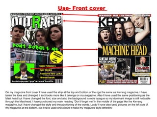
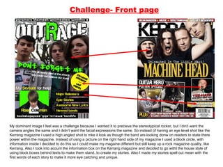
The document discusses the design choices made for various pages of a magazine created by the author. For the front cover, the author took inspiration from the layout and design elements of the Kerrang magazine but made modifications like changing fonts, sizes and backgrounds. For the contents page, the author copied the positioning of headings from Kerrang but changed the layout of pictures and stories. Throughout the magazine, the author aimed to make their design different from Kerrang while still appealing to a rock music audience.
For the last part of my AS Media coursework I have to complete an evaluation. Here is question 1 in a Powerpoint format to discuss my own Music Magazine.
If you want to see my progress to the finished magazine cover, contents page and double page spread this is my blog: http://sgracewhitehead.blogspot.co.uk/
media school homework coursework questions one a levels sixth form media studies exams preparation powerpoint presentation music magazine front cover contents page double page spread article images editing text layers text masthead coverlines
Read| The latest issue of The Challenger is here! We are thrilled to announce that our school paper has qualified for the NATIONAL SCHOOLS PRESS CONFERENCE (NSPC) 2024. Thank you for your unwavering support and trust. Dive into the stories that made us stand out!
Synthetic Fiber Construction in lab .pptxPavel ( NSTU)
Synthetic fiber production is a fascinating and complex field that blends chemistry, engineering, and environmental science. By understanding these aspects, students can gain a comprehensive view of synthetic fiber production, its impact on society and the environment, and the potential for future innovations. Synthetic fibers play a crucial role in modern society, impacting various aspects of daily life, industry, and the environment. ynthetic fibers are integral to modern life, offering a range of benefits from cost-effectiveness and versatility to innovative applications and performance characteristics. While they pose environmental challenges, ongoing research and development aim to create more sustainable and eco-friendly alternatives. Understanding the importance of synthetic fibers helps in appreciating their role in the economy, industry, and daily life, while also emphasizing the need for sustainable practices and innovation.
Ethnobotany and Ethnopharmacology:
Ethnobotany in herbal drug evaluation,
Impact of Ethnobotany in traditional medicine,
New development in herbals,
Bio-prospecting tools for drug discovery,
Role of Ethnopharmacology in drug evaluation,
Reverse Pharmacology.
The Art Pastor's Guide to Sabbath | Steve ThomasonSteve Thomason
What is the purpose of the Sabbath Law in the Torah. It is interesting to compare how the context of the law shifts from Exodus to Deuteronomy. Who gets to rest, and why?
Students, digital devices and success - Andreas Schleicher - 27 May 2024..pptxEduSkills OECD
Andreas Schleicher presents at the OECD webinar ‘Digital devices in schools: detrimental distraction or secret to success?’ on 27 May 2024. The presentation was based on findings from PISA 2022 results and the webinar helped launch the PISA in Focus ‘Managing screen time: How to protect and equip students against distraction’ https://www.oecd-ilibrary.org/education/managing-screen-time_7c225af4-en and the OECD Education Policy Perspective ‘Students, digital devices and success’ can be found here - https://oe.cd/il/5yV
How to Make a Field invisible in Odoo 17Celine George
It is possible to hide or invisible some fields in odoo. Commonly using “invisible” attribute in the field definition to invisible the fields. This slide will show how to make a field invisible in odoo 17.
Model Attribute Check Company Auto PropertyCeline George
In Odoo, the multi-company feature allows you to manage multiple companies within a single Odoo database instance. Each company can have its own configurations while still sharing common resources such as products, customers, and suppliers.
Instructions for Submissions thorugh G- Classroom.pptxJheel Barad
This presentation provides a briefing on how to upload submissions and documents in Google Classroom. It was prepared as part of an orientation for new Sainik School in-service teacher trainees. As a training officer, my goal is to ensure that you are comfortable and proficient with this essential tool for managing assignments and fostering student engagement.
Instructions for Submissions thorugh G- Classroom.pptx
Evaluation question 1
1. Use- Front cover On my magazine front cover I have used the strip at the top and bottom of the oge the same as Kerrang magazine. I have taken the Idea and changed it so it looks more like it belongs on my magazine. Also I have used the same positioning as the Mast head but I have changed the font, size and also the background is more opague so my dominant image is still noticable through the Masthead. I have positioned my main heading “Don’t forget me” in the middle of the page like the Kerrang magazine, but I have changed the style and the positioning of the words. Lastly I have also used pictures on the left side of my magazine at the bottom, but I have used one picture t make my magazine style different.
2. Develop- Front cover The picture on the bottom of the page have began to look different because I have taken away the background and put it on a green fill. I have done this to follow the colour and the house style that I have created for my magazine. I have used the strip at the bottom of my page but it is looking different to the one on the Kerrang magazine because mine is set to the bottom whereas the one on the Kerrang magazine is floating, and mine is clearer to read. Also my bar code is smaller and not as noticable as the one on the Kerrang magazine.
3. Challenge- Front page My dominant image I feel was a challenge because I wanted it to precieve the stereotypical rocker, but I din’t want the camera angles the same and I didn’t want the facial expressions the same. So instead of having an eye level shot like the Kerrang magazine I used a high angled shot to mke it look as though the band are looking donw on readers to state there power within the magazine. Instead of usng a picture on the right hand side of my magazine I used a block circle, with information inside I decided to do this so I could make my magaine different but still keep up a rock magazine quality, like Kerrang. Also I took into acount the information box on the Kerrang magazine and decided to go witht the house style of using block boxes behind texts to make them stand, to create my stories. Also I made my stories spell out mean with the first words of each story to make it more eye catching and unique.
4. Use- Contents In the top left of the page, I have used the idea of an editors note, I have done this to make my magazine look professional, but I have changed it by not putting a picture with the note. I have copied the postioning of the contents masthead and I have done this because I felt it looked stupid in other places on the page. I have used the idea of using loads of pictures and linking them into the stories, so they aren’t all listed on the side.
5. Develop- Contents page I have used a quotation under the contents masthead but I have boxed it so it stands out and follows the theme of the magazine. Also I have changed the layout of the pictures and stories so that it looks like the Kerrang but it isn’t copying it, I did this because I liked the layout and it made it look more informal, which I what I need to appeal to my target audience.
6. Challenge- Contents page I have used two coloured strips on my magazine, I did this so that it would make my magazine different, and also make it look more packed and fun. I feel these strips make the magazines contents more eye catching and also it also gives the magazine a layout and structure. The listing is different from the Kerrang magazine as the Kerrang magazine is split up into categories whereas mine is just listed and numbered. Also I have brought the bottom strip from the front page to the contents page, I feel this makes the pages match and front cover and follow the style through the magazine.
7. Use- Two page Spread I have used the idea of having a dominant images on The left hand side of the page, and I have done this because I think it makes the magazine appeal to the target audience more and it makes the magazine look more busy. I have used the background colour (black) as well and I did this because I wanted everything on the page to stand out as much as possible. Also the colour also represents the stereotypical rocker mood! Loud and outrageous.
8. Develop – Two page Spread I have used the Idea of a masthead title and a sub story underneath, but I have changed mine by spreading it between the two pages and having it straight instead of slanted. I have done this so that it is the first thing seen as you turn the page is the main heading so that the reader is automatically hooked into the story.
9. Challenge – Two page Spread I have changed the amount of writing making the article have more story so that the audience know more about the band. Also I have focused the main picture on the whole of the band, whereas in the Kerrang magazine the main picture is focused on the main singer