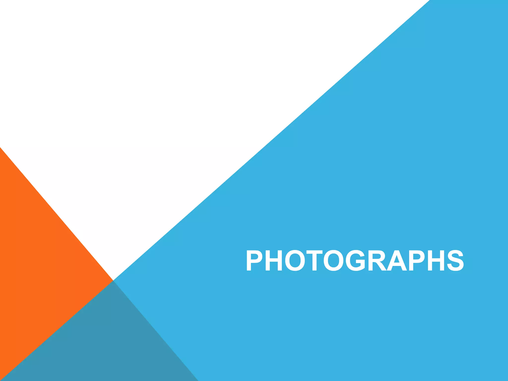
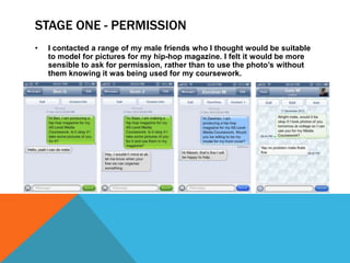
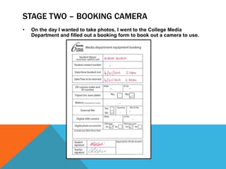
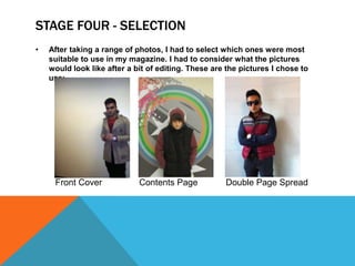
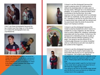
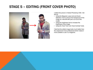
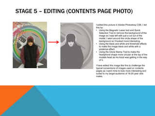
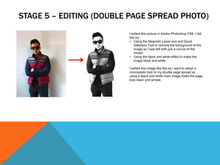
PHOTOGRAPHS
STAGE ONE - PERMISSION
•   I contacted a range of my male friends who I thought would be suitable
    to model for pictures for my hip-hop magazine. I felt it would be more
    sensible to ask for permission, rather than to use the photo’s without
    them knowing it was being used for my coursework.
STAGE TWO – BOOKING CAMERA
•   On the day I wanted to take photos, I went to the College Media
    Department and filled out a booking form to book out a camera to use.
STAGE THREE – TAKING PHOTOS
•   After booking the camera, I went and found places that I could take
    photos of the people I had asked permission of. I took a range of
    photos, below are some examples:
STAGE FOUR - SELECTION
•   After taking a range of photos, I had to select which ones were most
    suitable to use in my magazine. I had to consider what the pictures
    would look like after a bit of editing. These are the pictures I chose to
    use:


     Front Cover             Contents Page           Double Page Spread
I chose to use this photograph because the
                                                     model is wearing quite rich clothing which
                                                     reflects the stereotypically rich status given to
                                                     hip-hop artists. Although he is not wearing much
                                                     jewellery, he is wearing a diamond watch which
                                                     contributes to the hip-hop look. He is also
                                                     wearing a red top underneath which co-ordinates
                                                     well with my masthead, as that is going to be red
                                                     too. I decided to use this for my front cover as he
                                                     is making direct eye contact with the camera and
                                                     his pose would make the photo fit around the
                                                     layout I am hoping to achieve.
I didn’t use these photographs because the
                                                     I chose to use this photograph because the
two models have their bags on in the photos
                                                     model is wearing headphones which means it is
so it makes the photographs look very
                                                     suitable for a music magazine. He also has his
unprofessional.
                                                     hood up which reflects the ‘rebellious’ stereotype
                                                     associated with hip-hop artists. Furthermore, the
                                                     background is interesting to look at visually so
                                                     the picture will look attention-grabbing on the
                                                     page. I am going to use this picture for my
                                                     contents page because it is a photo of another
                                                     artist so it will enhance and add more depth to
                                                     the content of the magazine.


                                                     I chose to use this photograph because the
                                                     dress sense of the model is fashionable and
                                                     associated with hip-hop so it is appropriate for
                                                     my magazine. The model is also wearing
 I didn’t use these photographs because the          sunglasses and a watch which is reflected off the
 model isn’t looking directly at the camera so I     light which boosts the expensive gold it is made
 felt that it wasn’t suitable to use because it is   out of. These props add to the whole hip-hop
 more professional and conventional for there        look.
 to be direct contact between the model and          This is the same model I used for my front cover
 reader of the magazine.                             as the cover story is going to be about him so it
                                                     will make the magazine flow better
                                                     I am going to use this for the double page spread
                                                     and not the front cover as there is no visible eye
                                                     contact due to the sunglasses.
STAGE 5 – EDITING (FRONT COVER PHOTO)
                        I edited this picture in Adobe Photoshop CS6. I did
                        this by:
                        • Using the Magnetic Lasso tool and Quick
                           Selection Tool to remove the background of the
                           image so I was left with just a cut out of the
                           model.
                        • Using the brightness tool to increase the
                           brightness of the image.
                        • Using the ‘Auto Tone’ and ‘Auto Contrast’ tools.

                        I feel that the edited image looks much better than
                        the original and more professional which makes it
                        more suitable to use in a magazine.
STAGE 5 – EDITING (CONTENTS PAGE PHOTO)

                          I edited this picture in Adobe Photoshop CS6. I did
                          this by:
                          • Using the Magnetic Lasso tool and Quick
                             Selection Tool to remove the background of the
                             image so I was left with just a cut out of the
                             model. I went around the circle shape of the
                             background so it looked more interesting.
                          • Using the black and white and threshold effects
                             to make the image black and white with a
                             posterize effect.
                          • Using the Clone Stamp Tool to make the
                             headphone shape more circular at the top of the
                             models head as his hood was getting in the way
                             of it.

                          I have edited this image like this to challenge the
                          typical conventions of images used on contents
                          pages as I want mine to look more interesting and
                          suited to my target audience of 16-20 year olds
                          males.
STAGE 5 – EDITING (DOUBLE PAGE SPREAD PHOTO)
                         I edited this picture in Adobe Photoshop CS6. I did
                         this by:
                         • Using the Magnetic Lasso tool and Quick
                            Selection Tool to remove the background of the
                            image so I was left with just a cut out of the
                            model.
                         • Using the black and white effect to make the
                            image black and white

                         I edited this image like this as I want to adopt a
                         minimalistic look to my double page spread so
                         using a black and white main image make the page
                         look clean and simple.

Photographs (unaltered and permission)

  • 1.
  • 2.
    STAGE ONE -PERMISSION • I contacted a range of my male friends who I thought would be suitable to model for pictures for my hip-hop magazine. I felt it would be more sensible to ask for permission, rather than to use the photo’s without them knowing it was being used for my coursework.
  • 3.
    STAGE TWO –BOOKING CAMERA • On the day I wanted to take photos, I went to the College Media Department and filled out a booking form to book out a camera to use.
  • 4.
    STAGE THREE –TAKING PHOTOS • After booking the camera, I went and found places that I could take photos of the people I had asked permission of. I took a range of photos, below are some examples:
  • 5.
    STAGE FOUR -SELECTION • After taking a range of photos, I had to select which ones were most suitable to use in my magazine. I had to consider what the pictures would look like after a bit of editing. These are the pictures I chose to use: Front Cover Contents Page Double Page Spread
  • 6.
    I chose touse this photograph because the model is wearing quite rich clothing which reflects the stereotypically rich status given to hip-hop artists. Although he is not wearing much jewellery, he is wearing a diamond watch which contributes to the hip-hop look. He is also wearing a red top underneath which co-ordinates well with my masthead, as that is going to be red too. I decided to use this for my front cover as he is making direct eye contact with the camera and his pose would make the photo fit around the layout I am hoping to achieve. I didn’t use these photographs because the I chose to use this photograph because the two models have their bags on in the photos model is wearing headphones which means it is so it makes the photographs look very suitable for a music magazine. He also has his unprofessional. hood up which reflects the ‘rebellious’ stereotype associated with hip-hop artists. Furthermore, the background is interesting to look at visually so the picture will look attention-grabbing on the page. I am going to use this picture for my contents page because it is a photo of another artist so it will enhance and add more depth to the content of the magazine. I chose to use this photograph because the dress sense of the model is fashionable and associated with hip-hop so it is appropriate for my magazine. The model is also wearing I didn’t use these photographs because the sunglasses and a watch which is reflected off the model isn’t looking directly at the camera so I light which boosts the expensive gold it is made felt that it wasn’t suitable to use because it is out of. These props add to the whole hip-hop more professional and conventional for there look. to be direct contact between the model and This is the same model I used for my front cover reader of the magazine. as the cover story is going to be about him so it will make the magazine flow better I am going to use this for the double page spread and not the front cover as there is no visible eye contact due to the sunglasses.
  • 7.
    STAGE 5 –EDITING (FRONT COVER PHOTO) I edited this picture in Adobe Photoshop CS6. I did this by: • Using the Magnetic Lasso tool and Quick Selection Tool to remove the background of the image so I was left with just a cut out of the model. • Using the brightness tool to increase the brightness of the image. • Using the ‘Auto Tone’ and ‘Auto Contrast’ tools. I feel that the edited image looks much better than the original and more professional which makes it more suitable to use in a magazine.
  • 8.
    STAGE 5 –EDITING (CONTENTS PAGE PHOTO) I edited this picture in Adobe Photoshop CS6. I did this by: • Using the Magnetic Lasso tool and Quick Selection Tool to remove the background of the image so I was left with just a cut out of the model. I went around the circle shape of the background so it looked more interesting. • Using the black and white and threshold effects to make the image black and white with a posterize effect. • Using the Clone Stamp Tool to make the headphone shape more circular at the top of the models head as his hood was getting in the way of it. I have edited this image like this to challenge the typical conventions of images used on contents pages as I want mine to look more interesting and suited to my target audience of 16-20 year olds males.
  • 9.
    STAGE 5 –EDITING (DOUBLE PAGE SPREAD PHOTO) I edited this picture in Adobe Photoshop CS6. I did this by: • Using the Magnetic Lasso tool and Quick Selection Tool to remove the background of the image so I was left with just a cut out of the model. • Using the black and white effect to make the image black and white I edited this image like this as I want to adopt a minimalistic look to my double page spread so using a black and white main image make the page look clean and simple.