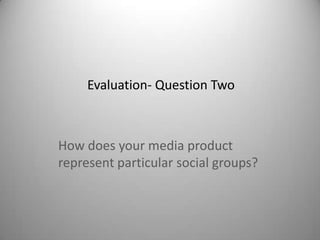
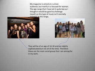
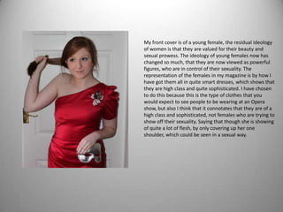
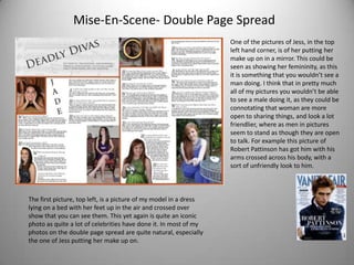
Evaluation- Question Two


How does your media product
represent particular social groups?
My magazine is aimed at a unisex
 audience, but mainly it is focused for woman.
 The age range that I have set it quite low as I
 thought it would be good to challenge
 myself, as this type of music isn’t normally
 targeted at this range.


They will be of an age of 16-18 and are slightly
sophisticated but not all of the time. Therefore
these are the main social group that I am aiming for
in my work.
My front cover is of a young female, the residual ideology
of women is that they are valued for their beauty and
sexual prowess. The ideology of young females now has
changed so much, that they are now viewed as powerful
figures, who are in control of their sexuality. The
representation of the females in my magazine is by how I
have got them all in quite smart dresses, which shows that
they are high class and quite sophisticated. I have chosen
to do this because this is the type of clothes that you
would expect to see people to be wearing at an Opera
show, but also I think that it connotates that they are of a
high class and sophisticated, not females who are trying to
show off their sexuality. Saying that though she is showing
of quite a lot of flesh, by only covering up her one
shoulder, which could be seen in a sexual way.
Mise-en-scene
                                        As you can see in this picture, I have got my model to
                                        tie her hair back, and then hold it out to the side, but
                                        also I have asked her to hold the mask by her hip. By
                                        getting my model to hold her hair like that it shows
                                        that she is confident, but also it distracts the eye.
                                        There is only one prop that I have used in this picture
                                        is a mask. I have used this mask because people
                                        generally associate Opera with masks, for example
                                        the film The Phantom Of The Opera. By asking my
                                        model to hold the mask by her hip it is subtle and
                                        discrete, yet still something that is quite important to
                                        be in the picture. Also by the way that she is actually
                                        holding the mask is in a very feminine way, the way
                                        that she is showing her finger nails, it sort of
                                        connotating a gentle look to it.

On my contents page, I have only used one
photo. The way that I have got my model to
pose is in a quite iconic way, as this is a pose
that Marylyn Monroe did and Audrey
Hepburn. I think that this picture also
connotates that she is confident, but also
innocent. The main prop that I have used in
this picture is the violin which connotates
sophistication and class, as it can be
associated with an Orchestra .
Mise-En-Scene- Double Page Spread
                                                                   One of the pictures of Jess, in the top
                                                                   left hand corner, is of her putting her
                                                                   make up on in a mirror. This could be
                                                                   seen as showing her femininity, as this
                                                                   it is something that you wouldn’t see a
                                                                   man doing. I think that in pretty much
                                                                   all of my pictures you wouldn’t be able
                                                                   to see a male doing it, as they could be
                                                                   connotating that woman are more
                                                                   open to sharing things, and look a lot
                                                                   friendlier, where as men in pictures
                                                                   seem to stand as though they are open
                                                                   to talk. For example this picture of
                                                                   Robert Pattinson has got him with his
                                                                   arms crossed across his body, with a
                                                                   sort of unfriendly look to him.


The first picture, top left, is a picture of my model in a dress
lying on a bed with her feet up in the air and crossed over
show that you can see them. This yet again is quite an iconic
photo as quite a lot of celebrities have done it. In most of my
photos on the double page spread are quite natural, especially
the one of Jess putting her make up on.
Does your title connote anything about your social
                     group?
My title doesn’t connote anything about my social group as none of them are ‘fat’, and only one person
sings. The only thing is that obviously then are ladies.


How have you used colours? Does they reinforce or challenge ideological assumptions about
this group?
I have tried to get the colours to match together, and also not have too many. As you can see from my
front cover, contents page and double page spread I have stuck with the orange and grey colour theme
throughout. I don’t really think that they reinforce or challenge any ideological assumptions as they are
quite subtle colours.


Does your choice of font connote anything about the social group you’re representing?
I have used the same font throughout my magazine. The font that I have used is called ‘Trajan Pro’ this
type of font connotes a simply style, yet sophistication, but it is also quite stylish in a subtle way. This is
sort of like my social group as they can be sophisticated yet they are relaxed and quite stylish at the same
time.

Evaluation question 2

  • 1.
    Evaluation- Question Two Howdoes your media product represent particular social groups?
  • 2.
    My magazine isaimed at a unisex audience, but mainly it is focused for woman. The age range that I have set it quite low as I thought it would be good to challenge myself, as this type of music isn’t normally targeted at this range. They will be of an age of 16-18 and are slightly sophisticated but not all of the time. Therefore these are the main social group that I am aiming for in my work.
  • 3.
    My front coveris of a young female, the residual ideology of women is that they are valued for their beauty and sexual prowess. The ideology of young females now has changed so much, that they are now viewed as powerful figures, who are in control of their sexuality. The representation of the females in my magazine is by how I have got them all in quite smart dresses, which shows that they are high class and quite sophisticated. I have chosen to do this because this is the type of clothes that you would expect to see people to be wearing at an Opera show, but also I think that it connotates that they are of a high class and sophisticated, not females who are trying to show off their sexuality. Saying that though she is showing of quite a lot of flesh, by only covering up her one shoulder, which could be seen in a sexual way.
  • 4.
    Mise-en-scene As you can see in this picture, I have got my model to tie her hair back, and then hold it out to the side, but also I have asked her to hold the mask by her hip. By getting my model to hold her hair like that it shows that she is confident, but also it distracts the eye. There is only one prop that I have used in this picture is a mask. I have used this mask because people generally associate Opera with masks, for example the film The Phantom Of The Opera. By asking my model to hold the mask by her hip it is subtle and discrete, yet still something that is quite important to be in the picture. Also by the way that she is actually holding the mask is in a very feminine way, the way that she is showing her finger nails, it sort of connotating a gentle look to it. On my contents page, I have only used one photo. The way that I have got my model to pose is in a quite iconic way, as this is a pose that Marylyn Monroe did and Audrey Hepburn. I think that this picture also connotates that she is confident, but also innocent. The main prop that I have used in this picture is the violin which connotates sophistication and class, as it can be associated with an Orchestra .
  • 5.
    Mise-En-Scene- Double PageSpread One of the pictures of Jess, in the top left hand corner, is of her putting her make up on in a mirror. This could be seen as showing her femininity, as this it is something that you wouldn’t see a man doing. I think that in pretty much all of my pictures you wouldn’t be able to see a male doing it, as they could be connotating that woman are more open to sharing things, and look a lot friendlier, where as men in pictures seem to stand as though they are open to talk. For example this picture of Robert Pattinson has got him with his arms crossed across his body, with a sort of unfriendly look to him. The first picture, top left, is a picture of my model in a dress lying on a bed with her feet up in the air and crossed over show that you can see them. This yet again is quite an iconic photo as quite a lot of celebrities have done it. In most of my photos on the double page spread are quite natural, especially the one of Jess putting her make up on.
  • 6.
    Does your titleconnote anything about your social group? My title doesn’t connote anything about my social group as none of them are ‘fat’, and only one person sings. The only thing is that obviously then are ladies. How have you used colours? Does they reinforce or challenge ideological assumptions about this group? I have tried to get the colours to match together, and also not have too many. As you can see from my front cover, contents page and double page spread I have stuck with the orange and grey colour theme throughout. I don’t really think that they reinforce or challenge any ideological assumptions as they are quite subtle colours. Does your choice of font connote anything about the social group you’re representing? I have used the same font throughout my magazine. The font that I have used is called ‘Trajan Pro’ this type of font connotes a simply style, yet sophistication, but it is also quite stylish in a subtle way. This is sort of like my social group as they can be sophisticated yet they are relaxed and quite stylish at the same time.