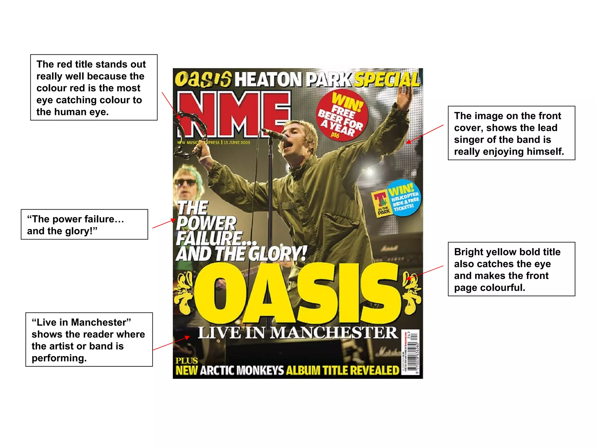
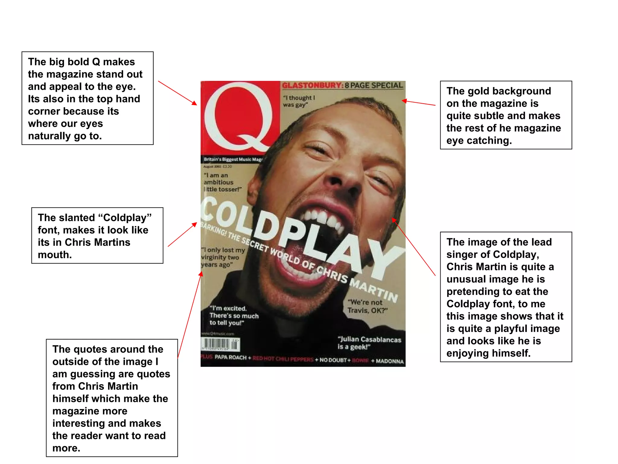
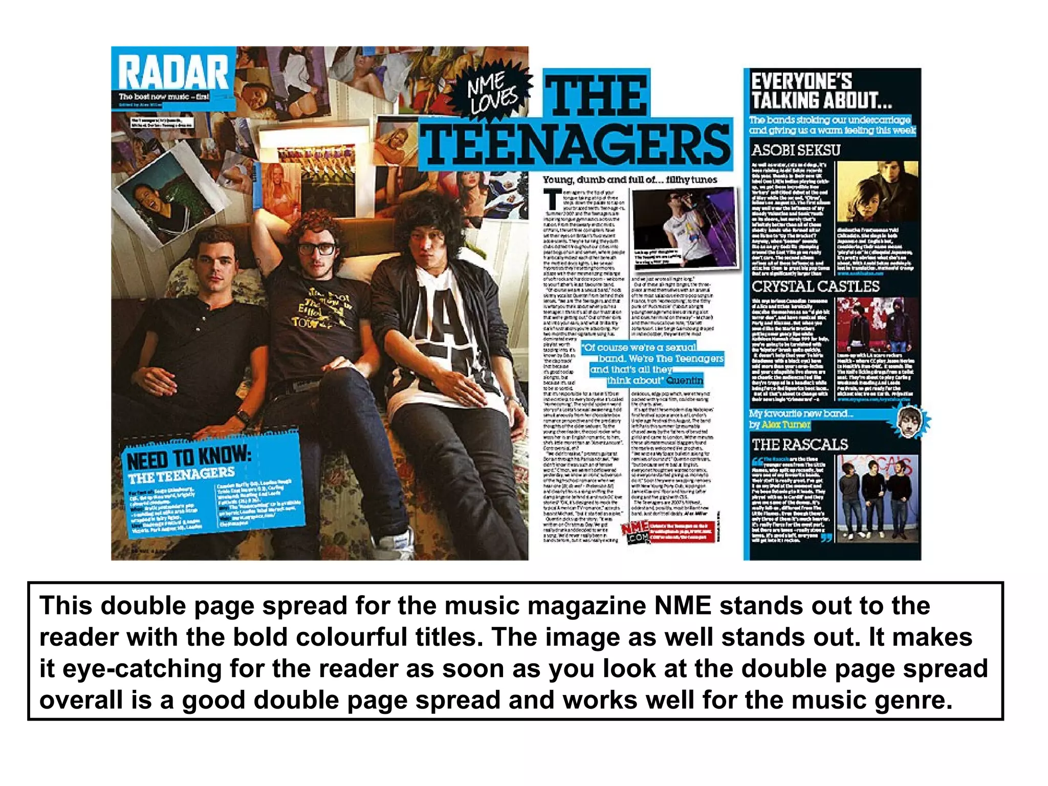
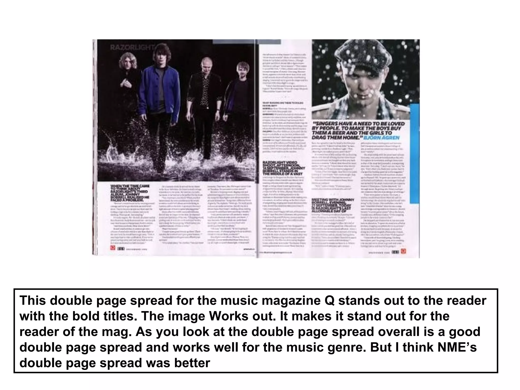
The red title stands out
 really well because the
 colour red is the most
 eye catching colour to
 the human eye.             The image on the front
                            cover, shows the lead
                            singer of the band is
                            really enjoying himself.


“The power failure…
and the glory!”

                            Bright yellow bold title
                            also catches the eye
                            and makes the front
                            page colourful.


“Live in Manchester”
shows the reader where
the artist or band is
performing.
The big bold Q makes
the magazine stand out
and appeal to the eye.         The gold background
Its also in the top hand       on the magazine is
corner because its             quite subtle and makes
where our eyes                 the rest of he magazine
naturally go to.               eye catching.


  The slanted “Coldplay”
  font, makes it look like
  its in Chris Martins         The image of the lead
  mouth.                       singer of Coldplay,
                               Chris Martin is quite a
                               unusual image he is
                               pretending to eat the
                               Coldplay font, to me
                               this image shows that it
                               is quite a playful image
                               and looks like he is
     The quotes around the     enjoying himself.
     outside of the image I
     am guessing are quotes
     from Chris Martin
     himself which make the
     magazine more
     interesting and makes
     the reader want to read
     more.
I like the font of this
                            magazine even though
                            its not in your face its
                            different and quite
                            subtle.
I like this music
magazine because its
different to the others
and isn't a very known
magazine.

                                                       The image on this
                                                       magazine is different as
                                                       well the male character
                                                       is looking with his hand
                                                       on his head, the image
                                                       makes you think about
                                                       what the male character
                                                       is doing and thinking.


The sub titles at the
side work well the black
and white colours and
the italic and non italic
fonts stand out and also                               The red title stands out
the white background                                   and seems to be the
behind the lettering                                   colour most magazines
stands out to. Also                                    use to make them stand
makes the reader want                                  out.
to read more.
The masthead at the top
of the contents page is
a black strip with the
logo in the top left hand
corner.                     The image shows the
                            reader what the main
                            focus is the magazine is
                            the main subject on the
                            contents page I makes
                            you look straight away
                            at the image.


This contents page
layout, has a column of
the page numbers
instead of all over the
                            The colour scheme of
place.
                            this contents page is
                            white, black and red
                            which is Q’s colour
                            scheme through out the
                            magazine.

 There's also a review
 section on this contents
 page it gives the reader
 a quick look of what's
 inside.
The masthead of this
                         magazine, is the same
This contents has a      as Q’s magazine with
band index also which    the same colour
also helps the reader.   scheme black, red and
                         white.


                         This contents page
                         layout, has a column of
                         the page numbers
                         instead of all over the
The main image of this   place.
contents page stands
out and is the readers
main focus when you
look at this magazine.


                         Subscribe today
                         section, tells the reader
                         that they can subscribe
                         to the magazine if they
                         wanted too.
Previous Issue of
   magazine shows the
   reader the last                The colour scheme of
   magazine and what it           this magazine stands
   was about in case they         out the black and
   missed it and want to          yellow work well
   buy it online.                 together.


The main image of this
contents page stands
out and is the readers
main focus when you
look at this magazine.


                                   The strip of contents
                                   works well on the right
       The other images on the     hand side I like the was
       contents stand out and      its quite subtle but the
       make the contents page      headings stand out with
       eye catching to readers.    the black and yellow
                                   colour scheme.
This double page spread for the music magazine NME stands out to the
reader with the bold colourful titles. The image as well stands out. It makes
it eye-catching for the reader as soon as you look at the double page spread
overall is a good double page spread and works well for the music genre.
This double page spread for the music magazine Q stands out to the reader
with the bold titles. The image Works out. It makes it stand out for the
reader of the mag. As you look at the double page spread overall is a good
double page spread and works well for the music genre. But I think NME’s
double page spread was better
Radial Analysis

Radial Analysis

  • 1.
    The red titlestands out really well because the colour red is the most eye catching colour to the human eye. The image on the front cover, shows the lead singer of the band is really enjoying himself. “The power failure… and the glory!” Bright yellow bold title also catches the eye and makes the front page colourful. “Live in Manchester” shows the reader where the artist or band is performing.
  • 2.
    The big boldQ makes the magazine stand out and appeal to the eye. The gold background Its also in the top hand on the magazine is corner because its quite subtle and makes where our eyes the rest of he magazine naturally go to. eye catching. The slanted “Coldplay” font, makes it look like its in Chris Martins The image of the lead mouth. singer of Coldplay, Chris Martin is quite a unusual image he is pretending to eat the Coldplay font, to me this image shows that it is quite a playful image and looks like he is The quotes around the enjoying himself. outside of the image I am guessing are quotes from Chris Martin himself which make the magazine more interesting and makes the reader want to read more.
  • 3.
    I like thefont of this magazine even though its not in your face its different and quite subtle. I like this music magazine because its different to the others and isn't a very known magazine. The image on this magazine is different as well the male character is looking with his hand on his head, the image makes you think about what the male character is doing and thinking. The sub titles at the side work well the black and white colours and the italic and non italic fonts stand out and also The red title stands out the white background and seems to be the behind the lettering colour most magazines stands out to. Also use to make them stand makes the reader want out. to read more.
  • 4.
    The masthead atthe top of the contents page is a black strip with the logo in the top left hand corner. The image shows the reader what the main focus is the magazine is the main subject on the contents page I makes you look straight away at the image. This contents page layout, has a column of the page numbers instead of all over the The colour scheme of place. this contents page is white, black and red which is Q’s colour scheme through out the magazine. There's also a review section on this contents page it gives the reader a quick look of what's inside.
  • 5.
    The masthead ofthis magazine, is the same This contents has a as Q’s magazine with band index also which the same colour also helps the reader. scheme black, red and white. This contents page layout, has a column of the page numbers instead of all over the The main image of this place. contents page stands out and is the readers main focus when you look at this magazine. Subscribe today section, tells the reader that they can subscribe to the magazine if they wanted too.
  • 6.
    Previous Issue of magazine shows the reader the last The colour scheme of magazine and what it this magazine stands was about in case they out the black and missed it and want to yellow work well buy it online. together. The main image of this contents page stands out and is the readers main focus when you look at this magazine. The strip of contents works well on the right The other images on the hand side I like the was contents stand out and its quite subtle but the make the contents page headings stand out with eye catching to readers. the black and yellow colour scheme.
  • 7.
    This double pagespread for the music magazine NME stands out to the reader with the bold colourful titles. The image as well stands out. It makes it eye-catching for the reader as soon as you look at the double page spread overall is a good double page spread and works well for the music genre.
  • 8.
    This double pagespread for the music magazine Q stands out to the reader with the bold titles. The image Works out. It makes it stand out for the reader of the mag. As you look at the double page spread overall is a good double page spread and works well for the music genre. But I think NME’s double page spread was better